
About this manual
This is the PageWright™ Users Guide. PageWright is a PDF page-layout engine: you describe a document as a JSON spec - its pages, text, tables, images, charts, forms and structure - and the engine flows it onto pages and writes a tagged, standards-compliant PDF.
Every page of this manual was produced by the engine itself from a JSON spec (sample/guide-users-manual.json), so it doubles as a worked example: the cover, the table of contents, the running heads and folios, the code boxes, the reference tables, and the index and glossary at the back are all ordinary engine features described in these pages.
Note: Conventions. Monospace text in a red tint marks a JSON key, value, or command - for example "type": "paragraph" or pagewrightapp. Shaded boxes are complete, valid snippets you can paste into a spec. Bold marks the first mention of a defined term; the Glossary collects them.
1. Your first document
PageWright reads a document spec - a JSON object - and writes a PDF. The smallest useful spec gives a title and a list of blocks:
{
  "title": "Hello, PageWright",
  "blocks": [
    {
      "type": "heading",
      "level": 1,
      "text": "Hello, PageWright"
    },
    {
      "type": "paragraph",
      "text": "This paragraph was laid out and rendered by the engine."
    }
  ]
}
Save it as hello.json and render it from the command line:
pagewrightapp hello.json hello.pdf
That is the whole loop: write JSON, run the engine, get a PDF. The engine chose a page size, a font, margins and line spacing for you, flowed the paragraph, and produced a one-page document. Everything else in this manual is about taking control of those choices.
Tip: The engine checks every spec against its schema, aplayout.schema.json, as it renders: a misspelled key or a value of the wrong kind is reported on the console with the pointer to where it is, and the render carries on. Run pagewrightapp -checkschema hello.json to check a spec without rendering it - see Running the engine.
2. The shape of a spec
A spec is a single JSON object. A handful of top-level keys set up the document; one of blocks or sections carries the content.
| Key | Type | Purpose |
|---|---|---|
title | string | Document title - written to the PDF metadata and (for tagged PDF) required; supplied automatically if you omit it. |
author / subject / keywords | string | More document metadata (/Info + XMP). |
producer | string | Overrides the /Producer metadata. Defaults to Appligent PageWright (written to both /Info and the XMP packet), so a file is self-identifying even if you set nothing. |
meta.rights | string | A copyright or licence notice, written to the XMP packet as dc:rights - /Info has no rights entry. Only inside the meta object. |
pageSetup | object | Page size, margins, columns, headers/footers, numbering - see Part II. |
defaultStyle | object | The base text style every block inherits (font, size, color, line height). |
blocks | array | The body, as one implicit section. |
sections | array | Use instead of blocks for multi-section documents (see Sections). |
styles | object | A named stylesheet you can reference by name (see Named styles). |
stories | array | Free-standing content poured into threaded frames (Article threading). |
tagged | bool | Emit a tagged, accessible PDF/UA document (Part VIII). |
pdfa | string | Emit an archival PDF/A file: "2b", "2u", or "2a" (Part VIII). |
declarations | array | Machine-readable claims of conformance to a standard PDF has no identifier for - WCAG above all (Part VIII). |
declarationGate | string | How the engine reacts when the document contradicts a WCAG level it declares: "warn" (default), "strict", "off" (Part VIII). |
Note: Every PDF the engine writes carries a /Producer of Appligent PageWright - including this manual. Set producer to stamp your own application's name instead; pdfinfo output.pdf shows the result.
A block is one piece of content - a paragraph, heading, list, table, image, chart, rule, and so on. Every block has a type; the rest of its keys depend on that type. Blocks stack down the page in order, breaking onto new pages as needed. The block types are introduced through Parts III-VII and collected in the Block Quick-Reference appendix.
Note: Coordinates run from the top-left of the page, in points (1 pt = 1/72 inch). A US Letter page is 612 x 792 pt. Sizes that read as a percentage ("50%") are relative to the content width. See the Units appendix.
3. Running the engine
One binary drives the engine, two ways:
- A single render,
pagewrightapp spec.json out.pdf, for one-off renders and scripting. - A batch,
pagewrightapp -batch jobs.txt, for many documents in one run: it pays the font/library start-up cost once, and-jobs autospreads the list across worker processes.
Both are covered in detail in the Developer Manual. For authoring, a single render is all you need:
# render, then open the result
pagewrightapp report.json report.pdf
open report.pdf            # macOS
Caution: Pass the output path as an absolute path if you render from an unusual working directory, and keep image/PDF assets next to the spec: a relative asset src is resolved against the spec file's directory.
Checking a spec
Every render first checks the spec against the schema and prints each problem it finds - up to twenty, each with the JSON pointer to where it is - then renders anyway. To check without rendering, name one or more specs after -checkschema. It exits 0 when every spec matches and 1 when any does not, so it drops into a build script:
pagewrightapp -checkschema report.json letter.json
pagewrightapp report.json report.pdf -strictschema   # refuse a spec that does not match
-strictschema makes a render refuse a spec that does not match - no PDF, and exit status 1 - and -noschemacheck skips the check. Point your editor at the same schema for completion and warnings as you type.
Fonts from your own folders
A fontFamily is looked up among the fonts installed on the machine. To use fonts that are not installed - a brand face that travels with the job - name their folder with -fontdir. It can be given more than once, and its folders are searched before the installed fonts; a spec can carry the same list as its top-level fontDirs. A font with the same name as an installed one is still taken from the installed copy. pagewrightapp -fonts lists every font the engine can embed.
pagewrightapp brochure.json brochure.pdf -fontdir ./fonts
One more option writes a second, print-ready copy of the document laid out as a folded booklet, -impose <file> - see Print production & color mode.
4. Units, points & coordinates
Before page setup, the measurement system. Everything in a spec is in PDF points unless written as a percentage.
| Concept | Rule |
|---|---|
| Points | All lengths are points: 1 pt = 1/72 inch. US Letter is 612 x 792 pt; one inch of margin is 72. |
| Percentages | A width written as a string ("50%") is relative to the current content width - the column, cell, or page body. |
| Origin | position and the layout map use a top-left origin, y increasing downward. (The PDF file uses bottom-left; the engine flips for you at write time.) |
| Insets | margins, padding and bleed take one number for all four edges, or { top, right, bottom, left }. |
| Spacing | style.spaceBefore / style.spaceAfter add points of gap above / below any block - the way to keep a paragraph off the box above it. |
Tip: Reach for a percentage when a block should track the column width (a half-width image, a "100%" table), and points when a size is fixed (a 72 pt margin, a 9 pt bleed). The two mix freely - table columns can be "30%", "auto", and 80 points side by side.
5. Page size, orientation & margins
pageSetup controls the canvas. The most common keys:
| Key | Type | Default | Meaning |
|---|---|---|---|
size | string / object | "Letter" | A named size ("Letter", "Legal", "A4", ...) or { "width": w, "height": h } in points. |
orientation | string | "portrait" | "portrait" or "landscape" (swaps width/height). |
margins | number / object | 72 | One number for all four edges, or { "top", "right", "bottom", "left" }. |
columns | integer | 1 | Number of text columns (Columns & flow). |
columnGap | number | 18 | Gutter between columns, in points. |
{
  "pageSetup": {
    "size": "A4",
    "margins": {
      "top": 56,
      "right": 64,
      "bottom": 56,
      "left": 64
    },
    "columns": 1
  }
}
See the Page Sizes appendix for the named sizes and their dimensions.
6. Headers, footers & page numbers
A running header and footer are bands reserved inside the top and bottom margins. Each has three independent slots - left, center, right - of inline runs, and the text may contain substitution tokens:
| Token | Expands to |
|---|---|
{{page}} | The current page number, in the active numbering format. |
{{pages}} | The total page count of the numbering group (triggers an exact counting pass). |
{{title}} | The document title. |
{{date}} / {{time}} / {{datetime}} | The render date / time (one value per render). |
{
  "pageSetup": {
    "numbering": {
      "startAt": 1,
      "format": "arabic"
    },
    "header": {
      "left": "Quarterly Report",
      "right": "{{title}}",
      "firstPage": "none"
    },
    "footer": {
      "center": "Page {{page}} of {{pages}}"
    }
  }
}
numbering.format is one of arabic, lower-roman, upper-roman, lower-alpha, upper-alpha; startAt sets the first number and pad zero-pads it (the Bates idiom). A band may carry its own style, suppress itself on the first page ("firstPage": "none"), or mirror left/right on verso pages ("evenPage": "mirror") - the recto/verso convention used by this manual and detailed under Sections.
Tip: {{pages}} makes the engine run a metrics-only counting pass so the total is exact even though it depends on the layout it is part of. The same fixed-point machinery powers the table of contents, the index, and cross-references.
Separator rule & band height
Two more per-band controls shape how a header or footer sits against the body. A band's rule draws a hairline separator across the content width on the band's body-facing edge - under a header, above a footer - and takes { "width", "color" } (or a bare color for a 0.75pt hairline). A band's height reserves extra vertical space inside the margin. Slot text is pinned: a header's left/center/right text hugs the top of its band and a footer's text hugs the bottom, so added height opens a clear gap on the rule side rather than nudging the text toward the page edge.
{
  "pageSetup": {
    "header": {
      "left": "{{title}}",
      "right": "Chapter",
      "height": 22,
      "rule": {
        "width": 0.5,
        "color": "#cdd4de"
      }
    },
    "footer": {
      "center": "{{page}}"
    }
  }
}
Because the rule is drawn as a page artifact, it never enters the tagged reading order - assistive technology reads only the slot text. The running header on every body page of this manual is exactly the band above: a thin #cdd4de rule below the title line, with a height of 22 that lifts the rule clear of the first line of body text.
Tip: Reach for height whenever a footer carries two lines, or a header sits close to tall body text: the extra room lands on the rule side, keeping the slot text where the reader expects it and the separator evenly spaced.
Bates numbering & continued sequences
numbering.pad zero-pads page numbers to a fixed width - the Bates idiom for legal and discovery documents (000001, 000002, ...). Because startAt sets the first number, you can also continue a sequence across separately generated documents: render volume one starting at 1, then render volume two with startAt set to one past where volume one ended, and the folios run unbroken.
{
  "pageSetup": {
    "numbering": {
      "startAt": 1,
      "format": "arabic",
      "pad": 6
    },
    "footer": {
      "right": "BATES-{{page}}"
    }
  }
}
Whatever numbering a section uses, the engine also publishes a catalog /PageLabels number tree, so a PDF viewer's own page box shows the document's folios - front matter i, ii, iii, body 1, 2, 3, an appendix A, B - rather than the physical sheet index. This is automatic; there is no key to set.
7. Columns & flow
Set pageSetup.columns greater than one and the body flows newspaper-style: column 0 fills top to bottom, then column 1, then the next page. columnGap sets the gutter. Headings, tables and other full-width blocks still flow within a column; for content that spans non-adjacent pages instead, see article threading under Article threading.
{
  "pageSetup": {
    "columns": 2,
    "columnGap": 22
  }
}
8. The table of contents
Drop a toc block where you want a contents list and the engine builds it from the document's headings - each an internal link to its target, with dot leaders and a page number that is exact (the TOC's own length shifts the page numbers, so the engine iterates until they stop moving).
{
  "type": "toc",
  "title": "Contents",
  "maxLevel": 2
}
maxLevel chooses the deepest heading level listed. The contents page at the front of this manual is exactly this block.
9. Sections: mixed page setups in one document
Replace the top-level blocks array with sections - an array of objects, each with its own blocks and an optional pageSetup that is folded onto the document defaults. A new section starts on a new page. Sections let one document change page size, orientation, columns, margins, headers/footers and page numbering partway through - for example roman-numbered portrait front matter followed by an arabic-numbered landscape, two-column body:
{
  "sections": [
    {
      "numbering": {
        "format": "lower-roman"
      },
      "blocks": [
        {
          "type": "heading",
          "level": 1,
          "text": "Preface"
        }
      ]
    },
    {
      "restartNumbering": true,
      "numbering": {
        "startAt": 1,
        "format": "arabic"
      },
      "orientation": "landscape",
      "columns": 2,
      "blocks": [
        {
          "type": "heading",
          "level": 1,
          "text": "Chapter 1"
        }
      ]
    }
  ]
}
Page numbers run per numbering group - a run of sections from one restartNumbering to the next - so {{pages}} is that group's page count, and front matter can be i, ii, iii... while the body restarts at 1. For bookmaking, a section may set "startOn": "recto" (open on a right-hand page, inserting a blank verso when needed) and the document may set pageSetup.mirrorMargins to swap the gutter on verso pages. This manual itself is two sections: roman front matter and an arabic body.
Bookmaking & the opening view
Two more controls finish a bound document. pageSetup.mirrorMargins widens the inner (gutter) margin and narrows the outer one, swapping them on verso pages so the binding edge always has room; the running footer mirrors with it. A top-level viewer object sets how the PDF first opens - useful for spreads:
viewer key | Values |
|---|---|
layout | single, oneColumn, twoColumnLeft/Right, twoPageLeft/Right |
mode | none, outlines (bookmarks pane), thumbs, fullscreen |
fit | fit, fitWidth, fitHeight, actual |
page | 1-based page to open on |
{
  "pageSetup": {
    "mirrorMargins": true
  },
  "viewer": {
    "layout": "twoPageRight",
    "mode": "outlines",
    "fit": "fitWidth"
  }
}
10. Paragraphs, runs & inline styling
A paragraph is the workhorse block. Its text can be a plain string, or - when you need styling within the paragraph - an array of runs, each a span of text with its own style:
{
  "type": "paragraph",
  "runs": [
    {
      "text": "PageWright supports "
    },
    {
      "text": "bold",
      "style": {
        "weight": "bold"
      }
    },
    {
      "text": ", "
    },
    {
      "text": "italic",
      "style": {
        "italic": true
      }
    },
    {
      "text": ", color, "
    },
    {
      "text": "underline",
      "style": {
        "underline": true
      }
    },
    {
      "text": " and links, all in one line."
    }
  ]
}
A style object may appear on a run, on a block, on a table cell, on a running band, or as the document defaultStyle; styles cascade (a run inherits its block's style, which inherits the document default). The common style keys:
| Style key | Type | Meaning |
|---|---|---|
fontFamily | string | "Helvetica", "Times", "Courier" (Base-14), or any embedded family (Fonts). |
fontSize | number | Point size. |
weight | string | "bold" (or "normal"). |
italic | bool | Italic / oblique. |
color | color | Text color in any color space (Color Spaces appendix). |
underline / strike | bool | Underline or strike-through, drawn in the text color. |
align | string | "left", "right", "center", "justify" (block-level). |
lineHeight | number | Line spacing as a multiple of the font size (e.g. 1.35). |
spaceBefore / spaceAfter | number | Extra space above / below the block, in points. |
letterSpacing / wordSpacing | number | Tracking and word-space adjustment, in points. |
smallCaps | bool | Render lowercase as small capitals; the real words survive via /ActualText for search and assistive tech. Inherited. |
background | color | A fill behind the text - a highlight on a run, a tint behind a paragraph. A box property (not inherited). |
bold | bool | Shorthand for "weight": "bold". |
A run can also carry a link (Links), a footnote or endnote (Footnotes & endnotes), a ref cross-reference (Cross-references), superscript: true for an ordinal or a ™/® mark (baselineShift moves it up or down), an inline badge, an inline equation (Math & equations), or its own lang (Part VIII).
Alignment, decoration & fitted headlines
align is left (default), right, center, or justify (flush both edges - pair it with hyphenate for tight narrow columns - Named styles). underline and strike decorate any run or block in the text color. letterSpacing and wordSpacing add or remove space (in points) between letters and words - useful for tracked small-caps headings or tightening a line. A headline run with "fitWidth": true is scaled to exactly fill the column width - a common cover-title and masthead trick.
{
  "type": "paragraph",
  "style": {
    "fitWidth": true,
    "weight": "bold",
    "letterSpacing": 1.5
  },
  "text": "THE LAYOUT TIMES"
}
Drop caps & small caps
A drop cap enlarges a paragraph's first character over several lines and wraps the body around it - the classic opening flourish. Set dropCap on the paragraph to the number of lines to drop (minimum 2):
{
  "type": "paragraph",
  "dropCap": 3,
  "text": "Once upon a time, the layout engine flowed its first paragraph, and the enlarged initial dropped neatly over three lines while the rest of the text wrapped around it."
}
Small caps render a run's lowercase letters as smaller capitals - set smallCaps in the style. The effect is synthetic (scaled from the regular font), inherited, and search-safe: the original words are preserved via /ActualText, so a screen reader and a text search still see the real text.
{
  "type": "paragraph",
  "style": {
    "smallCaps": true,
    "letterSpacing": 1.0
  },
  "text": "Chapter One"
}
11. Headings & lists
A heading has a level of 1-6 and text. Headings set the document outline: they become PDF bookmarks, feed the table of contents, supply the {{section}} family of running-head variables, and (in tagged output) open the structure tree's H1-H6 elements. A heading near the bottom of a page is kept with the content that follows it rather than stranded.
"outline": false keeps the <Hn> tag and the numbering and drops that outline registration - bookmark, contents row and running-head value together, since one registration feeds all three. It is what a card title or a panel label wants: real structure for a screen reader, absent from navigation. See Part VIII.
A list is ordered (numbered) or unordered (bulleted); its items each hold one or more blocks, so lists nest and can contain paragraphs, sub-lists, even tables:
{
  "type": "list",
  "ordered": true,
  "items": [
    {
      "blocks": [
        {
          "type": "paragraph",
          "text": "Write the spec."
        }
      ]
    },
    {
      "blocks": [
        {
          "type": "paragraph",
          "text": "Run the engine."
        },
        {
          "type": "list",
          "ordered": false,
          "items": [
            {
              "blocks": [
                {
                  "type": "paragraph",
                  "text": "Inspect the PDF."
                }
              ]
            }
          ]
        }
      ]
    }
  ]
}
The marker chooses the bullet or numeral style - bullet, dash, decimal, lower-alpha, upper-alpha, lower-roman or upper-roman. For a legal or technical outline, set multiLevel: true on an ordered list and each nested level prints its full path - 1, then 1.1, then 1.1.1 - joined by separator. Give levels a per-level format array to mix numerals (say 1 › a › i):
{
  "type": "list",
  "ordered": true,
  "multiLevel": true,
  "levels": [
    "decimal",
    "decimal",
    "lower-alpha"
  ],
  "items": [
    {
      "blocks": [
        {
          "type": "paragraph",
          "text": "Scope"
        }
      ]
    },
    {
      "blocks": [
        {
          "type": "paragraph",
          "text": "Requirements"
        },
        {
          "type": "list",
          "ordered": true,
          "items": [
            {
              "blocks": [
                {
                  "type": "paragraph",
                  "text": "Functional"
                }
              ]
            },
            {
              "blocks": [
                {
                  "type": "paragraph",
                  "text": "Non-functional"
                }
              ]
            }
          ]
        }
      ]
    }
  ]
}
12. Links
Any run with a link becomes a clickable annotation. An external link is a URL; an internal link is handled for you by the TOC, the index, and cross-references (Cross-references). In tagged output a link is wrapped in a <Link> structure element so it is accessible.
{
  "type": "paragraph",
  "runs": [
    {
      "text": "Read the "
    },
    {
      "text": "documentation",
      "link": "https://example.com/docs"
    },
    {
      "text": " online."
    }
  ]
}
A link that begins with # jumps inside the document - "link": "#intro" targets the block with "id": "intro". Every block id is also published as a named destination (namedDestinations, on by default), so other tools and URLs can deep-link to it by name. Turn on top-level linkStyle (true, or { color, underline }) to give links a consistent clickable look document-wide.
13. Footnotes & endnotes
Give a run a footnote and the engine cites an automatically-numbered superscript marker and draws the note text at the bottom of the page where the reference falls. The body reflows to reserve room, so a reference near the page bottom carries its note to the next page rather than orphaning it. In tagged output each note is a <Note> element.
{
  "type": "paragraph",
  "runs": [
    {
      "text": "Determinism is a design goal"
    },
    {
      "text": ".",
      "footnote": "Identical input always yields an identical PDF."
    },
    {
      "text": " The two-pass model makes it possible."
    }
  ]
}
Endnotes
An endnote cites the same superscript marker but gathers its text at the end of the document (or of a chapter) instead of the foot of the page. Give a run an endnote, then place an endnotes block where the collected notes should print - everything since the previous endnotes block is drained there, so several blocks make per-chapter note groups. Numbering runs continuously, and with backlink: true each note links back to its reference.
{
  "type": "paragraph",
  "runs": [
    {
      "text": "The rocket equation"
    },
    {
      "text": ".",
      "endnote": "Tsiolkovsky, 1903."
    },
    {
      "text": " governs staging."
    }
  ]
}
{
"type": "endnotes",
"title": "Notes",
"backlink": true
}Marker style is shared with footnotes through the document notes object: footnoteMarker / endnoteMarker may be "numeric" (the default) or "symbols" (a cycling * § ¶), and footnoteRestart can restart footnote numbering per "section". Each gathered note tags as a <Note>.
14. Fonts: Base-14 and embedded
Without any font setup the engine uses the Base-14 fonts every PDF reader has built in - Helvetica, Times and Courier (each with bold/italic variants), plus Symbol and ZapfDingbats. They cover Latin text and need no embedding, so the files are tiny.
For full Unicode - accents, Cyrillic, Greek, CJK - or to use a specific typeface, set pageSetup.embedFont to a system font name. The engine subsets and embeds that font (with its bold/italic variants) using Identity-H encoding and a ToUnicode map, so the text stays selectable and searchable:
{
  "pageSetup": {
    "embedFont": "Arial"
  },
  "defaultStyle": {
    "fontFamily": "Arial",
    "fontSize": 11
  }
}| Family | Variants | Notes |
|---|---|---|
Helvetica | regular / bold / italic / bold-italic | Sans-serif; the default body face. |
Times | regular / bold / italic / bold-italic | Serif. |
Courier | regular / bold / italic / bold-italic | Monospace (the code boxes here). |
Symbol, ZapfDingbats | - | Symbol and dingbat glyph sets. |
Mixing families is automatic - a block or run with a different fontFamily is embedded on demand as its own subset, which is exactly how the code boxes here are set in Courier amid Helvetica prose. Bold and italic embed as separate subset faces; if a variant face is not installed the engine falls back to the regular face.
CJK. Embed a CJK-capable font such as Arial Unicode MS. The tokenizer is CJK-aware - it breaks between Han characters, applies kinsoku (no forbidden line-start/-end punctuation), and justifies across every character boundary - while Latin in the same line still breaks at spaces.
One font per language. Han unification gives many Chinese, Japanese and Korean characters the same Unicode codepoint but different preferred shapes, so one pan-CJK font renders only one region's style. When a document mixes, say, Korean with Simplified Chinese, give each language run its own fontFamily - a Korean face for the Korean, a Chinese face for the Chinese, a Latin face for the English - and each embeds as its own subset. Tag every run with its lang so a screen reader switches voices. sample/multifont-cjk.json is a worked Korean + Chinese + English example.
The engine's auto-generated blocks - the table of contents, list of figures, glossary and index - collect their entries from headings, captions and terms and draw them in one font, not the font of the source. In a CJK document set the document-level fallbackFont to a CJK-capable family: the engine routes each CJK segment of a TOC / glossary / index entry to it while the Latin stays in the block's own font, so a mixed entry (a Korean heading followed by a Latin gloss) sets cleanly. Without it, those blocks fall back to the Latin default and CJK shows as blank boxes. (You can still force a whole block into one face with its style.fontFamily.) sample/fallback-cjk.json is a worked example.
Listing fonts. The CLI prints every system font it can see, as JSON. Each entry carries a usable flag, because seeing a font and being able to embed it are two different questions and the answers differ - on a stock macOS install roughly one font in six is advertised by the system and has no file the engine can open. Offer only the usable ones in a picker; the flag is computed by the renderer's own resolver, so it cannot drift from what a render will actually do:
pagewrightapp -fonts
{ "fonts": [
    { "name": "Arial-BoldMT",       "type": "TrueType", "usable": true  },
    { "name": "PingFangSC-Regular", "type": "Type0",    "usable": false },
    ...
] }
Note: Tagged and PDF/A documents must embed their fonts (Base-14 cannot be made accessible or archival), so if you turn on tagged or pdfa without naming an embedFont the engine automatically embeds Helvetica for you.
A document that cannot embed its font is not written. If you name a family this machine cannot supply, the engine does not quietly substitute another face or ship a page whose text is invisible - it reports the family, deletes the output and fails. This is deliberate and it is the safer default: a PDF whose text is not embedded looks perfect on the machine that made it, is blank on every other, and cannot honestly carry the PDF/UA or PDF/A claim it is stamped with.
Two ways to see it coming, both cheap:
pagewrightapp -auditfonts spec.json     # preflight: which families resolve, to what
pagewrightapp spec.json out.pdf -auditreport   # same record beside a real render
The audit reports, for every family the document asks for: whether the finished file will carry it, which font file answered and what that file calls itself, how many characters were set in it, and any the face cannot draw. It exits non-zero when there is something to review, so it drops straight into a build script. Run it in any generator that produces specs - it catches a missing font while the problem is still a line of JSON, rather than a stack of PDFs.
If you need the file anyway - to diagnose one, not to ship one - -allowunembeddedfonts downgrades the refusal to a warning.
Pair kerning. Set the top-level "kerning": true to tighten pairs such as AV, To, Wa, F. and P. The built-in Helvetica kerns from the canonical Adobe AFM tables; any other embedded font kerns from its own OpenType kern and GPOS pair tables, located by name in the system font folders - including faces housed inside TrueType collections (.ttc), which is where most macOS system fonts live. The same kerning is used to measure and to draw, so justification stays exact; a font whose file cannot be found simply renders unkerned:
{
  "kerning": true,
  "blocks": [
    "..."
  ]
}
15. Preformatted text
A paragraph collapses runs of spaces and reflows its text to fill the column. When that is exactly wrong - a Unix man-page Quick Reference, a console session, a code listing, any text whose column alignment is load-bearing - reach for a pre block. It draws its text verbatim in a monospace font (Courier by default), preserving every space and line break (\n) with no collapsing, wrapping or reflow. It reuses the paragraph's pagination and tags as a <P>, so a long listing breaks cleanly across pages and stays PDF/UA-clean.
{
  "type": "pre",
  "text": "USAGE\n    apcrypt [options] -o out.pdf in.pdf"
}
Every space and the \n line breaks are kept verbatim. Here is a fuller listing as a live pre block, drawn by the engine:
apcrypt - encrypt a PDF          Quick Reference

USAGE
    apcrypt [options] -o outFile.pdf inFile.pdf

OPTIONS
    -aes                 Encrypt with AES
    -keylength <int>     40, 128 or 256
    -ownerpass <string>  Owner password (required)
    -o <outFile.pdf>     Write to this file
Fit vs. wrap: taming an over-wide line
Two options decide what happens when a line is wider than the column. With fit (on by default) the engine shrinks the whole block's monospace size uniformly until the widest line fits, so an over-wide command never spills past the right margin and the column alignment is kept. Set "fit": false to draw at the exact size and let a wide line run to the margin.
A single over-wide command, drawn with the default fit (it shrinks to fit):
$ stamppdfbatch -stampfile bates.txt -prefix "CASE-2026-" -digits 6 input.pdf output.pdf
wrap takes a different approach: set "wrap": true (it overrides fit) and an over-long line soft-wraps at a space onto a hanging-indented continuation line, keeping the base size; short lines are left untouched. Use wrap when the exact typeface size matters more than fitting each command on one line.
{
  "type": "pre",
  "wrap": true,
  "text": "$ secursign -encrypt -ownerpass Pa55w0rd -userpass paSsWoRd -nomodify -noassembly -nocopy -o out\\secured.pdf in\\sample.pdf"
}
The same two commands as a live wrap block - the long line hangs, the short one does not:
$ secursign -encrypt -ownerpass Pa55w0rd -userpass paSsWoRd -nomodify -noassembly -nocopy -o out\secured.pdf in\sample.pdf
$ secursign -help
Tip: Use a pre block for anything you would type or read in a terminal, or any listing whose indentation and column alignment carry meaning. Use a paragraph for prose that should reflow to the column, and inline code runs for a key or command named mid-sentence.
The tinted code boxes throughout this manual are pre blocks in a bordered cell.
Syntax highlighting
A pre (or its alias code) block can carry colored syntax. The engine does not parse source itself - you supply a pre-tokenized color stream in tokens: an array of lines, each an array of { text, color } spans. Turn on a line-number gutter with lineNumbers, tint the panel with panelColor, and emphasize lines with highlightLines (shaded in highlightColor). A caption numbers the listing and files it in a list of listings (lol).
{
  "type": "code",
  "language": "python",
  "lineNumbers": true,
  "highlightLines": [
    2
  ],
  "panelColor": "#f5f7fa",
  "caption": "A tokenized listing",
  "tokens": [
    [
      {
        "text": "def ",
        "color": "#a626a4"
      },
      {
        "text": "render",
        "color": "#4078f2"
      },
      {
        "text": "(spec):",
        "color": "#383a42"
      }
    ],
    [
      {
        "text": "    return ",
        "color": "#a626a4"
      },
      {
        "text": "engine",
        "color": "#383a42"
      },
      {
        "text": ".",
        "color": "#383a42"
      },
      {
        "text": "run",
        "color": "#4078f2"
      },
      {
        "text": "(spec)",
        "color": "#383a42"
      }
    ]
  ]
}
Rendered live by the engine - line 2 is highlighted, the gutter is numbered, and every span keeps its color; the code is drawn as tagged artifacts so it stays PDF/UA-clean:
def render(spec):
    return engine.run(spec)
16. Color spaces
Any color value - text color, a background, a rule color, a table border, a chart series - may be written in one of four color spaces. The PDF backend emits the true operator for each, so CMYK and spot output is print-ready.
| Space | JSON | Use it for |
|---|---|---|
| RGB | "#1a4fa0" or "navy" | Screen and web; the default. |
| Gray | { "gray": 0.45 } | Neutral tones; valid under any OutputIntent. |
| CMYK | { "cmyk": [0.85, 0.5, 0, 0.2] } | Process (four-color) printing. |
| Spot | { "spot": "PANTONE 185 C", "tint": 1, "cmyk": [0, 0.91, 0.76, 0] } | A named ink / separation plate. |
Components run 0-1, but a value above 1 is read as a percentage (so 0.5 and 50 agree). A spot color's cmyk is the alternate the ink approximates; the same colorant at several tints shares one /Separation plate.
Set top-level "colorMode": "cmyk" to convert every color to DeviceCMYK (so the file carries no DeviceRGB) - required for an archival CMYK PDF/A, where the engine then embeds a CMYK OutputIntent (U.S. Web Coated SWOP v2) instead of sRGB. RGB raster images are recolored to DeviceCMYK at embed time, through the same ICC conversion as every other color, so an ordinary RGB PNG or JPEG lives happily in a CMYK document with no DeviceRGB left behind; CMYK JPEG/TIFF assets pass through as true DeviceCMYK and gray images stay DeviceGray. Printing somewhere other than a SWOP press? Name that press's ICC profile with "outputProfile": "profiles/CoatedFOGRA39.icc" and every conversion - and the PDF/X or PDF/A OutputIntent - follows it (COLOR.md, A different press).
The four spaces as live swatches (each cell's background in that space):
RGB #1a4fa0 | |
Gray 0.45 | |
CMYK [1, 0, 0, 0] | |
| Spot 185 C @ 50% |
Choosing a space. Use RGB for screen and ordinary office output. Use CMYK or spot when a printer has given you ink values or a Pantone - those reach the press as the exact k / scn operators rather than a conversion. Use a spot ink for a brand color that must be one consistent plate (a logo, a security tint), and vary its tint to get lighter shades from the same plate. Pair spot inks with top-level "overprint": true (see Print production & color mode) when they should print over the process color rather than knock a hole in it.
17. Named styles & hyphenation
Repeated styling belongs in a stylesheet. Define styles at the top level and reference an entry by name anywhere a style is accepted; an entry may build on another with basedOn:
{
  "styles": {
    "lead": {
      "fontSize": 13,
      "color": "#333333",
      "lineHeight": 1.4
    },
    "warning": {
      "basedOn": "lead",
      "color": "#7a2e20"
    }
  },
  "blocks": [
    {
      "type": "paragraph",
      "style": "warning",
      "text": "Heads up."
    }
  ]
}
Edit the named style once and every use follows on the next render. Finally, turn on "hyphenate": true at the top level for Knuth-Liang en-US hyphenation - most useful in justified, narrow columns, where it fills the measure tightly. Headings are never hyphenated.
18. Fine typography
Four refinements sharpen the finished page. Each is a single switch, off by default.
Tab stops & leaders
A paragraph style may define tabs - stops the engine aligns text to at a \t. Each is { at, align, leader }: at is the position in points, align is left, right, center or decimal (line the numbers up on the point), and leader fills the gap with dots, an underscore, a hyphen, or nothing. This is how a price list or a table of contents lines its numbers up without a table:
{
  "type": "paragraph",
  "style": {
    "tabs": [
      {
        "at": 300,
        "align": "decimal",
        "leader": "dot"
      }
    ]
  },
  "text": "Subtotal\\t1,240.00"
}
Balance due 9.50
Baseline grid
Set a top-level baselineGrid (in points) and every text baseline snaps to that page-absolute rhythm, so columns and facing pages align line-for-line - the mark of fine book and magazine typography. A heading or figure nudges the following text to the next grid line rather than drifting.
{
  "baselineGrid": 13.5,
  "blocks": [
    "..."
  ]
}
Optical margins & optimal breaks
opticalMargins hangs trailing punctuation - a period, comma or hyphen - a hair past the right edge, so the text block reads as an even wall instead of one dented by punctuation. optimalBreaks switches line breaking from greedy first-fit to the Knuth-Plass algorithm, which balances raggedness across the whole paragraph and minimizes loose lines and hyphens. Both are top-level booleans and cost only a little layout time. (For CJK, hangingPunctuation does the analogous burasagari.)
19. World scripts: direction & shaping
Latin text is the easy case: one character, one glyph, running left to right. Most of the world's writing breaks at least one of those three. Hebrew and Arabic run the other way; an Arabic letter takes a different shape depending on its neighbors; Devanagari fuses consonants into conjuncts and moves a mark to the front of the syllable it was typed after; a Chinese or Japanese book may run its columns down the page and bind on the right. This chapter is what the engine does about all of that - which switches you set, what happens without being asked, and what the finished file carries so the text is still selectable, searchable and readable aloud.
Note: Every switch in this chapter is off by default. Each one changes the ink on the page and reflows the lines it touches, so turning it on is the author's decision. The exception is direction, which is resolved for you - see below.
Direction: bidirectional text
Hebrew and Arabic run right to left, but the numbers, Latin words and product codes inside them still run left to right. Resolving that mixture is the Unicode bidirectional algorithm (UAX #9), and the engine applies it to every paragraph without being asked. A Hebrew paragraph in an English report resolves right-to-left on its own, an English paragraph in a Hebrew report resolves left-to-right, and nothing is declared in either case: the rule is that the paragraph's first strong character decides.
The style key direction exists only to override that default. Set it when the content cannot speak for itself - a paragraph of digits and punctuation has no strong character to read - or when an interface label must run one way regardless of what it currently says. It accepts auto (the default), ltr / rtl, and the long spellings left-to-right / right-to-left:
{
  "type": "paragraph",
  "fontFamily": "AdobeHebrew-Regular",
  "style": {
    "direction": "rtl"
  },
  "text": "..."
}
Direction moves the furniture, not just the letters. Under a right-to-left resolution the engine mirrors alignment (start and end swap ends), list bullets and numbers, table columns - the first column sits at the right edge, and spans and rules follow - footnote and endnote markers, and the leader dots and page numbers in a table of contents, list of figures or index.
Caution: direction is not pageSetup.binding. Direction is which way the text runs; binding is the edge the book is sewn on. A Hebrew book wants both. An English report quoting one Hebrew sentence wants neither - set the direction on that one paragraph and leave the book alone.
Note: Numbers inside right-to-left text still run left to right, and a bracket takes the direction of whatever it encloses. That is the algorithm's doing, not a setting, and it is why you should reach for direction rarely. Worked examples: the bidi-hebrew and bidi-arabic samples.
Arabic: joining forms & kashida justification
An Arabic letter is drawn differently depending on what it joins to: isolated, initial, medial or final. Choosing among those four is shaping, and the engine does it from the embedded face's own OpenType GSUB table, so the result is the shapes the type designer actually cut - including the obligatory lam-alef ligature.
Justified Arabic is not justified the way Latin is. Latin spends slack in the word gaps; Arabic elongates the joins between letters, inserting the face's own tatweel glyph (U+0640) where a letter connects onward. Set the top-level kashida to do that:
{
  "kashida": true,
  "blocks": [
    "..."
  ]
}
Only what the tatweels cannot absorb is handed back to the word gaps, so the line still ends exactly on the margin - the elongation quantum is coarse, about 0.195 em. Latin-style justification applied to Arabic leaves the words floating in holes, which is the thing this avoids.
Caution: kashida needs an embedded face that shaped through its GSUB. A run drawn from Unicode presentation forms - the fallback path when a face has no usable GSUB - has no joints for the elongation to reach, so the key does nothing. It also has no effect on any other script, or on Arabic set ragged rather than justified.
Devanagari and the Indic model
Devanagari asks for more than substitution. Consonants combine into conjuncts; the reph - the r-sound written as a hook - is typed after its consonant but drawn above and to the right of the whole cluster; vowel signs sit before, after, above or below the letter they modify. Getting this right means reordering the syllable, and the engine does it through the same GSUB machinery, using contextual lookups.
Nothing needs to be switched on: set Devanagari text in an embedded Devanagari face and it is shaped. What you must supply is the face - fontFamily on the block or run - since the Base-14 fonts carry no Indic glyphs at all. See the devanagari, bengali and gurmukhi samples.
Tip: Because a shaped run is drawn by glyph rather than by character, the engine writes its own /ToUnicode map so the characters you typed are what a copy, a search or a screen reader recovers. That is true of every shaped script here, not just Devanagari.
Numbering a Chinese book
A Chinese technical book numbers its chapters by wrapping the number in a word - 第三章 - and still numbers the sections beneath it 3.1, 3.2. Each part of that is a key on numbering.headings. A level in levels may be an object rather than a bare format string, and then it carries the prefix and suffix drawn around its own number; chainFormat is the numeral that level contributes when it appears as an ancestor inside a deeper heading, which is what lets 第一章 sit above a plain 1.1:
{
  "numbering": {
    "headings": {
      "levels": [
        {
          "format": "hanzi",
          "chainFormat": "arabic",
          "prefix": "第",
          "suffix": "章"
        },
        {
          "prefix": "",
          "suffix": ""
        }
      ],
      "gap": " ",
      "labelWord": "第{}节",
      "appendixWord": "附录",
      "appendixPrefix": "附录"
    }
  }
}
gap is what separates the finished label from the heading text - one ASCII space by default, an ideographic space here. An appendix is not a chapter, so the level-1 wrapper is replaced inside the appendices rather than inherited: appendixPrefix / appendixSuffix give 附录A instead of a nonsensical 第A章, and both default to empty so an existing document is untouched.
labelWord is what a cross-reference puts around the number. English puts the word first and spaced - "Section 3.2" - while Chinese wraps it, so a {} in the word says where the number goes: "第{}节" renders 第2.1节. The same slot works on the caption counters, where "labelWord": "图{}" gives 图2-1 rather than a spaced 图 2-1. A level that carries a prefix references itself by that wrapper instead, so 第三章 reads the same in the running text as it does in the heading.
Page numbers take the same treatment through pageSetup.numbering.format, which accepts hanzi (一, 十二, 一百零三) and hanzi-traditional. See the cjk-numbering sample for all of it working together.
Vertical writing (直排 / tategaki)
A paragraph with "writingMode": "vertical-rl" is set in columns that read top to bottom and advance right to left. The block owns a fixed box inside the ordinary horizontal flow - it is handed a width and a height budget exactly like any other block - so a vertical Chinese passage can sit in a Latin page, in the plain flow, in one cell of a columns block, or at a position:
{
  "type": "paragraph",
  "writingMode": "vertical-rl",
  "boxHeight": 190,
  "columnGap": 4,
  "lang": "zh-Hans",
  "text": "结构力学研究结构在荷载作用下的内力与变形。"
}
boxHeight is the height of the box the columns are set in; leave it out and the columns take the full height of the page's text area, which is what a whole vertical page wants - or, standing lower on the page, the room down to its foot. Placed at a position with no height, it takes at most that full height, and no more than the room from where its text begins down to the foot of the text area (to the page's foot, where it begins in the bottom margin). In the cells of a placed table, columns block or card grid with no height, the vertical text without a boxHeight shares the room down to that foot: each is given the same box, the tallest that lets the whole block end there - or, when the block's other content runs past the foot anyway, the tallest that lets the text end there - and every row is still drawn. A placed block that has a height, and a vertical section, do not bound it: give it a boxHeight there. The foot is taken when the block is placed, so place it after any paragraph whose footnote shares its page. columnGap is the space between columns on top of the one-em column body, half an em by default. Columns that overrun the box's width continue on the next page, like any other block that does not fit.
Put writingMode on a section (or on pageSetup) instead and every block in it that does not say otherwise is set vertically - which is how a whole 直排 chapter is authored without repeating the key. A single block can still opt back out with "writingMode": "horizontal-tb".
A heading takes writingMode too, and is set in columns at its own size. It stays the heading - one entry in the bookmarks and the contents - and a part of it that continues on the next page is still the heading, not body text. It takes a paragraph's boxHeight and columnGap, which mean the same for it: give it a boxHeight and its columns are that tall, so in a table cell, a columns cell or a container the row or box is sized to it, and in an ordinary page its body follows right below it. Without one it fills the height it is offered, as a vertical paragraph does: down to the foot of the page, wherever it stands - a table or columns row holding it stands a page tall - and in an ordinary page, because a heading keeps with what follows it and nothing can follow it on that page, it moves to a page of its own with its body on the next ("keepWithNext": false keeps it where it stands). So give a vertical heading in a horizontal page a boxHeight:
{
  "type": "heading",
  "level": 2,
  "writingMode": "vertical-rl",
  "boxHeight": 120,
  "lang": "zh-Hans",
  "text": "第一章 总论"
}
Make the box at least one character tall (a shorter one is raised to one, and the engine says so). When the box is taller than the room left on a page, the heading moves to the next, and a heading before it that keeps with it goes too. When its columns are wider than the width left on the page, it is split where it stands, its rest continuing on the next page - on the next page its box would be no wider - and a heading before it that keeps with it stays with its first part. (A heading without a boxHeight, in a vertical section, in a box narrowed by its padding or a picture beside it, or in a story's frame moves whole instead, since the next page or frame may hold it.) In a table cell, a columns cell, a card or a positioned box, columns past the width are not drawn, and the engine says how many characters were lost. A vertical paragraph's boxHeight is raised, and its lost columns reported, the same way. A footnote or a margin note in it is not drawn - a column has no page foot or margin band beside it - and runIn is ignored on it; the engine says so in each case.
Two things follow from the vertical CMap rather than from a setting. Latin inside a column is upright-stacked, one character per slot: the vertical encoding advances downward without rotating glyphs, and rotating instead would lay the Han characters on their side. And kinsoku shori (禁則処理) holds at a column break exactly as it does at a line break - no closing bracket or trailing comma begins a column, no opening bracket ends one.
Punctuation takes its vertical form automatically. A full stop belongs at the top right of its square rather than the bottom left, and a bracket must turn on its side, so each mark is replaced by its Unicode vertical presentation form before the text is set: 「」《》(){}【】〔〕〈〉『』 turn, 、。,:;!? move to the top right, and ......, and - - stand upright. ASCII punctuation is left alone, so Latin quoted inside a column keeps its own comma. Because those forms are compatibility characters, a paragraph that used any of them also carries an /ActualText giving its real text back in column order - a copy-paste or a screen reader reads 。and 「, not their presentation forms.
Note: A few marks are deliberately NOT substituted: 〖〗 is missing from the Traditional Adobe faces, and - [] from all of them. Drawing a form the font lacks would give an empty box, and a mark that is merely the wrong way round still reads.
Note: Vertical text needs an embedded font - pageSetup.embedFont, or a fontFamily on the block or run. The base-14 faces have no vertical encoding and no Han glyphs. See the vertical-cjk sample.
A whole book set vertically
Putting writingMode on a section's pageSetup turns the page's own flow axis, not just the blocks in it. The columns of one paragraph continue where the last one stopped, so consecutive blocks share the page's column grid and the page breaks when the trailing margin is reached - under vertical-rl the columns fill from the right margin leftward, and a fresh page starts at the right again. Headings take the same path, so a chapter title is a column group set larger, still tagged <Hn>, still a bookmark, and still moved whole to the next page rather than split at a page edge.
A block that cannot set itself in columns - a table, a figure, a chart, a table of contents - becomes a 横組み insert: it takes the page's full width and is laid out horizontally, and the section's vertical mode does not reach inside it, so a table's cells are ordinary horizontal cells. Successive inserts stack down that page. A page is therefore either a page of columns or a page of inserts, never both - which is what a printed 直排 book does with a wide table.
The other half of a vertical book is which edge it is bound on:
{
  "binding": "right",
  "pageSetup": {
    "writingMode": "vertical-rl",
    "mirrorMargins": true
  }
}
"binding": "right" is the 右綴じ of a Chinese or Japanese book - the spine on the right, the pages read back to front. It writes /ViewerPreferences /Direction /R2L, so a viewer showing two pages at a time lays the spreads out in reading order, and it mirrors every binding-relative side: with mirrorMargins the wider spine margin moves to the other edge, and inside / outside side heads and margin frames follow it.
Note: binding is independent of writingMode. A right-bound book of horizontal text is a real thing, and one vertical block inside a Western document must never re-bind the whole book around it - so say both when you want both. See the vertical-book sample.
OpenType features
A well-made face carries alternate glyphs the plain encoding never reaches. Name the ones you want in features, either document-wide or on a single style:
| Feature | What it does |
|---|---|
liga | standard ligatures - fi, fl, ff, ffi, ffl as the single glyph cut for them |
dlig | discretionary ligatures - the decorative ones, off unless asked |
onum | oldstyle (text) figures, which sit on the baseline with ascenders and descenders |
lnum | lining figures - all one height, the default in most faces |
tnum | tabular figures - every digit the same width, so columns of numbers line up |
pnum | proportional figures - each digit its natural width, for running text |
smcp | true small capitals, as designed, not shrunken capitals |
{
  "features": [
    "onum",
    "liga"
  ],
  "styles": {
    "Table Figures": {
      "features": [
        "tnum",
        "lnum"
      ]
    }
  },
  "blocks": [
    "..."
  ]
}
The document-level key is what every run is set with; a style that names its own features replaces it for that run. The example above is the usual arrangement - oldstyle figures throughout a book, lining tabular figures inside the tables. ligatures: true is shorthand for "features": ["liga"]; setting both is safe, because the shorthand can only add.
Note: smcp and smallCaps are different things and never both fire. smcp draws the small capitals the designer cut. The style key smallCaps is the synthetic two-tier fallback - lowercase set as uppercase at about 0.75x - for faces that have no smcp. When the face really defines smcp, the drawn small capitals win.
Base-14 faces carry no GSUB and are simply unaffected, as is any embedded face that lacks the feature you named, so a document mixing faces is safe. See the ligatures and opentype-features samples.
Kerning, and how it survives shaping
kerning is covered under Fonts - it tightens pairs such as AV and To, from Helvetica's Adobe AFM tables or from an embedded face's own kern and GPOS tables, including faces housed inside TrueType collections (.ttc), which is where most macOS system fonts live.
The part that matters here is the order. Kerning is applied to the glyphs shaping produced, not to the characters you typed - so a kerned pair either side of a ligature still kerns against the ligature glyph. Both passes feed the same measurement the line breaker uses, which is the invariant that keeps justification exact: whatever the engine draws, it measured.
Note: A shaped, kerned run is still text. It is drawn by glyph id, but it carries the /ToUnicode mapping back to the original characters, so it selects, copies, searches and reads aloud as what you wrote - the same guarantee the vertical CJK path earlier in this chapter relies on.
20. Tables
A table has a columns array (each a width), a rows array, and optional headerRows that repeat when the table breaks across pages. A cell is a bare string, an array of blocks, or an object with colspan / rowspan, padding, valign and a style (including a background fill in any color space). Column widths are "auto" (fit content), a percentage of the table width, or a number of points.
{
  "type": "table",
  "columns": [
    {
      "width": "40%"
    },
    {
      "width": "auto"
    },
    {
      "width": 80
    }
  ],
  "headerRows": 1,
  "headerRepeat": true,
  "border": {
    "width": 0.5,
    "color": "#999999"
  },
  "rows": [
    {
      "cells": [
        {
          "blocks": [
            {
              "type": "paragraph",
              "runs": [
                {
                  "text": "Item",
                  "style": {
                    "weight": "bold"
                  }
                }
              ]
            }
          ]
        },
        "Description",
        "Price"
      ]
    },
    {
      "cells": [
        "Widget",
        "A small widget.",
        {
          "style": {
            "background": "#eef2f8"
          },
          "blocks": [
            {
              "type": "paragraph",
              "text": "$9.99"
            }
          ]
        }
      ]
    }
  ]
}
Column widths
Each entry in columns carries a width, mixed freely across the three forms:
| Width | Means |
|---|---|
"auto" | Size to the column's content. |
"30%" | A percentage of the table's full width. |
80 | An exact number of points. |
Percentages and fixed widths are honored first; the width left over is shared among the auto columns - fit to their content, not split evenly. A narrow number or one-word column stays narrow while a prose column gets the room, so cell text stops wrapping awkwardly. Each auto column is sized between its longest word and its unwrapped width, and the auto widths always add up to the table width, so the table never overflows. A table with no columns at all divides the width evenly. If an auto column holds content the engine cannot size - a list, a nested table, a chart - that table falls back to an even split so nothing is crushed.
Headers, spanning & cell styling
headerRows marks the first N rows as the header; with headerRepeat: true (the default) they redraw at the top of every page the table spills onto. A cell may span with colspan / rowspan, carry its own style (a background in any color space, a border), and set valign (top / middle / bottom) and padding. Table-level cellPadding and cellVAlign set the defaults every cell inherits.
{
  "type": "table",
  "headerRows": 1,
  "cellPadding": 5,
  "cellVAlign": "middle",
  "columns": [
    {
      "width": "auto"
    },
    {
      "width": "25%"
    },
    {
      "width": "25%"
    }
  ],
  "rows": [
    {
      "cells": [
        {
          "colspan": 3,
          "style": {
            "background": "#1b3a5c"
          },
          "blocks": [
            {
              "type": "paragraph",
              "runs": [
                {
                  "text": "Q3 Summary",
                  "style": {
                    "color": "#ffffff",
                    "weight": "bold"
                  }
                }
              ]
            }
          ]
        }
      ]
    },
    {
      "cells": [
        "Region",
        "Units",
        "Change"
      ]
    },
    {
      "cells": [
        "North",
        "1,240",
        {
          "style": {
            "background": "#eaf5ec"
          },
          "blocks": [
            {
              "type": "paragraph",
              "text": "+23%"
            }
          ]
        }
      ]
    }
  ]
}
A hierarchy that a screen reader can follow. A financial schedule carries its structure in indentation and bold: a major section, subsections inside it, a subtotal closing each one, a grand total closing the section. Tagged as an ordinary grid, none of that survives - every heading row is a plain data cell, and "Property Taxes" is the same kind of thing as a figure. rowGroups says otherwise:
{
  "type": "table",
  "headerRows": 1,
  "rowGroups": {
    "levels": 2,
    "headerCols": 2
  },
  "columns": [
    46,
    168,
    74,
    74
  ],
  "rows": [
    {
      "cells": [
        "",
        "",
        "2025",
        "2026"
      ]
    },
    {
      "group": 1,
      "cells": [
        {
          "colspan": 4,
          "blocks": [
            {
              "type": "paragraph",
              "text": "Revenues"
            }
          ]
        }
      ]
    },
    {
      "group": 2,
      "cells": [
        {
          "colspan": 4,
          "blocks": [
            {
              "type": "paragraph",
              "text": "Property Taxes"
            }
          ]
        }
      ]
    },
    {
      "cells": [
        "400101",
        "Property Taxes - Current",
        "19,332,820",
        "20,060,400"
      ]
    },
    {
      "total": 2,
      "cells": [
        {
          "colspan": 2,
          "blocks": [
            {
              "type": "paragraph",
              "text": "Property Taxes Total"
            }
          ]
        },
        "19,332,820",
        "20,060,400"
      ]
    },
    {
      "total": 1,
      "cells": [
        {
          "colspan": 3,
          "blocks": [
            {
              "type": "paragraph",
              "text": "Revenues Total"
            }
          ]
        },
        "20,160,120"
      ]
    }
  ]
}
levels is how many levels of grouping the table has and headerCols how many leading columns are row headers; group and total mark a row as a heading or a summary at that level. Everything else is derived. A group heading stops being a row of its own and becomes a TH with a rowSpan covering everything under it, in a synthetic leading column; /Headers is written on every cell - the row header to its left, and its column header; the table becomes one <Table> however many pages it runs to; and the repeated column band on later pages becomes an artifact.
Note: The ink does not move. A heading is drawn exactly where you put it and then re-parented - nothing is redrawn, and no alternate text is invented. The page is pixel-for-pixel what it was; only the tree changes.
Tip: The acceptance test for this is not our opinion of it. sample/budget-hierarchy-table.json was sent to a professional 508 remediator, and the file that came back is committed as ground truth - the engine is held to it cell for cell, scope, spans and all. See TABLE_ROW_GROUPS.md.
Ruling. Beyond the single border (every edge), a table can rule its parts independently - a horizontal-rules-only ledger, a boxed grid, a hairline under the header:
| Key | Rules | Default |
|---|---|---|
border | shorthand for every edge (frame + interior) | - |
frame | the outer box only | {1.0, #000} |
colRules | the vertical interior lines | {0.5, #000} |
rowRules | the horizontal interior lines | {0.5, #000} |
headerRule | the line under the header rows | {1.0, #000} |
Each takes a width, a color, or { width, color }; set a width of 0 to remove that set of lines. stripeColor zebra-fills alternating body rows automatically (no per-cell background needed), and caption draws a title above the grid, tagged <Caption> for accessibility:
{
  "type": "table",
  "caption": "Q3 units by region",
  "headerRows": 1,
  "stripeColor": "#f4f6fa",
  "frame": {
    "width": 1,
    "color": "#333333"
  },
  "rowRules": "#dddddd",
  "colRules": {
    "width": 0
  },
  "columns": [
    {
      "width": "auto"
    },
    {
      "width": "30%"
    }
  ],
  "rows": [
    {
      "cells": [
        "Region",
        "Units"
      ]
    },
    {
      "cells": [
        "North",
        "1,240"
      ]
    },
    {
      "cells": [
        "South",
        "980"
      ]
    }
  ]
}
Tables paginate gracefully: header rows repeat, and a single row taller than a page splits cell by cell, with short cells continuing as empty boxes so the grid stays aligned (a row crossed by a rowspan never splits). In tagged output a table becomes a Table of THead/TBody › TR › TH/TD, header cells carrying column scope - see Tagged PDF & PDF/UA. A table with rowGroups is tagged differently, as described above: one Table for the whole run, neither THead nor TBody, and group headings lifted into rowspanned header cells.
Tip: Need a code listing or a tinted note box? A bordered single-cell table is the idiom for a code block, and a container with a style is the idiom for a callout (Rules, spacers & containers). The shaded boxes throughout this manual are exactly those two patterns.
21. Images
An image block places a raster (PNG, JPEG, GIF, TIFF or WebP, and HEIC/HEIF on macOS). src is resolved against the spec file's directory. Size it with width / height / maxHeight (points or a percentage of the content width) and a fit: contain fits the whole picture inside the box, cover fills the box and crops what overflows, fill stretches to the box, and none draws at natural size (one pixel per point), cropped to the box. A crop is centred unless focus: [x, y] names the point of the photo to keep in view (fractions, 0 = left / top), and zoom moves a cover crop in closer. float (left / right / center) lifts the image out of the flow and wraps following text around it; a center float straddles the gutter between columns. caption prints below it.
Note: In tagged output every image is a Figure and PDF/UA requires alt - a short text description. Always supply it; the engine cannot invent it for you. (Charts and barcodes default their alt to the title / encoded data, but a precise alt is still better.)
Here is a floated image with a caption and alt text, exactly as the snippet below produces it:

A floated image; this paragraph wraps beside it.
Text set after a floated image wraps into the reduced width beside it and returns to full width once it clears the bottom of the image - recomputed line by line. Other blocks - a table, a container, a code listing, a chart - cannot re-flow their own lines, so they are narrowed into the strip beside the float instead, provided at least half the column is free; below that they clear it and take the full width underneath. Headings always clear a float: a narrowed heading reads as a broken indent, not as a wrap. Floats do not split across pages.
float is not an image key. Any block takes it - float a summary table, a pull-quote container or a chart to one side and let the body run past it. The float box takes the block's own width; a block that declares none takes half the column, so there is always room beside it.
{
  "type": "container",
  "float": "right",
  "width": "38%",
  "style": {
    "background": "#eef2f8",
    "padding": {
      "top": 8,
      "right": 10,
      "bottom": 8,
      "left": 10
    }
  },
  "blocks": [
    {
      "type": "paragraph",
      "text": "A floated sidebar."
    }
  ]
}
{
"type": "image",
"src": "diagram.png",
"width": "42%",
"float": "right",
"fit": "contain",
"alt": "A stylized illustration of a headland at sunrise, the sun low over a calm sea.",
"caption": "A floated image."
}Transparency
A PNG, WebP or TIFF with an alpha channel keeps its transparency. The engine embeds the image with a soft mask, so transparent and semi-transparent pixels reveal whatever sits behind the image - a colored card, a gradient, another image - instead of compositing onto an opaque white box. A logo dropped onto a dark panel simply shows through, at any opacity. There is nothing to switch on: place the transparent file and it composites correctly, in both RGB and CMYK output, and it stays valid under PDF/A and PDF/UA. Fully opaque images are unaffected.
Photos: orientation and color profiles
A photo is placed as the camera wrote it. A phone stores a portrait picture sideways and tags its orientation (JPEG EXIF, TIFF, or HEIF); the engine stands it upright and sizes the box that way, before any rotate or flip you add, and without re-encoding it. Set autoOrient: false to draw the pixels as stored. An ICC profile embedded in the file (Adobe RGB, Display P3, a press CMYK) is kept, so the picture prints as its numbers mean. In a CMYK document (colorMode: "cmyk" or PDF/X) no profile is embedded: an RGB image's profile is what it is converted from, while a CMYK image's ink numbers pass through unchanged and a gray image stays gray, their profiles not applied. A profile the engine cannot use is reported and ignored, and images.colorProfiles: "ignore" treats every image as untagged.
In an RGB PDF/A document a CMYK photo with no profile of its own is given one - the engine's own U.S. Web Coated (SWOP) v2 - because a PDF/A file characterized for sRGB may not hold plain DeviceCMYK, and one such picture would otherwise make the whole file fail validation. Its ink is embedded unchanged; what the wrap adds is a statement of which press those numbers are for, and the engine says so once per document, since that is a choice you did not make. To make it yourself, tag the image with its press's profile or render the document with colorMode: "cmyk". Under images.colorProfiles: "ignore" the picture keeps DeviceCMYK, as you asked, and the engine tells you the file will not validate.
The List of Figures
Every captioned image or pdf block is collected, in reading order, into a List of Figures - an auto-generated front-matter list of "caption ...... page" rows, each linked to its figure. Turn it on by adding one block on its own front-matter page, next to the table of contents:
{
  "type": "lof",
  "title": "List of Figures"
}
The engine counts pages in the same fixed-point pass it uses for the table of contents, so every folio is exact. A long caption wraps within its figure's width on the page, and is clamped with an ellipsis in the list so the page number stays flush right. The List of Figures in the front of this manual was produced by exactly this block, and collects the four captioned images placed through Parts IV and V.
Write the captions as plain prose - the engine can number them for you. Add a document-level numbering object and every captioned block gets its label ("Figure 3-2. ") prepended, in reading order, in both the caption on the page and the row in the list:
{
  "numbering": {
    "figures": {
      "prefixWithHeading": true
    },
    "tables": true,
    "listings": true,
    "equations": true
  }
}
prefixWithHeading makes the number chapter-relative and restarts the counter at each chapter. A single block opts out with "numbered": false, or pins its own label with "number": "A-1"; neither advances the counter. Tables and listings - captioned pre / code blocks - have their own counters and their own lists, {"type": "lot"} and {"type": "lol"}, which work exactly like the lof.
Display equations are numbered too, but they have no caption to prefix: the number is drawn in the right gutter as (3-2), vertically centered beside the formula, and it drops to its own line below a formula too wide to leave room. A cross-reference asking for that equation's label renders the parenthesized number, which is what LaTeX spells \eqref.
Mark a level-1 heading "appendix": true and the appendices begin: the chapter counter restarts and switches to letters, so that heading is A and the next is B. Everything chapter-relative follows - figures there read Figure A-1 - and a cross-reference to one reads Appendix A.
Finally, a running header or footer can name the section it sits in. Any slot may use {{section}}, {{sectionNumber}} and {{sectionTitle}} for the current chapter, and the matching {{subsection}} trio one level down. Each resolves to the last heading of that level to have started on or before the page, so a running head composed like this reads "3 Assembly" on the left and the live subsection on the right:
{
  "header": {
    "left": "{{sectionNumber}}  {{sectionTitle}}",
    "right": "{{subsection}}"
  }
}
Note: A heading marked "outline": false is invisible to these. They read the same registration the bookmarks and the contents list read, so a heading kept out of navigation is kept out of the running head too - usually what you want for a card title, and worth knowing before you wonder why a head went stale.
Note: Charts and barcodes are tagged Figures for accessibility, but they carry a title/alt, not a caption, so they are not collected into the List of Figures - only captioned image and pdf blocks are.
22. Rules, spacers & containers
Three small blocks shape the page:
rule- a horizontal line:thickness,color, and aninsetfrom the column edges.spacer- vertical whitespace of a givenheight.container- a group of blocks treated as a unit. Astylegives it aborder,backgroundandpadding;keepTogether: truekeeps the group from splitting across a page, and a container that paints a box does so unless toldkeepTogether: false, as a callout does. A box that splits is drawn on every page it reaches. Arolemakes it a real structure element -asidefor a sidebar, orsection/div/blockquote- where the default emits none at all (Part VIII).
A container with a tinted background, a border and a bold lead line is the "callout" pattern used for every Note, Tip and Caution box in this manual:
{
  "type": "container",
  "keepTogether": true,
  "style": {
    "background": "#eef2f8",
    "border": {
      "width": 0.75,
      "color": "#2a4d7a"
    },
    "padding": {
      "top": 10,
      "right": 12,
      "bottom": 7,
      "left": 12
    }
  },
  "blocks": [
    {
      "type": "paragraph",
      "runs": [
        {
          "text": "Note",
          "style": {
            "weight": "bold",
            "color": "#2a4d7a"
          }
        }
      ]
    },
    {
      "type": "paragraph",
      "text": "Containers group and decorate content."
    }
  ]
}
Give that same container a corner radius, an edge stripe or a minimum height and it becomes a card - the subject of the next chapter.
Semantic callouts
Rather than hand-build that pattern, reach for the callout block: a named variant styles the box for you and tags it as an Aside, the accessible element for supplementary content. Pick from note, info, tip, success, important, warning, caution and danger - each sets an accent color, tinted panel and a bold label. Override the label with title, hide it with showLabel: false, and give the body either text or a blocks array.
{
  "type": "callout",
  "variant": "warning",
  "title": "Back up first",
  "text": "Encryption is mutually exclusive with PDF/A  -  choose one per document."
}
Tip: This live callout is a single block; the Note, Tip and Caution boxes in this manual are the same block type under the hood.
23. Cards, grids & badges
A container becomes a card when its style picks up a corner radius, an edge stripe or a tinted fill. The columns and cardGrid blocks then arrange cards side by side or in an auto-flowing grid, and two small primitives - an inline badge and a bar gauge - furnish them. Together they build dashboards, KPI tiles, scorecards and stat panels without a single table.
Every fill, border, stripe and gauge is emitted as an Artifact, so the structure tree - and PDF/UA conformance - stays clean. Text inside a card is ordinary tagged content that reads in document order.
A card is a container, so the two keys Part VIII describes apply directly, and cards are the case they were written for. A card that is genuinely a sidebar should say so with "role": "aside"; a KPI tile or a swatch should not, and the default leaves it emitting no element at all. A card title wants "outline": false on its heading - tagged <H2> for a screen reader, absent from the bookmark panel, which is what a bold paragraph used to be faked with.
Card style keys
These keys work on any block that draws a box - in practice a container:
| Key | Type | What it does |
|---|---|---|
radius | number | Corner radius in points. The fill, the border and any edge stripe all follow it. |
stripe | object | A colored bar along one edge: {edge, width, color}, where edge is top, left, right or bottom. The bar is clipped to the card outline, so on a rounded card it follows the corner arc instead of poking a square corner past it. accentBar remains as the left-edge alias. |
minHeight | number | The box grows to at least this height, so a row of tiles is uniform. The extra space falls below the top-aligned content. |
background | color or object | A solid color, or {color, alpha} - the color composited over white at alpha into a solid tint. Cards sit on a white page, so the tint is exact and needs no transparency. |
{
  "type": "container",
  "keepTogether": true,
  "style": {
    "radius": 9,
    "minHeight": 78,
    "border": {
      "width": 0.75,
      "color": "#dbe2ea"
    },
    "background": "#ffffff",
    "stripe": {
      "edge": "top",
      "width": 2.25,
      "color": "#bd372b"
    },
    "padding": {
      "top": 8,
      "right": 9,
      "bottom": 8,
      "left": 9
    }
  },
  "blocks": [
    {
      "type": "paragraph",
      "text": "A card with a red top stripe."
    }
  ]
}
Side-by-side blocks: the columns block
Caution: The columns block puts whole blocks next to each other. It is unrelated
to pageSetup.columns, which flows body text newspaper-style down one column and
then the next - see Columns & flow.
Each entry in columns pairs a width with exactly one child block. gap sets the gutter; valign positions each child inside the row.
| Setting | Value | Means |
|---|---|---|
width | a number | A fixed width in points. |
width | "1fr", "2fr" | A share of whatever is left after the fixed and auto columns take theirs. |
width | "auto" | Shrink to the child's natural width - a short label, a fixed-width image or bar, or a nested columns legend (swatch + text). |
valign | top center bottom | Where a shorter child sits in the row. |
valign | stretch | A child container fills the row's full height - the colored number panel of a two-panel card. |
{
  "type": "columns",
  "gap": 0,
  "valign": "stretch",
  "columns": [
    {
      "width": 58,
      "block": {
        "type": "container",
        "style": {
          "radius": 9,
          "background": {
            "color": "#bd372b",
            "alpha": 0.09
          }
        },
        "blocks": [
          {
            "type": "paragraph",
            "text": "06"
          }
        ]
      }
    },
    {
      "width": "1fr",
      "block": {
        "type": "container",
        "style": {
          "radius": 9,
          "border": {
            "width": 0.75,
            "color": "#dbe2ea"
          }
        },
        "blocks": [
          {
            "type": "paragraph",
            "text": "The body panel."
          }
        ]
      }
    }
  ]
}
Auto-flowing tiles: the cardGrid block
A cardGrid lays its items out row-major in equal-width columns. You do not say how many columns - you say how narrow a card may get, and the engine fits as many as it can. Every card in a row is given the tallest card's height, so the grid is even.
| Key | Type | What it does |
|---|---|---|
minColWidth | number | The narrowest a card may be, in points. The engine picks the column count from the available width. |
gap | number | Gutter between cards. gapCol and gapRow set them separately. |
items | array | The cards - normally containers, one per cell. |
Caution: minColWidth is in points, not CSS pixels. A 118 px design column is
118 x 0.75 = 88.5 pt; passing 118 would give you one column too few.
A live grid - three tiles, each a card with a stripe, a gauge and a badge:

Inline badges & pills
A run carrying a badge draws that text inside a rounded, padded, filled label, right in the text flow - it wraps with the line like any other word. The style colors the label text; badgeStyle carries the box. A radius of 999 renders a full pill.
The fill is an Artifact; the label is real tagged text, so a PASS badge reads simply as "PASS".
{
  "badge": "PASS",
  "style": {
    "fontFamily": "Courier",
    "fontSize": 8,
    "weight": "bold",
    "color": "#24845c"
  },
  "badgeStyle": {
    "background": {
      "color": "#24845c",
      "alpha": 0.14
    },
    "radius": 3.75,
    "padX": 5,
    "padY": 1.5
  }
}
Live, mid-sentence:

The bar gauge
A bar block draws a rounded track with a fill whose width is value / max of it - a sparkline-sized meter for a card. width defaults to the full content width; give it a number for a fixed one. Both track and fill accept a plain color or a {color, alpha} tint.
The gauge is decorative, so state the number it depicts in nearby text - the cards above print the word count beside their bars.
{
  "type": "bar",
  "value": 312,
  "max": 553,
  "height": 3,
  "radius": 1.5,
  "track": "#f4f7fa",
  "fill": {
    "color": "#256cb0",
    "alpha": 0.55
  }
}
Cards & columns from data
A cardGrid's items and a columns block's children are bound like any other content, so you rarely author them one at a time. Put a single repeat in items and the grid grows one tile per data row; put one in a column's block and the row grows one equal column per row - each generated column inherits the source column's width. when / unless drop a card, and {{tokens}} fill its text - the whole data toolbox from Data-driven documents reaches inside the grid.
{
  "type": "cardGrid",
  "minColWidth": 150,
  "gap": 10,
  "items": [
    {
      "type": "repeat",
      "for": "metrics",
      "as": "m",
      "blocks": [
        {
          "type": "container",
          "unless": "m.hide",
          "style": {
            "radius": 9,
            "minHeight": 74,
            "background": "#ffffff",
            "stripe": {
              "edge": "top",
              "width": 3,
              "color": "#256cb0"
            },
            "padding": 11
          },
          "blocks": [
            {
              "type": "paragraph",
              "runs": [
                {
                  "text": "{{m.label}}",
                  "style": {
                    "fontFamily": "Courier",
                    "fontSize": 8.3,
                    "weight": "bold",
                    "color": "#7c8798"
                  }
                }
              ]
            },
            {
              "type": "paragraph",
              "runs": [
                {
                  "text": "{{m.value}}",
                  "style": {
                    "fontSize": 19.5,
                    "weight": "bold"
                  }
                }
              ]
            }
          ]
        }
      ]
    }
  ]
}
Tip: sample/data-cardgrid.json renders exactly this - a five-tile KPI grid and a
four-column score row, each generated from a data array by one authored block. It is
PDF/UA-1 clean.
Tip: sample/audit-report.json is a complete five-page report built from nothing
but these primitives - KPI tiles, a 29-cell page map, two-panel cards, a
two-column scorecard and a difficulty ladder. It renders PDF/UA-1 clean.
A cardGrid flows across pages a row at a time: it fills the room left on the page, then continues on the next - a card is never split down the middle, so the tiles stay aligned. A grid that starts too low simply begins on the following page. So a grid of any length is fine; you do not have to break long ones up by hand.
24. Charts
A chart block draws a data graphic as crisp vector art (and one tagged Figure with alt). chartType selects the variety; series carries the data; common options decorate it:
| Key | Type | Meaning |
|---|---|---|
chartType | string | line, area, scatter, bubble, bar, pie, doughnut, radar, polar, heatmap, gauge. |
series | array | Each { name, color?, points }; a point is [x, y] ([x,y,size] for bubble). |
size | object | { width, height } - width as points or a percentage, height in points. |
xAxis / yAxis | object | label, min, max, unit, grid, majorTick, minorTicks. |
title / subtitle | string | Centered above the plot. |
legend / legendPos | bool / string | Show a legend (on by default). legendPos puts it in a corner inside the plot - tl, tr (the default), bl, br - or outside the plot on one side - top, bottom, left, right - where the plot gives up the room it needs. |
legendAt | object | { x, y }, each in points or "NN%" of the chart: the legend's top-left corner, measured from the chart's. Wins over legendPos. |
markers / valueLabels | bool | A marker / printed value at each point. |
smooth | bool | Catmull-Rom spline (line, polar). |
alt | string | Accessible description (defaults to the title). |
This line chart - with gridlines, markers, an axis unit and a legend - is a live chart block, produced by the snippet that follows it:
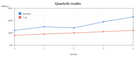
A centered captioned image, collected into the List of Figures.
{
  "type": "chart",
  "chartType": "line",
  "title": "Quarterly results",
  "size": {
    "width": "100%",
    "height": 190
  },
  "xAxis": {
    "label": "Quarter",
    "grid": true
  },
  "yAxis": {
    "label": "Millions",
    "unit": "M",
    "grid": true
  },
  "markers": true,
  "legendPos": "tl",
  "series": [
    {
      "name": "Revenue",
      "points": [
        [
          0,
          12
        ],
        [
          1,
          15
        ],
        [
          2,
          14
        ],
        [
          3,
          19
        ],
        [
          4,
          23
        ]
      ]
    },
    {
      "name": "Cost",
      "points": [
        [
          0,
          8
        ],
        [
          1,
          9
        ],
        [
          2,
          10
        ],
        [
          3,
          11
        ],
        [
          4,
          12
        ]
      ]
    }
  ],
  "alt": "A line chart of revenue and cost over five quarters."
}
Categorical and part-to-whole charts
- Bar charts add
categories- the labels along the shared category axis, matched to points by rank, not by x value - and the flagsstacked,stack100andhorizontal. Grouped is the default.categoriesworks the same way on line, area and combo. - Pie / doughnut: each series is one slice;
holeRatio(e.g.0.55) turns a pie into a doughnut. Slices carry their own percentage labels. - Radar / spider takes
categories(one spoke each) and an optionalfillOpacity; each series is a closed polygon. - Polar plots
(angle, radius)points withangleStart,angleUnit(deg/rad) andangleClockwise. - Area fills under each line (
fillOpacity, default0.45;stackedfor bands); bubble scales each dot by a third value; heatmap colors amatrixwithxLabels/yLabels; gauge shows onevalueon a dial with coloredzones.
A grouped bar chart, live:
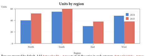
Bars are grouped by default. Add "stacked": true to stack the series in each category, "stack100": true to stack them proportionally to 100%, or "horizontal": true to run the categories down the left and the value axis along the bottom - useful when category names are long.
On a vertical chart the category names share the width of the plot, so the engine measures the widest one and labels every Nth category when they would collide (the tick and its gridline go with it). Set xAxis.majorTick to an integer to choose that stride yourself - or turn the chart horizontal, where a long name simply widens the left gutter instead.
{
  "type": "chart",
  "chartType": "bar",
  "stacked": true,
  "categories": [
    "Q1",
    "Q2",
    "Q3"
  ],
  "series": [
    {
      "name": "New",
      "points": [
        [
          0,
          30
        ],
        [
          1,
          42
        ],
        [
          2,
          51
        ]
      ]
    },
    {
      "name": "Renewal",
      "points": [
        [
          0,
          55
        ],
        [
          1,
          60
        ],
        [
          2,
          66
        ]
      ]
    }
  ],
  "alt": "A stacked bar chart of new and renewal counts per quarter."
}
Pie and doughnut
In a pie chart each series is one slice - its name is the label and the slice value is the sum of its points. Slices get their own percentage labels. Set holeRatio (e.g. 0.55) to cut the center out and make a doughnut. A live pie:
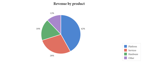
{
  "type": "chart",
  "chartType": "doughnut",
  "holeRatio": 0.55,
  "series": [
    {
      "name": "Platform",
      "points": [
        [
          0,
          42
        ]
      ]
    },
    {
      "name": "Services",
      "points": [
        [
          0,
          28
        ]
      ]
    },
    {
      "name": "Other",
      "points": [
        [
          0,
          30
        ]
      ]
    }
  ],
  "alt": "A doughnut chart of revenue share."
}
Radar and area
A radar (spider) chart takes categories - one labeled spoke each - and draws each series as a closed polygon over a web grid; fillOpacity tints the area. An area chart is a line chart with the region under each curve filled (fillOpacity, default 0.45; stacked turns the curves into stacked bands). Two live charts:
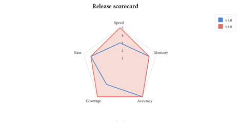
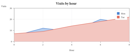
Scatter, bubble, polar, heatmap and gauge
- Scatter plots markers only -
(x, y)pairs with no connecting line. - Bubble is a scatter whose points carry a third value,
[x, y, size], that scales each dot's area. - Polar plots
(angle, radius)points;angleStart,angleUnit(deg/rad),angleClockwiseandclosedshape the curve. - Heatmap colors a
matrixof values withxLabels/yLabelsand a two-color ramp (lowColor/highColor). - Gauge shows a single
valueon a dial with coloredzones.
A live gauge:
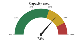
{
  "type": "chart",
  "chartType": "heatmap",
  "matrix": [
    [
      3,
      8,
      5
    ],
    [
      6,
      2,
      9
    ],
    [
      4,
      7,
      1
    ]
  ],
  "xLabels": [
    "Jan",
    "Feb",
    "Mar"
  ],
  "yLabels": [
    "A",
    "B",
    "C"
  ],
  "highColor": "#1b3a5c",
  "valueLabels": true,
  "alt": "A 3x3 heatmap of monthly values for three groups."
}
Note: Every chart is one tagged Figure with /Alt, so a chart is opaque to assistive technology - write an alt that conveys the takeaway, not just the chart type. The internal lines and labels are not separately tagged.
Advanced chart types
Seven more chartType values cover finance, process and hierarchy data. Each has its own data shape:
- Waterfall - one series of signed deltas plus
categories; rises draw inhighColor, falls inlowColor, with a running cumulative baseline. - Funnel - one series of stage values plus
categories, drawn as narrowing bands (a conversion or pipeline funnel). - Candlestick / ohlc - a
matrixof[open, high, low, close]rows withxLabels, for price bars. - Boxplot (or box) - a
matrixof[min, Q1, median, Q3, max]rows withxLabels, for statistical distributions. - Treemap - one series (or several named series) of values, packed into nested rectangles sized by value.
- Sankey (or flow) -
categories(the nodes) plus amatrixof[source, target, value]rows, drawn as weighted flows between nodes.
{
  "type": "chart",
  "chartType": "waterfall",
  "categories": [
    "Start",
    "Q1",
    "Q2",
    "Q3",
    "End"
  ],
  "series": [
    {
      "name": "Cash",
      "points": [
        [
          0,
          1000
        ],
        [
          1,
          250
        ],
        [
          2,
          -120
        ],
        [
          3,
          180
        ],
        [
          4,
          0
        ]
      ]
    }
  ],
  "alt": "A waterfall chart of cash movements ending at 1310."
}
Combo & dual-axis charts
A combo chart mixes bar and line series on one plot, and a second value axis (yAxis2, the right-hand axis) lets series in different units share it - the classic revenue-bars-with-margin-line figure. Give each series its own type, and send a series to the right axis with axis (right, secondary or y2 all select yAxis2); bars group only among the bar series:
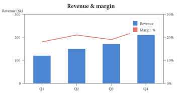
Reference lines & shaded bands
Annotate a cartesian chart with limits and context, given in real data units so they track the axes. A referenceLines entry draws a horizontal rule at {"y": ...} or a vertical one at {"x": ...} - a target, a budget, a spec limit - over the data, dashed by default. A bands entry shades a value range behind the data: {"yFrom": ..., "yTo": ...} for a horizontal band or {"xFrom": ..., "xTo": ...} for a vertical one. Both apply to line, scatter, area and every bar orientation (grouped, stacked, horizontal); on a horizontal bar the value axis is X, so a value threshold uses x there.
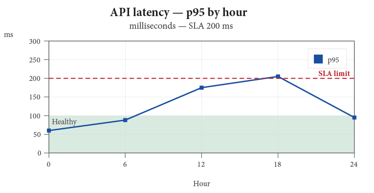
Error bars
Show measurement uncertainty with error bars. A series-level error draws the same ± whisker on every point; errors gives a per-point array where a number is a symmetric ± and a [below, above] pair is asymmetric. They apply to line, scatter, area, bubble and grouped-bar series.
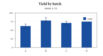
25. Barcodes
A barcode block encodes data as a code (symbology) and draws it as vector modules - sharp at any zoom or print resolution. Every zint symbology is available: 2-D codes (qr, datamatrix, pdf417, aztec, maxicode, hanxin, ...), linear codes (code128, code39, code93, codabar, ...), retail (ean, upca, isbn), and postal codes. The human-readable line is drawn in the document's own embedded font.
| Key | Type | Default | Meaning |
|---|---|---|---|
code | string | - | Symbology name (alias symbology), case-insensitive. |
data | string | - | The content to encode (alias text). |
width | number | 120 / 216 | Display width in points (2-D / linear). |
showText | bool | true | Draw the human-readable line. |
security | number | - | QR ECC 1-4 / PDF417 security 0-8 (alias ecc). |
align | string | left | left / center / right. |
alt | string | the data | Accessible description. |
Available symbologies
Set code to any zint symbology name (case- and punctuation-insensitive). The families, with the names you are most likely to use:
| Family | Names |
|---|---|
| 2-D matrix | qr, microqr, datamatrix, aztec, pdf417, micropdf417, maxicode, dotcode, hanxin, gridmatrix, codeone |
| Linear | code128, code39, code93, code11, codabar, interleaved2of5, itf14, msi, telepen, code32, pharma |
| Retail / GS1 | ean (EAN-8/13 by length), upca, upce, isbn, gs1-128, databar (+ stacked / expanded), ean14 |
| Postal | postnet, planet, intelligentmail, royalmail, kix, auspost, japanpost, koreapost, mailmark |
Composite (*cc) and health-industry (hibc*) variants are available too. An unknown name or invalid data draws a light placeholder box and says so on stderr, and the JSON Schema flags a misspelled code at validation time.
intelligentmail is the exception to width: a USPS sorter reads its bars at a mandated size, so it is always drawn at USPS-B-3200's nominal dimensions (0.020 in bars, 22 per inch, 0.145 in full height), 3.18 x 0.20 in with its clear zone, and a width is ignored with a notice. Its data is the 20-digit tracking code and the routing ZIP, run together or split by a dash.
A live gallery
Four symbologies, each a live barcode block (a 2-D matrix, a stacked code, and a linear code), rendered as sharp vector art:
QR (2-D matrix)
| Data Matrix
|
PDF417 (stacked)
| Code 128 (linear)
|



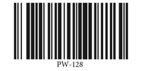
A figure deeper in the book, so the folios differ.
{
  "type": "barcode",
  "code": "datamatrix",
  "data": "PAGEWRIGHT-2026",
  "width": 84,
  "align": "center",
  "alt": "Data Matrix code."
}
26. Placing existing PDF pages
Reuse a page from another PDF - a chart exported elsewhere, a signed form, a figure - with a pdf block. The page is imported as a vector Form XObject (never rasterized) and is sized, floated and captioned exactly like an image:
{
  "type": "pdf",
  "src": "chart.pdf",
  "page": 1,
  "width": "60%",
  "fit": "contain",
  "align": "center",
  "caption": "A placed PDF page.",
  "alt": "A bar chart imported from chart.pdf."
}
A captioned figure with a longer caption that the List of Figures clamps with an ellipsis mark here.
A pdf-contact-sheet tiles many source pages into a paginated thumbnail grid. Point it at one file with src + pages ("all", "1-5", "1,3,5", or a number/array):
{
  "type": "pdf-contact-sheet",
  "title": "Contents of report.pdf",
  "src": "report.pdf",
  "pages": "all",
  "columns": 4,
  "gap": 12,
  "labels": true,
  "frame": true,
  "uniformCells": true
}
Or mix pages from several files with an items list - each with its own src, page and optional label:
{
  "type": "pdf-contact-sheet",
  "columns": 3,
  "items": [
    {
      "src": "cover.pdf",
      "page": 1,
      "label": "Cover"
    },
    {
      "src": "report.pdf",
      "page": 4
    },
    {
      "src": "appendix.pdf",
      "page": 2,
      "label": "Appendix A"
    }
  ]
}
Caution: For tagged or PDF/A output the placed source's own fonts must be embedded (an unembedded Base-14 source cannot be made accessible - it is a property of the source file, not something the engine can repair).
27. Shapes, paths & vector graphics
The shape block draws vector primitives - rectangles, lines, ellipses, polygons and arbitrary paths - filled (a solid color or a gradient) and/or stroked. The image block adds decorative effects, and the svg block imports SVG drawings. Everything here is native PDF vector content, so it scales crisply and stays print- and PDF/A-safe.
The shape block
A shape reserves a box - width x height in flow, or the rectangle of a position when placed absolutely - and draws inside it:
{
  "type": "shape",
  "shape": "ellipse",
  "fill": "#f0a000",
  "stroke": "#7a5200",
  "strokeWidth": 1,
  "width": 150,
  "height": 80
}| Field | Meaning |
|---|---|
shape | rect (default), line, ellipse (or circle), polygon, path |
fill | fill color (RGB / CMYK / gray / spot) or a gradient object; omit for no fill |
stroke | stroke color; omit for no stroke |
strokeWidth | stroke width in points (default 1) |
width / height | flow box size (points, or width as "50%"); an absolute shape uses position |
points | line / polygon vertices as [x, y] fractions 0..1 of the box |
Fractional points let a shape scale with its box: the triangle [[0.5, 0], [1, 1], [0, 1]] is top-center -> bottom-right -> bottom-left at any size. A line runs points[0] -> points[1] (default: straight across); a polygon connects its points and closes.
Paths
A path shape draws an arbitrary outline from a d (path data) scaled through an optional viewBox:
{
  "type": "shape",
  "shape": "path",
  "fill": "#1a4fa0",
  "width": 220,
  "height": 130,
  "viewBox": [
    0,
    0,
    100,
    60
  ],
  "d": "M5 25 L60 25 L60 10 L95 30 L60 50 L60 35 L5 35 Z"
}
d is either an SVG path string (the full M L H V C S Q T A Z command set, absolute or relative) or a structured op array ([["M", x, y], ["L", x, y], ["C", ...], ["Z"]]). viewBox - [x, y, w, h] (or [w, h]) - sets the path's coordinate space and is stretched to fill the box, so round-number coordinates scale to any size (default [0, 0, 100, 100]). An open path (no Z) strokes as a polyline; a filled path closes implicitly.
Gradient fills
A shape's fill may be a gradient instead of a solid color - a color ramp the backend emits as a true PDF axial (linear) or radial shading, clipped to the shape. It works on every fillable shape; a line ignores it.
{
  "type": "shape",
  "shape": "rect",
  "width": "100%",
  "height": 40,
  "fill": {
    "type": "linear",
    "angle": 0,
    "stops": [
      {
        "offset": 0,
        "color": "#1a4fa0"
      },
      {
        "offset": 1,
        "color": "#7fb0ff"
      }
    ]
  }
}
| Field | Meaning |
|---|---|
type | linear (axial, default) or radial |
angle | linear direction in degrees - 0 = left->right, 90 = top->bottom |
from / to | linear axis endpoints [x, y] as box fractions (default [0, 0.5]->[1, 0.5]) |
center / radius | radial center [x, y] and radius (fraction of the longer side; default 0.5) |
stops | two or more { offset: 0..1, color }; each color is the full color model |
Note: The shading is DeviceRGB, or DeviceCMYK in a colorMode: "cmyk" document, so a gradient is print- and PDF/A-safe. Two stops make a smooth ramp; three or more stitch a multi-color sweep.
Image effects
An image block can carry three decorative effects, alone or combined - all of them following the same rounded-corner radius:
{
  "type": "image",
  "src": "photo.jpg",
  "alt": "A framed photo.",
  "width": 300,
  "cornerRadius": 18,
  "border": {
    "width": 6,
    "color": "#f4f1ea"
  },
  "shadow": {
    "dx": 4,
    "dy": 7,
    "blur": 12,
    "opacity": 0.45
  }
}| Field | Meaning |
|---|---|
cornerRadius (or radius) | clip the image to a rounded rectangle of this radius (points) |
border | a stroke around the edge - a width, a color, or { width, color } |
shadow | a drop shadow - true for defaults, or { dx, dy, blur, opacity, color } |
Caution: The drop shadow uses constant alpha, valid in PDF/A-2 and PDF/UA (the engine's targets) but not PDF/A-1.
Importing SVG
The svg block imports a vector drawing from an .svg file (src) or inline markup (content) and draws it as native PDF paths:
{
  "type": "svg",
  "src": "logo.svg",
  "width": 200,
  "align": "center",
  "alt": "Acme logo"
}
content (inline markup) wins over src; width is points or "NN%" and the height follows the drawing's aspect unless you give one. Set alt to tag the drawing as an accessible Figure - without it the drawing is a decorative artifact.
The importer speaks a broad, practical slice of SVG and turns it into native PDF vector paths - not a raster - so an imported drawing stays crisp at any zoom and prints clean:
- Geometry -
<g>groups, nestedtransforms (translate / scale / rotate / matrix / skew), every basic shape, and full<path>data (M L H V C S Q T A Z, with elliptical arcs flattened to curves). - Paint - solid
fillandstroke,stroke-width, linear and radial gradients (withgradientTransformand per-stop opacity), element opacity, and the even-odd fill rule. - Design-tool idioms - a
<style>stylesheet (CSS class / id / type selectors, full cascade), a<defs>library reused through<use>/<symbol>, and multi-line<text>built from<tspan>runs - so a drawing exported from Illustrator, Inkscape or Figma imports with the right paint instead of black. - Compositing -
clip-pathcrops an element to a shape, a<mask>knocks an even-odd hole through it, a<pattern>tiles a motif to fill it, and afilterdrop shadow (<feDropShadow>, or the classic blur-plus-offset) lifts it - all as real PDF clipping (W/W*) and vector paint. The root viewport clips anything drawn past theviewBox, exactly as a browser'soverflow:hiddenwould; setoverflow="visible"on the root<svg>to let it spill.

Caution: A native-vector importer cannot rasterize a general filter, so effects with no vector form - a Gaussian blur of content, color-matrix and lighting filters - are skipped, and a <mask> honors its geometry (even-odd), not a soft luminance edge. objectBoundingBox clip / mask / pattern units are skipped in favor of userSpaceOnUse.
Everything a flat vector asset uses imports faithfully.
28. Math & equations
A math block sets a display equation as its own centered line, and an inline math run drops a formula into running text on the baseline. Either way the equation is real vector art rendered at the surrounding font size - never a screenshot - and it carries its MathML so assistive technology can read the actual mathematics.
{
  "type": "math",
  "mathml": "<math><mrow><mi>x</mi><mo>=</mo><mfrac><mrow><mo>-</mo><mi>b</mi><mo>±</mo><msqrt><mrow><msup><mi>b</mi><mn>2</mn></msup><mo>-</mo><mn>4</mn><mi>a</mi><mi>c</mi></mrow></msqrt></mrow><mrow><mn>2</mn><mi>a</mi></mrow></mfrac></mrow></math>",
  "alt": "x equals minus b plus or minus the square root of b squared minus four a c, all over two a."
}
Give the block mathml (Presentation MathML) and the engine draws it and attaches the MathML source as an associated file on a tagged <Formula> element, the accessible form for equations. If your toolchain renders MathJax itself you may instead pass a pre-rendered content / src (SVG) plus alt. An inline run carries the same mathml (with mathSvg / content and mathAlt) and aligns to the text baseline:
{
  "type": "paragraph",
  "runs": [
    {
      "text": "Einstein's "
    },
    {
      "mathml": "<math><mrow><mi>E</mi><mo>=</mo><mi>m</mi><msup><mi>c</mi><mn>2</mn></msup></mrow></math>",
      "mathAlt": "E equals m c squared"
    },
    {
      "text": " relates energy and mass."
    }
  ]
}
Tip: Turn on equation numbering with numbering.equations - each display equation then gets a right-gutter number like (3.2) that a {ref} run can cite. See The List of Figures for how the caption-numbering streams work.
29. Diagrams (mermaid)
A mermaid block places a diagram authored as code - a flowchart, sequence or state diagram. The engine does not run Mermaid itself; give it the diagram as pre-rendered SVG in content (or svg / src) and it is placed as native vector art, tagged as a Figure with your alt. If only the source text is supplied, the block falls back to a captioned code panel so the diagram is never lost.
{
  "type": "mermaid",
  "source": "flowchart LR\n  A[Spec] --> B{Valid?}\n  B -->|yes| C[Render]\n  B -->|no| A",
  "alt": "A flowchart: Spec flows to a Valid decision; yes renders, no returns to Spec."
}
Note: Because the placed diagram is ordinary SVG, everything in Importing SVG applies - the diagram is native paths, not a bitmap, and scales cleanly.
30. Absolute positioning
Any block may carry a position - { x, y, width, height } in points from the page's top-left - to place it at fixed coordinates instead of in the flow. A positioned block consumes no flow height, never splits, and ignores float exclusions; content past height is clipped. This is the basis of form overlays (The form-overlay recipe) and fixed page furniture.
{
  "type": "container",
  "position": {
    "x": 131,
    "y": 240,
    "width": 350,
    "height": 60
  },
  "style": {
    "border": {
      "width": 0.5,
      "color": "#888888"
    }
  },
  "blocks": [
    {
      "type": "paragraph",
      "text": "Pinned box."
    }
  ]
}
31. Article threading
Magazine-style features that continue on a later page are built from two pieces: a top-level stories pool of free-standing block lists, and frame blocks that pour a story into their columns. A frame fills its column(s); the overflow threads into the next frame that names the same story - which may sit on any later page. Thread order is document order.
{
  "stories": [
    {
      "id": "feature",
      "blocks": [
        {
          "type": "heading",
          "level": 3,
          "text": "The Long Migration"
        },
        {
          "type": "paragraph",
          "text": "Every autumn the flock departs..."
        }
      ]
    }
  ],
  "sections": [
    {
      "blocks": [
        {
          "type": "frame",
          "story": "feature",
          "columns": 2,
          "continued": true,
          "position": {
            "x": 64,
            "y": 320,
            "width": 484,
            "height": 200
          }
        }
      ]
    }
  ]
}
Set continued to print "(Continued on page N)" at the foot of a frame when the story overflows, and continuation to print "(Continued from page N)" at the top of the next frame - where N is a live link to the neighboring frame. fromText / toText customize the wording; a frame style border turns it into a boxed sidebar. Frames in one thread may use different column widths - a story can open in one wide column and continue in three narrow ones, and the straddling paragraph re-wraps to each frame's measure (a threaded table, though, keeps its own declared column widths).
32. Technical-document finishing
A set of finishing controls borrowed from long-form technical publishing - the kind of touches a FrameMaker or InDesign user reaches for. Each is a small key on a block, a heading or a section's pageSetup; together they turn a plain flow into a polished manual, data-sheet or book. All are engine-drawn and leave the tagged reading order intact, so output stays PDF/UA-clean.
Side heads
A side head sets a heading out in the margin beside its body text instead of above it - the classic technical-reference look. Reserve the margin band once on the section's pageSetup, then flag the headings that belong in it with sidehead:
| Key | On | Means |
|---|---|---|
sideHeadWidth | pageSetup | points reserved beside the body for margin headings (0 = off) |
sideHeadGap | pageSetup | gap between the side-head band and the body (default 18) |
sideHeadSide | pageSetup | left / right, or outside / inside to flip per recto/verso |
sidehead | a heading | true draws this heading in the band, aligned to the body that follows |
{
  "pageSetup": {
    "sideHeadWidth": 120,
    "sideHeadGap": 18,
    "sideHeadSide": "outside"
  },
  "blocks": [
    {
      "type": "heading",
      "level": 2,
      "text": "Installation",
      "sidehead": true
    },
    {
      "type": "paragraph",
      "text": "The body runs in the narrowed main column, its first line level with the heading beside it."
    }
  ]
}
Run-in headings
A run-in heading is a bold lead-in on the same line as the paragraph it introduces, not a heading on its own line. Set runIn on the heading; the paragraph flows on beside it, and the heading stays a distinct <Hn> in the structure tree:
{
  "blocks": [
    {
      "type": "heading",
      "level": 4,
      "text": "Note.",
      "runIn": true
    },
    {
      "type": "paragraph",
      "text": "The body begins right after the lead-in, on the same line."
    }
  ]
}
Change bars
A change bar (revision bar) is a short vertical rule in the margin that flags what changed since the last revision. Mark a block with changeBar: true; a document-level changeBars object styles every bar at once:
| Key | On | Means |
|---|---|---|
changeBar | any block | true draws a revision bar in the margin beside the block |
changeBars.width | document | bar thickness in points |
changeBars.color | document | bar color (any color space) |
changeBars.side | document | outside / inside / left / right |
changeBars.distance | document | gap from the text out to the bar |
Bars beside consecutive changed blocks join into one continuous rule.
Straddle: spanning across columns
In a multi-column section, straddle: true lifts a block out of the column flow and lays it full width across every column - a spanning headline, a wide table or a figure - with the columns resuming above and below it:
{
  "pageSetup": {
    "columns": 2
  },
  "blocks": [
    {
      "type": "heading",
      "level": 1,
      "text": "A headline across both columns",
      "straddle": true
    },
    {
      "type": "paragraph",
      "text": "The body flows in two columns beneath the spanning title."
    }
  ]
}
Vertical alignment & feathering
By default a page fills from the top down. verticalAlign on a section's pageSetup places a short page's content differently:
| Value | Means |
|---|---|
top | fill from the top - the default |
center (middle) | center the content block vertically - a title page |
bottom | push the content to the foot - a colophon |
justify | feather - spread the space between blocks so the page is flush top and bottom |
center and bottom shift a single-column page's content as one block; justify distributes the leftover space between the blocks, the way a book's text pages are vertically justified so facing pages align.
Rotated pages & cells
A wide table or figure can ride a fold-out: set rotate (a multiple of 90) on a section's pageSetup and that section's pages carry a display /Rotate, so a landscape page prints sideways within a portrait book - the layout coordinates are unchanged, only the viewing rotation. Inside a table, a header cell's text can be turned on its side to label a narrow column with rotate on the cell (90 reads bottom-to-top, 270 top-to-bottom):
{
  "type": "table",
  "headerRows": 1,
  "columns": [
    {
      "width": "auto"
    },
    {
      "width": 40
    },
    {
      "width": 40
    }
  ],
  "rows": [
    {
      "cells": [
        "Region",
        {
          "rotate": 90,
          "blocks": [
            {
              "type": "paragraph",
              "text": "Q1"
            }
          ]
        },
        {
          "rotate": 90,
          "blocks": [
            {
              "type": "paragraph",
              "text": "Q2"
            }
          ]
        }
      ]
    },
    {
      "cells": [
        "North",
        "1,240",
        "1,510"
      ]
    }
  ]
}
Tip: Each of these finishing controls has a worked sample in the gallery, and the Feature Tour template exercises the whole set on one document.
33. Master pages
A master is a reusable page template of background furniture - a watermark, a side rule, a color panel, a positioned logo - that a section adopts by name. Declare them in a top-level masters object, each with a frames array of absolutely-positioned background blocks (and its own page-setup keys), then point a section (or the document) at one with master. A frame's side (recto, verso or both) limits it to right- or left-hand pages, so the gutter furniture mirrors.
{
  "masters": {
    "chapter": {
      "frames": [
        {
          "type": "shape",
          "shape": "rect",
          "position": {
            "x": 0,
            "y": 0,
            "width": 24,
            "height": 792
          },
          "fill": "#1b3a5c",
          "side": "verso"
        }
      ]
    }
  },
  "sections": [
    {
      "master": "chapter",
      "blocks": [
        "..."
      ]
    }
  ]
}
Note: Master frames are drawn behind the flowing content and reserve no space in it, so the body pours over them. They can read document variables and be gated by conditions, so one master serves several editions.
34. Anchored frames
An anchored frame is a block pinned to a place in the flow rather than to fixed page coordinates - a figure that rides beside the paragraph that introduces it, a margin note, a page-foot box. Give any block an anchor: { to, side, offset }. to chooses the target - below-line (right after the reference), column-top or column-bottom, page-top or page-bottom, or outside (the outer margin) - and side (inside / outside / left / right) picks the edge. The body text flows around it, and if the frame will not fit it carries itself and its heading to the next page rather than overprinting.
{
  "type": "image",
  "src": "fig1.png",
  "width": 150,
  "anchor": {
    "to": "outside",
    "side": "outside"
  },
  "caption": "A margin figure",
  "alt": "..."
}
35. Cross-references
Give any block an id, then reference its page number from anywhere with a run { "ref": "that-id" }. The engine prints the target's page number (in that page's numbering format) as a live internal link, resolved by the same fixed-point pass as the table of contents.
For example, charts are covered on page 24. Charts — that page number is a live cross-reference produced by a ref run, and barcodes are on page 25. Barcodes.
{
  "type": "paragraph",
  "runs": [
    {
      "text": "See the chart chapter on page "
    },
    {
      "ref": "charts"
    },
    {
      "text": "."
    }
  ]
}
36. Indexes & glossaries
Two back-matter blocks build reference apparatus automatically, the same fixed-point way the table of contents does - the index and glossary you see at the end of this manual are exactly these blocks.
The index block
An index block scans the whole document for a list of terms and prints an alphabetical, page-numbered index. Each term is a string, or an object with a term (the printed heading), a match (the phrase to find - defaults to the term; an empty "" makes a heading-only grouping row), and one level of subentries:
{
  "type": "index",
  "title": "Index",
  "columns": 2,
  "letterHeadings": true,
  "collapseRanges": true,
  "terms": [
    "ATP",
    {
      "term": "Membrane",
      "match": "",
      "subentries": [
        {
          "term": "nuclear",
          "match": "nuclear membrane"
        }
      ]
    }
  ]
}
columns is 1 or 2 (two auto-balance), letterHeadings inserts the A / B / C letter bands (# groups non-alphabetic terms), and collapseRanges folds runs of consecutive pages into ranges (5-7). Matching is whole-word and case-insensitive; words is an alias for terms.
Ordering a Chinese index
Entries sort by code point unless the block says otherwise - which is fine for Latin and meaningless for Chinese, where code-point order is Unicode block order. collation picks the order a reader of Chinese actually knows:
{
  "type": "index",
  "title": "索引",
  "collation": "pinyin",
  "terms": [
    {
      "term": "北京"
    },
    {
      "term": "长江",
      "sortAs": "changjiang"
    }
  ]
}
pinyin orders by the Hanyu Pinyin reading and then the tone, so 北京 files under B and 力学 comes before 梁 (li sorts before lia). Latin entries interleave alphabetically, which is what a technical book with both wants.
strokes orders by total stroke count, then Kangxi radical, then code point - the order Traditional Chinese and reference works use. Each group is headed by its count, and strokeLabel supplies the word after it: "画" draws 9画, "畫" the Traditional form. Latin entries gather into their own run ahead of the Han, the way a Chinese index sets its 西文 section apart.
The readings and stroke counts come from the Unicode Unihan database, embedded for the two blocks an index draws from. sortAs on an entry overrides them, in every collation - and a Chinese index needs it, because a 多音字 reads differently in different words: the table gives 长 its zhng reading, but 长江 is Chángjing, so that entry says so itself. Use it for proper nouns, for anything the table does not cover, and to file a Chinese term in a Latin-ordered index.
Note: One collation per document - the last index block sets it, the same way collapseRanges and letterHeadings already work. See the index-pinyin and index-strokes samples.
The glossary block
A glossary block prints an alphabetical term list from its entries, each a { term, definition }. With autoLink (the default) the first occurrence of each term in the body becomes a live link to its definition:
{
  "type": "glossary",
  "title": "Glossary",
  "autoLink": true,
  "entries": [
    {
      "term": "ATP",
      "definition": "Adenosine triphosphate, the cell's energy currency."
    }
  ]
}
Entries sort alphabetically and the term renders bold above its wrapping definition. Set autoLink to false to leave the body text untouched (the glossary still prints).
37. Watermarks & letterhead
pageSetup.watermark stamps text (or an image) onto every page. Its keys:
| Key | Type | Default | Meaning |
|---|---|---|---|
text | string / array | - | The message; \n or array entries make multiple lines. |
position | string | diagonal | diagonal (bottom-left -> top-right), diagonal-down (top-left -> bottom-right), center, top, bottom, or angle. The diagonals use the page's own diagonal angle, so it changes with page size and orientation. |
angle | number | - | Degrees counter-clockwise (with position: "angle"). |
justify | string | center | Multi-line alignment: left / center / right. Anchors the block for top/bottom; justifies each line within the rotated block for diagonal / diagonal-down / center / angle. |
mode | string | solid | solid (filled), outline (hollow), or dual (both). |
layer | string | under | under or over the body content. |
opacity | number | 0.25 | Constant alpha, 0-1. |
color | color | - | Any color space; a spot ink fades by tint. |
size | number | auto | Explicit font size in points (0/omitted = automatic). |
autoScale | number | fit | Font size as a % of page height; omitted fits the mark to the page extent. |
image | string | - | Stamp a raster instead of text (scale = % of page width). |
pages | string | all | all / even / odd / first / rest. |
By default the text auto-sizes to span the page (a DRAFT diagonal grows to fill the diagonal); set size for an exact point size or autoScale to make the mark a fixed percentage of the page height.
Note: A multi-line watermark (text as an array, or \n) stacks its lines and, on a diagonal, rotates the whole block together - and justify aligns the lines within that block: left lines up the leading edges, right the trailing edges, and center (the default) keeps each line on the block axis.
Sample watermark-multiline.
dual is the most legible on busy pages: a solid pass under the body plus a hollow outline pass over it. The text is drawn in the document's own embedded font, so any Unicode works. pageSetup.template draws a page of an external PDF as a full-page letterhead underlay (src, page, and on: all/first/rest). The per-page painting order is: page background -> letterhead -> under-watermark -> body -> over-watermark.
{
  "pageSetup": {
    "watermark": {
      "text": "CONFIDENTIAL",
      "mode": "dual",
      "opacity": 0.22,
      "color": {
        "cmyk": [
          0,
          0,
          0,
          1
        ]
      },
      "pages": "all"
    },
    "template": {
      "src": "letterhead.pdf",
      "page": 1,
      "on": "first"
    }
  }
}
Note: Watermarks are tagged as artifacts, so they stay out of the reading order and keep tagged output accessible. One caveat: a translucent over-content text watermark needs a transparency state that strict PDF/UA flags - in a tagged document prefer dual, an under layer, or a full-opacity overlay.
Translucent overlay images are exempt and always PDF/UA-clean. The letterhead source's fonts must be embedded.
38. Data-driven documents
A spec can carry a data record and bind its fields into the document, so one template renders many personalized PDFs - statements, letters, certificates, invoices. A document with no data is completely unaffected: binding is skipped, so an ordinary spec renders exactly as before.
The data context
Give the document a record - inline, or in an external file:
{
  "data": {
    "customer": {
      "name": "Dr. Alice Reyes"
    },
    "balance": "1,284.50"
  },
  "blocks": [
    "..."
  ]
}
data is an inline JSON object (or array); dataFile names an external JSON record, relative to the spec, used when there is no inline data - the natural shape when the template and the data live in separate files.
Binding tokens
Any text may contain {{ path }} tokens; each is replaced by the addressed value:
| Token | Resolves to |
|---|---|
{{company}} | a top-level field |
{{customer.name}} | a nested field (dot path) |
{{invoices.0.no}} | an array element - {{invoices[0].no}} works too |
Binding reaches inline-run text and link URLs, image / PDF src, alt and caption, barcode data, form-field labels and values, the running header / footer text, and the title / author / subject / keywords metadata. An unresolved token (a path not in the record) becomes an empty string.
Note: Data wins over page variables. The render-time variables {{page}} {{pages}} {{date}} {{time}} {{title}} are resolved later, per page. If the record has a field of that name the token binds to the data; otherwise a page-variable name passes through untouched. So {{page}} still means the page number, but a record with its own date makes {{date}} mean that date everywhere - including the body, which the page-variable pass never reaches.
Repeating content — repeat
A repeat block clones its blocks once per element of a data array, turning a list of records into a list of rendered blocks:
{
  "type": "repeat",
  "for": "order.items",
  "as": "item",
  "blocks": [
    {
      "type": "paragraph",
      "text": "{{loop.number}}.  {{item.name}}",
      "style": {
        "bold": true
      }
    },
    {
      "type": "paragraph",
      "text": "Qty {{item.qty}} x ${{item.price}}"
    }
  ]
}
for is the data path to the array; as names the element (default item). Inside the body, {{item.name}} is the current element and enclosing fields still resolve ({{order.id}}). A loop helper gives {{loop.index}} (0-based), {{loop.number}} (1-based), {{loop.count}}, {{loop.first}} and {{loop.last}}. The whole subtree is cloned - nested containers, tables and repeats all work - and binding happens at the model level, so a value with a quote or backslash can never corrupt the structure.
Conditionals — when / unless / if
Any block takes a when and/or unless attribute; it is kept only when when is true and unless is false. For an either/or, an if block emits its blocks when its test passes, else its else:
{
  "type": "if",
  "test": "balance > 0",
  "blocks": [
    {
      "type": "paragraph",
      "text": "${{balance}} is PAST DUE."
    }
  ],
  "else": [
    {
      "type": "paragraph",
      "text": "Paid in full  -  thank you!"
    }
  ]
}
A predicate is deliberately small and safe - field lookups and comparisons only, no code: a bare path tests its truthiness (false for missing / null / false / 0 / "" / empty); path OP value with OP one of == != < > <= >= (right side a number, a 'quoted' string, true/false/null, or another path); a leading ! negates. A hidden block and its whole subtree are removed before layout - they never enter the structure tree.
Reusable partials — include
Factor shared content - a letterhead, an address block, a signature - into a partial file and pull it in with an include:
{
  "type": "include",
  "src": "partials/address-block.json",
  "with": {
    "addr": "{{billTo}}"
  }
}
src is a partial (a single block, an array of blocks, or { "blocks": [ ... ] }), relative to the spec. with adds fields to the data scope for the included blocks; a with value that is a single {{path}} token resolves to the whole value there, so a partial can take an object ({{addr.name}}, {{addr.city}}). Includes nest, and a missing partial warns rather than failing the render.
Batch — one template, many PDFs
The CLI renders a template once per record of a data set:
pagewrightapp template.json out.pdf -data records.json          # -> out-1.pdf, out-2.pdf, ...
pagewrightapp template.json out.pdf -data records.csv           # CSV: header row = field names
pagewrightapp template.json out.pdf -data records.json -merge   # one PDF, one section per record
-data <file> supplies the records - a JSON array (one element per record), a single JSON object, or a CSV file (its header row names the fields). Each record replaces the template's data context. Without -merge each record writes its own out-<n>.pdf; with -merge every record becomes one section of a single PDF, whose settings (metadata, the images policy, colour mode, security, ...) are the first record's, exactly as a render of that record alone would use them. Each record keeps its own master frames and threaded stories, and -recordrange N-M picks the records.
Caution: -merge concatenates page content only. Cross-references and the TOC / index are per-record constructs and are not reconciled across a merge - use separate PDFs when a record relies on those.
Variables & named counters
A top-level variables object holds named values you reach with {{var.name}} - a product name, a version, a support address defined once and reused everywhere, including in running heads and metadata. Separately, numbering.counters declares named autonumber streams: a block with counter: "step" prints the next value in that stream (Step 1., Step 2.), and counterRestart resets it. Unlike the automatic figure/table counters, these are yours to place anywhere.
{
  "variables": {
    "product": "PageWright",
    "version": "3.0"
  },
  "numbering": {
    "counters": {
      "step": {
        "prefix": "Step ",
        "suffix": ".",
        "start": 1
      }
    }
  },
  "blocks": [
    {
      "type": "paragraph",
      "counter": "step",
      "text": "Install {{var.product}} {{var.version}}."
    }
  ]
}
Conditions & editions
Where when / unless switch on data, conditions switch on named edition tags - the mechanism behind a single source that prints an Instructor and a Student edition, or Internal and Public builds. Declare tags in a top-level conditions object (each true/false, or { show, color, changeBar }), then tag any block, run or table row with a condition expression - a tag name, or a boolean of them with and / or / not and parentheses. Hidden content is dropped from the flow and the structure tree, so the edition is genuinely absent, not merely invisible.
{
  "conditions": {
    "instructor": true,
    "student": false
  },
  "blocks": [
    {
      "type": "callout",
      "variant": "note",
      "condition": "instructor",
      "text": "Answer key: B."
    }
  ]
}
Tip: Turn on conditionIndicators while authoring to show every conditional block color-coded by tag, then leave it off for the final render.
39. Form fields
A field block creates a real interactive AcroForm widget. The field key picks the kind; name is its form name; label prints a visible label beside it (and supplies the accessible name in tagged output):
field | Extra keys | Widget |
|---|---|---|
text | multiline, value, width, height | A text entry (single or multi-line). |
checkbox | checked | A check box. |
radio | options ({value,label}), value | A radio-button group. |
choice | options (strings), value | A dropdown / list box. |
signature | width, height | A digital-signature field. |
button | label | A push button. |
A live two-field form - type into it in any PDF viewer - from the snippet that follows:


[
  {
    "type": "field",
    "field": "text",
    "name": "reader_name",
    "label": "Your name",
    "width": "60%"
  },
  {
    "type": "field",
    "field": "checkbox",
    "name": "reader_ack",
    "label": "I have read the Users Manual"
  }
]
A radio group and a choice (dropdown / list box) take a fixed set of options and an initial value; a text field takes multiline and a starting value; a checkbox takes checked. Fields also work inline inside a paragraph. Here are the richer types together:
[
  {
    "type": "field",
    "field": "radio",
    "name": "plan",
    "label": "Plan",
    "value": "standard",
    "options": [
      {
        "value": "standard",
        "label": "Standard"
      },
      {
        "value": "premium",
        "label": "Premium"
      }
    ]
  },
  {
    "type": "field",
    "field": "choice",
    "name": "region",
    "label": "Region",
    "value": "North",
    "options": [
      "North",
      "South",
      "East",
      "West"
    ]
  },
  {
    "type": "field",
    "field": "signature",
    "name": "sig",
    "label": "Signature",
    "width": "55%",
    "height": 40
  }
]
Two flags refine any field: required asks the viewer to flag it when left empty, and readOnly (also spelled readonly) makes it display-only - useful for a pre-filled account number or a locked total:
[
  {
    "type": "field",
    "field": "text",
    "name": "full_name",
    "label": "Full name",
    "required": true
  },
  {
    "type": "field",
    "field": "text",
    "name": "acct",
    "label": "Account",
    "value": "XY-1000",
    "readOnly": true
  }
]
Note: For accessible forms (tagged output), every widget needs an accessible name. The visible label supplies it, and a tooltip sets the field's /TU explicitly - provide one of them. Each widget is tagged as its own Form element (a radio group is several). A pre-filled value is embedded in the field's appearance so it prints correctly.
40. The form-overlay recipe
To turn an existing paper form into a fillable PDF, combine three features:
pageSetup.templatedraws the original page as a full-trim underlay.- One positioned
fieldper blank (Absolute positioning), each withlabelPos: "none"and atooltipfor the accessible name. - Render with the layout map (
-map) so a design tool can read back where each widget landed and write new positions - the loop the PageWright Studio editor uses.
The Developer Manual covers the layout map and the overlay loop in full.
41. Tagged PDF & PDF/UA
Set "tagged": true and the engine builds a logical structure tree - the basis of PDF/UA (ISO 14289) accessibility. Every block is bracketed into its element: headings become H1-H6, paragraphs P, images and charts Figure (with /Alt), call-outs Aside, tables Table/TR/TH/TD with header scope, lists L/LI, links Link, form widgets Form, footnotes Note. Decoration - rules, table borders, running heads, watermarks - is marked as an artifact, out of the reading order.
A short author checklist for accessible output:
- Set
"tagged": trueand a document"lang"(e.g."en-US"). - Give every
imageanalt. (Charts and barcodes default it, but be specific.) - Keep heading levels meaningful - they are the document outline.
- Provide a
title(the engine supplies one if you forget, but name it). - Let the engine embed fonts (it forces this for tagged output).
Tip: Validate with veraPDF: verapdf --flavour ua1 out.pdf. Every tagged sample shipped with the engine - including this manual - passes with zero failures.
The pdfua key names the accessibility standard explicitly: true or 1 selects PDF/UA-1 (identical to "tagged": true), and 2 selects PDF/UA-2 - the newer ISO 14289-2 target on PDF 2.0, with a namespaced structure tree and structure destinations. Any value forces tagging.
{
  "pdfua": 2,
  "lang": "en-US",
  "blocks": [
    {
      "type": "heading",
      "level": 1,
      "text": "..."
    }
  ]
}
Note: A PDF/UA-2 document should avoid the toc block for now; the rest of the authoring vocabulary is UA-2 clean.
42. Choosing the structure a reader gets
The list above is what the engine tags by default. Three keys let an author change the shape of the tree - none of them changes a pixel, and none of them is a conformance question: every combination below is veraPDF PDF/UA-1 clean. They matter because what a validator accepts and what assistive technology reads pleasantly are not the same thing.
A heading that should not be a bookmark. level drives three things at once - the <Hn> tag, the outline hierarchy, and heading numbering. A card title or a panel label wants the first and not the second:
{
  "type": "heading",
  "level": 2,
  "text": "Named styles",
  "outline": false
}
That keeps the <H2> and drops the bookmark entry - and the contents-list entry with it, because one registration feeds both, so the two can never disagree. Without it an author who wants a card title announced as a heading has to accept it sitting in the bookmark panel beside the document's real chapters, and will usually reach for a bold paragraph instead. A bold paragraph is a <P>: announced as body text.
A box that is more than a box. A container can declare its own structure type, so a sidebar stops being indistinguishable from a tile:
{
  "type": "container",
  "role": "aside",
  "style": {
    "background": "#eef3f9",
    "padding": 10
  },
  "blocks": [
    {
      "type": "paragraph",
      "text": "..."
    }
  ]
}
role takes aside, section, div, blockquote or none. none is the default and is usually right - a KPI tile, a color swatch or a specimen box is a visual grouping and should emit no element at all. Reserve aside for content genuinely outside the narrative: a sidebar, a pull quote, a closing commentary band. A callout sets it for itself.
Caution: An unknown role refuses the document rather than being ignored. That is deliberate: a role that quietly did nothing would leave a page that looks right and a structure tree that is silently missing the thing you asked for.
How much grouping the tree carries. sectionTags is a document-level key:
| Value | What the tree gets |
|---|---|
auto | Default. A nested <Sect> for every heading, plus one wrapping each document section. |
pages | The per-section wrapper only - no heading nesting. |
none | No <Sect> at all. Headings and content sit directly under <Document>. |
On this engine's own marketing brochure that is 63 <Sect> elements and twelve levels at the deepest path under auto, against none and ten under none. Nothing in ISO 14289 prefers either - 32000-1 §14.8.4.3.5 calls the grouped form "strongly structured" and permits both. Professional remediators commonly strip <Sect>, because every level is one more container a reader passes through before reaching a heading. The engine cannot know which your document wants, so it asks.
43. Declaring WCAG conformance
PDF/A, PDF/UA and PDF/X each carry an identifier inside the file. WCAG does not. It was written for the web, and ISO 14289 deliberately stops short of the content-level questions WCAG asks - is the alt text accurate, is the contrast sufficient, does the link text say where it goes. So "this file is PDF/UA-1" and "this file meets WCAG 2.2 AA" are different statements, and PDF has an identifier for only the first of them.
The PDF Association's PDF Declarations specification closes that gap with a block of XMP metadata. A declarations array records the claim:
{
  "tagged": true,
  "lang": "en-US",
  "declarations": [
    {
      "conformsTo": "wcag22aa",
      "claimBy": "Your Organization",
      "claimDate": "2026-08-05",
      "claimReport": "https://example.com/audit/12345.html"
    }
  ]
}
conformsTo is the only required field; a bare string ("wcag22aa") is shorthand for an entry with no claim data. The optional claimBy, claimDate, claimCredentials and claimReport are what turn an anonymous badge into an accountable statement, so a document meant as evidence should carry them.
The mechanism is general, not WCAG-only. conformsTo accepts a registry alias - wcag21a/wcag21aa/wcag21aaa, wcag22a/wcag22aa/wcag22aaa, wtpdf-accessibility, wtpdf-reuse, iso32005, pdfua1-validated, pdfua2-validated, hipaa - or any literal URI, which is how an agency declares a national accessibility profile of its own. Aliases ignore case, separators and the word level, so "WCAG 2.2 Level AA" and "wcag22aa" name the same thing.
Caution: A declaration is a claim, not a validation result. The PDF Association is explicit that its presence does not by itself guarantee conformance. The engine writes exactly what you list and never adds a declaration or fills in a claimant on your behalf - the claim is yours to stand behind.
The gate. Because the engine authors the content, it can check part of that claim before drawing a single glyph. A document that declares a WCAG level is checked against it; one that declares none is never gated.
declarationGate | Behavior |
|---|---|
"warn" | The default under a WCAG declaration: report every finding, write the file anyway - the claim is the author's. |
"strict" | Refuse to write the file at all. No PDF, so no claim. The run fails, so a build pipeline cannot mistake it for success. |
"off" | No checking. |
What it can decide: alt-text presence (1.1.1), structure and table headers (1.3.1), text contrast (1.4.3 at AA, 1.4.6 at AAA), document title (2.4.2), empty link text such as click here (2.4.4), skipped heading levels (2.4.6), document language (3.1.1), and passages in a script the declared language cannot account for (3.1.2).
Three of those are worth dwelling on, because a validator structurally cannot reach them - and all three exist because the engine fills a missing declaration with a placeholder that satisfies PDF/UA while saying nothing useful:
- veraPDF does not check contrast at all, so a
ua1-clean file can still be unreadable. The engine knows every run's color and the nearest filled box behind it. - An image with no
altand nocaptionis tagged/Alt "Image"; an equation with noaltgets"mathematical equation". Both pass validation. Neither tells a reader anything. - A tagged document with no
langis written out asen-US. Foreign text in it does not merely lack a language - it claims the wrong one, and a screen reader reads Chinese as English.
Note: A clean gate means nothing the engine can decide contradicts your claim - never that the document conforms. Alt-text accuracy, whether the reading order makes sense, use of color, images of text and non-text contrast all remain human judgments. The engine prints what it did not check alongside what it did, so a report can never overstate itself.
Auditing without declaring. The same checks run from the command line against any spec, at a level it need not declare. No PDF is written and the PDF library is never initialized, so a whole corpus audits in a fraction of a second:
pagewrightapp -wcag aa mydoc.json
pagewrightapp -wcag aa specs/*.json      # exits 1 if anything is found
Findings carry a JSON Pointer to the exact spec node, followed by a ranked summary by criterion - the ranking is the useful part, because one criterion dominating usually means one shared style, not many independent mistakes.
Note: Under PDF/A the file must also describe the declarations schema in an XMP extension block - the engine emits whichever extension schemas your combination of standards requires, so a document asserting PDF/A-2a, PDF/UA-1 and WCAG 2.2 AA at once validates against all three. The next chapter covers PDF/A.
44. PDF/A archival
For documents that must render identically for decades, set pdfa to a conformance level. The 2, 3 and 4 families each offer b/u/a sub-levels (rising rigor):
"2b"- basic: embedded fonts + an OutputIntent + archival metadata."2u"- adds a Unicode mapping for all text (the engine always writes one)."2a"- adds tagged structure and reading order; a2afile is therefore also a PDF/UA file."3b"/"3u"/"3a"- the same three levels, plus support for embedded files (attachments - below)."4"/"4e"/"4f"- the PDF 2.0 revision (%PDF-2.0);4never forces tagging,4eallows rich media, and4fpermits attachments.
Any PDF/A level forces font embedding, and 2a/3a turn tagging on. "pdfa": true is a smart default - 2a when the document is tagged, else 2u. Level strings are forgiving (PDF/A-3u, 3-U all parse). The engine embeds the matching ICC profile (sRGB, or the bundled CMYK profile - or your outputProfile - when colorMode is cmyk) as the OutputIntent. See the Color Spaces appendix.
{
  "title": "Archival report",
  "pdfa": "2a",
  "blocks": [
    {
      "type": "heading",
      "level": 1,
      "text": "..."
    }
  ]
}
Embedded files & hybrid invoices
A top-level attachments array embeds companion files inside the PDF - a machine-readable XML payload beside a human-readable invoice (Factur-X / ZUGFeRD), source data behind a report, a spreadsheet behind its printed summary. Declaring attachments auto-promotes a 2* level to the matching 3* (or PDF/A-4 to 4f), the conformance levels that permit embedded files:
{
  "pdfa": "3a",
  "attachments": [
    {
      "file": "invoice-data.xml",
      "name": "invoice-data.xml",
      "mime": "application/xml",
      "relationship": "Source",
      "description": "Machine-readable invoice payload"
    }
  ],
  "blocks": [
    "..."
  ]
}
Each attachment needs a file (the path to embed) and takes an optional name (the shown name), mime type, description, and relationship - one of Source, Data, Alternative, Supplement, FormData, Schema, EncryptedPayload or Unspecified - which tells a reader how the file relates to the document.
45. Print production & color mode
For commercial printing, render in process color with "colorMode": "cmyk" (every color becomes DeviceCMYK) and add print furniture in pageSetup: bleed (a scalar or per-edge insets), marks (crop + registration marks), a full-bleed background, colorBars, and a slug job line. Top-level overprint makes spot inks overprint rather than knock out. The Color Spaces appendix and the Developer Manual cover the details.
{
  "colorMode": "cmyk",
  "pdfa": "2b",
  "pageSetup": {
    "size": "Letter",
    "bleed": 9,
    "marks": true
  }
}
For press delivery, set "pdfx": "x-4" to badge the file as PDF/X-4 (ISO 15930-7). It forces cmyk mode, embeds every font, writes a GTS_PDFX output intent characterized against U.S. Web Coated (SWOP) v2 with the pdfxid metadata a RIP reads, gives each page a TrimBox, sets PDF 1.6, and skips encryption. PDF/X-4 permits live transparency, so nothing is flattened; only X-4 is offered (X-1a would require transparency flattening).
{
  "pdfx": "x-4",
  "pageSetup": {
    "size": "Letter",
    "bleed": 9,
    "marks": true
  }
}
Step and Repeat: one design, many copies
A sheet of business cards or labels is one design placed many times. Give a positioned block a repeatAt list and the engine draws it once and places that drawing again at each offset - in points from the block's own position, x to the right and y downward. The block itself stays where it is and each entry adds one copy, so seven entries make eight cards. Everything inside the block repeats exactly; anything else on the page, such as crop marks or a job label, is drawn once.
{
  "type": "container",
  "clip": true,
  "bleed": 9,
  "position": {
    "x": 36,
    "y": 72,
    "width": 270,
    "height": 162
  },
  "blocks": [
    {
      "type": "paragraph",
      "text": "Avery Lane",
      "style": {
        "weight": "bold"
      }
    },
    {
      "type": "paragraph",
      "text": "Head Gardener"
    }
  ],
  "repeatAt": [
    {
      "x": 0,
      "y": 162
    },
    {
      "x": 0,
      "y": 324
    },
    {
      "x": 0,
      "y": 486
    },
    {
      "x": 270,
      "y": 0
    },
    {
      "x": 270,
      "y": 162
    },
    {
      "x": 270,
      "y": 324
    },
    {
      "x": 270,
      "y": 486
    }
  ]
}
For cards that print to the edge, make the block's box the bleed box: bleed is how far it reaches past the trim on every side, and clip keeps the artwork inside it. The trim is the box inset by bleed, so the 270 x 162 pt box above trims to a 252 x 144 pt card, 3.5 x 2 inches. Copies are moved, never rotated or scaled; a link or a form field works on the original only; and the engine warns when a repeated block carries tagged content, which a screen reader would otherwise meet once per copy.
A booklet print copy
A brochure printed on both sides of large sheets, folded once and stapled on the fold, needs its pages in saddle-stitch order: the last page beside the first on the outside sheet, and so on inwards. -impose writes that print copy beside the PDF - two pages to a side of the sheet, in printing order - and leaves the PDF unchanged:
pagewrightapp brochure.json brochure.pdf -impose brochure-booklet.pdf
With no impose key the pages sit side by side on a sheet just large enough for two. The top-level impose key chooses the rest: the sheet ("11x17", "Letter", "12x18", "A3", "A4", or a size in points), the duplex flip the backs are laid out for ("shortEdge", the default, or "longEdge"), where blank pages go when the page count is not a multiple of four ("beforeLast", the default, keeps the last page as the back cover; "end"), and scale ("actual", the default, or "fit" to shrink the pages onto a smaller sheet).
{
  "pageSetup": {
    "size": "Letter"
  },
  "impose": {
    "layout": "booklet",
    "sheet": "11x17",
    "duplex": "shortEdge"
  }
}
Print the copy at Actual Size, on both sides, flipping on the edge it was laid out for - not with the printer's own booklet setting, which would impose it a second time. Fold the stack with sheet 1 outside and staple on the fold. The print copy is untagged: it is for the press, and the tagged PDF remains the one to publish. Its document properties repeat these printing instructions.
46. Encryption & permissions
A top-level security object encrypts the finished PDF and sets what a reader may do. Give it an ownerPassword (required - it governs the permissions), optionally a userPassword (required to open the file at all), a keyLength of 40, 128 or 256, and a cipher (aes, the default, or legacy rc4). The permissions object then toggles print, highResPrint, modify, copy, annotate, forms, accessibility and assemble.
{
  "security": {
    "ownerPassword": "---",
    "keyLength": 256,
    "cipher": "aes",
    "permissions": {
      "print": true,
      "copy": false,
      "modify": false,
      "accessibility": true
    }
  },
  "blocks": [
    "..."
  ]
}
Caution: Encryption is mutually exclusive with PDF/A and PDF/X - an archival or press profile forbids it, so set one or the other. Leave accessibility and text copy enabled so a screen reader can still extract the text; a tagged, encrypted document can still pass PDF/UA-1.
A. Page sizes
| Name | Points (W x H) | Inches / mm |
|---|---|---|
Letter | 612 x 792 | 8.5 x 11 in |
Legal | 612 x 1008 | 8.5 x 14 in |
Tabloid | 792 x 1224 | 11 x 17 in |
A4 | 595 x 842 | 210 x 297 mm |
A5 | 420 x 595 | 148 x 210 mm |
Names are case-insensitive. For any other size give explicit points: "size": { "width": 936, "height": 1224 }. orientation: "landscape" swaps the width and height of a named size.
B. Template variables
These tokens are substituted inside header/footer slot text and the print slug:
| Token | Expands to |
|---|---|
{{page}} | Current page number, in the active numbering format. |
{{pages}} | Total pages in the numbering group (forces an exact count). |
{{title}} | Document title. |
{{date}} | Render date. |
{{time}} / {{datetime}} | Render time / date-and-time (one value per render). |
C. Block quick-reference
type | What it is | Key fields |
|---|---|---|
paragraph | A run of text. | text or runs, style |
heading | An outline heading. | level (1-6), text |
list | Bulleted or numbered list. | ordered, items |
table | A grid of cells. | columns, rows, headerRows |
image | A raster picture. | src, width, fit, float, alt |
chart | A data graphic. | chartType, series, size |
barcode | A 1-D/2-D barcode. | code, data, width |
pdf | A placed PDF page. | src, page, width |
pdf-contact-sheet | A grid of PDF thumbnails. | src/items, columns |
rule | A horizontal line. | thickness, color, inset |
spacer | Vertical whitespace. | height |
container | A grouped, styleable box (a card with style.radius/stripe). | blocks, style, keepTogether |
columns | Side-by-side blocks. | columns (width+block), gap, valign |
cardGrid | Auto-flow equal-width cards. | items, minColWidth, gap |
bar | A value/max gauge. | value, max, fill, track |
pre (code) | Verbatim monospace / syntax-highlighted code. | text or tokens, language, lineNumbers |
shape | A vector rectangle, line, ellipse, polygon or path. | shape, fill, stroke, points/d |
svg | An imported SVG drawing. | src or content, width, alt |
math (equation) | A display equation. | mathml, alt |
mermaid (diagram) | A diagram placed as SVG. | content/source, alt |
callout (note) | A semantic admonition box. | variant, title, text/blocks |
toc | Auto table of contents. | title, maxLevel |
lof / lot / lol | Auto list of figures / tables / listings. | title, maxLevel |
index | Auto hyperlinked index. | terms, columns |
glossary | Auto-linked definitions. | entries, autoLink |
endnotes | Gathered end-of-document notes. | title, backlink |
field | An interactive form field. | field, name, label |
frame | A threaded story box. | story, columns, position |
repeat | Clone a template per data row. | for, as, blocks |
if | Include blocks when a test passes. | test, blocks, else |
include | Insert a reusable partial. | src, with |
marker | An invisible running-head anchor. | name, text |
pagebreak | A hard page break. | - |
That is the complete authoring vocabulary. For driving the engine from the command line and in batches, the layout map, and the internals, turn to the Developer Manual.
Glossary
Base-14
The fourteen fonts every PDF reader provides built in (Helvetica, Times, Courier families, Symbol, ZapfDingbats); usable with no embedding.
Bleed
Extra printed area past the trim edge so ink runs to the edge after cutting; set with pageSetup.bleed.
Block
One unit of content in a spec (paragraph, heading, list, table, image, chart, …), identified by its type.
Embedded font
A font subset stored inside the PDF so it renders identically anywhere; required for tagged and PDF/A output.
Frame
An absolutely-positioned box that pours a story into its columns; frames referencing one story form a thread (article threading).
OutputIntent
A PDF/A color-characterization dictionary naming the target color space via an embedded ICC profile (sRGB or CMYK).
PDF/A
ISO 19005 archival PDF: self-contained and reproducible. Levels 2b, 2u, 2a in this engine.
PDF/UA
ISO 14289 universal-accessibility PDF: a tagged logical structure tree with reading order and alternate text.
Point
The PDF unit of length, 1/72 inch. All coordinates and sizes in a spec are points unless written as a percentage.
Run
A span of text within a paragraph carrying its own style, link, footnote or language.
Section
A run of pages with its own page setup; a document is one implicit section (blocks) or several explicit ones (sections).
Spot color
A named ink (e.g. a Pantone) emitted as a PDF /Separation color space with a CMYK alternate; see Color Spaces.
Story
A free-standing list of blocks, not in the normal flow, poured into a thread of frames.
Tagged PDF
A PDF carrying a logical structure tree (the basis of PDF/UA accessibility).