
About this guide
This is the PageWright™ Studio Users Guide. PageWright Studio is Appligent's desktop design tool for the PageWright PDF engine: you lay out documents and forms by direct manipulation - click, drag, and edit on the rendered page - while the engine does all of the typesetting and writes tagged, standards-compliant PDF.
Every page of this guide was rendered by that same engine from a JSON spec, the identical format PageWright Studio documents use, so the book itself is a working example of what the application produces.
Note: Conventions. Bold marks user-interface elements and menu paths, such as Format > Document Styles.... Keyboard shortcuts are written like Cmd-Y. Monospace text in a red tint marks a JSON key, value, file name, or template token - for example style.fontSize or {{page}}.
1. Welcome to PageWright Studio
What PageWright Studio Is
PageWright Studio is a desktop design tool for the Appligent PageWright engine. You lay out documents - covers, tables of contents, chapters, glossaries, indexes - and design forms, including re-hosting existing paper forms as fillable, accessible AcroForms. The division of labor is simple: you work by direct manipulation on the rendered page, and the engine does all the typesetting. You never place lines of type by hand; you describe what a block is, and the engine flows, breaks, and paginates it.
A PageWright Studio document is an PageWright specification - a plain .json file describing pages, sections, named styles, and blocks. Everything you do in the app, from dragging a form field to redefining a style, is an edit to that spec. Because the spec is the document, a file you design in PageWright Studio renders identically anywhere the PageWright engine runs, and you can open Edit > Edit JSON... at any time to see exactly what the app wrote.
The Render Loop
Every editing session follows the same cycle:
- You open a spec (or create one from a template). PageWright Studio hands it to the engine, which typesets the whole document and produces a layout map alongside the PDF.
- The current page is rasterized by the engine server and drawn on the canvas - what you see is the engine's real output, not an approximation.
- When you click anything on the page, the layout map resolves the click to the exact node in the spec (a JSON Pointer), and the outline and inspector follow the selection.
- When you change something - drag a positioned block, edit text in place, apply a style - PageWright Studio writes the change into the spec and re-renders, so the page you see is always the document you will export.
Note: There is no separate preview mode. The canvas is the engine's actual rendered page, so typesetting, hyphenation, and pagination on screen match the exported PDF exactly.
The Welcome Window
PageWright Studio opens with the Welcome window, your starting point for every session. To bring it back later, choose Window > Welcome to PageWright Studio.
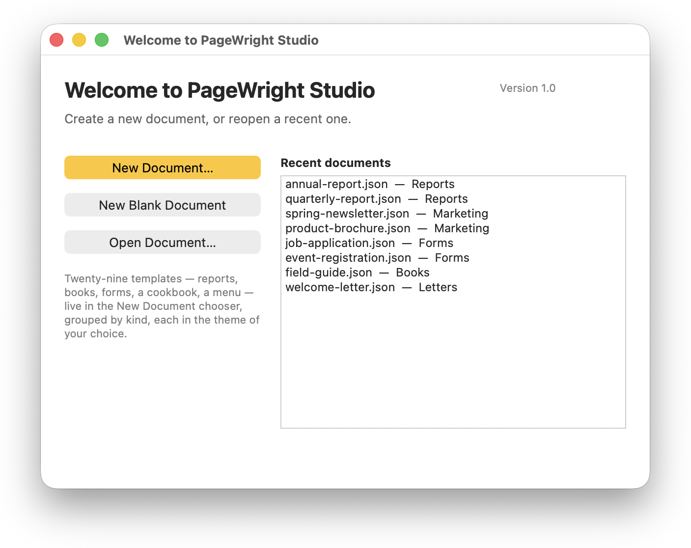
Figure 1. The Welcome window.
The Recent documents list shows the documents you have opened before, displayed as name - folder (for example, annual-report.json - Reports). Double-click an entry to open it. If you have not opened anything yet, the list reads "(no recent documents)". The same list is available later from File > Open Recent, which keeps your last nine documents.
The buttons across the window create or open documents:
| Button | What it does |
| New Blank Document | Creates an empty Letter page, ready for content |
| New Document... | Opens the New Document chooser: twenty-nine templates - reports, books, forms, a cookbook, a menu - grouped by kind, each in the theme of your choice, beside Blank and the Feature Tour |
| Open Document... | Opens a file browser so you can pick any PageWright spec |
Every template opens as an untitled document: nothing is written to disk until you save, and the first Save asks where to put the file. You can experiment freely with a template or the Feature Tour and simply close the window if you decide not to keep the result.
Tip: The Feature Tour is the fastest way to see what PageWright Studio can do. Open it from the New Document chooser, from File > New > Feature Tour, or from Help > Show Feature Tour. It demonstrates the engine - charts, a watermark, a barcode, a table, and a threaded article - and its Editing on the page section invites you to double-click a sample line and watch the in-place editor match the page exactly - same typeface, size, weight, color, and alignment - then drag a block in from the palette.
Click around, and watch the inspector show the properties behind each block. For the full reference, the tour points you to Help > PageWright Studio Users Guide (this guide).
Requirements
PageWright Studio drives external tools to render your pages, and it needs three things installed:
- The PageWright engine build (
aplayoutapp), which renders your document to PDF - The engine server (
apdoclibapp), which rasterizes the page previews you edit on - The APDFL libraries both of them link against
Each of these locations is only a default. PageWright Studio > Settings... (Cmd-K) lets you point the app at a different engine build, server, schema, veraPDF, or emoji library, and set the preview DPI. Your choices persist in ~/Library/Application Support/LayoutPro/prefs.json (under %APPDATA% on Windows, where the defaults expect an engine folder beside the executable).
Note: If pages fail to render on first launch, the paths are the first thing to check. The Settings appendix covers every option in detail.
The About box
Help > About PageWright Studio shows the version you are running - the first thing to quote when reporting a problem.
Figure 2. The About box.
2. The Main Window
Every PageWright Studio document opens in its own window, and every window has the same layout: a vertical tool palette down the left edge, a block outline beside it, the rendered page in the center, an inspector on the right, and two bars across the top - a control bar and a format bar. A status line reports what the app is doing. This chapter tours each region; later chapters cover the editing work you do inside them.
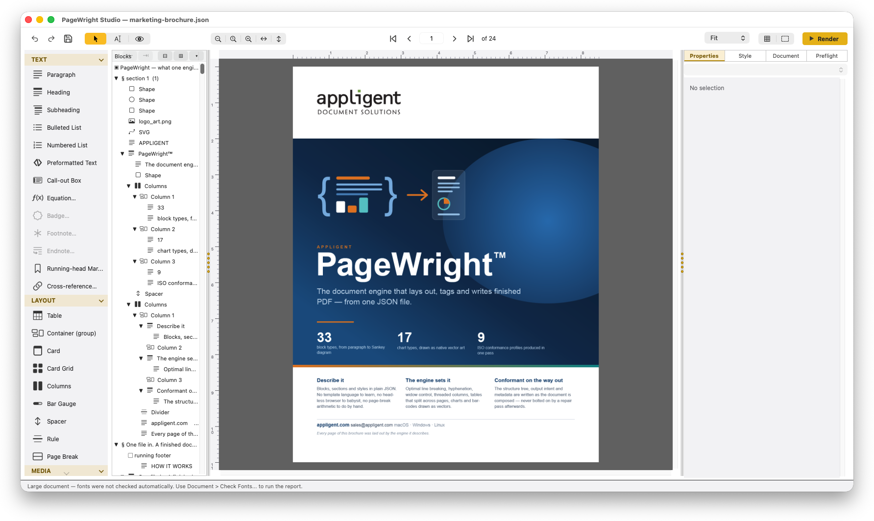
Figure 3. The main window with a document open.
The three panes
Two draggable dividers separate the panes - drag either one to trade width. Selection keeps all three synchronized: pick a block in any pane and the other two follow.
The Blocks outline (left)
The left pane, headed Blocks, lists every placed block in the document with a type icon, indented to show nesting - sections contain their content, tables contain their cells. Click any entry to select that block and jump the canvas to its page; click a section header to jump to the section's first page and show the section's own properties in the inspector. Selection stays synchronized in both directions: click a block on the page and the outline highlights it too.
The canvas (center)
The center pane shows the current page exactly as the PageWright engine renders it - what you see is the PDF you will export. Click anything on the page to select the block that produced it; the outline and inspector follow. Drag on empty space to marquee-select every block fully inside the rectangle (Shift-drag adds to the selection); the group then moves, nudges, aligns, or deletes together. Absolutely positioned blocks (form fields, shapes, pinned labels) drag directly; flow blocks (paragraphs, headings, lists) are typeset by the engine and reflow rather than drag. Double-click a text block to edit its text in place.
The inspector (right)
The right pane shows the selected block. A four-segment switch at its top chooses the view - the two panes about the selection on the left, the two about the document on the right:
- Properties - an editable property list, with a More properties... popup that offers every scalar key the schema allows on the block's type (plus style keys), and a Position group - X, Y, Width, Height - for positioned blocks. Edit > Edit JSON... opens the selected block's raw spec JSON in a dialog - edit it and click Apply Changes to replace the block and re-render.
- Style - the selected block's resolved style, value by value, with the source that set each one: a container's value links to the container, a named style's opens the style editor.
- Document - the document's own facts: page size, live page counts, and the variables and data feeding
{{tokens}}- each section with an Edit... door into its full dialog. - Preflight - everything the engine reported about the last render: keys it refused and why, substitutions it made, or the failure itself. The toggle shows a count when there is something to read.
The tool palette
A rail of tools runs down the left edge of the window - the fastest way to add content. Every block on the Insert menu is here, grouped into nine categories, each under a tinted heading:
| Category | What is in it |
| Text | Paragraph, headings, lists, preformatted text, call-out boxes, equations, badges, footnotes, cross-references |
| Layout | Table, container, cards, columns, bar gauge, spacer, rule, page break |
| Media | Image, SVG image, diagram |
| Shapes | Rectangle, ellipse, line, polygon, Bezier curve |
| Charts | All twenty chart types |
| Barcodes | All eight symbologies |
| Placed PDF | A PDF page, or a contact sheet of every page |
| Form Fields | Text field, checkbox, radio buttons, dropdown, list box, signature, push button, date, label |
| Data | Repeat, conditional, include, text frame |
Each tool shows its icon and name; hover for a one-line description of what the block is for.
Opening and closing categories
Click a heading to open or close its category. A closed heading shows how many blocks are behind it, so you can tell at a glance whether it is worth opening.
The rail opens with Text, Layout and Media showing and the other six closed - enough to keep everything one click away without a very long scroll. Your choices are remembered between sessions.
Tip: Option-click a heading to open that category and close every other one at the same time. With nine categories that is one click instead of eight.
Hiding blocks you never use
If you never place a form field, you can take the whole category out of the rail: Settings... > Tools lists every block with a checkbox. Blocks you turn off leave the palette entirely, and a category with nothing left showing loses its heading too. The Insert menu always keeps everything, so nothing becomes unreachable.
The three ways to add a block
- Click a content tool to insert immediately: one click inserts the block after the current selection and selects it, ready to edit. (Image... and the PDF placements ask which file first; Table asks for its size.) To position the block freely afterward, use Pin to Page.
- Click a placing tool - a form field, a shape, or a text frame - to arm click-to-place: the tool highlights, the status line reads "Click on the page to place the new block", and your next click on the canvas drops it there as a positioned block you can drag and resize.
- Drag a tool onto the page to place it where you drop it. While you drag a content tool over the page, a blue insertion line marks the gap the block will flow into - drop high in the flow to land high, low to append at the end, regardless of what is selected. A drag places one block and leaves nothing armed, so it never becomes a repeated-placement mode.
A few tools open a dialog or a file chooser before anything is inserted - Equation..., Badge..., Diagram..., SVG Image... and Cross-reference... among them. Those are click-only: there is no drop point for them to honor. An equation or a diagram goes in after the current selection, as a clicked content tool's block does.
Note: Badge... and Footnote... mark a piece of text rather than adding a block of their own, so they stay dimmed until you have text selected or an editor open. Clicking one anyway tells you what is missing rather than doing nothing.
The compact rail
Prefer a slimmer palette? View > Compact Tool Palette collapses it to an icon-only strip. Category headings shrink to a rule with a chevron, and the tooltip becomes the only thing naming a category - hover to read it, click to open or close as usual.
The palette needs an open document; with none loaded, clicks and drags do nothing, though you can still open and close categories.
The top bar
Across the top of the window sit the edit-history and navigation controls:
- Undo and Redo step backward and forward through your edits (Cmd-Z and Shift-Cmd-Z do the same).
- The editing-mode switch chooses what a click on the page does. Point, the selection tool, selects, drags and double-clicks into text. Text edits a text block with a single click. View is a read-only preview. View > Selection Tool, Text Tool and Viewer do the same, and so do the V, T and W keys on the page.
- The page controls run left to right: |< first page, < previous, an editable page field, > next, and >| last. Type a number into the field and press Return to jump straight to that page; leave the field without pressing Return and it snaps back to the current page.
- The zoom popup chooses the page magnification: Fit, 75%, 100%, 150%, or 200%.
The guides button, just left of Render, has two halves, each on or off by itself.
- The left half shows or hides the page guides: the margin box, the running header and footer bands, and the gutters between columns - the page's own columns, and those of any multi-column block on it. They are drawn in dashed teal rules over the preview and never reach the exported PDF. View > Show Guides does the same thing, and the half lights up whenever they are on. The toggle applies to this window only; whether a new window opens with the guides showing is Show guides in new windows, on the General tab of PageWright Studio > Settings... (Cmd-K).
- The right half, the dashed rectangle, outlines every block on the page in dotted magenta - the blocks nested inside others too: a container's contents, each column of a columns block, a table's cells, a list's items, and the frames a master page puts on the page. Each outline is the box the block's selection would show: a pinned picture's whole box, not just the picture inside it, and a turned block turned. Use it to see where each block begins and ends on a crowded page, what is inside what, and what overlaps. View > Show Block Outlines does the same thing, the status line says how many blocks it outlined, and the outlines step aside while you type in a block. Like the guides, they are for this window only, start off in a new one, and never reach the PDF.
Note: The page field shows the page's position in the document; the readout beside it shows the total and, when the page's printed folio differs from that position, the folio in parentheses - the seventh page of a manual whose body restarts its numbering at 1 reads "7 of 21 (4)".
The document actions that once sat here now live on the menus, where their keyboard shortcuts already are: the preview re-renders automatically after every edit (force a fresh pass with View > Render, Cmd-R), Edit > Delete Block(s) - or Backspace - removes the selected block, and File > Export PDF... (Cmd-E) writes the finished file. The status text moved to the band along the bottom of the window.
Moving through the document
Beyond the page buttons, you can move through the document from the keyboard and menus:
- View > First Page and View > Last Page - like the |< and >| buttons - jump to the ends; Home and End do the same.
- View > Previous Page and View > Next Page step one page back or forward, as do PageUp and PageDown.
- View > Go to Page... (Cmd-J) opens a dialog that jumps straight to a page number; the toolbar's page field does the same inline - type a number and press Return.
Zoom and panning
View > Zoom In (Cmd-=) and View > Zoom Out (Cmd--) step through the magnifications; choose Fit in the zoom popup to scale the page to the pane again. When the page is larger than the pane, the canvas pans with the scroll wheel or a trackpad scroll gesture, and scroll bars appear along the edges.
Rulers
Rulers run along the top and left edges of the page, marked in inches, centimeters or points.
- View > Show Rulers turns them on and off. They are on by default.
- Settings... > General > Ruler units chooses the unit; the rulers and the cursor readout follow it together.
As you move the pointer over the page, a thin indicator tracks its position on each ruler and the status bar reads out the exact coordinates. Both are in the unit you chose, so a measurement you take off the ruler is the number you type into the inspector.
Tip: Points are the engine's own unit - every measurement in a spec is in points, at 72 to the inch. Set Ruler units to points when you are working close to the JSON and inches or centimeters when you are laying out by eye.
The grid
Three items on the View menu control the layout grid:
- View > Show Grid draws the grid over the page.
- View > Snap to Grid locks dragging, resizing, and click-to-place to grid points.
- View > Grid Size sets the grid pitch: 6, 9 (the default), 12, 18 or 36 points - 9, 18 and 36 are an eighth, a quarter and half an inch. The current size carries a checkmark.
Grid visibility, size, and snap persist per document.
Tip: Hold Cmd while dragging to move a block freely with snapping left on.
The format bar
The second bar holds the character and style controls. Most act on text you are editing in place - double-click a text block to open the in-place editor, select some text, then click a control; when no editor is open the strip dims and the popups disable.
- B, I, and U toggle bold, italic, and underline; each lights when its style is active in the selection.
- The four alignment buttons (left, center, right, justify) set the alignment; the current one lights.
- The color well shows the color of the selected text; click it to choose another.
- The Font and Size popups set the typeface and size, and track the selection as you click through differently formatted text.
Named styles are not on this bar. The Style row at the top of the inspector's Properties tab shows the selected block's named style and applies another (or (No style) to clear it) as a clean style reference rather than inline overrides, with no editor open.
Finding text
Edit > Find... (Cmd-F) searches every rendered block's text - paragraphs, headings, list items, table cells, captions, alt text, and styled runs. Cmd-G finds the next match and Cmd-Shift-G the previous one, wrapping at the ends, jumping pages, and selecting each hit; the status text shows "Match i of N". The grid toggles gave up their shortcuts to make room for these standard Find keys.
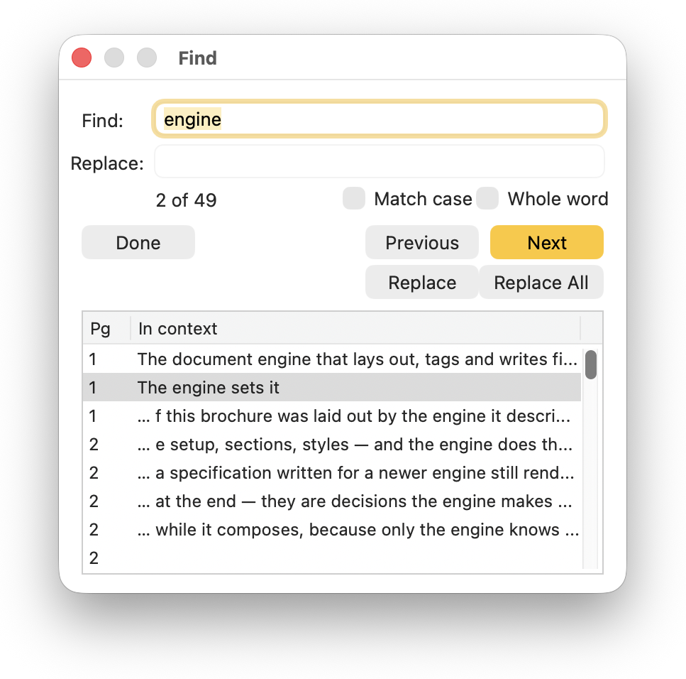
Figure 4. The Find dialog.
Each match is highlighted at the word, not the block, so on a dense page you can see exactly which words matched rather than which paragraphs contain them. The dialog also lists the matches in context, a line each, so you can read the hits without stepping through them one at a time - click a line to jump straight to it.
Replacing
The same dialog replaces. Type into Replace with, then:
- Replace changes the current match and moves to the next.
- Replace All changes every match in the document in one undoable step.
Replacement works on the text of any block Find can reach, including table cells and styled runs, and it preserves the run styling around what it changes - replacing a word inside a bold phrase leaves the phrase bold.
Caution: Replace All is a single undo step, so Cmd-Z takes back the whole sweep. That is usually what you want, but it does mean you cannot keep some replacements and undo others - check the match count before you commit to it.
View > Go to Page... (Cmd-J) opens a small dialog that jumps the canvas straight to a page number.
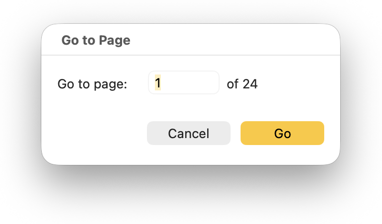
Figure 5. The Go to Page dialog.
Reading the status line
The status text is the window's running commentary. Typical messages:
| Message | Meaning |
| Rendering... | The engine is re-rendering the document |
| Rendered 12 page(s) - server, 240 ms | The last render succeeded; backend and time |
| Match 2 of 7: invoice | Find is cycling matches |
Saved form-overlay.json | The spec was written to disk |
| Editing - select text then use the format bar; Return commits, Esc cancels | The in-place editor is open |
Caution: When a render fails, a problem panel opens with a plain-language explanation, the engine's full output, and a Revert Last Change button - read it rather than guessing from the status line alone.
Using PageWright Studio with VoiceOver
PageWright Studio draws much of its window itself - the page, the tool palette, the Blocks pane, the buttons along the top, the inspector - and a screen reader cannot see a drawn control on its own. Each of these tells VoiceOver what it is, what it says, and what pressing it does, so you work them with the VoiceOver commands you already use: VO-arrow keys to move, VO-Space to press.
- The tool palette reads as a group called Tools. Each category heading is a disclosure triangle - "Shapes, 5 tools, collapsed" - and VO-Space opens or closes it. Each tool is a button named for its block, with its one-line description as the hint. VO-Space does what a click does, and VoiceOver reads out the status line's answer.
The Blocks pane is an outline called Blocks, or whatever its header says while a filter or a master page is on. Each row gives VoiceOver what it shows, in words: the kind of block its icon marks and its label ("Heading 2: Fin design", "Image: sample-image.png", "Section: Stability and the center of pressure, pages 2 to 3", "Page furniture: running header"), with its level in the outline and whether it is expanded.
- VO-Space selects the block, as a click does: the page turns to it and the inspector describes it. The keyboard stays in the pane, so Up Arrow and Down Arrow step through the document, and VoiceOver reads each row it lands on.
- To select several blocks, hold Shift and press Up Arrow or Down Arrow.
- VO-Backslash expands or collapses a row. So do Right Arrow and Left Arrow; on a row that is not expanded, Left Arrow moves up to the row it sits under.
- VO-Shift-M opens the pane's menu, the one a right-click shows, for the row.
The page is a layout area named for the page on show, as a page button reads it: "Page 3 of 22 (1)". Each block drawn on it is an item, and VoiceOver's cursor outlines the block where it is drawn.
- The items come in the order the document is read, not the order the blocks are painted: on a designed page, the order of the Blocks pane; a story's text where its frame is.
- An item says what kind of block it is and what it says: "Heading 2, Fin design". An image reads its alt text. A list or a table says how many items or rows it has, and each item or cell is an item of its own. A block with nothing to say, such as a shape or a divider, gives its kind.
- VO-Space selects the block, as a click does, and the Blocks pane and the inspector follow. The keyboard moves to the page, so the arrow keys nudge a pinned block and Delete deletes the selection.
- VO-Shift-M opens the page's menu, the one a right-click shows, for the block.
- When the page is zoomed in past the window, moving to a block scrolls it into view.
- What VoiceOver finds under the mouse pointer is the block a click there would select: the one on top, and the innermost.
- In Edit Master Page, the items are the master's frames. On a page the master governs, its frames are not items, as a click does not select them there.
- Along the top, Undo, Redo and Save and the four page buttons stand beside the page field. A page button reads out where it landed: "Page 3 of 22 (1)". Render is a button too, and VoiceOver reads out the result of the render.
- The two dividers between the panes are splitters named for the pane each one sizes, "Blocks pane divider" and "Inspector divider", and each reads that pane's width in points. Choose increment or decrement from VoiceOver's actions (VO-Command-Space) to widen or narrow the pane by 20 points.
- The inspector's switch is a tab group called Inspector, with a tab for each pane; the selected tab is the pane on show.
Each inspector pane is a group named for the pane, with one item per row:
- A row reads its name and its value as the pane shows it - "Size, 20", "Float, Not set". Its hint is the row's tooltip, which says where the value comes from: set on this block, or inherited from a named style or the document's defaults.
- What VoiceOver calls a row tells you what pressing it does. A checkbox toggles. A pop-up button opens its choices, under the row. A button opens the row's field, named for the row (type the value, press Return to apply or Esc to cancel), or the dialog that edits it. A heading or a read-out is only read.
- A color row is three buttons: the row itself, which opens its field for a hex value; Pick a color for the row, the swatch, which opens the color picker; and Color editor for the row, the dot, which opens the color editor for gray, RGB, CMYK or a spot ink. A border written as text, such as a cell's
2 #c0202a, has its Pick a color for button too. - On the Properties tab, VO-Shift-M opens a row's menu, the one a right-click shows: Clear takes the value off, Remove takes out an array entry, and Copy Style and Paste Style work as they do on the Edit menu.
- In the Style pane, where a value comes from is a link: press it to go to the style that sets it.
- In the Preflight pane, each problem is read with its severity first - "Error: ...", "WCAG AA: ..." - and one that names a block is a link: press it to select that block.
- Rows scrolled out of the pane are still in VoiceOver's list. Pressing one brings it into view first.
The Emoji window reads its grid as a group named for what it shows, "Emoji, All Emoji, 1,923 emoji", "Emoji, Recently Used, 12 emoji" or "Emoji, 2 emoji match thumbs, all categories". The emoji in view are buttons named with the emoji's name in the skin tone it shows, such as "grinning face" or "thumbs up: medium skin tone". When the skin-tone artwork is installed, an emoji that comes in skin tones also says how many it has, counting yellow: "6 skin tones", or "skin tones for each person" for an emoji of two people. One whose picture is missing from the emoji library says so. The category headings are text.
- VO-Space selects an emoji, as a click does, and never inserts it: press Return, or the Insert button, to put it in the front document. VO-Shift-M opens the emoji's menu, the one a right-click shows.
- The arrow keys move through the grid, and VoiceOver reads the name of each emoji the selection lands on. Only the emoji in view are in VoiceOver's list, so move past the last one with the arrow keys or the scroll bar, or switch to the list view.
- After a search, VoiceOver says how many emoji matched. Down Arrow or Return in the search field goes to the first result.
- Categories is a table, read row by row with each category's count. Recently Used is always its first row, with its count even when it is empty, and an empty Recently Used reads what it will hold.
- The list view is a table called Emoji list, with a row for every result, not only those in view. A row reads the emoji's name as its cell in the grid does, then its code points. Up Arrow and Down Arrow move the selection, and VoiceOver reads each row it lands on; VO-Shift-M opens the row's menu.
- The detail area reads the selected emoji's name, code points, category, keywords and how it prints.
- The skin-tone swatches are a group called Skin tone. Each swatch is a button named for its tone, such as "Medium", or "Left person, Medium" for an emoji of two people, and the chosen one is selected. VO-Space chooses a tone, and VoiceOver says the emoji's new name. Without skin-tone artwork the swatches are dimmed and the reason is read after them; for an emoji with no skin tones, the group reads "No skin tones for this emoji".
The lists in dialogs - the matches in Find, the fonts in Check Fonts, the languages, a document's styles and their properties, a theme's colors, and every other list in a dialog - are tables, each named for what it lists: "Matches, table". VoiceOver reads a row cell by cell under its column titles, and says which row is selected.
- Up Arrow and Down Arrow move the selection, and VoiceOver reads each row it lands on.
- VO-Space on a row selects it, as a click does. On a cell, it does what a click on that cell does: a checkbox toggles, a cell you can type in opens for typing, a color swatch opens the color picker, and a value with a set of choices opens them.
- A column title names its column. The lists keep the order their dialog gives them: neither a click nor VO-Space on a title re-sorts one.
- Where a list has a right-click menu, as the style properties do, VO-Shift-M opens it for the row.
- A cell PageWright Studio draws rather than writes says what it shows: a theme's color swatch is a button named for its color, an unset color says "Not set", and a group's heading says "Group:".
Note: On the page, a data field reads as it is written, {{name}}, rather than as a record's value, and the running header and footer are not items. VoiceOver support is for macOS; on Windows, these drawn controls are not yet visible to a screen reader.
3. Working with Documents
A PageWright Studio document is an PageWright spec - a .json file the engine typesets on every render. This chapter covers the document lifecycle: opening, saving, working in multiple windows, importing a manuscript, exporting a PDF, and printing.
Opening a document
To open a document, choose File > Open Document... (Cmd-O) and pick a spec file such as form-overlay.json. PageWright Studio renders it through the engine and shows the first page on the canvas.
File > Open Recent lists the last nine documents you opened, each shown as "name - folder" so you can tell two files with the same name apart. Choose Clear Menu at the bottom of the submenu to empty the list. The Welcome window shows the same recent list when the app starts.
You can also open a document from outside the app. Right-click a .json file in the Finder, choose Open With, then PageWright Studio; or right-click it in Windows Explorer, choose Open with, then PageWright Studio, which PageWright Studio adds to that menu the first time it runs. PageWright Studio does not ask to be the default for .json files: where another app already opens them, a double-click still goes to that app, and you choose Always Open With on a Mac, or Always use this app on Windows, if you want PageWright Studio instead. On a Mac with no other app that opens .json files, though, the Mac opens every .json file you double-click in PageWright Studio. If PageWright Studio is already running, the document opens there, in front.
PageWright Studio opens PageWright documents only. The view-settings file it keeps beside a document - report.layoutpro.json beside report.json, holding the zoom, page and grid - opens the document it belongs to. Any other JSON file, such as a package.json or a list of blocks, is refused with a message that says why, and no window opens.
Creating a document from a template
File > New > From Template... (Cmd-N) opens the New Document chooser, which lists every template by kind with a preview, in the theme you pick. The File > New submenu also makes the commonest ones in one step: Blank Document, Report, Book, Job Application, Feature Tour, and Poster. Every template opens as an untitled document: nothing is written to disk until you save, and the first save asks where to put the file, starting in the folder of the document you opened or saved last. To put your own pictures in, drag them from the Finder onto the template's images and picture placeholders; see Drop a picture from the Finder in Inserting Content.
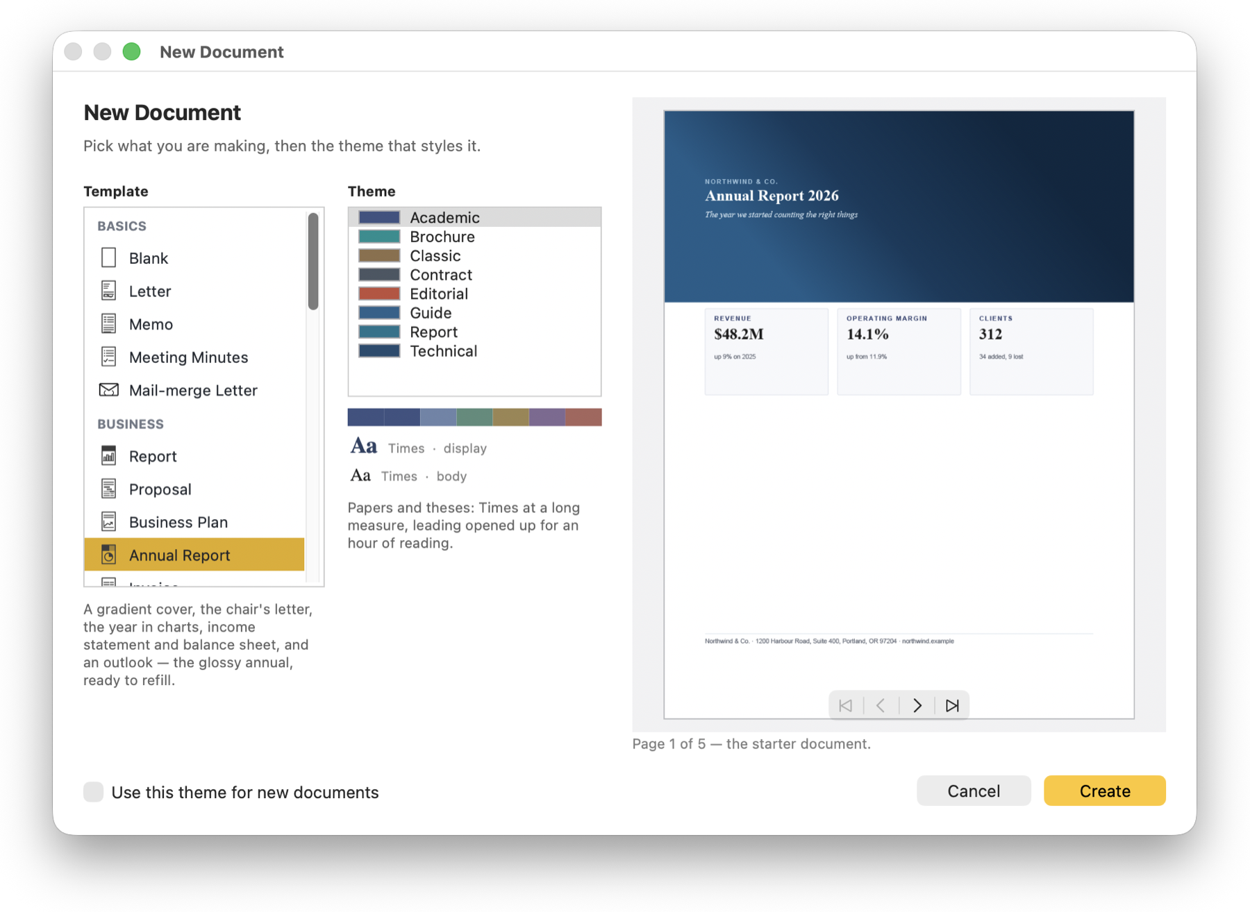
Figure 6. The New Document gallery.
Saving your work
To save the frontmost document, choose File > Save (Cmd-S). A document that already has a file saves in place; an untitled document opens the save dialog and asks where to save instead of doing nothing.
File > Save As... (Cmd-Shift-S) saves a copy of the document under a new name or location.
The .json file you save is your editable project; the finished PDF comes from File > Export PDF... (see below). Saving does not give the document a title - the file's name is not one - so name it in Document > Document Properties... (see Describing the document). An export of a document with no title says so.
File > Revert to Saved throws away every change since the last save and reopens the file as it is on disk. It asks first, because it cannot be undone. With no unsaved changes it simply reloads the file, which is useful when a script or another editor has rewritten it since you opened it.
While a document has unsaved changes, a - appears in the window's title bar. If you close the window - or open another spec over the unsaved document - PageWright Studio asks what to do:
- Save writes the changes (asking where first, if the document is untitled) and then proceeds.
- Don't Save discards the changes and proceeds.
- Cancel returns you to the document untouched.
Caution: Don't Save discards every change since the last save with no way back - the undo history closes with the window.
If PageWright Studio stops unexpectedly
While a document has unsaved changes, PageWright Studio writes a recovery snapshot every 60 seconds. The snapshot sits beside the document - or in Application Support, for a document that has never been saved - and is deleted the moment you save or close cleanly. Next time you open that document after an unexpected quit, PageWright Studio tells you a snapshot exists and offers it, with the time it was taken so you can judge whether it is worth having.
Tip: This is not "save my file every minute". Your file is written only when you ask, by File > Save. The snapshot is a separate copy, and the interval answers one question: how much work are you willing to lose?
The interval is in PageWright Studio > Settings, as Recovery snapshots. It can be set to Off, or to any interval from 10 seconds upward. Off means no snapshot is ever written, and an unexpected quit costs everything since your last save.
Describing the document
Document > Document Properties... sets what a PDF reader shows about the finished file, in three groups.
- Description - Title, Author, Subject and Keywords (separate keywords with commas), and the Creator and Producer names the file reports about itself, which you leave empty to ship the engine's own.
- Initial View - the page layout, which panel is open, and the magnification a reader sees when the document is first opened; the page the document opens at; and five window flags - hide the toolbar, hide the menu bar, hide the window controls, resize the window to the first page, and center the window.
- Links and Navigation - how links and the document outline behave.
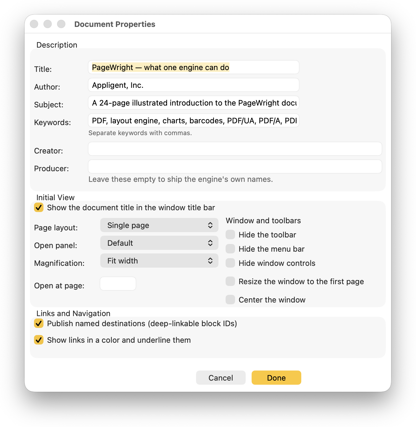
Figure 7. The Document Properties dialog.
Caution: Give every document a Title. A PDF with no title shows its filename in the reader's window, and an accessible document is required to have one: an export that declares PDF/UA is checked for a title, and for the viewer preference that makes readers show it rather than the filename.
Caution: The five window flags are a kiosk setting, not a document setting. Hiding a reader's toolbar and menu bar hides that reader's own accessibility controls along with them - the zoom, the read-aloud command, the view preferences someone may depend on. Set them for a file you know will be projected or presented, never for one somebody has to read.
Working in multiple windows
Each document opens in its own window, so you can work on several at once. File > Open Document... and the templates reuse an empty untitled window when one is frontmost; otherwise they make a new window. Opening a document that is already open brings its window to the front instead of opening it a second time. File > Close Window (Cmd-W) closes the front window, and the file commands - Save, Save As..., Export PDF..., Print... - always act on the frontmost document.
Importing text or Markdown
To bring a manuscript in without hand-building blocks, choose File > Import Text / Markdown... and pick a .txt or .md file. PageWright Studio reads it and appends flow blocks to the current page:
| In the source file | Becomes |
| Lines starting with one to six # characters | Headings at the matching level |
| Runs of text separated by blank lines | Paragraphs - soft-wrapped source lines are joined into one paragraph |
| Lines starting with -, *, or + | A bulleted list |
| Lines starting with 1. or 1) | A numbered list |
| Fenced blocks (three backticks) | Preformatted blocks |
The imported blocks are ordinary flow content: the engine typesets them, and you edit and style them like anything else in the document.
Tip: The whole import is a single undo step. If the manuscript lands in the wrong place, one Undo (Cmd-Z) removes everything it added.
Importing a Word document
File > Import Microsoft Word... brings a Word .docx in the same way. Its content is added to the end of the selected container, or else of the section on show, as one undo step:
| In the Word document | Becomes |
| Paragraphs | Paragraphs, with their alignment and indents |
| Bold, italic, underline, strikethrough, color, highlight, superscript | The same, on the same words |
| A line set larger or bolder than the text around it | A heading, levels 1 to 4 - Word's style names are not read, so a heading is recognized by how it looks |
| Bulleted and numbered paragraphs | Bulleted and numbered lists |
| Tables | Tables, the first row as the header, with cell shading, vertical alignment and pictures |
| Pictures in the text | Image blocks with their alt text, at most 240 pt wide |
| Web and mail links | Links |
| Page breaks | Page breaks |
| The header and footer | The running header and footer, when the document has none yet - the page number and page count become {{page}} and {{pages}} |
Fonts and point sizes are left behind on purpose, so the document's own styles set the type. Footnotes, merged cells and nested lists do not come across, list items arrive as plain text, and a link to another place in the Word file keeps its text but not its target. The page size and margins are taken only into an empty document. A Word document with fill-in form fields is converted differently: its headings and labels come across with live PDF form fields in place of Word's.
Exporting a PDF
To produce the finished PDF, choose File > Export PDF... (Cmd-E). The engine writes the document out as a PDF file - at the conformance level declared in Document > Output Standards..., if you have set one.
Exporting a booklet
File > Export Booklet PDF... writes a second, print-only PDF: the document's pages two to a sheet side, in the order a stack of sheets reads once it is folded and stapled on the fold. The save panel suggests a name with the sheet in it, such as program-booklet-11x17.pdf. The status line then says how many sheets to print and how to print them.
The booklet is laid out as Document > Color, Images & Print Production... says in its Booklet group. If you have not set that up, it uses two pages side by side: Letter pages on 11 x 17 in, and 5.5 x 8.5 in pages on Letter.
To print it:
- Open the booklet PDF and print at Actual Size (100%), on both sides, flipping on the edge the Booklet group names.
- Do not turn on your printer's own Booklet setting. The file is already in booklet order.
- Fold the stack in half with sheet 1 outside, and staple on the fold.
Acrobat and Reader preset their Print dialog from the file, and the file's description repeats these steps. File > Export PDF... is unchanged: send that PDF to readers. The booklet is untagged, because a sheet has no reading order, so it is only for the printer.
Exporting a merge
When the document carries a record set of more than one record, Export asks first whether you want one PDF per record or all of them in one file, with a naming pattern and a range. A failed record ends the run and the message names the range to resume with. See Chapter 11 - Data for the whole flow.
Rendering many documents at once
File > Batch Render... renders a list of documents in one pass, without opening any of them. It needs no document open at all - the ones it renders are the ones you choose inside it.
Add Document... adds one spec; Add Folder... adds every .json one level inside a folder, skipping PageWright Studio's own scratch files. Each row shows the document, the PDF it will produce, and - once you press Render - how it ended: waiting, rendering..., done - 42 pages, or failed (line 4) naming the line in the spec that stopped it.
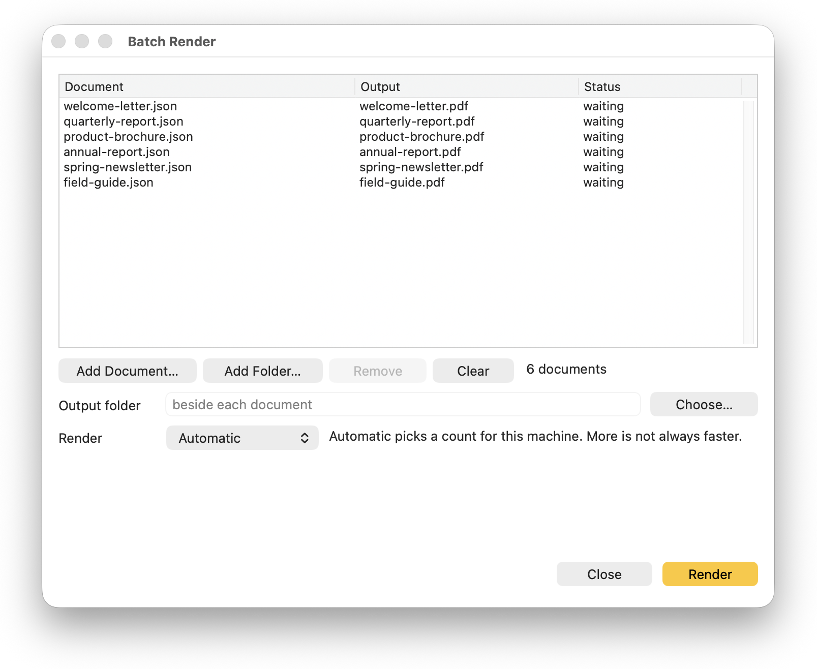
Figure 8. Batch Render with a folder of documents added.
Output folder is where the PDFs go; leave it empty and each one is written beside its own document. Render ... at a time chooses how many run in parallel; Automatic picks a number for the machine, and more is not always faster.
Note: One document failing does not stop the others - the run finishes and the failures stay on their own rows. Stop ends the run and keeps the PDFs already written.
Caution: On Windows the list renders one document at a time regardless of the setting, and the dialog says so.
Page setup and printing
File > Print Setup... opens the system page-setup dialog. File > Print... (Cmd-P) renders the document at 300 dpi and prints it through the standard system print dialog, so all of your printer's options are available.
Per-document view state
View settings - grid visibility, grid size, snap-to-grid, zoom, and the current page - persist per document in a sidecar file saved next to the spec. For a document named report.json, the sidecar is report.layoutpro.json. When you reopen the document, PageWright Studio restores the view exactly as you left it.
Note: The sidecar keeps the document itself a pure PageWright spec: no view state is ever written into your .json file. The sidecar holds only window settings, so deleting it loses nothing but the remembered view.
4. Selecting and Editing Blocks
Selecting Blocks
Everything the engine places on a page - a heading, a form field, a shape, a chart - is selectable directly on the canvas.
Click to select
Click a block on the canvas to select it. PageWright Studio resolves the click to the exact node in the spec: the outline highlights the block's row and the inspector loads its properties. The selected block shows selection handles on the canvas; on an absolutely positioned block, drag a handle to resize it. Shift-click another block to add it to the selection (or to remove one that is already selected).
Where pinned blocks overlap, a click selects the one on top - the one drawn last - and then the block inside it that you clicked, if it holds others. A container that clips its contents, such as a window showing one corner of a larger picture, hides the rest of that picture from clicks as well as from view: a click beside the window reaches whatever is really there.
Marquee selection
To select several blocks at once, drag on empty space. A marquee rectangle follows the pointer, and every block fully inside the rectangle when you release becomes selected. Shift-drag adds the lassoed blocks to the existing selection instead of replacing it.
Working with a multi-selection
A multi-selection behaves as a group:
- Move - drag any block in the group and the whole group moves together.
- Nudge - press an arrow key to move the selected positioned blocks 1 pt; Shift-arrow moves 10 pt.
- Move between table cells - with a table cell selected, the arrow keys step to the neighbouring cell. At the table's edge they stay put, and a table that runs over several pages turns to the page the cell is on.
- Step through the Blocks pane - click in the Blocks pane, then press Up Arrow or Down Arrow to move the selection through the document's structure. The page turns to show each block. Right Arrow expands the selected row and Left Arrow collapses it, or moves up to the row it sits under.
- Align - Arrange > Align Left Edges, Align Right Edges, Align Top Edges, or Align Bottom Edges line the group up.
- Distribute - Arrange > Distribute Horizontally or Distribute Vertically spaces the blocks evenly.
- Copy, duplicate, or delete - the clipboard and delete commands below act on every selected block.
Moving Positioned Blocks
Form fields, pinned blocks, shapes, labels, and rules are absolutely positioned: each carries a position in the spec. Drag one anywhere on the page - on mouse-up PageWright Studio writes the new coordinates back into the block and re-renders the page:
"position": { "x": 72, "y": 144, "width": 216, "height": 24 }When View > Snap to Grid is on, dragging, resizing, and click-to-place all lock to the grid; hold Cmd during the drag to move freely. View > Show Grid displays the grid and View > Grid Size sets its pitch. While you drag or resize, alignment guides appear when an edge lines up with another block or the content box, and the dragged edge snaps to the guide.
A press only becomes a drag once the pointer has moved about 4 pixels, so clicking a block to select it never nudges it onto the grid or a neighbour's edge, and holding the button down changes nothing on the page until you move. The same holds for resize handles, the rotation grip, a shape's points and a table's dividers. To move a block by a point or two, use the arrow keys.
Note: Every edit re-renders the document through the PageWright engine, so the canvas always shows the real typeset output - never an approximation.
Flow Blocks: Reorder, Pin, and Release
Flow blocks - paragraphs, headings, lists, and the rest of the typeset content - are placed by the engine, so they reflow rather than drag. To move one:
- Reorder it with Arrange > Move Block Up or Arrange > Move Block Down (also on the right-click menu). The engine reflows the page around the new order.
- To place it freely, choose Arrange > Pin to Page (Absolute Position), or right-click the block and choose Pin to Page. The block freezes at its current spot as an absolutely positioned block, and from then on it drags and resizes like a field.
Arrange > Release to Flow reverses a pin and returns the block to the flow.
Designed Pages
On a designed page, every block sits in a box of its own, exactly where you put it. Nothing flows: a box never pushes the one below it down, and text that does not fit its box stays in the box. Posters, flyers, covers and certificates are designed pages. Everything else in this guide is flowing text, which the engine sets down the page and on to the next: a report, a book, a letter.
- File > New > Poster starts a one-page designed document.
- Document > Page Mode > Designed Pages turns a flowing document into designed pages. Every block stays where it renders now, and the whole change is one undo step. Flowing Text turns it back. The check mark shows which mode a document is in.
- Document > Add Design Page adds an empty page.
Placing a block. Insert puts a new block at the top left of the page's content area, in front of everything. With a block selected, the new one goes just below and to the right of it instead. A picture's box is the size of the picture: 60% of the content width, with its height from the picture. A box that would run off the page is moved back onto it. Then:
- drag the block to move it, and drag its corner handle to size it;
type its place in the Properties tab's Position group:
- X and Y are measured from the page's top left corner;
- Width and Height are the box's size;
- all four are in points, 72 to the inch, or with a unit such as
6inor150mm;
- press an arrow key to nudge it 1 pt, or Shift-arrow for 10 pt.
A thin block, such as a line, is easier to select by its row in the Blocks pane than on the page.
A picture in a box also has a Picture width row: how wide the picture is inside its box. On a designed page, Properties offers no Space before, Space after, Start on a new page or Keep with next: nothing flows there, so they would change nothing.
Paint order and reading order. A designed page has two orders, and changing one leaves the other alone:
- Paint order is what is drawn over what. A new block goes in front. The stacking commands below change it, and a block's Paint order row shows it.
Reading order is what a screen reader says first. It is the order of the page's rows in the Blocks pane, top to bottom.
- View > Show Reading Order numbers each block that is read, on the page, joined by a thin line. A block that is decoration, such as a shape or a line, gets an empty square instead: a screen reader skips it. A number is the block's place in the Blocks pane, and a decoration keeps its place: on a poster whose banner and line are rows 5 and 6, a picture in row 7 reads 7, though it is the fifth thing a screen reader says.
- To change the order, drag a row in the Blocks pane, or choose Arrange > Move Block Up or Move Block Down. Nothing moves on the page, and the status line says where the block is now read. Where a dragged row lands also depends on how far right you let go: at the rows' left edge it stays a block of the page; over the words of a row inside a list or a container, it goes inside it.
A block's Reads / paints row says where it stands in both, for example "reads 4th of 7 · paints 7th of 7".
Stacking: Bring to Front and Send to Back
When pinned blocks overlap, one is drawn over the other. Arrange > Bring to Front and Send to Back move the selection to the top or the bottom of the stack; Bring Forward and Send Backward move it one step, past the nearest block it is not already above or below. The same four commands are on the right-click menu of a pinned block, and each is one step to undo.
- On a designed page, they change only the drawing order. The order the page is read in stays as it is.
- In a flowing document, pinned blocks are drawn in the order they appear in the Blocks outline, so these commands move the block there - among the pinned blocks on its own page only. Flowing text never moves, and no block leaves its page. Because the outline order is also the reading order, a block brought to the front is read after the blocks it now covers; the status line says so.
Grouping Blocks in a Container
Arrange > Wrap in Container puts the selected block inside a new container, in the same place: a pinned block's position and stacking order move to the container, so nothing shifts on the page. With several blocks selected, it groups them into one container where the first of them stood - blocks from the same list, brought together if they were apart - and on a designed page the container takes their combined box. It is one undo step. Table rows and cells, master pages and stories cannot be wrapped, and a lone container is not wrapped again.
Step and Repeat: One Design, Placed Many Times
A sheet of business cards, a page of labels, four postcards on a tabloid sheet: one design, placed again and again. Block > Step and Repeat draws a placed block once and places it wherever you say. Every copy is that one drawing, so a change to the block - its text, its picture, its size - is a change to every copy, and the PDF stores the design once however many times it prints.
Step and Repeat works on a block placed on the page; for a flowing one, choose Arrange > Pin to Page (Absolute Position) first. A container holding the whole card is the usual thing to repeat. The same commands are on the right-click menu of a placed block.
- Fill Page places as many copies as fit on the page, side by side and centered, with no space between them.
- Add Copy adds one more: the next one along a row, or a new row under a grid.
- Remove Copy removes the copy you clicked, or the last one.
- Separate Copies turns each copy into a block of its own, so one card can differ from the others.
- Combine into Copies is the reverse: select two or more identical blocks and they become one block, placed at each spot.
- Line Up Backs is for a two-sided sheet. Select the block on the back page, then choose Long Edge or Short Edge - the edge the sheet is turned over on - and every back moves to sit behind its front.
Selecting, moving and typing in copies
Click any copy to select the block. The status line says which one: "Container - copy 3 of 8 · drawn once, placed 8 times." The block itself carries the handles; each copy has a dashed outline with its number, counted in reading order.
- Drag the block itself to move it and every copy with it.
- Drag a copy to move that copy alone.
- Resize the block itself; every copy takes the new size.
- Click into the text of any copy to type there. Every copy shows the change when the edit settles.
Everything inside a copy can be selected where you see it, and VoiceOver reads each copy and its contents as their own items - "Paragraph, copy 3 of 8" - straight after that copy.
The Step and Repeat group
The Properties tab shows a Step and Repeat group for a placed block. Placed says how many times it is drawn. Layout is Grid when the copies make full rows and columns, or Free when they sit wherever they were put:
- In Grid, Columns and Rows set the grid, and Space across and Space down the space between copies. 0 puts them edge to edge, so neighboring bleeds touch.
- In Free, each copy has a row with its offset from the block - across, down, in points or with a unit such as 3.5in. Type a new offset to move it; clear the row to remove that copy.
Grid or Free is worked out from the copies each time, so nothing extra is stored in the document.
Card size and bleed
For a placed container, picture or shape, the Position group gains two rows:
- Card size - a business card (3.5 x 2 in, or 85 x 55 mm), a postcard (6 x 4 in or 9 x 6 in) or A6. The box becomes that card plus its bleed, standing the way it stands now; a grid keeps its spacing.
- Bleed - how far the box reaches past the cut on every side. Changing it grows the box on every side and keeps the artwork where it was against the cut: blocks placed from the box's corner move with it, and the text inside gets matching padding. A bleed of 0.125in (9 pt) is usual; 3mm works too.
With View > Show Guides on, each copy shows where it will be cut: violet dashes on a white line, so they show on dark artwork as well as light. Fill Page places its sheet by the page, not by the margins, so the page's margin lines step aside where a block with copies is drawn: only the cut lines cross the cards.
Every page, and the templates
To put the same sheet on every page, move the block to a master page with Block > Send to Master, copies and all. A block on a master page is changed in Section > Edit Master Page, and its text in the Properties tab's Text row. File > New > From Template... offers two sheets built this way in its Design group: Business Cards - eight 3.5 x 2 in cards on Letter, front and back, with bleed, crop marks and a cut list - and Postcards, four 6 x 4 in cards on 17 x 11 in.
Note: A drawing placed many times can be read by a screen reader only once. When a repeated block holds tagged content in a tagged document, the engine says so in the Preflight pane: an accessible (PDF/UA) file needs the repeated content to be decoration - which a master page makes it - or placed once.
The Preflight pane also reports what goes wrong with copies on paper and on screen:
- A link or form field inside a block with copies works on the first copy only. Separate Copies gives each copy its own.
- Ink that reaches the edge of a box with no bleed may leave a thin line after cutting. Give the block a Bleed.
- Backs that do not sit behind their fronts when the sheet is turned over. Line Up Backs moves them.
Editing Text in Place
Note: Text that is filled in from data - a paragraph that holds only {{message}}, say - does not open for typing on the page, because the words you see are the data's, not the paragraph's. The status line names the field and where its words are changed: Document > Data Sources... for a record's field, Document > Variables... for a {{var....}}.
To type fixed text there instead, replace the field in the inspector's Text row. Text that mixes typed words with fields opens as usual, fields and all.
Double-click a text block to edit it where it sits: an editor opens directly over the block on the page.
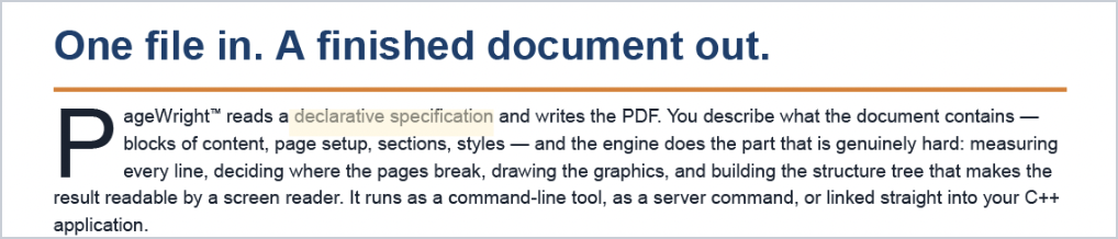
Figure 9. A paragraph being edited in place.
The editor is WYSIWYG - your text appears in the same typeface, size, weight, slant, color, and alignment it has on the page, so a centered blue heading edits centered and blue rather than left-aligned in a default face. PageWright Studio resolves that appearance the way the engine does - from the block's own style, any style its container passes down to it, and the document defaults - so what you type always matches what you will export. (A block set to justify shows left while you edit, because a single editable line can't be justified, but it still renders and exports justified.)
- In paragraph-family blocks, Return inserts a new line; Cmd-Return (or keypad Enter) commits the edit.
- In other text blocks, Return commits directly.
- Shift-Cmd-Return commits the edit and starts a new paragraph right after the block, already open for typing: the quick way to type a report one paragraph after another. It works on a paragraph or heading in the body; in a table cell or a list item it commits, as Cmd-Return does.
- Esc cancels the edit and leaves the block unchanged.
- A new block opens with its starter text selected, so the first thing you type replaces "New paragraph. Double-click to edit." The same goes for a new table's "Column A" and "Cell" when Tab moves you into the next cell. Text you have written opens with the caret where you clicked.
- An item of a list is typed into the same way: double-click it. Edit > Edit Text (Cmd-T) edits a selected item in a dialog.
- Select text inside the editor to format just that selection: Format > Bold, Italic and Underline (Cmd-B, Cmd-I, Cmd-U), Small Caps, Underline Style, Text Color..., and the font and size menus. The page shows the change at once, and the editor stays open.
- Format > Text Color... asks for a hex value such as
#2e6b3a. To pick the color instead, click Pick Color... in that dialog: the color picker opens on the color typed there, opacity included, and the color you pick goes into the field. The swatch beside the button shows the color the field holds. Leave the field empty to take the color off. With no block open for editing, the same command colors the selected blocks. - Format > Clear Formatting takes the selected text back to how its paragraph draws it. Only how the text looks goes; its links, language and notes stay.
- Format > Link... and Format > Language... mark exactly the selected text. Each dialog opens on the link or language the selection already carries, empty when the selected words disagree, and leaving it empty takes the mark off.
- Insert > Text > Footnote... and Endnote... put a note marker right after the selected text. Choosing one again with a selection that ends at that marker edits the note rather than adding a second one, and clearing the note's text removes it.
Bold, italic and underline go by what the selected text actually shows. Text that is all bold turns plain, including a word in a heading, which is bold because it is a heading. Anything else turns bold.
Each formatting change is its own undo step, and so is the typing before it: type, bold a word, type again, and Edit > Undo takes those back one at a time.
A badge is formatted as a whole, not from inside its label. Selecting only a badge's label and pressing Cmd-B says so rather than doing nothing; to change a badge's face or size, pick it with the Properties tab's Run row and use the Style tab.
Committing re-renders the page immediately. Form fields do not open the text editor - double-clicking a field opens its tooltip dialog instead.
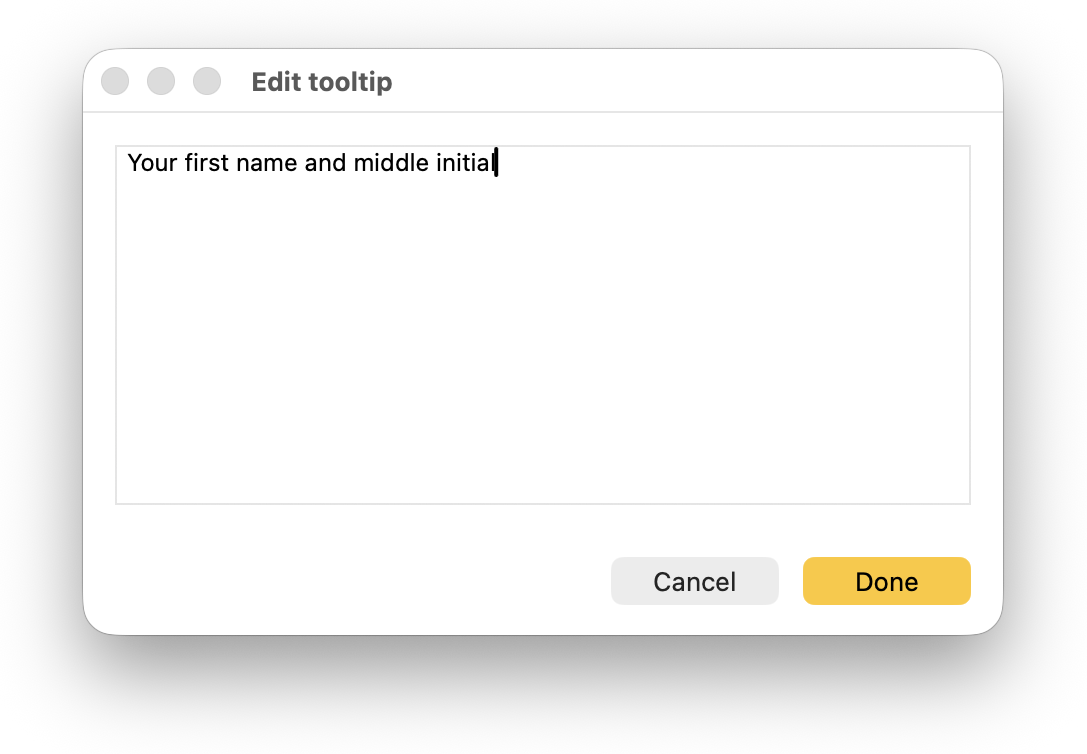
Figure 10. The field tooltip editor.
Tip: The status bar tells you which commit key applies while you are editing, and the grid settings - visibility, size, and snap - persist per document in its sidecar file.
Changing a Block's Type
A paragraph that should have been a subheading, a heading at the wrong level, three lines that want to be a list - Block > Convert To retypes the selected block instead of making you delete it and start again. The submenu offers eleven targets: Paragraph, Heading 1 through Heading 6, Bulleted List, Numbered List, Preformatted Text, and Call-out Box.
The type the block already is carries a checkmark, so the submenu tells you where you are as well as where you can go. It stays dimmed over a block that has no text to retype - an image, a chart, a form field.
What survives, and what it says
Every block type accepts a different set of properties, so a conversion carries across everything the new type allows and drops the rest. The status line names what went:
Converted to Paragraph - Level, Outline were dropped; a Paragraph cannot carry them
That sentence is the reason the command is safe to use. A heading you had deliberately kept out of the table of contents loses that setting when it becomes a paragraph, and a silent loss looks exactly like the conversion "not having worked properly" - you would have no way to tell which it was. A setting that was doing nothing is not mentioned: dropping a heading's numbering when numbering was on by default is not a loss, and saying so would be noise.
The text itself is reshaped rather than discarded. A paragraph converted to a bulleted list becomes one item per line, keeping the bold, the links and the language tags inside each; converted back, it becomes one paragraph again with the lines intact. Preformatted text is the one target with nowhere to keep styling, so converting into it flattens the formatting - and says that too.
Note: A blank line cannot be a list item, so converting a paragraph that contains blank lines skips them and counts them: "(2 blank lines skipped)".
Converting part of a block
You do not have to convert a whole block. Double-click into a paragraph, select several lines, then pick a target: the block splits into as many as three - what came before, the converted middle, and what came after.
The selection widens to whole lines before the split, so you cannot end up with half a sentence promoted to a heading. Drag from the middle of one line to the middle of the next and both lines convert entire. If the block carries an id, only the converted middle keeps it, so a cross-reference aimed at that block cannot quietly start resolving to a fragment nobody pointed it at. Selecting the whole block, or nothing at all, converts the block entire as usual.
Call-out Box: the one that wraps
Every other target retypes the block. Call-out Box boxes it - the block goes inside the call-out whole, so its runs, its heading level and its list markers all survive exactly as they were, and its text stays editable in place. Choose the box's Variant - Note, Tip, Warning, Caution and the rest - in the inspector afterwards.
- Converting a call-out to any other type unwraps it and hands the block back.
- Select several blocks and choose Call-out Box and they all go into one box, not one box each.
- A call-out holding more than one block cannot be unwrapped by a conversion, because one block has to come out. It says so and names the way through: Arrange > Unwrap Container moves the contents up a level first.
Tip: Wrapping a heading in a call-out leaves it in the document outline, so it still appears in the bookmark panel and the table of contents. If the box is an aside rather than a section in its own right, select the heading inside it and add Outline from the inspector's More properties... popup, set to off.
The heading keeps its tagged structure for assistive technology either way - it just stops being a navigation stop.
Text on a Path
A paragraph or heading can run along a curve instead of a straight baseline. Right-click the block and open Text on a Path:
- Arch Up / Arch Down sweep the baseline through an arc - the Curve (°) row in the inspector then tunes the exact sweep in degrees (positive arches up), and clearing it sets the text straight again.
- Follow Shape at /blocks/N bends the text along a Bezier Curve you have drawn anywhere in the document. The shape's path is copied into the text block at that moment, so reshaping the shape afterwards does not re-bend the text - pick the menu item again to re-copy it.
- Straight removes the curve.
Once a curve is set, the inspector adds Align on path (where a run shorter than its path sits: start, center, or end) and Below the path (hang the type under the curve instead of standing it on the line). The block reserves the curve's full height, so an arched heading never overlaps what follows it. Text on a path stays real text - it selects, searches, and reads aloud as words.
Only paragraphs and headings can follow a path; the engine refuses the property anywhere else and says so in the Preflight pane.
Copy, Duplicate, and Delete
- Edit > Copy (Cmd-C) copies the selected block(s); Edit > Paste (Cmd-V) places the copies right after the selected block. Edit > Cut (Cmd-X) copies and removes in one step.
- Edit > Duplicate (Cmd-D) makes an immediate copy of the selection.
- Edit > Delete Block(s) (Cmd-Delete) removes the selection; Backspace on its own does the same.
Each command applies to the entire multi-selection, so you can copy or delete a whole group at once.
Pasting Text as Blocks
Edit > Paste (Cmd-V) puts copied PageWright Studio blocks back into the document, right after the selected block. Text copied from somewhere else - a browser, a word processor, a notes app, or a single emoji - goes in as new blocks right after the selected block, read the way Edit > Paste as Structured Text reads it: headings, paragraphs, bulleted and numbered lists, preformatted text, and horizontal rules. To put text inside a paragraph instead, double-click the paragraph and paste into its text.
Both commands prefer the formatted HTML that most applications put on the clipboard alongside the plain text, and fall back to reading the plain text as Markdown when there is no HTML. Markdown reads some ordinary punctuation as structure - a line that starts with # becomes a heading, and one that starts with - becomes a list item - so read the status line after a paste of plain text.
Because the parse is an interpretation, the status line reports what it decided:
Pasted 6 block(s) from HTML - 1 x Heading 1, 3 x Paragraph, 2 x Bulleted List
Read that line before you carry on. If it is not what you meant, Cmd-Z takes the whole paste back in one step.
Pasting from a word processor
Word documents are the awkward case: much of what looks like a heading on the page is not marked as one in the copied HTML, only set in a larger, bolder face. Where the HTML states no structure at all, PageWright Studio infers the headings from relative text size - and tells you it has:
Pasted 12 block(s) from HTML - 3 x Heading 2, 9 x Paragraph (3 headings inferred from text size - the HTML stated none)
A guess you can see is a guess you can correct, and Block > Convert To is how you correct it. Where the document does mark its headings properly, nothing is inferred and nothing is claimed.
Note: Copied PageWright Studio blocks are not text, so Paste as Structured Text declines them rather than re-parsing their JSON, and says to use plain Paste (Cmd-V) for those instead. Every paste goes in right after the selected block: copied blocks, pasted text, and Paste as Table on the right-click menu, which turns tab- or comma-separated text into a table.
With a container selected, the paste goes in at the end of the container; with a block pinned to the page selected, at the end of the list it belongs to, as a new block from Insert does.
Right-click the canvas for the common operations in place: Edit Text..., Duplicate, Delete, Move Block Up, Move Block Down, Pin to Page or Release to Flow, alignment commands when several blocks are selected, Paste, Paste as Table, Select All on Page, and Properties.... Additional commands appear for specific block types, such as charts, images, shapes, and tables - inside a table the menu also carries the row, column, and cell commands described below.
Working with Tables
A table's structure - its rows, its columns, and which of them are headers - is edited from the Block menu, or from the same commands on the right-click menu. Every command acts on the cell you have selected and names what it will change, so you can read the menu instead of guessing: with a cell in the second row selected it offers Insert Row After 2 and Delete Row 2, not a bare "Add Row".
Selecting a row or a column
Click a cell on the page to select that one cell: the first click on a table selects the table, and the next selects the cell under the pointer. Block > Cell > Select This Cell does the same from the menu, and reaches an empty cell that has no text to click.
Click any cell in the band, then choose Block > Cell > Select Row or Select Column. Both name their target, so with a cell in the second row selected the item reads "Select Row 2" - the number tells you what you are about to get before you commit to it. The whole band becomes the selection, and the cell formatting commands then apply to all of it at once - one background color, one vertical alignment, in a single undo step. So does the Format menu: Format > Bold for a total row, Format > Align Right for a column of numbers.
Note: Dragging a column or row divider takes precedence over clicking into a cell, and a divider has a few pixels of grab room either side of it. In a narrow column that leaves a small target, so click toward the middle of the cell rather than near its edge.
Adding rows and columns
| Command | Where the new one lands |
| Insert Row Before 2 / Insert Row After 2 | Above or below the row your cell is in |
| Add Row at the End | The bottom, when the table itself is selected rather than a cell |
| Insert Column Before 1 / Insert Column After 1 | Left or right of the column your cell is in |
| Add Column at the End | The right edge |
A new row or column copies the formatting of its neighbor - the row above, or the column to its left - column by column, so it matches the table it joined rather than arriving bare. Pressing Tab in the last cell of the last row adds a row too, without leaving the keyboard. A new row's cells start empty, and an empty cell keeps one line of height, so the row is there to see and to click into.
Note: Inserting a column re-shares the widths so the table still fits: four columns at 25% become five at 20%. A table whose columns are deliberately unequal keeps its proportions rather than being flattened, and columns set to auto are left alone - they already share whatever space is left.
Block > Equalize Column Widths sets every column back to auto at any time.
Deleting rows and columns
Delete Row 2 and Delete Column 1 remove the band your cell is in. With the table itself selected there is no particular row to point at, so the commands read Delete Last Row and Delete Last Column and remove the last one. A table will not go below one row or one column.
Header rows and columns
A cell becomes a header in one of three ways: it sits in a header band, it carries its own header flag, or the table's row groups make it one. The bands are the common case - set Header rows and Header columns in the inspector and the cells in those bands are tagged as headers in the exported PDF, which is what lets a screen reader announce "Region: Americas" instead of reading a bare number.
Bands cannot describe every table. A subtotal row whose label heads the values beside it is not a top band or a left band, and that is what the other two ways are for.
Select a table and its header cells are tinted on the canvas, apart from the body cells, so you can see the structure you are exporting without opening the inspector. A table with no headers shows no tint - itself worth noticing, because a data table without them is an accessibility failure the Check PDF Compliance report will raise.
Tip: Header rows repeat at the top of every page a long table breaks across. Turn that off with Repeat header in the inspector if you would rather they appeared only once.
Tagging a table for accessibility
Select a cell and choose Block > Cell > Header Cell to tag that one cell as a header, whatever row or column it is in. Block > Cell > Header Associations... states which header cells govern a data cell - the row header to its left and the column header above it - for a table too irregular for the bands to describe. Ticking a header cell that has no identifier creates one, and identifiers have to be unique across the whole document, so the dialog refuses one that is already taken and says who holds it.
Block > Accessible Table... (Cmd-Shift-H) shows every row of the table with the role it will be given, turns the hierarchy on, and derives how many levels it has from the rows you mark. View > Show Table Tagging draws the TH and TD badges on the page, so you can read what the tagger decided without exporting anything; it shows them for the table you have selected.
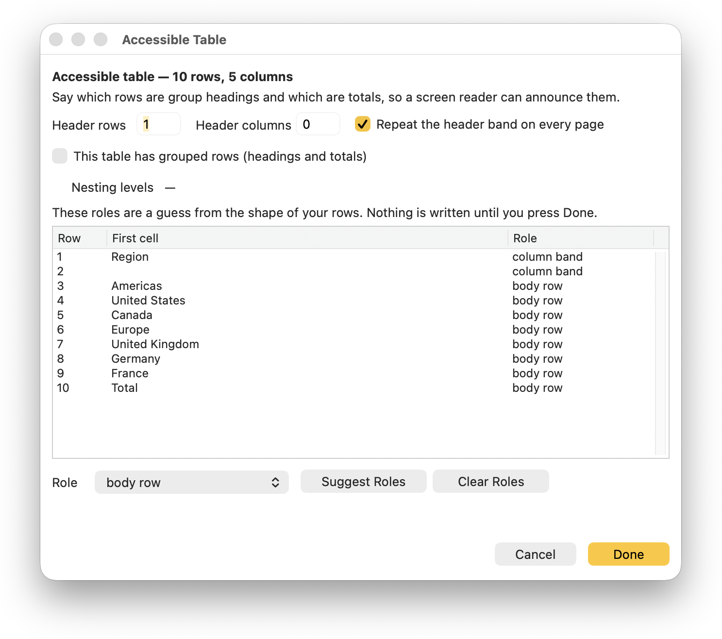
Figure 11. The Accessible Table dialog.
Caution: With row groups on, the engine works out /Headers for every cell itself - and overwrites a header cell's identifier along with them. Both keys you set by hand are discarded on such a cell, which is why Header Associations... is unavailable on a grouped table and says so in its own name.
Note: The tagging badges and the header tint are drawn for left-to-right tables. A right-to-left table is tagged correctly in the PDF, but the badges are mirrored on screen.
Merged cells
Merge Cell Right and Merge Cell Down join a cell to its neighbor; Split Cell undoes it. A merged cell cannot be divided by an insert, so a column inserted through the middle of one widens that cell rather than cutting it in two - the rows above and below gain a new cell as usual, and the table stays rectangular.
Rotating a cell's text
Block > Cell > Rotate Text turns the text of every selected cell to 90° (bottom-to-top) or 270° (top-to-bottom) - the way to fit long headings over narrow columns - and Upright turns it back. Only the text turns, not the cell. All the selected cells change in one undo step, and the status line says how many.
Undo and Redo
Edit > Undo (Cmd-Z) and Edit > Redo (Cmd-Shift-Z) cover everything in this chapter - moves, nudges, alignment and distribution, pin and release, reordering, in-place text edits, pastes, duplicates, and deletions. Each undo or redo step re-renders the page, so the canvas always reflects the document's current state.
5. The Structure Outline
The Blocks panel on the left side of the document window is the structure outline: every placed block in the rendered document, listed in reading order and indented to show what belongs to what. Where the canvas shows one page at a time, the outline shows the whole document at once. Use it to find a block anywhere in a long book, see at a glance which section it lives in, and rearrange content without touching the canvas.
How the outline is organized
Each row shows a type icon - paragraph, heading, image, table, and so on - followed by the first line of the block's own text. An image row shows its file name instead, and a list item shows its own (truncated) text so you can tell items apart. A block with no text of its own is named for its kind: Divider, PDF page, PDF contact sheet, Page break. The indentation follows the document's structure:
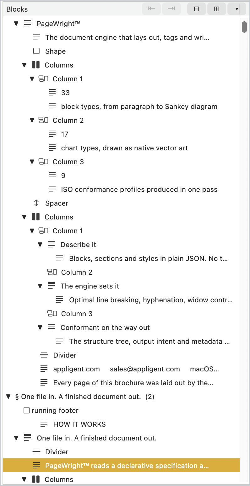
Figure 12. The Blocks pane with a paragraph selected.
- Document furniture comes first. Page furniture that applies to the whole document - the page template PDF, the running header, the running footer, and the watermark - appears as small rows at the very top of the list.
- Sections are collapsible rows. In a book, each section shows as a row marked with a section mark (§), labeled with the section's first heading (or "section N" when it has none). Everything in the section nests one level beneath it.
- Section furniture nests under its section. A section that sets its own page template, running header, running footer, or watermark shows those as small rows directly under the section row, before the section's blocks.
- Headings open scopes. The blocks that follow a heading indent beneath it, down to the next heading of the same or a higher level - the same run the heading owns when you move it.
- Containers own their contents. A list's items nest under the list they belong to, and a table opens to its rows - one row per band, not one row per cell. A row says what it is for:
Row 1 - header,Row 2 - group 1 · Revenues,Row 14 - total 2,Row 8 - repeats over data.lines. Cells are reached on the page or through Block > Cell, not from this list.
A blank document has no sections, so its blocks simply list flat.
Furniture rows are informational: you can't select or drag them. To change what they show, use Section > Section Properties... (Cmd-Shift-Y) for the page template and running bands, and Document > Watermark... for the watermark.
Collapsing and expanding
Any row that owns other rows carries a disclosure triangle. Click the triangle to collapse the row's subtree; click it again to expand. Double-clicking anywhere on a collapsible row toggles it too. From the keyboard, with a row selected in the pane, Right Arrow expands it and Left Arrow collapses it; on a row that is not expanded, Left Arrow moves up to the row it sits under. Hold Option with either arrow to expand or collapse the whole branch. Collapsing a section hides both its furniture rows and all of its blocks, which shrinks a long book down to one row per chapter. The collapse state and your scroll position survive re-renders, so the panel stays where you left it while you edit.
Filtering by block type
Sometimes the question is not "where am I" but "where are they all" - every H2 in the manual, every figure, every table. The pane's options button (the small downward arrow at the right of the Blocks header, also the top of any right-click menu in the pane) opens Filter by Type, listing every kind of block the document actually contains and how many there are. Headings are listed by level, so Heading 2 (48) is its own choice.
Pick one and the pane lists just those blocks, flat, in document order, each labeled with the page it is on - the sheet number, with the printed folio in brackets when a document numbers its front matter separately. The Blocks header names the filter and the count while it is on. Clicking a row selects and jumps to that block exactly as it always does.
All Blocks - the first choice in the same menu - puts the whole tree back, with your collapse state and scroll position as you left them. The filter belongs to one window, so a second window on the same document can show something else.
Note: Reordering by dragging is turned off while a filter is on: the pane is then a list of matches, and the gap between two of them is not a place in the document. Clear the filter to drag.
Click any row to select that block, or, once the pane has the keyboard, move with Up Arrow and Down Arrow; hold Shift to select several rows. If the block sits on a different page, the canvas jumps to the block's first page, highlights it, and the inspector shows its properties - the outline, canvas, and inspector always agree on the selection. Clicking a section's row jumps to the section's first page and shows the section's own properties in the inspector.
VoiceOver reads the pane as an outline, row by row; see Using PageWright Studio with VoiceOver in The Main Window.
Right-clicking a row offers the same common operations as the canvas - Edit Text..., Duplicate, Delete, and Properties..., plus table, list, chart, image, and shape commands when the selection supports them.
Tip: For text you can't spot by structure, use Edit > Find... (Cmd-F) instead - it searches every rendered block's text and jumps to each match.
Reordering blocks by dragging
Drag a row up or down and drop it where the block should go; the block is inserted before the row you drop it on, and the engine reflows the document around the new order. The drag unit is always a whole block:
- Grabbing a list item, a table row, or anything nested inside a cell drags the entire list or table it belongs to. A row cannot be reordered by dragging it; to move one, use the insert and delete commands on Block.
- Dragging a heading moves its whole scope - the heading plus every block nested beneath it - so a chapter's content travels with its title.
- Dragging a section's row moves the entire section, reordering the book's chapters in one gesture.
Note: Flow blocks are typeset by the engine, so they reflow rather than sit at fixed coordinates - dragging rows in the outline (or Arrange > Move Block Up/Down) is how you move flow content. Absolutely positioned blocks can also be dragged directly on the canvas.
Stories in the outline
A document with threaded text frames lists its stories at the top of the Blocks pane, above the page's own blocks - because a story belongs to no page until a frame pours it. Each story row carries its name and its state (Story "main" overflows · 3 frames), and its blocks are nested underneath in reading order: the order they pour, which is the order a screen reader announces them.
That includes blocks past the end of the last frame. Text that overflows is drawn nowhere, so it appears on no page and in no other pane - the outline is where you find it, and where you edit it.
Arrange > Move Block Up and Arrange > Move Block Down on a story's row reorder the stories themselves rather than moving a block, which is harmless: it changes where they sit in this pane and nothing about the printed page.
Moving a block into another section
To move a block from one chapter to another, drag its row onto the destination section - either onto the section's § row or onto any block inside it. A cross-section drop appends the block to the end of that section, and the engine reflows and repaginates the document. Dropping past the last row (or onto a furniture row) appends the block to the end of its own section.
Exporting the outline
View > Export Outline Map... saves the Blocks pane as a JSON file - one entry per row the pane shows, with the block's address in the document, its label, its depth and its type - named after the document (report.outline.json) and saved beside it. It is a record for scripts and reviews; the document does not change.
Edit > Copy Selection Path puts the selected block's address - a pointer such as /sections/0/blocks/1 - on the clipboard, and View > Go to Block... (Cmd-Shift-B) fills itself in from an address on the clipboard. Together they carry a place in the document from one window, or one person, to another.
6. The Inspector
The inspector is the right-hand pane of the document window. It always shows the current selection - the block you clicked on the canvas or in the outline - and gives you a Properties form for quick, structured edits, with Edit > Edit JSON... for everything the form does not cover. Three more panes share the pane's toggle: Style shows the selected block's resolved style with where each value came from, Document shows the document itself - its page, its variables and data - and Preflight keeps what the engine said about the last render. A positioned block is placed exactly from the Position group of the Properties form, and the format bar above the canvas edits the document from a different angle - mostly the text inside a block rather than the block itself.
Use the toggle at the top of the pane to switch among Properties, Style, Document, and Preflight. The two panes about the selection sit on the left, the two about the document on the right.
The Properties tab
The Properties tab is a form built from the block's own data and the PageWright schema. It starts with a header naming the block type, then lists the block's scalar properties, followed by a Style group (the block's style settings, or its named-style reference), a Crop group for a picture its frame crops (see Move a picture inside its frame in the Editors chapter), a Position group for positioned blocks, and a Content group summarizing collections such as list items or table rows.
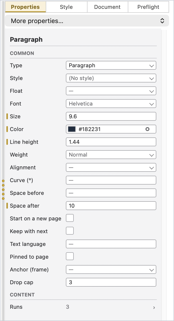
Figure 13. The Properties tab for a selected paragraph.
Click any value to edit it with the right control for its type:
- Numbers and strings open an inline text field over the value. Press Return to commit, Esc to cancel; clicking elsewhere also commits.
- Enumerated values such as alignment pop up a menu of the values the schema allows - pick one and it applies immediately.
- Booleans are checkboxes; clicking toggles the value.
- Colors show a swatch beside their value. Click the swatch for the system color picker, click the value to type a hex code, or click the dot at the right for the full color editor - gray, RGB, CMYK, or a spot ink with its tint. A color that is not set yet shows an empty, crossed-out swatch; click it to pick one. The picker keeps a color's opacity: a translucent
#rrggbbaaopens at its own opacity and comes back with it. A color written in gray, CMYK or a spot ink opens the color editor from the swatch as well, so it stays in its color space. - Borders and rules written as text - a width alone, such as
0.75, or a cell border shown as2 #c0202a- have a swatch too, in the color of the line, black when only a width is set. Click it to pick the line's color; the width stays. A row with no line yet, such as a table's Header rule, gets the width that property starts at, 1 point for a header rule and 0.5 for row rules. Typing0.4 #d3dae3still works. - Inset values (margins, padding) show four cells - top, right, bottom, left - and each cell edits independently.
- Lengths - a padding, a width, a gap, a size - are in points, 72 to the inch, but you can type a unit:
0.125in,3mm,2.5cm,12pt. The value is converted to points and the status line says what it came to ("0.125in is 9 points"). A row that counts something, such as a list's Start at, takes a plain number. - Collections drill down: clicking one selects the first child, so you can walk into list items or table cells.
Every edit re-renders the page, so you see the result at once. Each change is a single undo step.
With VoiceOver, every row of every pane reads its name and value, and VO-Space does what a click does; on this tab, VO-Shift-M opens a row's right-click menu. See Using PageWright Studio with VoiceOver in The Main Window.
What a property means
Every property row explains itself: rest the pointer on a property's name for a moment and its description appears - the same text the PageWright schema carries for that key, so it says what the engine actually does with the value, what units it is in, and what the allowed values are. It is the fastest way to answer "what can I type here?" without leaving the page.
Adding a property
The More properties... popup above the property list is schema-driven: it offers every scalar key the schema allows on the selected block's type that is not already set - a field block lists all of its AcroForm keys - plus the style.* keys. Choosing one adds the key with a sensible default, and its row appears in the list, ready to change.
Tip: When you add an inherited style property such as style.fontSize, PageWright Studio seeds it with the block's current effective value, so adding the key never changes how the block already renders - you then adjust it from there.
The Position group
A positioned block - a form field, a pinned block, a shape, a label - has a Position group with four rows. X and Y are the distance from the top-left corner of the page to the block's top-left corner, and Width and Height are the size of its box. All four are listed whether or not they are set, and one that is not set shows a dash. Click a row, type the value, and press Return. A plain number is points - 72 to the inch - and a value with a unit is converted to points: 6in, 150mm, 2.5cm, 12pt. The status line says what a converted value came to.
X and Y must always have a value, so emptying either one is refused. Empty Height and the box grows to fit its content; give it a height only when it has to stay that size, because text that does not fit is cut off, and the status line and the Preflight pane say so. Empty Width and the box is 144 points (2 inches) wide. A width or height of 0 or less is refused; empty the row instead.
In the JSON, a size written with the short keys w and h shows here as well, and changing it writes width and height in their place.
A form field also has Width and Height rows in its Common group. Those size the field's control; the Position group's Width is the whole box it sits in, label included.
A flow block - a paragraph, a heading, a list - has no position, because the engine places it. Tick Pinned to page in its Common group, or choose Arrange > Pin to Page (Absolute Position), and it stays where it is and gains a Position group. See Flow Blocks: Reorder, Pin, and Release in the Editing chapter.
Counting the collection
The Content group at the foot of the list gives a collection its own editable count - Rows and Columns on a table, Items on a list, Cards on a card grid, Series on a chart. Type a larger number and the collection grows, appending entries shaped like the ones already there. Type a smaller one and it shrinks from the end.
Caution: Shrinking a count deletes, so it asks first - and says what is going: "Delete the last 3 rows of this table?", then whether they are empty, some have content, or all do. Cancel is the default button, and both Return and Escape cancel; only a click on Delete Rows goes through.
Growing never asks.
Table headers
A table's Header rows and Header columns sit together in its Common group. They are counts, not switches: 1 makes the first row, or the first column, a header band; 2 makes two. The cells in those bands are tagged as headers in the exported PDF, and are tinted on the canvas whenever the table is selected.
Setting either one is what clears the "table has neither header rows nor header columns" finding in File > Check PDF Compliance. A matrix whose left column labels its rows needs both.
Note: Header rows and columns are a tag, not a look - they change what the PDF says about the table, not how it is drawn. Style the header band itself through the cells' own formatting, or a named style.
Table row, column, and cell properties
Select something inside a table and the inspector gains up to three more groups, named for what they act on: Table row, Table column N (the number is the column the selection sits in), and Table cell.
| Group | Rows | What each writes |
| Table row | Min height, Keep together, Header row | A floor on the row's height, whether it may break across a page, and whether its cells tag as headers |
| Group level, Total row | Which level of the hierarchy the row opens or closes | |
| Repeat over, As name | The data path the row repeats over, and the name each record binds to | |
| Accessible Table... | A door - see below | |
| Table column N | Width, Align, Style | The column's own width and the alignment and named style its cells inherit |
| Table cell | Padding, Background, Vertical align, Rotate text | The cell's own look |
| Header cell, Id, Border | Whether this one cell tags as a header, the identifier other cells point at, and its own border | |
| Headers... | A door - see below |
Min height is a floor, not a height: a row never renders shorter than its content, so setting 12 on a row whose text needs 21 still renders 21.
Group level and Total row appear only when the table declares row groups, or when the row already carries one of the markers. Without row groups the two keys are inert - the engine ignores them - so the pane does not offer a control that would change nothing.
The last row of a group is a door: it shows a summary and a chevron, and clicking it opens the dialog that owns the key rather than editing it in place. Accessible Table... summarizes the hierarchy ("2 groups, 2 totals", or "not a hierarchy"), and Headers... on a cell reads "2 header cells", or "derived by row groups" for a table where the engine works them out itself. Those two keys have editors of their own, and a list of identifiers is not something a text field can sensibly hold.
Document properties
Most properties belong to a block, but a document has properties of its own - its language, its binding direction, how it numbers figures, which fonts it may embed. To reach them, select the document itself.
There are three ways in, and they all land in the same place:
- Choose View > Select Document.
- Click the row at the top of the Blocks outline - it carries the document's title, above the page-furniture rows.
- In the Document pane, click the Title or Page readout.
The Properties tab then describes the document. Title, Author and Language are ordinary editable rows. Below them, any other document-level key you have set appears under Document keys - an object or an array shows as compact JSON, which is a home for the value rather than an editor for it.
Reading & tagging and Page & type hold readouts and doors. A readout reports a fact you change elsewhere; a door - the rows ending in ... with a › - opens the dialog that owns that part of the document.
Note: Tagged is a readout, not a checkbox, and deliberately so. A PDF/A level ending in a, and any PDF/UA level, force tagging on whatever the tagging setting says. A checkbox here would let you create a document whose claim and whose structure disagree. The readout tells you what the exported file will actually claim; Output Standards... below it is where you change it.
More properties... on the document
The More properties... popup works here exactly as it does for a block, offering the document-level keys the schema allows that you have not already set - binding, kerning, hyphenation, ligatures, kashida justification, numbering, notes, and the rest of the long tail.
It deliberately does not offer everything. Keys that are the document's body - its blocks, sections and pages - are never offered, because setting one from a popup would replace your document rather than describe it. Neither are keys a dialog owns outright, such as attachments or page setup: an empty object added from a popup is worse than the one the dialog would have built for you.
Edit Document Keys...
At the foot of the pane, Edit Document Keys... opens the same JSON editor a block gets, on a projection of the document: the top-level keys, without the body. Deleting a key from that text removes it from the document; the blocks, sections and pages are never shown and can never be changed there, so an editing mistake cannot cost you your content.
Editing the raw JSON
Edit > Edit JSON... opens the selected node exactly as it lives in the spec. The item names what it will open: it reads Edit Document Keys... when the document itself is selected, and it is available whichever inspector pane you are on, because it acts on the selection rather than on the pane. Edit the text and click Apply Changes to write it back and re-render. This is the escape hatch for anything the form does not cover - nested arrays, styled runs, chart series, a barcode's code field, or a structure you are building by hand. The first line of the editor is the node's address in the document (its JSON Pointer); leave it alone, or delete it - either way it is not part of the block.
Caution: Apply Changes replaces the whole node with what you typed. If the JSON does not parse, nothing is applied - fix the syntax and apply again.
The Style pane
The Style side of the toggle answers "why does this look like that" - for a block, or for a run of text inside one. For the selection it lists every style value that reaches it - from the document default, any container or list or table it sits inside, the paragraph a run lives in, a named style, or the selection's own settings - with the value each key resolves to and, in the right column, who set it.
The values are the engine's. When the document is open, the pane asks the typesetter what it actually resolved, so a heading shows the size, weight and spacing it is drawn with rather than the document default its style inherits. A value that no level of your document set - a heading's built-in size, for instance - says engine rule in the source column. While the engine's answer is still arriving the pane shows your document's own values and says so at the foot of the list.
The source column is the point. A value set by a container or a paragraph is a link: click it and the selection jumps there, whose own cascade the pane then shows - that is where the value can be changed. A value from a named style opens Format > Named Styles..., where redefining it changes every block that uses the style, and a link's colour from the document's link style opens Document > Document Properties..., where the link style is set. Values from the document default or the selection itself are stated but inert.
Two kinds of property do not travel the way a font does:
- Box properties stay with the block that sets them. Background, padding, border, spacing before and after, and the rest of a block's box never reach the blocks inside it - not from a container, and not from the document default either. The pane lists them only for the block that owns them.
- A run cannot change its paragraph's shape. Alignment, line height, word spacing and direction come from the block, so a run's pane marks them block only. A box or block-only property written on a run anyway is listed as ignored on text, beside the value the text really uses, so you can find it and remove it.
Changing a run's style
For a block the Style pane only explains; for a run it is also where the run's formatting is changed. Select a run by drilling into a paragraph's Runs row on the Properties tab, and use its Run row to move to the others. The Style pane then lists the properties text most often needs - font, size, bold, italic, underline, strikethrough, colour, small caps and letter spacing - even when nothing sets them, each at the value the run draws with now, and the values work like the Properties tab's: tick a box, pick from a menu, click a swatch for the colour picker, or click a number to type one. Click the left two columns to change a value; the source column keeps its links.
- The style row at the top names the run's named style. Its menu picks a different style (the run's own changes are kept), (No style) (drops only the name), Clear overrides (back to the plain named style, offered when the run has changes of its own), Clear formatting, and Manage Named Styles....
- Clear formatting removes how the run looks - its style, named style included, superscript or subscript, and any baseline shift. What the text is stays: its link, language, notes and conditions.
- + Add a style property... at the foot adds a row for a less common property - overline, stretch, outline colour and width, or a text effect. Adding the row writes nothing; the run changes only when you change the value.
- Block-only and ignored rows stay read-only, because a run cannot use them. When the run set an ignored property itself, the row offers Clear to take it off. A background on a run offers Use as highlight instead: text draws no box behind itself, so the property becomes the highlight effect that was almost certainly meant, in the same colour.
A change that restates what the run already inherits is not written, so setting a word back to its paragraph's size removes the override instead of copying the size onto the word - and the pane measures that against what the run really inherits, including a heading's built-in size and weight and the document's link style. When a change leaves a run identical to the run beside it, the two become one and the selection moves to it. Each change is a single undo step.
A run on the Properties tab
A picked run's Properties tab lists what the text is: its Text, Link, Language, Superscript, Subscript and Baseline shift, its Footnote and Endnote, and whatever an inline object carries of its own, such as an equation's spoken reading. How the run looks is not listed there; a Formatting row points to the Style tab, where it is changed.
Baseline shift moves the run off its baseline by a number of points: a positive number raises it, a negative one lowers it, and either is added to where Superscript or Subscript puts the run - so a small superscript ™ can be lifted to the top of the capitals, or a subscript set lower. A unit can be typed (0.5mm), and an empty row or 0 removes the shift. Only the text moves: the line keeps its height.
While a run is picked, the Blocks pane highlights the paragraph it belongs to. Esc steps up to that paragraph, and a second Esc clears the selection. Delete does not remove a run's words - edit the paragraph and delete them there - but it does delete an inline object that has no words to select, such as an equation, a form field or a cross-reference. The undo step names what went, and Edit > Undo puts it back.
The Style pane while you edit
While the text editor is open on a block, the Style pane is about the text rather than the block.
- With nothing selected it reads At the cursor in "word" and shows what the character before the cursor draws with, every value with where it came from. The values are read-only here, and the foot of the pane says Select text to change its style.
- With text selected it reads Selected text and the number of characters. Each value is what every selected character draws with, or Mixed, marked differs, where they do not agree. The values become controls, the same ones a run gets, and a change applies to every selected character at once, exactly as the matching Format menu command does.
The style row shows the selection's named style and offers the same menu as for a run: a named style (each piece of text keeps its own changes), (No style), Clear overrides, Clear formatting and Manage Named Styles.... The paragraph's own properties, such as alignment and line height, stay read-only, with a link to the paragraph; clicking that link finishes the edit and selects the paragraph. The pane follows the cursor as you move it.
A badge is formatted as a whole, so a selection that is only a badge's label shows its values without controls and says how to reach the badge instead.
The Properties tab while you edit
With text selected in the editor, the Properties tab is about that text: it reads Selected text and the number of characters, then lists the selection's Link, Language, Superscript, Subscript, Baseline shift, Footnote and Endnote, each reading Mixed where the selected characters disagree. Clicking Link, Language, Footnote or Endnote opens the same dialog as the menu command, on the same values. Superscript and Subscript toggle, and turning one on turns the other off. Clicking Baseline shift asks for the points to move the selected text by - 2 raises it, -1.5 lowers it, and an empty answer removes the shift. With nothing selected, the tab shows the paragraph.
Note: The pane lists only what reaches the selection. Everything it does not mention renders at the engine's defaults - so a short list is not a sparse pane, it is plainly styled text.
The Document pane
The Document side of the toggle is about the document rather than the selection: the title, the page size, and a live count of what the last render produced. Below that, the document-level state that otherwise lives behind dialogs:
- Variables lists the document's
{{token}}values; click a row or Edit... to change them in Document > Variables.... - Data summarizes the inline record, row set, or data file feeding Repeat and Conditional blocks, with Edit... opening Document > Data Sources....
Tip: The Document pane never needs a selection, so it is also the answer to an empty inspector: click Document with nothing selected and the panel has something useful to say.
The Preflight pane
The Preflight side of the toggle keeps everything the engine reported about the last render, where the status line shows only the first line of it and the next render wipes even that. A render that succeeds can still have ignored something: the engine refuses a key it cannot honor, says exactly what it kept and why, and carries on - so the page looks fine and the only sign is a sentence here. When a render fails outright, the failure is kept too.
Accessibility findings
When a document declares a WCAG level, every render checks it and the findings land here alongside the engine's other notices. Each carries its level - A, AA or AAA - in the gutter where other rows show a warning triangle, then the criterion, and what was measured: 1.4.3 Contrast (Minimum) - 1.92:1 for normal text (#bbbbbb on #ffffff); 4.5:1 required. The heading counts them separately, so 2 WCAG findings, 1 problem from the last render tells you which kind you are looking at.
Two more rows, marked with an information glyph rather than a warning, say what the check did and did not look at. They are the engine's own words, not a summary, and they are not defects - nothing is wrong because they are there.
Clicking a finding selects the block it names, with one honest caveat: a contrast finding selects the block, not the exact run inside it. The engine names the run, and for an ordinary paragraph the document has no separate run to select - so the pane takes you to the block you have to open anyway.
A long document is capped at twelve findings in this pane, with a row saying how many more there are; File > Audit Accessibility... lists them all.
A problem that names a block is a link - its marker draws in the accent color with a chevron at the row's edge, and clicking it selects that block, ready to fix. The count on the toggle - Preflight (2) - is how you know there is something to read without opening the pane. Each new render replaces the list, so what you see always describes the document as it is now.
Condition tags - marking content so that it is left out for some audiences - are not available in this version; editing them arrives in the next. A document made with them in an earlier build still opens, and saving it keeps its tags and the conditions on its blocks exactly as they were. Every render is a final build: content under a hidden tag is left out of the preview, the exported PDF and the printed page alike, and nothing is drawn tinted or struck through, even in a document that was saved for author review. After each render the Preflight pane says that the document carries conditions and names the tags that are hidden. The Document pane lists each tag as Shown or Hidden, and a block that carries a condition shows it in the Properties pane as a Condition row you can read but not edit.
Caution: Some hidden content still prints. A condition on text in a running header or footer is not applied, and neither is a condition on anything inside an included partial file: that text prints whether its tag is hidden or not. When a document has either, the notice says so.
A condition that names a tag the document does not list - a misspelling, or a tag renamed after the condition was written - counts as shown, and the notice cannot warn you about that. A book is the one place a final build is not guaranteed: a chapter file that an earlier build saved for author review still shows its hidden content, struck through, inside the book.
The notice names each such chapter; check those pages before you send the file.
Editing from the format bar
The format bar above the canvas edits the same document from a different angle - but not always the same thing the inspector is showing, so it is worth knowing which control aims where.
- The Font and Size popups act on characters you have selected in the in-place editor, not on the block in the inspector. Both stay disabled until you double-click a text block to open that editor, and with the editor open but nothing selected they say so rather than guessing - "Select some text first, then choose a font". Each tracks the cursor as you move it through differently formatted text, so an opened menu carries its checkmark on the typeface or size under the cursor. Size lists the usual sizes plus Other size... for anything else, and a size already used in the text joins the list so that it can be shown.
- The Style: popup is the one control on the bar that acts on the block the inspector is showing. It needs no editor - only a selected block and at least one named style in the document - and it applies a style reference, so redefining the style later still reaches the block. (No style) removes the reference and leaves any local formatting standing.
Note: Applying a named style to a block that already carries formatting of its own keeps that formatting: the block references the style and keeps its local settings, and the inspector's Style row then reads Heading 1 (modified). To drop the local settings too, use Clear overrides on that row's menu - the format bar's popup offers only (No style) and the style names.
For creating and redefining named styles themselves, see Format > Named Styles... (Cmd-Y).
Section properties
In a sectioned document, the outline shows each section as its own row. Clicking a section row jumps to the section's first page and shows the section's own properties in the inspector - the header reads Section, and its keys (numbering settings, columns, margins) edit like any block property. Object-valued settings, such as a running header or footer band, display as compact JSON; edit those through Edit > Edit JSON..., or use the dedicated dialog at Section > Section Properties... (Cmd-Shift-Y), which covers the full page grid, numbering, and running bands with a friendlier form.
7. Inserting Content
Every block a document can hold - text, tables, images, vector graphics, charts, cards, barcodes, and data-driven content - is added from the Insert menu. The left tool palette offers the everyday content blocks as well, so you can work from whichever is closer to hand.
Click-to-place
Positioned inserts - shapes, SVG images, and text frames - are a two-step gesture: choose the block from the Insert menu, then click the spot on the page where it belongs. The block appears at the click point, already selected, ready to edit in the inspector. Content blocks skip the click: they go into the flow after the selected block and are selected immediately. A chart is a content block: Insert > Chart puts it after the selection, and Arrange > Pin to Page positions it.
Tip: Click-to-place obeys the snap grid when View > Snap to Grid is on - hold Cmd while clicking to place freely. View > Show Grid makes the grid visible while you work.
Drag from the palette
The left tool palette adds the one-gesture alternative: press a tool, drag onto the page, and release. As you drag a content tool over the page, a blue insertion line shows the gap where the block will flow in, so you place it exactly where you want - drop high in the flow and it lands high, drop low and it appends at the end, regardless of the current selection. A form field instead drops as a positioned block right at the release point. A drag places a single block and leaves nothing armed, so it never becomes a repeated-placement mode. Click-to-place still works alongside it, so use whichever gesture is closer to hand.
Tip: The insertion line uses the drop location, not the selected block - the same blue line you see when you reorder blocks by dragging their outline rows. Clicking a content tool, by contrast, inserts after the current selection.
Drop a picture from the Finder
Drag a picture file from the Finder onto the page or the Blocks pane:
- Onto an image, it replaces the picture. While you drag, the image under the pointer is outlined and labeled Replace image, whether it is selected or not. Everything else about the block stays: its size and place, fit, corners, border, shadow, crop shape, link, and caption.
- Onto a template's picture placeholder, the dashed box that says Replace with your cover image, it becomes an image that fills the box.
- Anywhere else, it adds a new image where a dragged Image tool would land: in the gap under the pointer on a flowing page, and at the drop point on a designed page.
- In the Blocks pane, drop onto an image's row to replace its picture, or between rows to add a new image there.
- In Edit Master Page, a drop reaches the master's frames, as a click does: onto a frame's picture it replaces the picture, and anywhere else it adds a new frame at the drop point. The page's own content is not what the mode edits, so a drop never lands in it.
The replaced image's alt text is cleared, because it described the old picture: describe the new one in the inspector. If the old picture's crop was aimed at part of it, the new one is centered again, and if the old one was turned or mirrored to stand upright, the new one is not: use Rotate Picture (see Image effects in the Editors chapter) if it needs a turn. An image whose picture came from merge data is replaced too, and that data field no longer supplies it. Each drop is one step to undo.
PageWright Studio stores the picture's location relative to the document, so the document and its pictures move together. A picture already in the document's folder is used where it is; one from anywhere else is copied into an images folder beside the document. A document you have not saved yet, such as a new one from a template, points at the picture where it is until its first save, which copies it in. A picture placed with Insert > Media > Image... is stored the same way.
Drop one picture at a time: a PNG, JPEG, GIF, TIFF, or WebP file, or HEIC on a Mac. To place an SVG use Insert > Media > SVG Image..., and for a page of a PDF use Insert > Placed PDF > PDF Page....
Emoji
Insert > Media > Emoji..., the Emoji... tool on the palette's Media group, and Window > Emoji all open the Emoji window. There is one for the whole app, and it floats above your documents, so you can drag from it onto any of them. Closing it only hides it; it opens again where you left it, at the same size, set, category, and view.
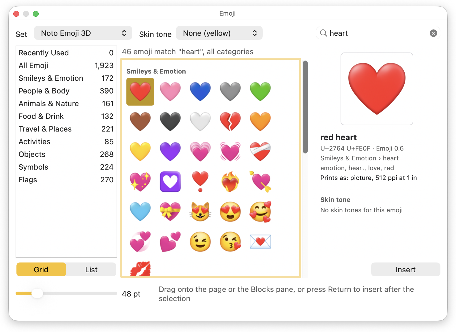
Figure 14. The Emoji window.
- Set chooses the artwork: Noto Emoji 3D, the default, or Noto Emoji 2D.
- Skin tone, beside it, sets the tone every emoji that comes in skin tones is shown and inserted in, unless you chose one for that emoji: None (yellow), the default, Light, Medium-Light, Medium, Medium-Dark, or Dark. See Skin tones, below.
- Search finds emoji by name and by keyword (love finds the smiling face with hearts), by code point (U+1F600 or 1f600), or by an emoji pasted in; one pasted with a skin tone shows in that tone. Names that hold your words as whole words come first, the ones that say least besides them leading, so heart starts with the red heart; then names where your word only begins a longer one (hearts); then emoji that match by keyword. Results come from every category, grouped under their category's name, and the line above the grid says how many matched.
- Categories, on the left, starts with Recently Used, then All Emoji and each group, every row with its count. Under it, Grid and List show the results as a grid of pictures or as a list.
- The slider at the bottom makes the emoji in the grid larger or smaller, from 24 to 160 pt. It changes only what you see in the window, and it is off in the list; from 80 pt the names show under the cells.
- The detail area on the right shows the selected emoji large, with its name and code points in the skin tone it shows, its Unicode version, category, keywords, and how it prints. The skin-tone swatches are under it.
To put an emoji in your document:
- Drag it, from the grid or the list, onto the page or into the Blocks pane. It lands where a dropped picture would: in the gap under the pointer on a flowing page, centered on the pointer on a designed page, and at the insertion line in the Blocks pane. Dropped on text, it goes in after that paragraph.
- Select it and press Return, double-click it, click Insert, or choose Insert from its menu: it goes in after the selected block of the front document.
Each emoji goes in 1 inch (72 pt) wide, as a block of its own that you size, move, and style like any picture. Its alt text is the emoji's name, such as grinning face, with its skin tone when it has one: thumbs up: medium skin tone. An emoji from the 3D set is a picture that prints at 512 ppi at that size; one from the 2D set is vector art, sharp at any size. Each insert is one step to undo.
Dropped on a picture, an emoji replaces it, as a picture file from the Finder does, with three differences. The alt text becomes the emoji's name instead of being cleared. An emoji from the 3D set keeps the image block and sets the picture to fit inside the box, so a square emoji is not cropped. An emoji from the 2D set turns the block into vector art, which cannot hold a border, rounded corners, a shadow, a link or a fit, so those settings go; an alignment that vector art cannot take goes too, or becomes the side it meant. The status line lists what changed. The block keeps its size, place and caption, and the replace is one step to undo.
Hold Option as you drop an emoji on a picture on the page, and it goes on top of the picture instead, leaving the picture as it was. While you drag with Option held, the outline over the picture reads Add on top. On a designed page, and in Edit Master Page, the emoji is centered on the pointer, in front of the picture. On a flowing page, a picture pinned to the page, or inside a pinned block, takes one the same way: the emoji is pinned in front of it. A picture that flows with the text cannot carry one, because the emoji would not move with it: while you drag, the insertion line shows the gap after the picture instead of an outline, the emoji goes in there, and the status line says why. Pin the picture to the page first to put an emoji on it. Option makes no difference in the Blocks pane, where a drop on a picture's row still replaces it.
While a document holds Noto emoji, its PDF records the artwork's licence notice in its metadata, and the notice goes again when the last emoji leaves. If the document already has a rights notice of its own, PageWright Studio adds the emoji credit after it, separated by a semicolon, whenever emoji arrive: inserted, dropped, or pasted, duplicated or moved in from another document (then at the next save or export). The status line says so. Your own words are never changed: when the last emoji leaves, exactly that credit comes off again, leaving your notice as you wrote it, and a notice that already credits the artwork in your own words gets nothing added. If you delete the credit yourself, saving and exporting leave it out, and the export's status line reminds you the artwork is not credited; it comes back only when more emoji arrive.
Skin tones
Many emoji of people, hands and gestures come in five skin tones as well as the yellow they have with none. The Skin tone popup at the top of the window sets the tone all of them are shown and inserted in. To give one emoji a tone of its own, select it and click a swatch under the detail area, or choose one from Skin Tone on its menu. That choice is remembered for that emoji, whatever the popup is set to later. An emoji that comes in skin tones has a small triangle in the corner of its cell; for one that does not, the swatch area says No skin tones for this emoji.
An emoji of two people, such as people holding hands, has two rows of swatches, Left person and Right person. While both are yellow, a tone chosen for one person goes to both; then choose the other person's. None (yellow) for either person makes both yellow, because the artwork has no pair with one person toned and the other not.
The emoji follows its skin tone everywhere: its cell and its row in the list, the name and code points in the detail area, an insert or a drag, Copy Emoji and Copy Name, and the alt text of what goes in.
Note: Skin tones need artwork for them. When the set on show has none, as in the Emoji Art pack without skin tones, the Skin tone popup is dimmed at None (yellow), the swatches are dimmed with Skin tones need the Emoji Art pack with skin tones under them, no cell shows the triangle, and every emoji goes in yellow.
The tones you chose are kept, and come back when artwork with skin tones is installed. The Emoji library line on the Engine tab of PageWright Studio > Settings... says which you have.
Recently Used
Recently Used, the first row in Categories, holds the last 35 emoji you put in a document, by Return, a double-click, Insert, or a drop, with the most recent first. Each emoji is there once, in the skin tone it last went in with, and inserting it from there uses that tone again unless you choose another. Copying an emoji does not add it, and neither does a drag that puts nothing in.
To take an emoji out, choose Remove from Recently Used from its menu, in Recently Used or anywhere else in the window, whatever tone it shows. To empty the list, right-click the Recently Used row, or an emoji while Recently Used is showing, and choose Clear Recently Used. The list is kept from one session to the next, and clearing it cannot be undone.
Grid and list
Grid and List, under Categories, switch how the results are shown. The list holds the same emoji in the same order, a row each without the group headings, under the headings Emoji, Name, and Code points, each in the skin tone it shows. Everything else works as in the grid: a click selects; Return, a double-click, or Insert puts the emoji in; a row drags onto the page or into the Blocks pane; and a right-click opens the emoji's menu. Up Arrow and Down Arrow move from row to row. Every row is the same size, so the slider and the size commands are off in the list. The window remembers which view you chose.
Right-click an emoji in the grid or the list, or Control-click it, to select it and open its menu:
| Item | What it does |
| Insert | Puts the emoji in after the selection, as Return does. Dimmed, as the Insert button is, when no document is open or the emoji's picture is missing from the emoji library |
| Copy Emoji | Copies the emoji as a character, in its skin tone |
| Copy Name | Copies its name, in its skin tone: the words its alt text will be |
| Skin Tone | Chooses its skin tone, as the swatches do, with the current one checked; for two people, a submenu for each person. Dimmed for an emoji with no skin tones, and when the artwork has none |
| Remove from Recently Used | Takes it out of Recently Used. Dimmed when it is not there |
| Clear Recently Used | Empties Recently Used. On the menu only while Recently Used is showing |
A click selects an emoji and never inserts it. A click anywhere in the Emoji window also gives it the keyboard, even while you are typing in a paragraph, so Return then inserts the emoji instead of starting a new line. Dragging an emoji out of the window, or moving the window by its title bar, does not take the keyboard. After a drop, the document has the keyboard, with the emoji you dropped selected, as after dropping a picture from the Finder: dropped on the page, Delete removes it and the arrow keys nudge it; dropped in the Blocks pane, the pane has the keyboard with the new row selected. A drop that puts nothing in leaves the keyboard where it was. Return, a double-click and the Insert button leave the keyboard with the Emoji window, so you can go on choosing.
Tab moves from the search field to Categories, the grid or the list, the skin-tone swatches, and Insert, and Shift-Tab goes back. Typing while the grid, the list or the swatches have the keyboard goes to the search field, and Esc clears the search, then closes the window. In the grid the arrow keys move the selection, and in the list Up Arrow and Down Arrow do; in either, Cmd-Up and Cmd-Down jump between categories. On the swatches, Left Arrow and Right Arrow choose the tone beside the chosen one, Up Arrow and Down Arrow move between the two people's rows, and Space chooses the swatch the keyboard is on. The Keyboard Shortcuts appendix lists every key.
While the Emoji window has the keyboard, the menus are named for what they will do there. Edit > Undo, Edit > Redo, and File > Save act on the front document; Edit > Copy reads Copy Emoji and copies the selected emoji as a character, in the skin tone it shows; Edit > Find... goes to the search field; View > Zoom In and Zoom Out become Larger Emoji Size and Smaller Emoji Size and change the size of the cells, and View > Zoom to Fit, Zoom 100% and Zoom 200% become Default Emoji Size, Smallest Emoji Size and Largest Emoji Size, so Cmd-0, Cmd-1 and Cmd-2 set the cells to 48, 24 or 160 pt instead of zooming the page (Zoom 75% and Zoom 150% are off, and in the list view all five size commands are off); and File > Close Window closes the Emoji window, not your document. In the search field, Cut, Copy, Paste, and Select All work on the search text, and Edit > Delete Block(s) reads Delete: Cmd-Delete deletes the search text back to the start. Commands that act on the document's selection, such as Duplicate and Edit Text, are off until you click back in the document, and every menu item has its own name again. The rest of the menus still act on the front document: the Format commands (Cmd-B, Cmd-I and the alignment shortcuts) change its selected text, and choosing a footnote, link or badge from the Insert menu opens it for typing in the document.
Note: With VoiceOver, the grid reads the emoji in view by name, in the skin tone each shows, and VO-Space selects one; press Return or the Insert button to put it in. VO-Shift-M opens an emoji's menu. The swatches are buttons named for their tones, with the chosen one selected, and choosing one reads the emoji's new name.
The list view puts every result in VoiceOver's reach, not only those in view. After a search, VoiceOver says how many emoji matched. With no document open the window still opens, and Insert says what it needs. If the window cannot find its emoji library, it names the folder it looked in and how to point PageWright Studio at another: the Emoji library row on the Engine tab of PageWright Studio > Settings....
Content blocks
The menu leads with the everyday building blocks:
| Block | What it inserts |
| Paragraph | Body text |
| Heading / Subheading | Section titles |
| Bulleted List / Numbered List | List blocks |
| Table | A table you fill cell by cell |
| Image... | A picture file, centered at 60% of the column width; its Alignment row in the inspector moves it |
| Call-out Box | A boxed aside |
| Preformatted Text | Fixed-pitch text, spacing preserved |
| Spacer | Vertical breathing room between blocks |
A new paragraph, heading or subheading takes the document's own named style for it - body, heading or subhead - when the document defines one, as every template's own blocks do. That is what gives a paragraph the space after it that the style asks for, and what lets Format > Named Styles... restyle every heading at once.
Inside a box that sets its own text color - a dark card with white words - a new block takes no named style, because a named style's own color would cover the box's. It follows the box, as the box's first paragraph does, and keeps following it when the box's Color changes. A block whose own style sets a color keeps it: when you give a box a Color, the status line says how many blocks inside keep their own and which styles give it to them.
Content blocks are flow blocks: the engine typesets them in order, so they reflow rather than drag. Double-click a text block to edit it in place, reorder a block with Arrange > Move Block Up or Move Block Down, or use Pin to Page to freeze it at its current spot as a positioned block you can drag.
Block > Highlight Code colors a preformatted block by its language. JSON gets full syntax coloring - keys, strings, numbers, and true, false and null - and any other language a plainer two-tone version. The text stays editable and is colored again as you change it.
Equations
Insert > Text > Equation... sets mathematics. Type the equation in LaTeX, such as \frac{-b \pm \sqrt{b^2-4ac}}{2a}, or tick Source is MathML and give it MathML instead; LaTeX is converted to MathML for the PDF. An equation is set off on its own line unless you tick Inline equation, which sizes it to sit in a line of text. Preview sets it as it will print, and Insert puts it in the document as one undo step.
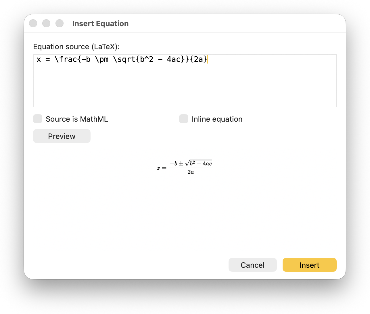
Figure 15. The Insert Equation dialog.
Cards, grids, and gauges
Card-style blocks build the dashboards and scorecards the engine is good at. All four sit on the tool palette and in the Insert menu, and each flows with the text like any content block:
| Block | What it inserts |
| Card | A rounded container with a colored top stripe, a hairline border, and a minimum height - a styled box you fill with any blocks |
| Card Grid | A row of equal-width KPI tiles that wrap to fit the page and continue onto the next page a row at a time |
| Columns | Two blocks placed side by side, each column a fixed, fractional (1fr), or shrink-to-content (auto) width |
| Bar Gauge | A rounded meter whose fill shows a value as a fraction of its maximum |
Each inserts a styled starter you refine in the inspector. A card's look lives in its style: radius rounds the corners, stripe paints a colored edge band, minHeight sets a floor, and a {color, alpha} background lays a translucent tint over the page. Add any of these with the inspector's + button, which offers every style key the engine understands.
Tip: A Card is just a container, so you can drop any blocks inside it - a heading, a paragraph, even a chart. Build a KPI tile by hand that way, or start from a Card Grid and edit its tiles.
With a card grid or one of its cards selected, Block > Add Card adds a starter tile after the selected card, or at the end, and Block > Delete Card removes the selected card, or the last one; a grid always keeps at least one card. Each is one undo step.
Shapes
Insert > Shape drops a Rectangle, Ellipse, Line, Polygon, or Bezier Curve at the click point. A shape has a fill, a stroke, and an absolute position, so it drags and resizes like a form field. Right-click a shape for Gradient Fill... when a solid fill isn't enough.
A Bezier Curve arrives as a two-segment S-wave and is reshaped right on the canvas: drag a square anchor to move a point the curve passes through (its tangent handles ride along), or drag a round control handle to bend the curve on its way through that anchor. Double-click anywhere on the curve to add an anchor at that spot, and Option-click an anchor to remove it - a curve keeps at least two. Square versus round is the whole vocabulary: the squares and dots inside the frame reshape the curve, while the eight round handles outside it still resize the box, which scales the curve with it. The raw path lives in the inspector's Path data row as ["M",x,y] / ["C",x1,y1,x2,y2,x,y] commands in a 0-100 view box, so it can also be edited as text, and the Stroke style group - dash pattern, line ends and corners, arrowheads - applies to a curve like to any other stroked shape (see Stroke style, below). A drawn curve can also carry text: see Text on a Path in the Editing chapter.
Editing points
A line or a polygon is reshaped point by point. Select it and choose Edit > Edit Points: drag a point to move it, double-click an edge to add one, press Delete to remove the selected point, nudge it with the arrow keys, and Tab from point to point. Esc - or the same menu item, which now reads Finish Editing Points - ends it. While you edit, Block > Add Point adds a point halfway along the edge after the selected one and Block > Delete Point removes the selected one; a polygon keeps at least three points and a line its two ends. Each change is one undo step. (A shape drawn from path data is edited as a Bezier Curve is, above.)
Block > Shape Points... edits the same points by number: each point's X and Y as fractions of the block's box - 0, 0 is its top-left corner and 1, 1 its bottom-right - with Add Point, Delete Point and Move Earlier / Later. Changes show as you make them, and Cancel puts the shape back as it was. On a block that is cropped rather than drawn, the same command is Crop Points....
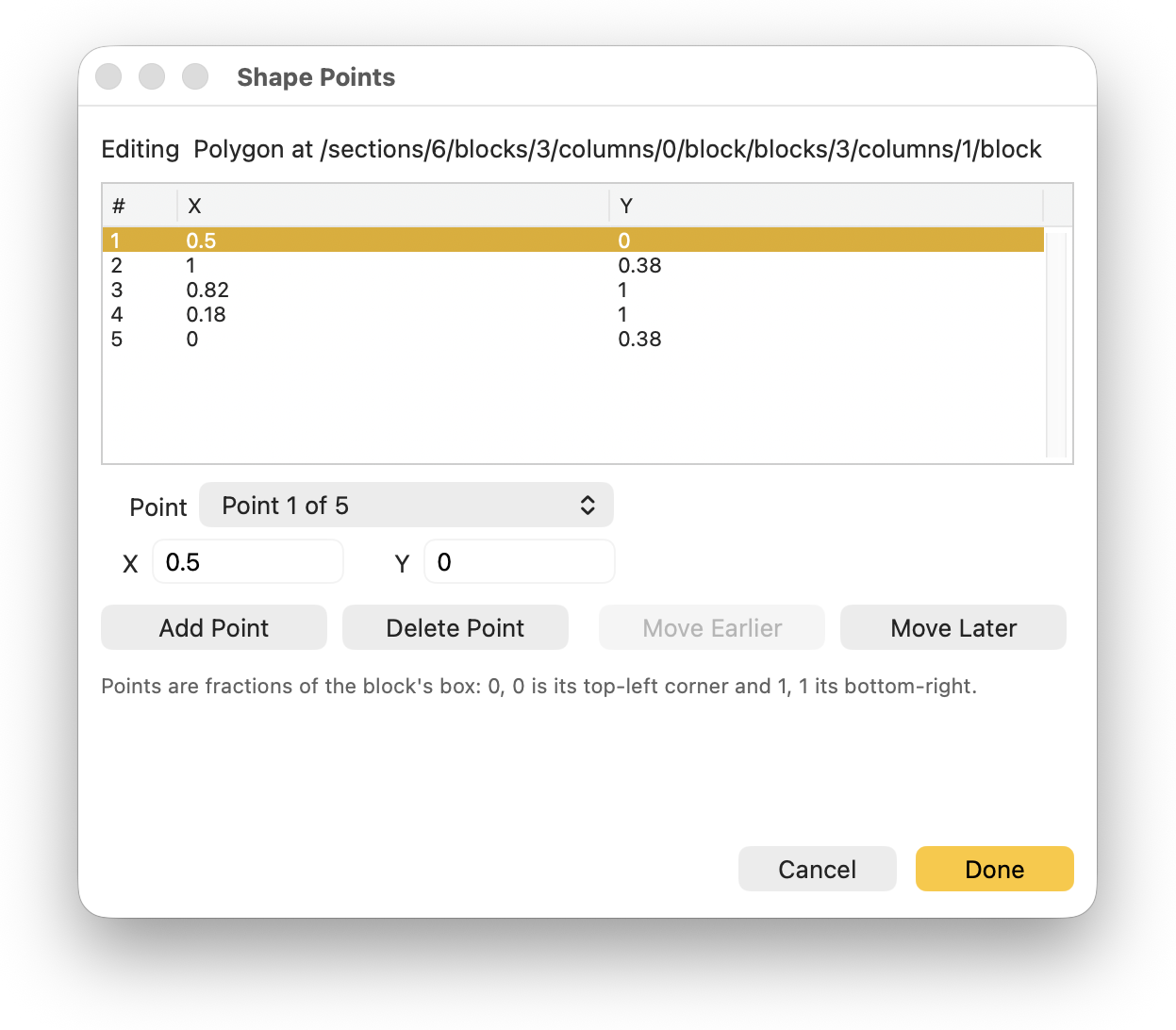
Figure 16. The Shape Points dialog.
Stroke style
Every stroked shape - and a table rule or a block border - carries a Stroke style group in the inspector: dash pattern, dash offset, line ends, line corners, miter limit, and arrowheads on a line or a curve.
Dash pattern is a list of run lengths in points, alternating ink and gap, repeating for the length of the line. Type them separated by spaces or commas:
| You type | You get |
6 3 | a 6pt dash, then a 3pt gap, repeating |
4 | equal on and off - 4pt dash, 4pt gap |
10 3 2 3 | a long dash, gap, short dash, gap |
| (empty) | a solid line |
Dash offset shifts where in that pattern the line begins, also in points - useful when two dashed lines meet and you want their dashes to line up rather than collide.
Caution: A dotted line is a dash pattern of 0 4 - zero-length ink - with Line ends set to Round. The round cap is what draws the dot; with the default butt ends a zero-length dash has no width and the line draws nothing at all.
This is the single most surprising thing about dashing in PDF, and it is not PageWright Studio's invention: it is how the format defines it.
Note: A pattern whose lengths are all zero is refused rather than drawn - it is a division by zero in most renderers and an invisible line in the rest - and the engine says so in the Preflight pane instead of quietly giving you a solid line.
Charts
Insert > Chart offers 20 chart types: Bar, Stacked Bar, Horizontal Bar, Line, Area, Combo (bar + line), Pie, Doughnut, Funnel, Treemap, Scatter, Bubble, Radar, Polar, Waterfall, Candlestick, Box Plot, Heatmap, Gauge, and Sankey. Each arrives pre-filled with placeholder data so it renders immediately, in the document's theme colors - edit the series in the inspector, or double-click the chart (or right-click it and choose Edit Chart Data...) for a categories-and-series grid that re-renders as you type.
A chart's legend sits in a corner inside the plot unless you move it. In the inspector, Legend position puts it in any corner inside the plot (Inside, top right is the default) or outside it - Outside, above, below, left or right - where the plot makes room, so no bar runs under it. Legend at puts it at a point of your own: X across and Y down from the chart's top-left corner, in points or as a percentage of the chart's width and height.
SVG images
Insert > Media > SVG Image... picks an .svg file and places it as native vector paths - it stays sharp at any zoom and prints as true vector art, not a rasterized picture.
PDF pages and contact sheets
Insert > Placed PDF > PDF Page... imports one page of an external PDF as vector art; Insert > Placed PDF > PDF Contact Sheet... imports a thumbnail grid of its pages instead. Use a single page to quote a figure or a form from another document, and a contact sheet to preview a whole file at a glance.
To choose what a contact sheet shows, select it and choose Block > Contact Sheet Pages.... It lists the sheet's cells - file, page and label. Add Files... adds PDFs, each at its page 1; Add These Pages adds a cell for each page of the selected cell's file that you type as a range (4-6), a list (1,3,9) or all; and Delete Page and Move Earlier / Later arrange them. Nothing changes until Done, which is one undo step.
Barcodes
The Insert > Barcode submenu drops any of 8 symbologies: Code 128, QR Code, EAN-13, UPC-A, Code 39, Data Matrix, PDF417, and Aztec. Other symbologies are available too - insert one of the eight, then change the inspector's code field to the symbology you need.
Form fields
The Insert > Form Field submenu places a fillable control at the point you click: a text field, a checkbox, radio buttons, a dropdown, a list box, a signature field, a push button, or a date field. Label is the one exception - it drops ordinary text, for the caption beside a control you are drawing by hand.
Insert > Form Field > Push Button places a clickable button. Its Button caption is what the button says. In a tagged document the engine draws a plain grey face instead of the drawn caption; the caption is still written into the button, but the text a screen reader announces is the Tooltip, so fill that in as well.
Field type in the inspector is a menu of every kind the engine accepts. Four of its ten entries are older spellings of another entry and say so, so a document written elsewhere keeps the word it came with. It is the one property a field cannot do without, which is why this menu - alone among the inspector's menus - offers no way to clear it.
Text frames
Insert > Data > Text Frame places a threaded text frame. Frames that share the same story are linked: when the text overfills the first frame, placing a second frame with the same story continues the text into it automatically. Use threaded frames for newsletter-style layouts where one article snakes through several boxes.
Marks on text
Four items on Insert > Text do not add a block of their own. They mark a piece of text that is already there, so they need a text selection or an open in-place editor before they will do anything - in the tool palette they stay dimmed until then, and clicking one tells you what is missing rather than failing silently.
Badges
Insert > Text > Badge... stamps a small colored pill on the selected text - a status marker like NEW, BETA or DEPRECATED that sits inline with the words around it.
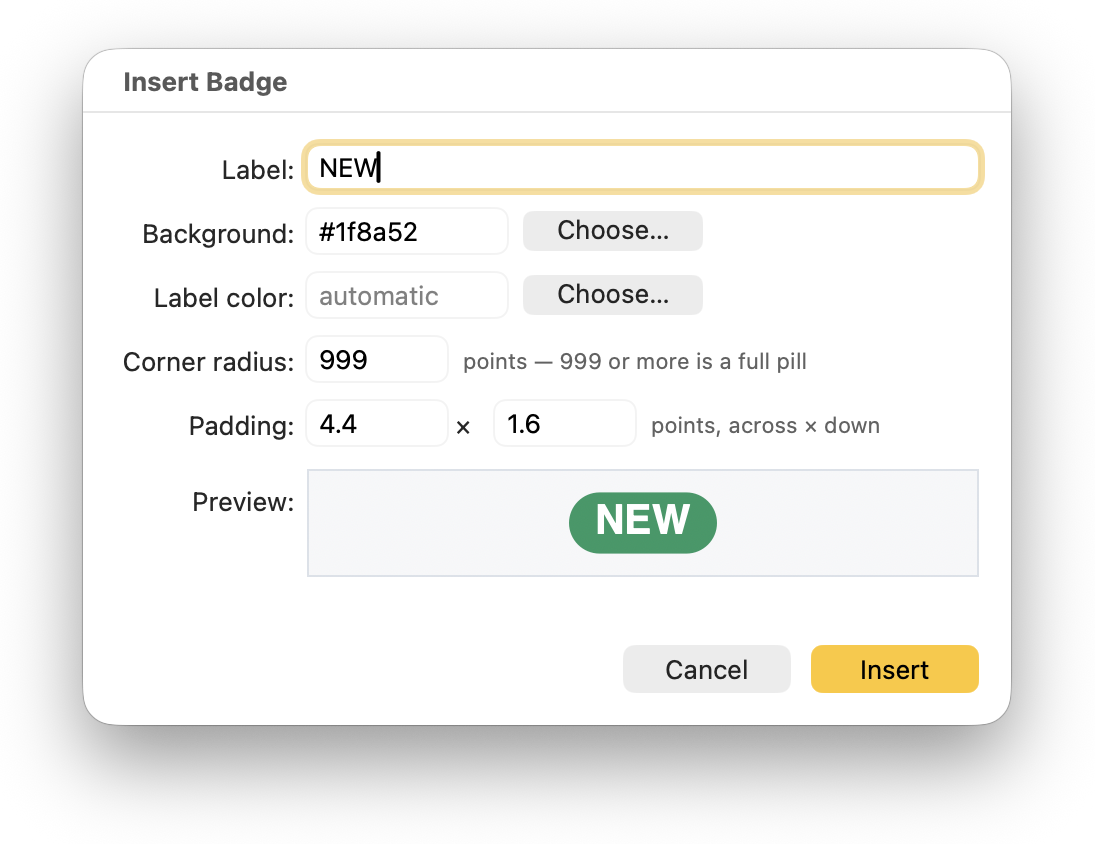
Figure 17. The Badge editor.
The dialog sets the label, its background and text colors, the corner radius, and the padding around the text. Selecting an existing badge and choosing Badge... again edits it rather than nesting a second one.
Footnotes
Insert > Text > Footnote... attaches a numbered note to the selected text. The engine places the note at the foot of the page the mark lands on and renumbers automatically as the document reflows, so a footnote never ends up on a different page from its reference.
The marker sits right after the selected text. To change a note, select text that ends at its marker and choose Footnote... again: the dialog opens on the note, and your change replaces it. Clear the text to remove the note and its marker.
Endnotes
Insert > Text > Endnote... attaches a note that is gathered at the end of the document rather than at the foot of the page. If the document has no endnotes list yet, PageWright Studio offers to add one before you write the note, and puts a Notes list at the end of the current section. Section > Endnotes adds more, and each list gathers the notes since the one before it, so a chapter can keep its own notes. An endnote is changed or removed the way a footnote is.
Cross-references
Insert > Cross-reference... inserts a live reference to a heading, a captioned figure or table, or a numbered equation. The dialog lists everything in the document that can be referenced; pick a target and choose what the reference should say - its number, its title, or its page. With a paragraph, heading, quote or call-out selected, the reference goes at the end of its text; with anything else selected, it becomes a paragraph of its own, right after that block. Either way it is one step for Edit > Undo, which also takes back the id the dialog gave the target.
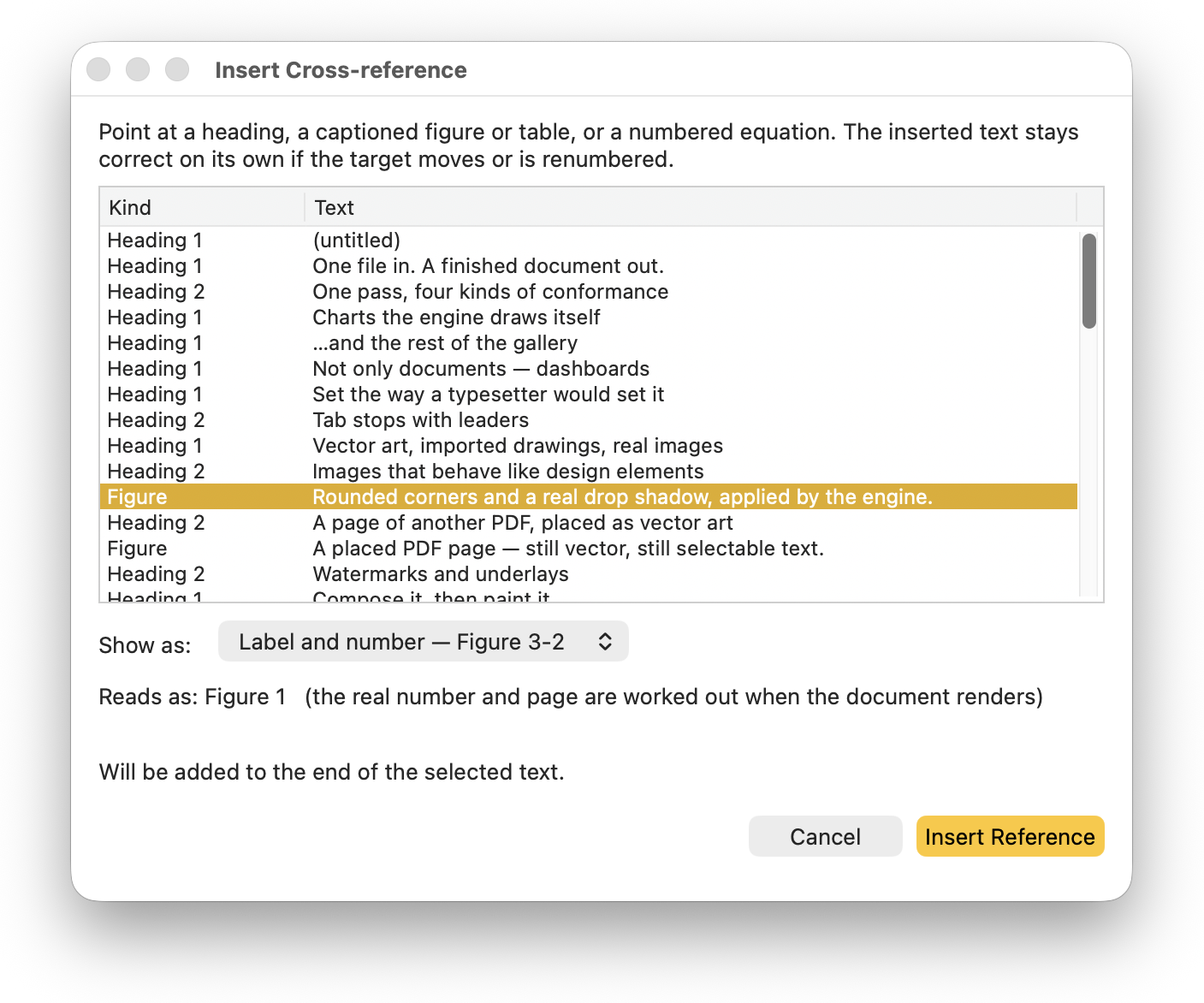
Figure 18. The Insert Cross-reference dialog.
The reference stays correct as the document changes: renumber the headings, move a figure to another page, and every reference to it updates on the next render.
Note: A target needs an id before anything can point at it, and most blocks do not have one until they are referenced. The dialog stamps an id on the target for you when you create the reference - ids exist because something points at them.
Data blocks
Insert > Data adds the three building blocks of data-driven documents:
- Repeat loops a template over a data array - one rendered copy per element.
- Conditional shows one branch or another based on an if/else test on the data.
- Include pulls in a reusable partial file.
Repeat and Conditional blocks seed sample data when inserted, so they render immediately. Point them at real data with Document > Data Sources..., which sets the inline data record - a JSON object or array whose fields fill {{tokens}} anywhere text appears - or names an external data file.
Note: Shapes, SVG images, and text frames are positioned blocks - they carry an absolute position and drag anywhere on the page. Charts, imported PDF pages, contact sheets, and barcodes join the flow like content blocks: they move with the text unless you pin them.
8. Chart, Image, and Shape Editors
Right-Click Block Editors
Beyond the common commands (edit text, duplicate, delete, align), the canvas context menu grows extra entries for certain block types. Right-click a chart, an image, a shape, or a table cell and PageWright Studio adds a deeper editor for exactly that block - no trip through the raw JSON required.
Editing chart data
Double-click a chart - or right-click it and choose Edit Chart Data... - to open the Chart Data dialog. The chart type is shown read-only at the top; the data below it is fully editable:
- Categories - a single field of comma-separated labels along the axis, one per value.
- The series grid - one row per series with three columns: Name, Color (a hex value such as
#1565C0, or empty: an empty Color takes the document's theme colors, and follows the theme when it changes), and Values (comma-separated). Click any cell to edit it in place; enter one number per category in the values column. - Add Series appends a new series pre-filled with a zero for each category, and no color of its own. Remove Series deletes the selected row. Series Color... opens the system color picker for the selected series and writes the result back as a hex value.
Every edit applies immediately - commit a cell and the chart re-renders on the page. The dialog opens beside the chart rather than over it, so you can tune values by eye. However many you make, Done keeps them as one step: Edit > Undo Edit Chart Data takes them all back.
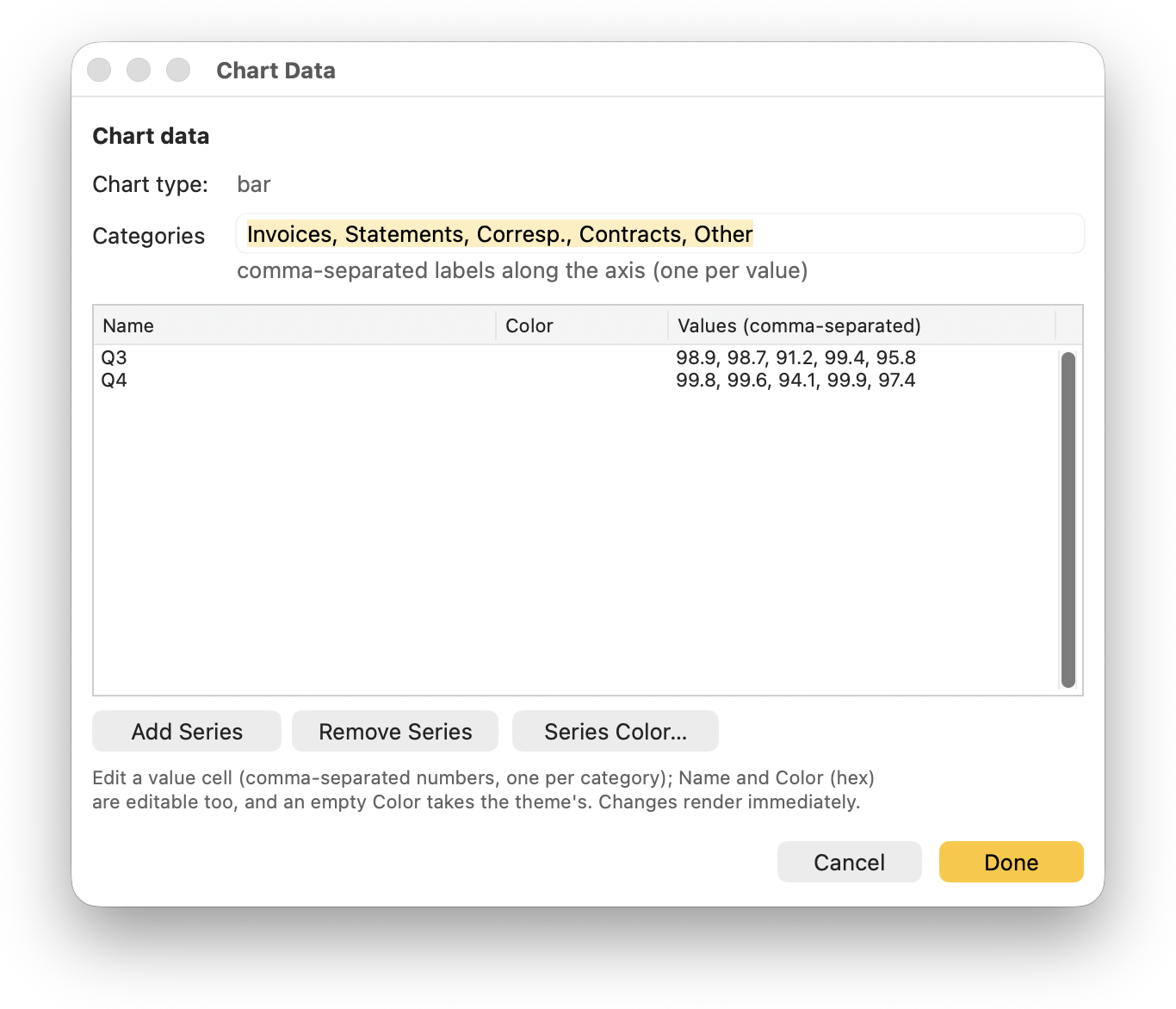
Figure 19. The Edit Chart Data editor.
Note: The grid changes shape with the chart type, and the hint under it says what each cell takes: a pie or doughnut has a row per slice (Slice, Color, Value); a scatter, bubble or polar chart a row per series of x,y points; a combo chart adds each series' Type and Axis; a heatmap a row per grid row under its column labels; a box plot or candlestick a labeled row of numbers; a Sankey diagram a row per flow between named nodes; and a gauge a single value.
Anything the grid does not show is still on Edit > Edit JSON....
Threaded text frames
A story is text that belongs to no page. Draw a text frame with Insert > Data > Text Frame, and the story pours into it; draw a second frame and the leftover continues there. Block > Story > Stories... lists every story in the document, says how many frames each has and whether it fits, and points the selected frame at any of them; Block > Story > New Story... starts a second, independent thread.
The Stories window has two halves. The table at the top is one row per story: its name, how many blocks it holds, how many frames pour it, and whether it fits. Click a name to rename it in place - every frame pouring that story follows the new name in the same undo step. New Story adds one and opens its name for editing; Delete removes a story and its blocks, and warns you first how many frames will be left printing empty boxes.
The lower half is about the frame selected in the document behind the dialog. It names where that frame sits in its thread - Frame 2 of 3 · continues on page 3 - and gives you three controls:
- Pours story points the frame at any story in the document, or at (none - empty box) to unlink it.
- Print "(Continued from page N)" at the top and Print "(Continued on page N)" at the bottom add the jump lines. The engine works the page numbers out for itself and keeps them right as the document repaginates.
The same three live on the Inspector when a frame is selected, as a Story picker, a Thread read-out and the two check boxes; and Block > Story > Unlink Frame from Story does what picking (none) does.
Block > Story > Next Frame in Thread and Block > Story > Previous Frame in Thread walk the thread in pouring order rather than in page order, following the page as they go - which is how you read a threaded article without a mouse.
View > Show Thread Links draws the thread over the page: a numbered badge on each frame saying its position, a dashed arrow between two frames on the same page, and a tab reading -> or <- with a page number where the thread leaves the spread. A frame whose story overflows gets a red dashed outline and a +; a frame pointing at a story the document does not define gets a red outline and a ?. Whether a new window opens with the overlay showing is Show thread links in new windows, on the General tab of PageWright Studio > Settings....
Caution: A story is read in its own order, across every frame in the thread - and that order is the one the Blocks outline shows, not the order the frames sit on the page. Three consequences worth knowing before you lay out a spread: - Two stories sharing a page are read in page order, not article order.
A sidebar dropped between two frames of the main article is announced in the middle of it. Preflight says so when it happens; keeping a story's frames together is the fix. - A paragraph split across two frames becomes two elements in the tagged PDF, not one.
Nothing is lost and nothing is mis-tagged - the two halves are simply not one element. - The (Continued on page N) lines are real tagged content with a working link, so they are read aloud and they navigate. The frame's own box and border are marked as decoration and are correctly silent.
Image effects
Right-click an image, or use Block > Image, for these quick effects:
- Rounded Corners - a submenu of No rounding, Corners 4 pt, Corners 8 pt, Corners 12 pt, and Corners 16 pt. Each sets the image's
cornerRadius. - Rotate Picture - a submenu of 90° Right, 90° Left, and 180°. Each turns the picture inside its image block by a quarter turn or a half turn, so a portrait photo can lie on its side while the block stays upright. It sets the image's
rotate, shown in the inspector's Rotate row, and turning the picture back upright removes the key. - Image Border... - opens the color picker and applies a 1 pt border in the chosen color.
- Drop Shadow On / Drop Shadow Off - adds or removes a drop shadow.
Each command writes the change into the image block and re-renders the page. A single command is a single edit, so Cmd-Z takes it back.
Rotate Picture turns the picture, not the block. The block keeps its place and its width:
- A flowing image with no height of its own takes the turned picture's proportions, so a portrait picture turned a quarter becomes a landscape one.
- A box of a set size keeps that size, and the picture turns inside it. With fit cover the picture fills the box and is cropped to it. With contain, the default, the whole picture shows: inside the box on a designed page, while in the flow a set height is kept and the width follows the picture, so a quarter turn can make it wider than the block. For a flowing box that has to keep its shape, set its fit to cover.
The turn is counted from the picture as its file shows it, so a phone photo that already stands upright needs none. A number typed into the Rotate row is drawn at the nearest quarter turn, and the menu turns from there. A crop aimed at part of the picture stays on that part as it turns. To turn the whole block, caption and all, use Angle (°) in the inspector's Transform group.
Move a picture inside its frame
When a frame crops its picture - an image or a placed PDF whose fit is cover or none - select it and Option-drag inside it to choose which part shows. The frame stays where it is and the picture slides under it. While you drag, the page shows the picture exactly where letting go will leave it, inside the frame and nowhere else, and a thin outline marks where the whole picture now lies, the hidden part included. The picture stops at its own edges, so the frame never shows a gap.
Letting go writes the block's focus, the point of the picture the crop is aimed at, and Cmd-Z takes the move back in one step. A picture pushed flush against an edge gets the corner value, 0 or 1, the way the postcard's postage page is aimed at its top-right corner with [1, 0]. A picture turned with Rotate Picture slides the way you see it, and its focus is still written for the upright photo.
An Option-click that does not drag keeps its usual meaning, so on a designed page it still selects the element below. Option-dragging a resize handle still resizes. When there is nothing to slide, the status line says why:
- The fit is contain or fill, so none of the picture is hidden. Set the fit to cover or none first.
- The whole picture already fits its frame.
- The focus comes from merge data (
"{{...}}"), so each record aims its own crop. - The block is turned, skewed, or scaled.
To type the aim instead, use the Crop group in the inspector's Properties tab. It appears whenever an image or placed PDF has the fit cover or none:
- Focus X and Focus Y - where the crop is aimed, from
0(the left or top edge) to1(the right or bottom edge). The default is0.5, the middle. For an image they are measured on the picture as it stands upright, so a picture turned with Rotate Picture keeps its crop on the same part. - Zoom (cover only) - magnifies the picture past a plain cover and keeps the focus in view:
1is a plain cover,2is twice as close.
The rows work from the keyboard and with VoiceOver like any other row, and each edit is one undo step. A value outside its range is clamped, and the status line says so. To let each record of a data merge aim its own crop, type a data field such as {{photoFocus}} into Focus X or Focus Y. The group then shows that binding in a single Focus row; type one number or two over it to aim the crop by hand again.
Shape gradient fills
Right-click a fillable shape (lines carry no fill) and choose Gradient Fill... to open the Gradient Fill dialog:
- Type - Linear (axial) or Radial. Linear gradients use the Angle (°) field; radial gradients use Center x,y (as fractions of the shape's box, e.g.
0.5, 0.5for the middle) and Radius (a fraction of the longer side). The fields that don't apply to the current type are disabled. - Color stops - a list with Offset (0-1) and Color (hex) columns; the offset places each stop along the gradient axis. Click a cell to edit it, Add Stop and Remove Stop manage the list, and Stop Color... opens the color picker for the selected stop. A gradient needs at least two stops.
As in the chart editor, changes render immediately on the page.
To go back to a flat fill, right-click the shape and choose Remove Gradient - the gradient collapses to a solid fill in the first stop's color.
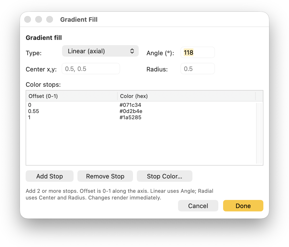
Figure 20. The Gradient Fill editor.
Table cell formatting
Right-click inside a table cell and the context menu adds cell formatting alongside the row and column commands:
- Cell Background... - opens the color picker and sets the cell's
background. - Cell Vertical Align - Align Top, Align Middle, or Align Bottom positions the cell's content within the row height.
- Cell Padding - No padding, Padding 4 pt, Padding 8 pt, or Padding 12 pt sets the inset on all sides.
Done keeps, Cancel restores
Chart Data and Gradient Fill are live-apply dialogs: they snapshot the document the moment they open, and every edit renders on the spot. When you close them:
- Done keeps everything you changed.
- Cancel (or Esc) puts the document back exactly as it was before the dialog opened - including trimming the undo entries the live edits pushed, so you never back out with a string of Cmd-Z.
Tip: Because edits render live, keep the dialog off to the side of the block you're editing - you get a real preview of every value before you commit with Done.
9. Pages and Sections
Long documents are built from sections - runs of pages that share a page grid: size, margins, columns, numbering, and running headers and footers. Two dialogs manage them. Section > Section... adds a new section from a preset gallery, and Section > Section Properties... edits the page grid of the whole document or any one section.
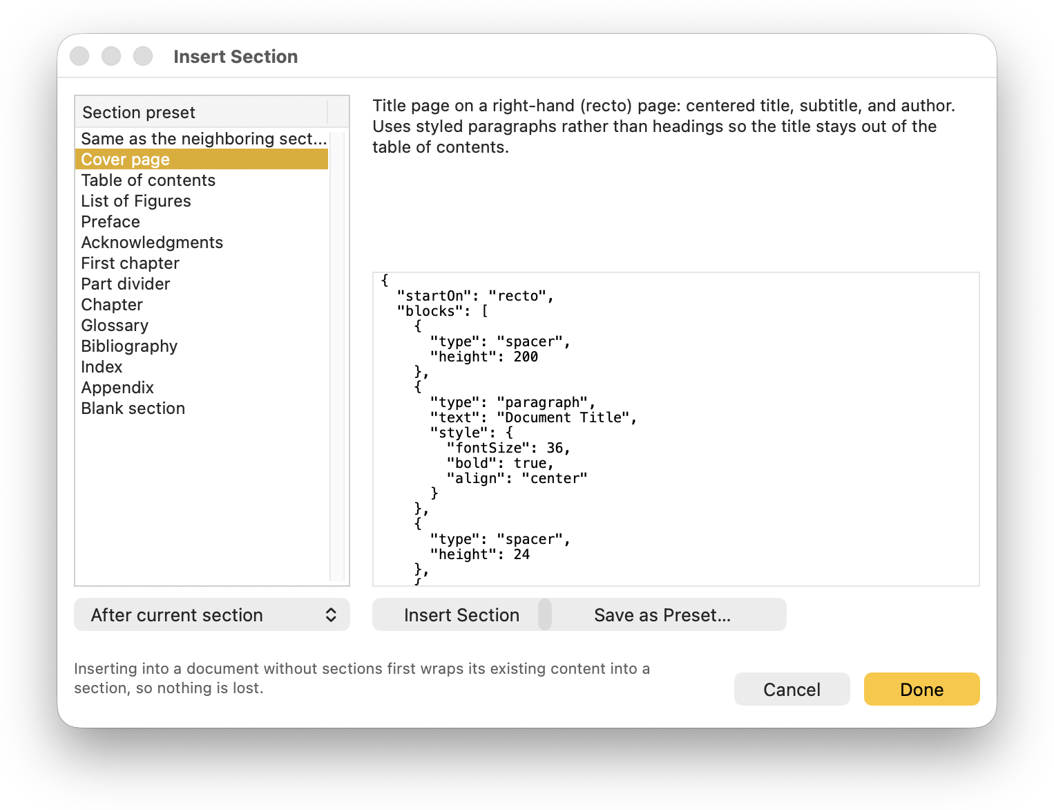
Figure 21. The Insert Section gallery.
Inserting a section
To add a section, choose Section > Section... (Cmd-Shift-N). The dialog is a page-type gallery. Select a preset on the left to see a plain-language description and the exact JSON it inserts - nothing goes into your document sight unseen. The gallery includes:
- Cover - a title page that starts on a right-hand (recto) page: centered title and subtitle.
- Table of contents - a contents block on roman-numbered folios (i, ii, ...), with numbering restarted at i.
- First chapter - opens the arabic-numbered body: restarts page numbering at 1, adds a running header (document title plus page) and a footer folio, and starts on a recto page.
- Chapter - a further chapter: starts on a recto page and continues the page numbering.
- Glossary - a glossary with sample entries.
- Index - a two-column index with letter headings. The terms it lists are edited with Block > Edit Entry List... (see Index terms, glossary entries and references below).
- Appendix - back matter: an "Appendix A" heading and body text, starting on a recto page.
- Blank - a plain section with one paragraph; a clean slate that inherits the document defaults.
As an example, the First chapter preset's JSON begins:
{
  "startOn": "recto",
  "restartNumbering": true,
  "numbering": { "startAt": 1, "format": "arabic" },
  "header": {
    "style": {
      "fontSize": 9,
      "color": "#666666"
    },
    "left": "Document Title",
    "right": "{{page}}",
    "firstPage": "none"
  }
}
Choose where the section goes - After current section, At start of document, or At end of document - then click Insert.
Note: Inserting into a document that has no sections first wraps its existing content into a section, so nothing is lost. The engine ignores top-level blocks once sections exist.
Editing section properties
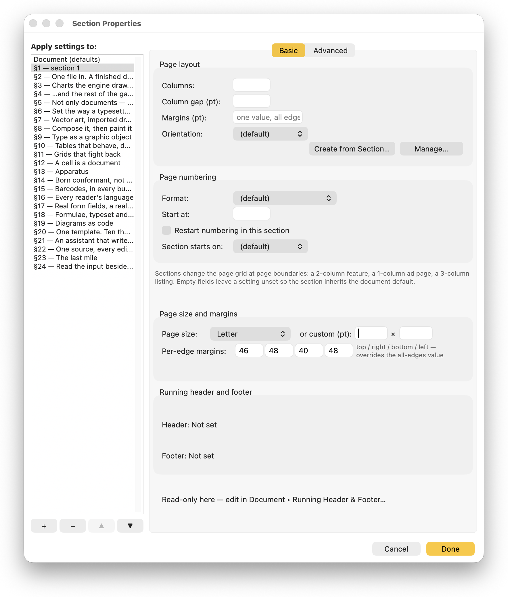
Figure 22. The Section Properties editor.
To change the page grid, choose Section > Section Properties... (Cmd-Shift-Y). The target list on the left, under Apply settings to:, selects what you are editing: Document (defaults) or any single section. A field left empty leaves that setting unset, so the section inherits the document value.
Columns, margins, and orientation
Set the number of columns and the column gap to switch a page run to a 2- or 3-column grid. Margins are per edge - top, right, bottom, and left - and orientation is portrait or landscape.
Page numbering
Choose a numbering format - 1, 2, 3 (arabic); i, ii, iii or I, II, III (roman); a, b, c or A, B, C (alpha) - and a start at value. Two options apply to sections only: Restart numbering in this section and starting the section on a recto (right) page.
Page size and letterhead
The page-size popup offers Letter, Legal, Tabloid, A4, A5, A3, B5 (ISO), Trade 6 x 9 in, and Half Letter 5.5 x 8.5 in - or choose Custom... and enter a width and height. Dimension fields accept unit suffixes, so 6in, 150mm, and plain point values all work. You can also pick a letterhead / template PDF that is drawn under every page.
Image policy
The same dialog carries the document image policy for shrinking image-heavy books: downsample images to a target ppi, re-encode them (auto, JPEG with a quality setting, or flate), and turn on Lossless predictor compression - row predictors before Flate that make files smaller while staying pixel-identical.
Mirror margins and running bands
The bottom band covers book furniture. Mirror margins on facing pages swaps the left and right margins on verso pages, so the wider margin always hugs the binding. The header and footer themselves are shown here read-only, and edited in Document > Running Header & Footer..., which gives each band left, center, and right slots. To keep a band off the first page of a section - a title page without a page number - choose Pages: First page of the section, then This variant: No band at all. Slots accept the tokens {{page}}, {{pages}}, {{title}}, {{date}}, and {{time}} anywhere in the text (Insert Token... offers them). Empty slots inherit the document band, so a section only overrides what it fills in.
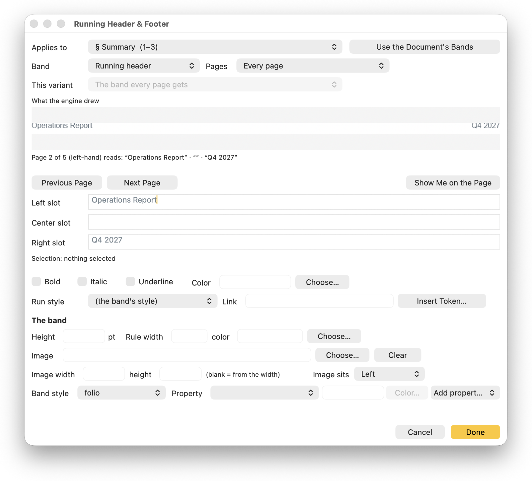
Figure 23. The Running Header & Footer dialog.
Every color in that dialog can be typed as a hex value or picked. Choose... beside the selected text's Color, and beside the Rule width's color, opens the color editor, where Pick... is the color picker and a press job can have gray, CMYK or a spot ink. A color of the band's own type - its text color, a background, a border's color - is chosen in the Property popup beside Band style and typed in the field after it, and the Color... button there opens the color editor on it. Color... is dimmed while the property chosen is not a color.
Tip: A band authored in the JSON as styled runs - mixed fonts or colors within one slot - is preserved exactly as written unless you retype its text here. Leave the slot alone and your hand-styled band survives every Apply.
Running-head markers
A dictionary prints the first and last entry of the page in its header; a manual, the topic in force. That text comes from a marker. Insert > Text > Running-head Marker... puts an invisible marker block after the selection, with a Name - the band asks for it by that name - and the Text the band prints. In a slot of Document > Running Header & Footer..., {{marker:Topic}} prints the marker in force on the page, and {{firstMarker:Topic}} and {{lastMarker:Topic}} the first and last that start on it. Select a marker and choose the command again to change it. Each insert or change is one undo step.
Live changes, Cancel and Done
Each change is written into the spec as you make it - leave a field, or pick from a popup - and the page re-renders immediately, so you can judge a margin or column change on the live page. Cancel (or Esc) puts the document back exactly as it was before the dialog opened, including the field you are still typing in - no backing out with a string of undos. Done keeps your changes, that last field included, and closes the dialog.
Index terms, glossary entries and references
Add the apparatus from the Section menu: Section > Table of Contents, Section > List of Figures, Section > List of Tables, Section > List of Listings, Section > List of Charts, Section > Glossary, Section > Index, Section > Bibliography and Section > Endnotes each insert one block where the selection is.
Then select the block and choose Block > Edit Entry List... to edit what it holds. The same window edits index terms, glossary entries and reference works; the fields change to suit. The Blocks pane row tells you how the list is doing before you open it - Index - 42 terms · 3 never occur.
There are no inline index marks
You index a word by listing it as a term; the engine finds it in the body. There is no "mark this word" command, because the engine has no run-level index key. That is why the editor is a list of terms rather than something you apply to selected text.
A term that occurs nowhere is left out
If the engine finds no occurrence of a term, that term does not appear in the printed index - unless one of its sub-entries occurs, in which case it prints as a heading over them. The Occurs column tells you which before you print, and the sentence under the fields says what will happen to the selected term.
An em dash in Occurs means not measured yet, not never occurs: render the document and the column fills in. The counts are the engine's own, measured on your document.
Match, Sort as, and Heading only
Match is what is searched for in the body when it differs from the printed label. Sort as is the key the entry files and sorts under, and it wins in every collation - it is how you file a name under a different letter, or place a Chinese term in a Latin index. Ticking Heading only makes an entry a group header that is never searched for; it prints above its sub-entries when one of them occurs.
Sub-entries go one level deep. The engine draws everything below the first sub-entry at that same level, so the editor offers one level and no more.
Collation is a property of the document, not of the block
If a document holds more than one index, the last one sets the collation, the page-range collapsing and the letter headings for all of them. The editor says so beside the Collation popup, and names the count when there is more than one index.
Collation matters well beyond alphabetical order: code-point order is Unicode block order, which is not a sort at all for Chinese. Choose Pinyin reading or Stroke count, then radical for a Chinese index.
Order
The index prints in collation order and the glossary prints A-Z, so the order of those lists does not reach the page - which is why the editor offers no Move Up or Move Down for them. A bibliography prints in citation order (numeric style) or alphabetically (author-year), so Move Up and Move Down appear there, and matter for ties and for uncited works when Only cited works is off. With it on - the default for numeric style - uncited works are dropped and the order does not reach the page at all. The line at the foot of the window says which of those cases your list is in.
Collecting terms from the document
Collect Terms... proposes candidates drawn from this document's headings, glossary terms and short emphasised phrases, leaving out anything already in the list. Each candidate carries its measured occurrence count, so you can add only the ones that will actually print. Nothing is added until you press Add Selected, and the whole batch is one undo step.
Master pages
A master page is a named set of page properties - and, optionally, a set of frames - that any number of sections share. Set the margins and the running head once on a master, point six sections at it, and one edit changes all six.
What a master page is
Three things decide the grid a page is laid out on, and they apply in this order:
- The document's own page setup - what Section > Section Properties... edits on its Document (defaults) row.
- The master page the section names, which overrides any of those settings it carries itself.
- The section's own settings, which override the master in turn.
The link is live, not a copy. A section that names a master goes on tracking it, so editing the master re-lays every page that uses it in a single render. That is also why capturing a master out of a section strips the captured settings from the section: a section that kept its own copy would override the master with the very values the master now holds, and later edits to the master would appear to do nothing.
A master carries two kinds of thing. The first is page setup - size and orientation, margins, columns and gap, numbering, mirror margins, the running header and footer, a letterhead template, a watermark: the same settings a section carries, edited in the same dialog. The second is frames: blocks the master stamps at fixed page coordinates on every page that uses it, which is how a rule, a logo, or a boilerplate line repeats through a document without being pasted onto every page.
A master draws nothing until something names it. The document can name one as its default, which every section that names no master of its own then inherits, and each section can name one for itself.
Caution: Everything you change on a master changes on every page that uses it. The status line tells you how many.
Creating and managing masters
Choose Section > Master Pages... to see every master page the document defines, what uses each one, and how many frames it carries. The list on the left has two columns - the name, and who uses it, in words: 4 sections, or not used. A star and the word default mark the document's default master. The panel on the right describes the selected one: what names it, its page setup in a line, and how many frames it stamps, with the hands they are restricted to.
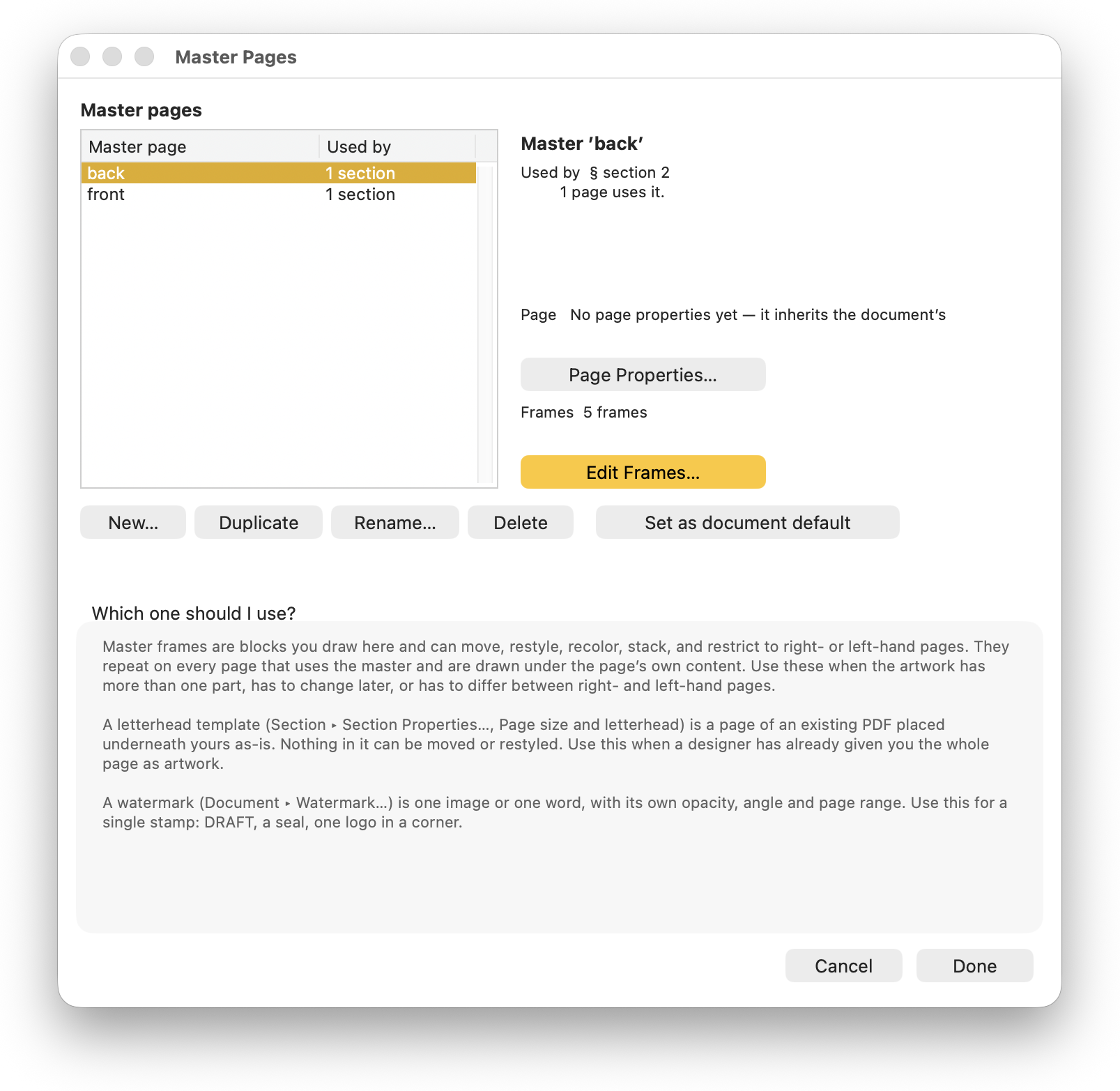
Figure 24. The Master Pages dialog.
- New... starts an empty master. It carries nothing, so it inherits everything from the document until you give it page properties - an honest starting point rather than a snapshot of something else.
- Duplicate makes a deep copy, frames and all, named body copy, then body copy 2.
- Rename... renames the master and rewrites every reference to it - the document default, every section, every designed page - in one undo step.
- Delete asks first, and the question names what it costs: which sections use it, that they keep the page properties they set for themselves and fall back to the document defaults for the rest, and that the frames this master stamped stop being drawn. Undo brings it all back together.
- Set as document default makes the selected master the one every section that names none of its own inherits. On a master that is already the default, the same button reads Stop being the default.
- Page Properties... opens Section > Section Properties... aimed at this master.
- Edit Frames... opens the master on the canvas so you can place frames on it. It stays disabled until something uses the master - a master no page uses has no page to position frames against - and its tooltip says what to do about it: Assign this master to a section first.
Cancel puts back the whole session, every New, Duplicate, Rename and Delete you made while the dialog was open; Done keeps them.
A master page's name cannot contain / or ~. Those two characters are how the layout map addresses a frame inside a master, so a name that used them would leave its frames unselectable.
The other way to make a master is to lift one out of a section you have already set up. In Section > Section Properties..., select the section and click Create from Section.... The page properties the section carries become a new master and the section is pointed at it; when other sections carry an identical set, the dialog offers to re-point them all at once, which is what turns sixteen hand-set sections into one master you can change in a single place. A section that sets no page properties of its own has nothing to lift, and the status line says so: This section sets no page properties of its own - nothing to capture.
Until a document has a master, the catalog shows one row reading No master pages yet, and the panel beside it explains what one is and names both routes in: start an empty one with New..., or capture one from a section with Create from Section....
Note: Repeating artwork: which one? Master frames are blocks you draw here and can move, restyle, recolor, stack and restrict to right- or left-hand pages. They repeat on every page that uses the master and are drawn under the page's own content. Use these when the artwork has more than one part, has to change later, or has to differ between right- and left-hand pages. A letterhead template (Section > Section Properties..., Page size and letterhead) is a page of an existing PDF placed underneath yours as-is.
Nothing in it can be moved or restyled. Use this when a designer has already given you the whole page as artwork. A watermark (Document > Watermark...) is one image or one word, with its own opacity, angle and page range. Use this for a single stamp: DRAFT, a seal, one logo in a corner.
Editing a master's page properties
A master is edited in the same dialog a section is. Choose Section > Section Properties... and look at the target list on the left: below the sections, under a rule reading Master pages, there is one row per master. Select one and every field on the right aims at that master instead of at a section - margins, columns and gap, page size and orientation, numbering format, mirror margins, the letterhead template and the image policy, and the whole running header and footer editor on the Bands tab. A master's header and footer are edited exactly as a section's are, tokens and all.
The note under the list says which master you are aiming at and what depends on it: Editing master 'body' - the document default, used by 4 sections, 96 pages. It also names the door that can rename or delete one, and it is the only part of the target list a screen reader can read, so it says in words what the selected row says in pixels.
Two controls are dimmed on a master row. Restart numbering in this section and Start on are section-only - the engine never reads them from a master - so the dialog will not let you set something that could not take. The Master page popup disappears as well: a master cannot name a master.
Changes apply live, and Cancel and Done behave as they do for a section. Beside the Master page popup, Manage... opens the catalog without leaving the dialog.
A master has an inspector pane too. Masters appear at the end of the structure outline, collapsed, one row per master with a star on the default and each master's frames nested beneath it. Select a master row and the pane shows Used by, a Master frames group with the frame count, and two rows that open the two editors: Page properties... and Edit master page.
Putting frames on a master
A frame is an ordinary block - a rule, an image, a shape, a paragraph, a container - that lives on the master rather than on a page. Choose Section > Edit Master Page to place frames on it.
The canvas stays on the page you were looking at, and changes state around it. A banner appears above the page naming the master you are editing and which page you are seeing; the page's own content dims behind a scrim, visible but not selectable; the master's frames are outlined. Draw with any tool, drag and resize with the ordinary handles, nudge with the arrow keys, align and distribute as usual - everything you place goes onto the master, not onto the page. Click the banner's Done, or choose Section > Edit Master Page again - it reads Finish Editing Master 'body' while the mode is open - to return to the document. Entering and leaving change nothing in the document, so neither takes an undo step.
Every frame needs a position. That is not a preference: the engine skips a frame that has none, so such a frame is simply never drawn. Anything you place on the canvas has one.
Two commands move a block onto and off a master without opening the mode. Block > Send to Master turns the selected positioned blocks into frames of the master that governs the page they sit on - one master for the whole selection, since blocks from pages governed by two different masters have no single destination. Block > Return to Page does the exact inverse for one selected frame, dropping it back onto the page on screen as a pinned block. Neither moves anything: the position travels with the block, so it lands where it was drawn.
Frames are drawn under the page's own content. They are stamped as the page opens, beneath the running head and the body, so body text always runs over a frame and a frame can never sit on top of a headline. If you want artwork over the text, that is what a pinned block is for. The same fact is why a frame's Text wrap row in the inspector is a read-out reading Runs over it rather than a control: the engine forces a frame's text wrap to none, so nothing wraps around a frame either, and moving a frame can never reflow the body.
Frames draw in the order they are stored, which makes Arrange > Move Block Up and Arrange > Move Block Down the stacking verbs among frames - up brings a frame forward, down sends it backward. There is no separate bring-to-front command.
A frame's text is edited in the inspector's Text row, not by clicking into it on the page. A frame is not part of the page's flow, so the in-place editor does not open on one. Select the frame and type in the Text row.
One thing a frame keeps that is worth knowing: {{var.*}} tokens inside its text are substituted from your data file. Page tokens are not: {{page}} inside a frame prints as the literal text {{page}}, because a frame is placed once per page as artwork rather than composed per page the way a running head is. Put a page number in the header or footer band, where it belongs. What a frame does not do is register a cross-reference or a named destination - the engine drops both on purpose, because a frame that repeats on 400 pages would otherwise claim the same anchor 400 times over. For the same reason its words are never indexed: a term that appears only in a master frame does not collect a page number, so a word in your running artwork cannot flood the index with every page in the document.
Right-hand and left-hand pages
A frame can be restricted to one hand of a spread. Every frame has a Pages property in the inspector with three values - Every page, Right page and Left page - and the same three are on Block > Frame Pages, checkmarked to show which is in force.
Page 1 is a right-hand page (a recto), page 2 is a left-hand page (a verso), and so on through the document. A Right page frame is stamped on the right-hand pages only, a Left page frame on the left-hand ones only, and the hand is counted through the whole document rather than from the folio a section happens to print - so a section that restarts its numbering does not restart the hands. Every page is the default and writes nothing at all, so a document that never sets a hand is unchanged by the row.
In the structure outline a restricted frame says so in its own text - · right-hand pages only - so a frame that is not drawn on the page in front of you is never invisible.
Pair this with Mirror margins on facing pages for book work: mirrored margins swing the wider margin toward the binding, and a pair of frames, one right and one left, puts a folio rule or a thumb tab on the outside edge of both.
Building a book from several files
A long document does not have to be one file. Document > Book Chapters... merges other PageWright Studio JSON files onto the end of this one, in the order you set, so each chapter can be edited - and owned - separately.
- Add File... appends a chapter. Each is a PageWright Studio JSON file, merged in order after this one.
- Remove takes a chapter out of the book. It does not delete the file.
- Move Up and Move Down reorder the chapters.
- Toggle Restart # marks a chapter as restarting the page numbering, so a part or an appendix can begin again at 1.
The book is assembled when you render or export: the chapters are laid out as one document, so the table of contents, the list of figures, cross-references and the index all run across the whole book rather than stopping at the end of the first file.
10. Watermarks and Print Production
Watermarks and the print-production furniture are document-level settings: you set them once and every page follows. Both live on the Format menu, and both dialogs apply live - the page re-renders as you change values, Done keeps the result, and Cancel (or Esc) puts the document back exactly as it was when the dialog opened.
Watermarks
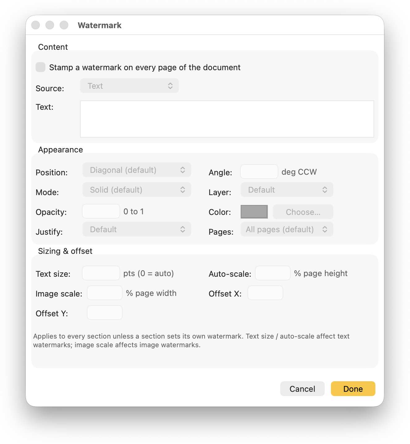
Figure 25. The Watermark dialog.
To stamp every page with a watermark, choose Document > Watermark... and check Stamp a watermark on every page of the document.
Content
The Source popup switches between a text and an image watermark:
- Text - type the watermark into the Text box. Each line in the box becomes a row of the stamped watermark.
- Image - click Choose... and pick a PNG, JPEG, GIF, TIFF or WebP file.
Appearance
- Position - Diagonal (the default, rising across the page), Diagonal down, Center, Top, Bottom, or Angle.
- Angle - degrees counter-clockwise; used with the Angle position.
- Mode - Solid (the default), Outline, or Dual (solid + outline).
- Layer - Under body draws the watermark behind the page content so body text stays readable over it; Over body stamps it on top.
- Opacity - a constant alpha from 0 to 1.
- Color - click Choose... next to the swatch to pick the watermark color.
- Justify - Left, Center, or Right; the horizontal anchor for the Top and Bottom positions.
- Pages - All pages (the default), Even pages, Odd pages, First page, or Rest (after first).
Sizing and offset
- Text size - the font size in points. Leave it blank (or 0) for automatic sizing.
- Auto-scale - the font size as a percentage of the page height, so the watermark scales with the page.
- Image scale - the image width as a percentage of the page width.
- Offset X / Offset Y - horizontal and vertical nudges in points.
Text size and auto-scale affect text watermarks; image scale affects image watermarks.
In the spec, the watermark is a watermark object on the page setup. A typical draft stamp looks like this:
"watermark": {
  "text": "DRAFT",
  "mode": "outline",
  "layer": "under",
  "opacity": 0.15,
  "autoScale": 12,
  "pages": "rest"
}
Note: The watermark applies to the whole document. A section inherits it unless the section sets its own watermark - edit the section's JSON in the inspector to give one section a different stamp (or none).
Change bars
Document > Change Bars... marks revised material with a vertical rule in the margin, the convention technical and regulated documents use to show what moved since the last issue.
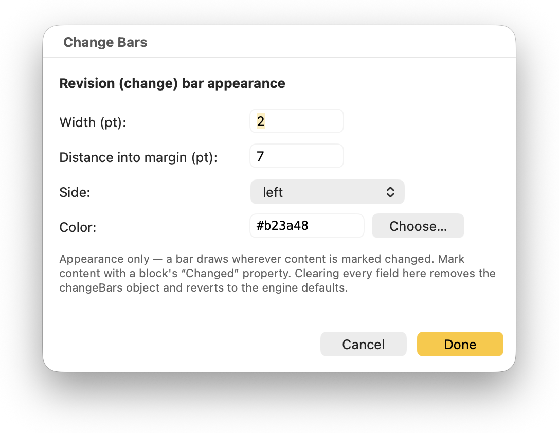
Figure 26. The Change Bars dialog.
The dialog sets which side of the page the bars sit on, how thick they are, their color, and how far they stand off the text. Blocks are marked as changed individually, so a bar covers exactly the material you flagged rather than the whole page it appears on - and the engine draws the bar beside the block wherever it eventually lands, including when it reflows onto a later page.
Color and print production
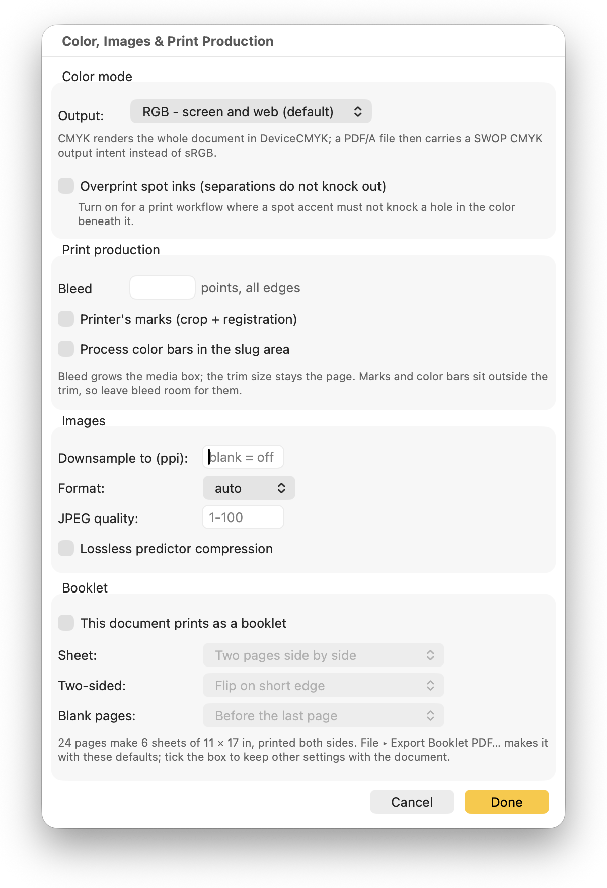
Figure 27. The Color and Print Production dialog.
Document > Color, Images & Print Production... sets the document's color mode and the furniture a commercial printer expects.
Color mode
The Output popup offers two whole-document modes:
- RGB - screen and web (the default).
- CMYK - print - the whole document renders in DeviceCMYK. A PDF/A file then carries a SWOP CMYK output intent instead of sRGB.
In the spec this is the document-level colorMode key; "cmyk" selects CMYK output.
Overprint
Check Overprint spot inks (separations do not knock out) for a print workflow where a spot accent must not knock a hole in the color beneath it: spot-ink fills and strokes print over the process colors instead of cutting one out. This writes the document-level overprint key.
Bleed, marks, and color bars
- Bleed - the bleed in points, applied to all edges. For per-edge bleed, set the
bleedvalue in the JSON inspector instead. - Printer's marks (crop + registration) - corner crop marks and registration targets outside the bleed.
- Process color bars in the slug area - K tints plus C/M/Y solids along the bottom slug area.
Caution: Bleed grows the media box; the trim size stays the page. Marks and color bars sit outside the trim, so leave enough bleed room for them.
Booklet
Check This document prints as a booklet for a document you print folded and stapled, such as a program or a brochure. The setting is kept with the document. From then on, the Problems pane says what the page count costs the booklet while you can still change it. A booklet needs a multiple of four pages, so 22 pages print as 24.
- Sheet is the paper. Two pages side by side is the default: 11 x 17 in for Letter pages, and Letter for 5.5 x 8.5 in pages. A sheet too small for two pages shrinks them to fit, and the line under the popups says by how much.
- Two-sided must match the printer's two-sided setting. Flip on short edge is the usual one for a booklet.
- Blank pages go Before the last page by default, so your last page stays the back cover. At the end leaves the outside back cover blank instead.
The line under the popups counts the sheets as you choose, for example 22 pages make 6 sheets of 11 x 17 in, printed both sides, with 2 blank pages before the last page. In the spec this is the document-level impose key. File > Export Booklet PDF... writes the print copy (see Exporting a booklet in Chapter 3).
Spot inks
Spot (Pantone / separation) inks are not a dialog setting - you enter them per color in the property inspector. Wherever a block takes a color, give it a spot value with the colorant name, a tint, and a CMYK alternate:
{ "spot": "PANTONE 185 C", "tint": 100, "cmyk": [0, 91, 76, 0] }spot- the colorant name written into the PDF.tint- ink strength, 0..1 or 0..100 percent; the default is full strength.cmyk- what the ink approximates at full tint. Prefer acmykalternate; acolor(RGB) alternate is display-only.
The ink becomes a real Separation colorspace with a tint transform in the output.
Tip: For a print-ready separation workflow, combine the pieces: set Output to CMYK, turn on overprint, and enter each accent color as a spot ink in the inspector.
11. Styles and Typography
Named styles keep a document consistent: define a body, caption, or heading look once, and every block that references it updates when the definition changes. Styles live in the spec's named-style table; a block points at one by name through its style reference, and a style can inherit from another with basedOn.
The Named Styles editor
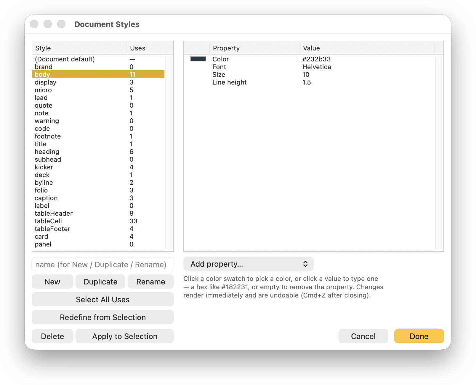
Figure 28. The Document Styles editor.
Choose Format > Named Styles... (Cmd-Y) to open the style editor. It opens on the style of the selected block - the style it names, or the one its own style is based on - and on (Document default) when nothing with a named style is selected. The list on the left shows every named style with a Uses column counting the rendered blocks that reference it; the property list on the right shows the selected style's definition. The dialog applies changes live - the page re-renders as you edit - and Cancel (or Esc) puts the document back exactly as it was when the dialog opened, while Done keeps your changes.
Creating and managing styles
- New creates a style with the name typed in the name field (left blank, PageWright Studio picks a unique default). A new style starts with
fontSizeset to12. - Duplicate copies the selected style under the name in the field, or the original name with
-copyappended. - Rename applies the name in the field to the selected style - and rewrites every
styleandbasedOnreference in the document, so nothing comes unlinked. - Delete removes the selected style. If it is still in use, PageWright Studio warns you how many times it is referenced; deleting anyway leaves those blocks to fall back to default formatting.
Editing style properties
Click a value in the Property / Value list to edit it in place; the page re-renders when you commit. A color has a swatch at the left of its row: click it to open the color editor on that color, where Pick... is the color picker and the color can be gray, RGB, CMYK or a spot ink. Clearing a value removes that key from the style. Values that are themselves objects or arrays show "(complex - edit the spec JSON)" - edit those in the inspector instead. The Add property... popup below the list offers the style properties you can add - font family and size, bold/italic/underline/strike, color and background, alignment, line height, letter spacing, space before/after, and basedOn - inserts a sensible default value, and drops you straight into editing it.
Applying a style
Select one or more blocks in the main window, then click Apply to Selection. The hint line confirms how many blocks were changed.
Select All Uses
Click Select All Uses to select every rendered block that references the selected style; PageWright Studio jumps to the first use's page. Close the dialog to work with the selection as a group - move, restyle, or delete every use together.
Redefine from Selection
When you format a block directly - with the font strip, for example - PageWright Studio forks it onto inline overrides (a local {"basedOn": ...} copy) so the change stays local. Redefine from Selection goes the other way: select the forked block in the main window, pick its style in the list, and click the button. PageWright Studio merges the block's local formatting into the named style and re-links the block to the clean style reference, so every other use picks up the change on the spot.
Tip: Restyle by example: tweak one block on the page until it looks right, then open Named Styles and click Redefine from Selection. The style absorbs the changes and every other use follows immediately.
Create Style from Selection
Where Redefine updates a style that exists, Format > Create Style from Selection... makes a new one from the selected block's own formatting and points the block at it. The Create Style dialog suggests a name from the block's kind - Heading 2, say - which must be unique, and lists the properties it captures. When other blocks are formatted exactly the same way, Apply it to every block formatted this way, on by default, gives them the style too. It is one undo step. A block with no formatting of its own, or one that already uses a named style, has nothing to capture, and the status line says so.
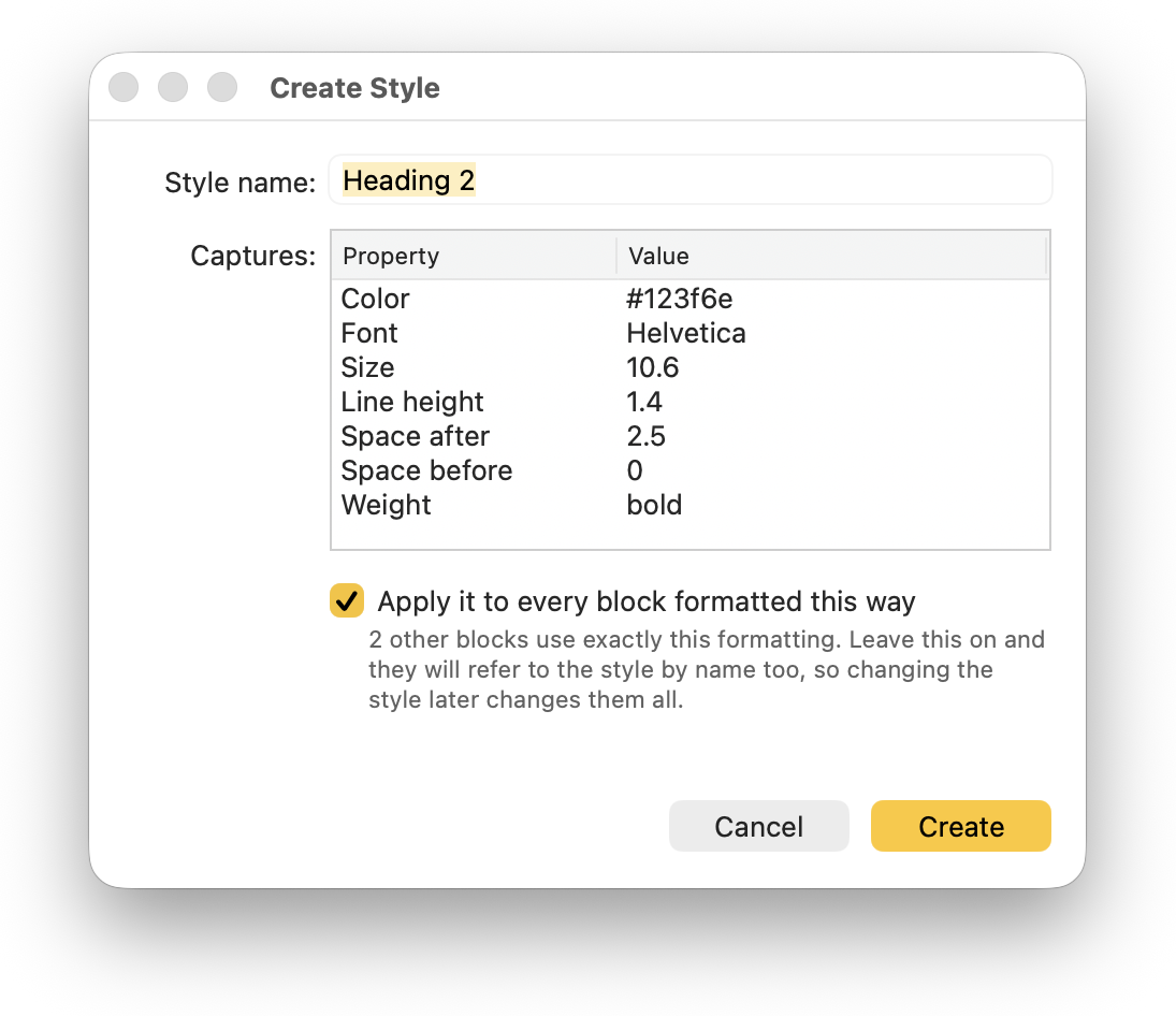
Figure 29. The Create Style dialog.
The Style popup in the format bar
The format bar's Style: popup shows the selected block's named style and lists every style in the document. Choose another style to apply it in one step, or choose (No style) to clear the reference. Unlike the font strip, the popup applies the same clean style reference the Named Styles editor uses - it never forks the block onto inline overrides. The popup enables whenever a block is selected and the document has at least one named style.
Typography
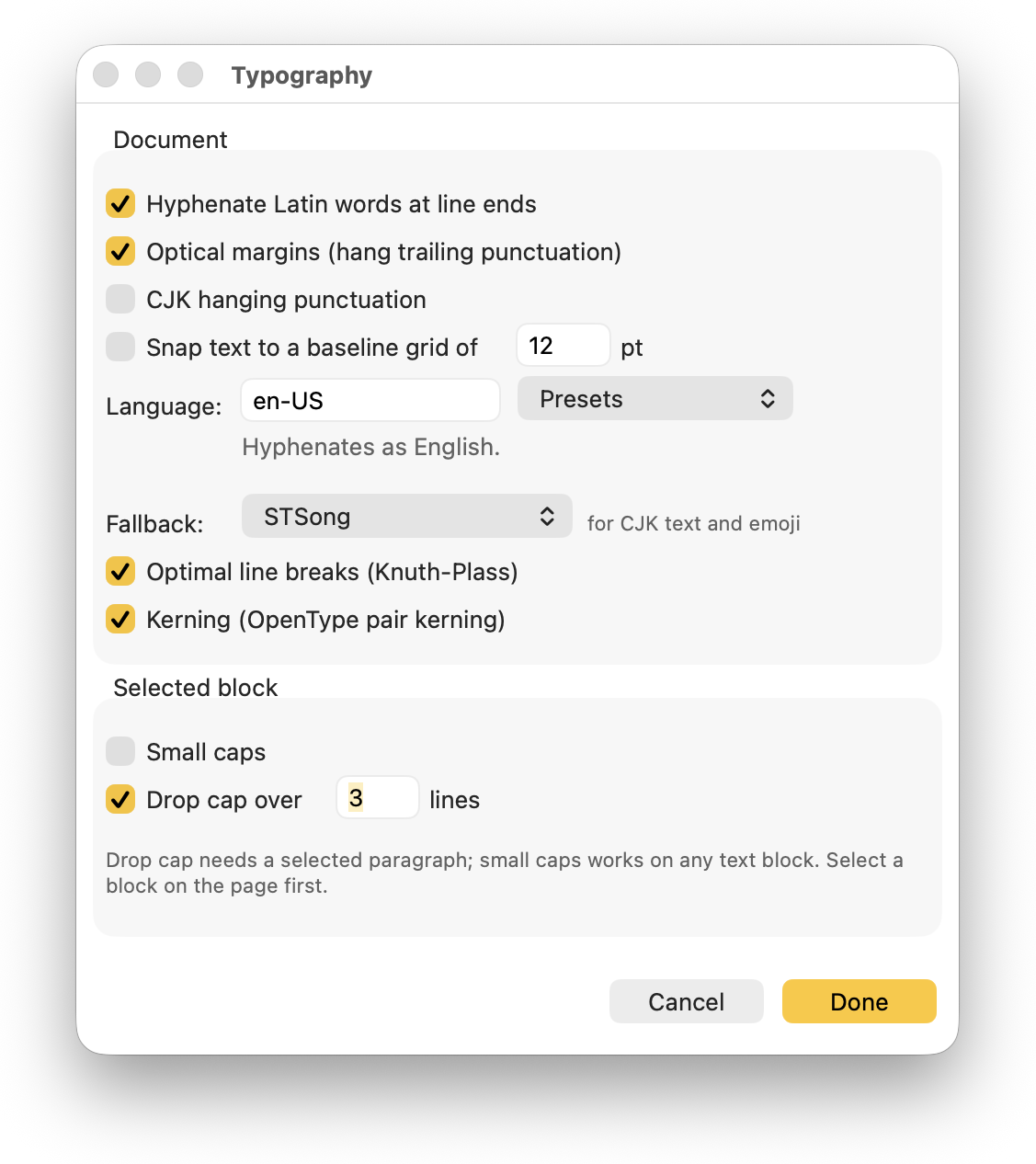
Figure 30. The Typography dialog.
Choose Document > Typography... (Cmd-Shift-T) to set document-wide typographic behavior plus two refinements for the selected block. Like the styles editor, the dialog applies live: Done keeps the changes, Cancel backs them all out.
Document settings
- Hyphenate Latin words at line ends turns on hyphenation throughout the document.
- Optical margins (hang trailing punctuation) lets trailing punctuation hang past the text edge so justified margins look straight.
- CJK hanging punctuation does the same for Chinese, Japanese, and Korean punctuation.
- Snap text to a baseline grid of N pt locks baselines to a document-wide grid; type the pitch in points.
- Language: is a free-text field - type any BCP-47 tag, not a choice from a short list. The Presets menu beside it fills in the four languages PageWright Studio can hyphenate and then springs back, and a hint line under the field says what it will do with the tag you typed. Hyphenation patterns ship for English, French, German and Spanish; any other tag sets the document language and turns hyphenation off. There is more on this below, under Document language.
- Fallback font names the family the engine turns to for characters the document's own fonts do not have - Chinese, Japanese, and Korean text, and emoji - in the body of the document and in its auto-generated Table of Contents, List of Figures, glossary, and index. It is chosen from the fonts the engine can embed. Set a CJK family (for example, NanumGothic) for CJK text; for emoji, set a color emoji font such as TwemojiMozilla, which draws them in color as real, selectable text. Without a fallback that covers them, emoji draw blank, and the Font Audit window lists the missing characters when the document opens. Leave it (none) for a document that needs neither.
Selected block
- Small caps renders the selected text block in small capitals; it works on any text block.
- Drop cap over N lines enlarges the first letter of the selected paragraph so the text wraps around it over the number of lines you enter.
Note: Drop caps apply to paragraphs only, and both controls need a block selected on the page before you open the dialog. Small caps works on any text block.
Document language
Document > Typography... carries the document's language as a free-text field: any BCP-47 tag, not a short list. pt-BR, ja, cy, zh-Hans are all as valid as en-US, and the engine writes exactly what you type.
The tag is not decoration. PDF/UA and WCAG 3.1.1 both require a document language, and a tagged PDF without one fails on that alone.
Beneath the field, PageWright Studio says what it can do with the tag you typed. It hyphenates English, French, German and Spanish - matching on the primary subtag, so fr-CA and de-CH hyphenate too - and for every other language it says so plainly rather than pretending. A tag it does not recognise is still written; the sentence tells you it looked wrong, and nothing is refused.
The Presets menu beside the field fills in the four hyphenating languages, then springs back: the field is the value, and the menu is only a shortcut into it.
12. Themes
A theme is the whole look of a document in one choice: the typefaces, the sizes, the heading ladder, the colors, the table and call-out treatments. Applying one re-points every named style at once, so the document keeps its structure and changes its appearance. This chapter covers choosing a theme, editing one, and making your own.
Themes and named styles
The previous chapter covered named styles - body, heading, caption and the rest - and why a style reference beats a pile of inline overrides. A theme is the layer above: it is a complete set of those styles, filled in for every role the engine knows about.
That is why applying a theme is safe. Your blocks refer to styles by name; the theme decides what those names mean. A heading stays a heading, and simply becomes a different-looking one.
Note: Blocks carrying inline overrides - a color or size set directly on the block rather than through a style - are not touched by a theme, because the override is more specific than the style it sits on. If a document looks only half-changed after applying a theme, inline overrides are usually why.
Format > Flatten Style on a block clears them.
Choosing a theme
Choose Format > Document Theme... to open the theme chooser.
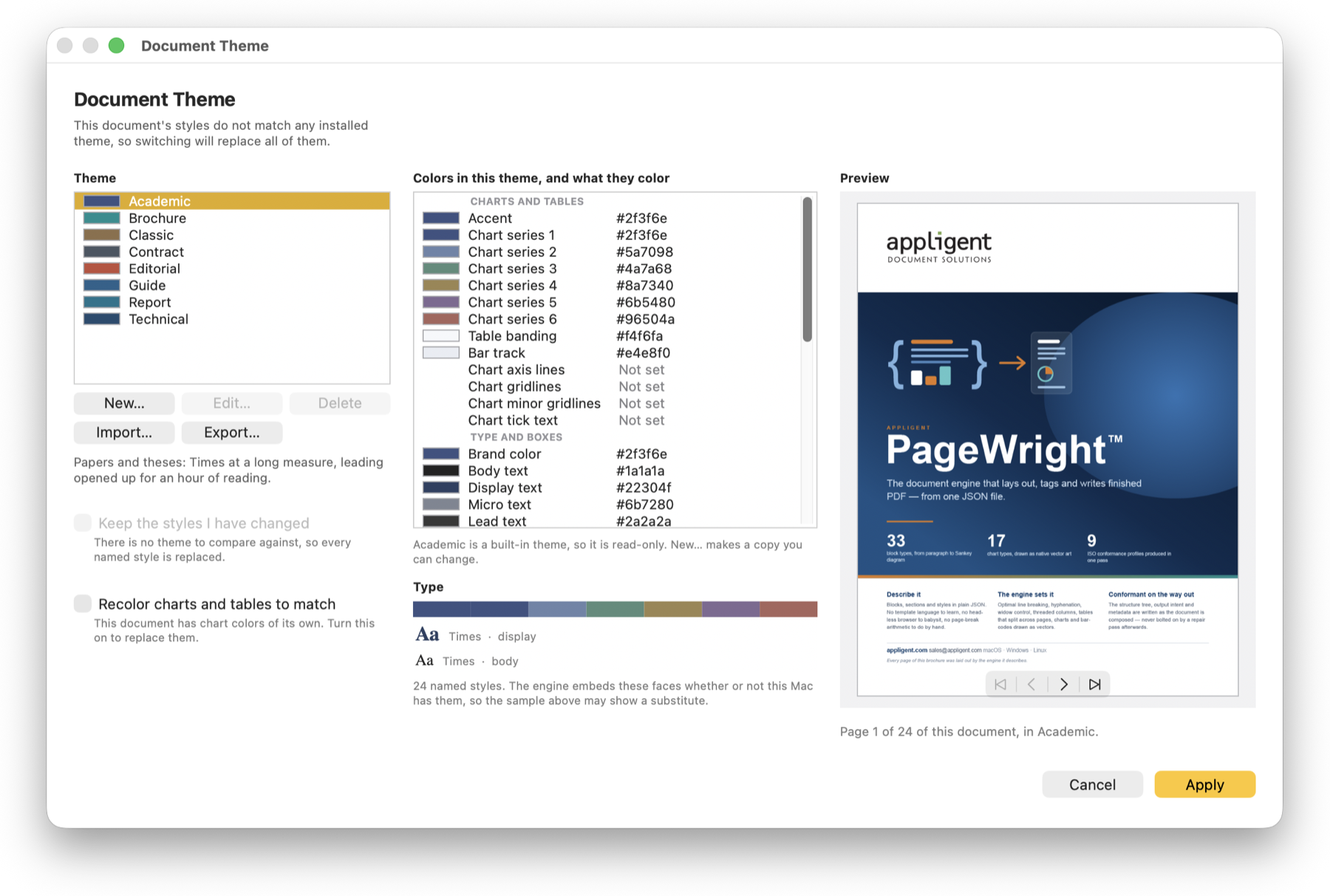
Figure 31. The Document Theme chooser.
The dialog answers three questions about a theme before you commit to it.
What it looks like. The preview on the right renders your document in the selected theme - not a canned sample - so you are judging it against your real content. Page through it to see how the theme handles the pages you care about; the caption beneath tells you which page of how many you are looking at.
What colors it uses. The middle column is a labeled inventory: every color the theme defines, what it colors, and its hex value. They are grouped into the ones that reach charts and tables - the accent, six chart series, table banding, the bar-gauge track, and the four a chart's own furniture is drawn in: axis lines, gridlines, minor gridlines and tick text - and the ones that reach type and boxes, such as body and display text, note fills and borders, and the warning treatment. A theme is not a mood board; this is the actual list. The four chart-furniture colors usually read Not set, which means the engine draws them in its own grays; give one a color and every chart in the document follows.
What type it sets. Beneath the inventory, a sample shows the display and body faces the theme names, above a strip of its palette.
Note: The type sample renders in whatever face this Mac can show. The engine embeds a theme's faces whether or not they are installed locally, so a substitute in the sample does not mean a substitute in your PDF.
Two checkboxes control what the change touches:
- Keep the styles I have changed leaves any style you have edited by hand exactly as it is, and re-points only the ones still at their theme values. Leave this on when you have tuned a few styles and want the rest to follow the new theme; turn it off for a clean slate.
- Recolor charts and tables to match extends the theme's palette to chart series colors and table banding. Off, your charts keep the colors they have.
Apply commits the change as a single undoable step. If the result is not what you expected, Cmd-Z puts the old theme back.
The themes that ship
Eight themes come with PageWright Studio, each a complete set of styles rather than a color scheme:
| Theme | Suits |
| Report | Business and technical reports - the default |
| Academic | Papers and theses: serif body, formal heading ladder |
| Brochure | Marketing pieces: display type, generous color |
| Classic | Traditional book typography |
| Contract | Legal documents: dense, numbered, restrained |
| Editorial | Magazine-style features |
| Guide | Manuals and documentation - this book uses it |
| Technical | Specifications and data-heavy documents |
Making a theme your own
The buttons under the theme list manage your own themes. The eight that ship are read-only; anything you create sits beside them.
- New... creates a theme starting from the one currently selected, so you begin from something close rather than from nothing.
- Edit... opens the theme editor. Only your own themes can be edited.
- Delete removes one of your themes.
- Import... and Export... move a theme between machines or people as a single file.
The theme editor
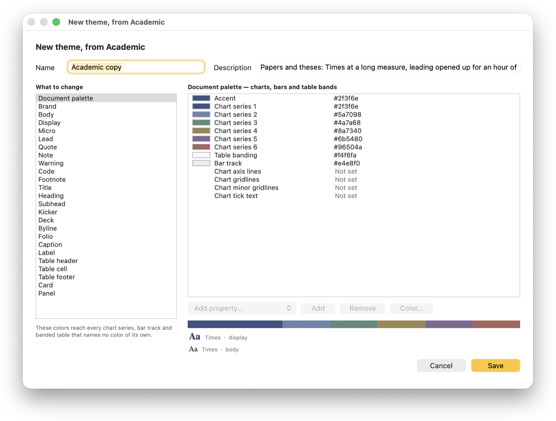
Figure 32. The theme editor.
Give the theme a name and a one-line description - the description is what appears under the theme list, so it is worth writing something that tells you later why you made it.
What to change lists the theme's twenty-four named styles, from Body, Display and Heading down to Caption, Folio and the table roles, plus Document palette at the top. Select one and its properties appear beside it: typeface, size, weight, leading, color, spacing, and the background and border treatments that give call-outs and tables their look.
- Add property... offers the properties that role does not yet set; Add puts one in.
- Remove takes a property back out, so the role falls to the value it inherits - usually what you want after overriding something and changing your mind.
- Color... opens the color editor for whichever color property is selected, as clicking the swatch at the left of its row does. Pick... there is the color picker; a color can also be gray, RGB, CMYK or a spot ink.
Document palette is the one entry that is not a text style: it holds the accent, the six chart series, the table banding and the bar-gauge track. Those colors reach every chart series, bar track and banded table that does not name a color of its own, so changing them here re-colors the document's data graphics in one move.
Tip: Edit a theme rather than editing styles document by document. A theme travels: apply it to the next document and the work comes with it, where per-document style edits stay behind.
Themes for new documents
Two places decide what a new document starts as.
File > New > From Template... opens the template chooser: pick the kind of document you are making and the theme it should wear, and PageWright Studio creates it already structured and styled. Use this theme for new documents on that dialog makes your choice the default for next time.
Format > Style Kit for New Documents... sets the same default directly, without creating a document.
Note: Changing the default for new documents does not touch documents you have already made. Use Format > Document Theme... for those.
Where themes live
The themes you create are stored one file per theme, under the PageWright Studio application-support folder, which is what makes Export... a straightforward copy and Import... a drop-in. The eight built-in themes are part of the application and are the same on every machine, so a document that names one looks the same wherever it is opened.
13. Data-Driven Documents
A PageWright Studio document can carry a data record and bind its fields into the page, so one template renders many personalized documents - statements, letters, certificates, invoices. You define the data once, reference its fields with {{token}} placeholders anywhere text appears, and use data blocks to repeat, show, or share content.
- Define the data. Choose Document > Data Sources... and enter a JSON record (or point at an external data file).
- Reference fields in your text. Type
{{token}}placeholders into any paragraph, heading, or header/footer band. - Repeat over arrays. Insert a Repeat data block to turn an array of records into a list of rendered blocks.
Setting the document data
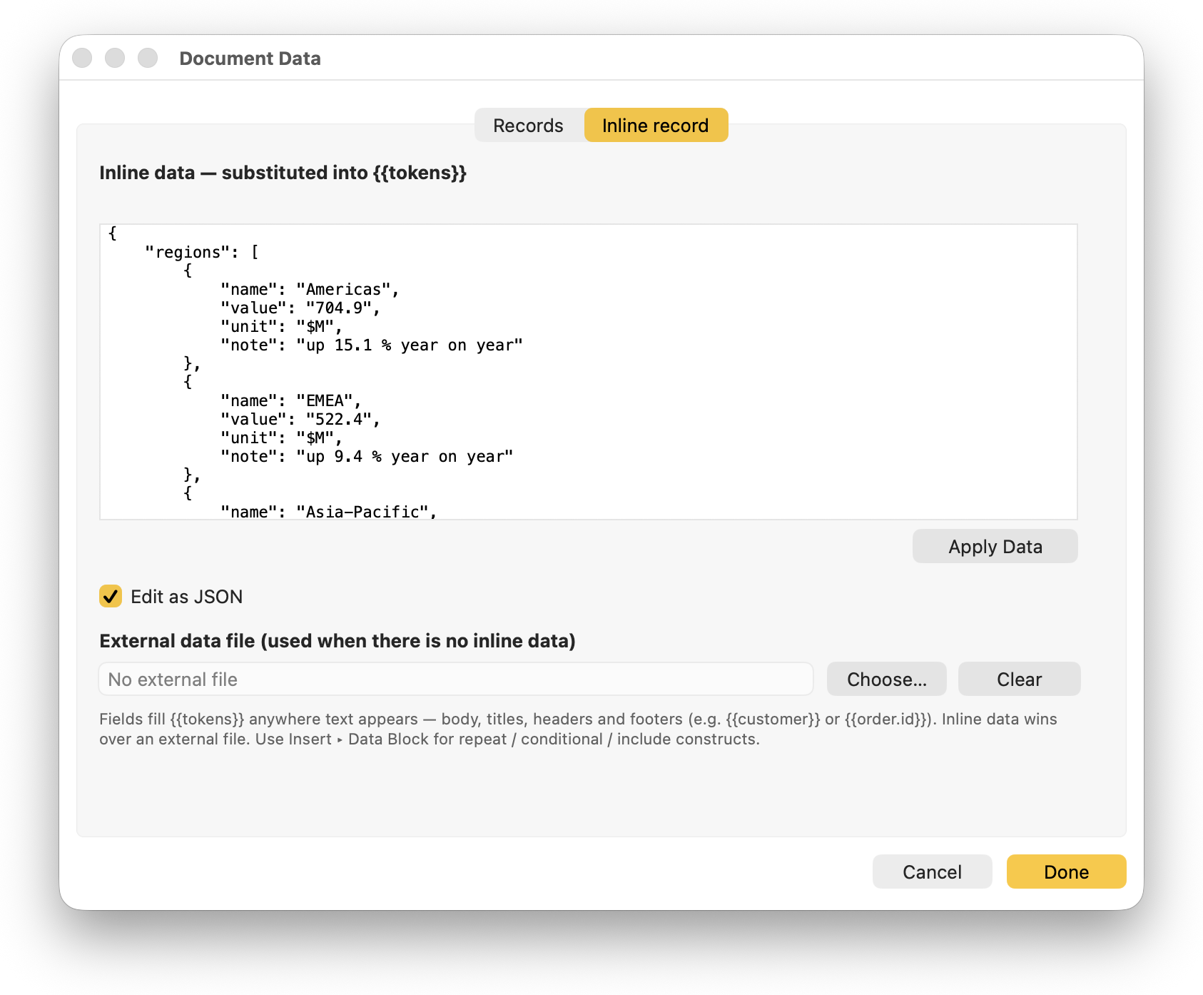
Figure 33. The Document Data editor.
Choose Document > Data Sources... and click Inline record. The tab has two parts.
Inline data
The tab opens on a grid of the record's keys and values, which Add Field, Add Group and Add List build a piece at a time. Check Edit as JSON to work on the record as text instead: type or paste a JSON object or array into the Inline data box and click Apply Data. The document re-renders immediately with the new values bound in. If the JSON does not parse, the dialog reports "Invalid JSON - check quotes, commas, and braces." and leaves the document alone. Emptying the box and clicking Apply Data removes the inline record.
External data file
To keep the template and its data in separate files, click Choose... under External data file and pick a JSON file; Clear removes it. A file in the document's own folder is stored by name and found relative to the document (a file elsewhere is stored by its full path), and the file is used only when there is no inline data - inline data always wins.
Click Done to keep your changes. Cancel (or Esc) restores the document exactly as it was when the dialog opened.
Tip: Keep a small inline record while you design - you see real values as you work. Switch to an external data file when the template is finished and production data takes over.
Record sets - one template, many documents
An inline record fills the page once. A record set is a list of records, and it turns the same document into one PDF per person: 250 award letters, 40 certificates, a statement for every account.
Choose Document > Data Sources... and use the Records panel.
Binding a list
Click Choose... beside File and pick either a CSV - a header row naming the fields, then one row per record - or a JSON list. The panel then shows what it found: how many records, how many fields, and a grid of the first 25 with your own column headings in your own order. Clear unbinds the list again.
PageWright Studio never reads the file itself: it asks the PageWright engine, which is the same reader that will bind the records when you export. That is deliberate - it means the grid you check your data in and the PDF you ship can never disagree about a quoted comma, a BOM or a line ending.
Seeing one record at a time
The page behind the dialog shows a real record, not braces. Preview record chooses which one, and View > Previous Record / View > Next Record step through the list without opening a dialog at all. The Document pane's DATA group also names the bound source and the record on screen, so you can tell at a glance which of 250 people you are looking at.
The preview record is your view, not part of the document: it is remembered beside the file, not inside it, so a template you send to a colleague opens on its own first record rather than on whichever one you happened to be checking.
Fields this document uses
Under the grid, every {{token}} in the document is listed with a verdict: in this source, or NOT in this source. This is the cheapest way to catch the single commonest mail-merge mistake - a mistyped field name. A token that names nothing binds to nothing, the engine substitutes empty, and nobody finds out until 250 letters come off the printer with a hole where the name should be.
Before the document uses any field, the list says so, and the line under it says how to add one: click Done, put the cursor in a paragraph, and choose Insert > Data > Merge Field... (below).
Tokens the engine fills itself - {{page}}, {{pages}}, {{date}}, {{title}}, the running-head variables, and anything of the form {{first:Heading1}} - are not listed, because no record is expected to supply them. Neither are {{var.name}} tokens, which come from Document > Variables...
Select a field and Copy {{token}} puts it on the clipboard; Insert Field puts it straight in at the caret when you have one.
Inserting a field by seeing its value
Insert > Data > Merge Field... (Shift-Cmd-M) lists the fields with each one's value in the record you are previewing, so you choose award by seeing $4,000 rather than by remembering a column header. Type in the search box to narrow the list. The token goes in at the caret, or as a new paragraph if there is no caret to put it at.
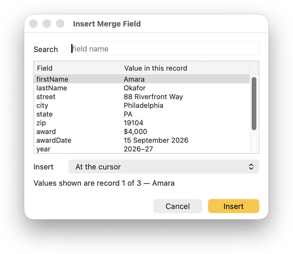
Figure 34. The Insert Merge Field dialog.
Exporting a merge
With more than one record bound, File > Export PDF... asks the one question that matters before it asks for a filename:
- One PDF for every record - a folder of files, named by a pattern you choose.
- One PDF with every record in it - a single document, each record starting a new page.
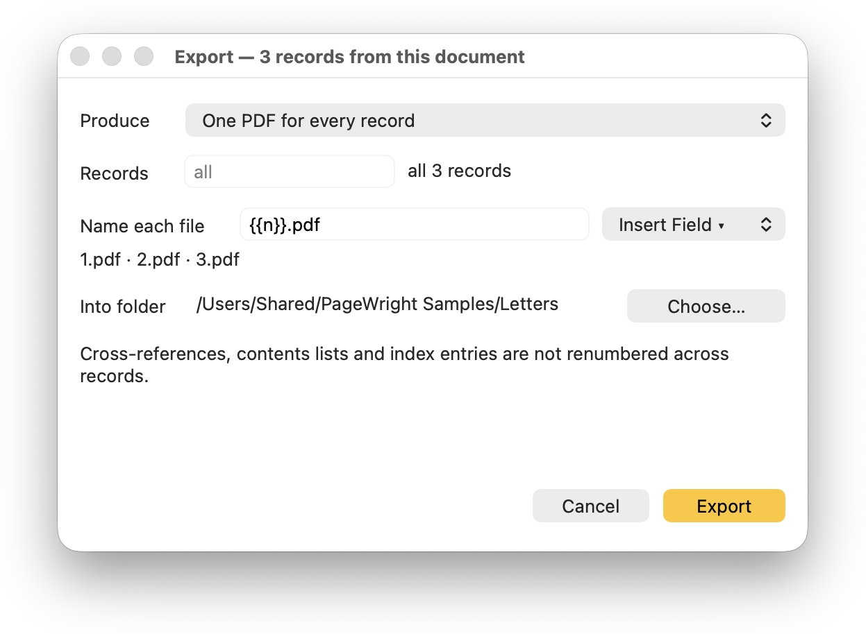
Figure 35. The merge sheet of File > Export PDF.
Records limits the run: 7 is one record, 7- is from seven to the end, 7-31 is a span, and empty is everything. The count beside it says what you have asked for before you commit to it.
Name each file takes any field token plus {{n}}, the record's 1-based number - so {{lastName}}-{{n}}.pdf produces Okafor-1.pdf, Chen-2.pdf, Rivera-3.pdf. The three names below the box are a live preview of what you will actually get. Where two records would produce the same filename, PageWright Studio adds -2, -3 rather than letting one letter overwrite another - and says so, because the fix is usually to add {{n}}.
Caution: Cross-references, contents lists and index entries are not renumbered across records. Each record renders as its own document; a table of contents inside the template numbers that record's pages, and a cross-reference to a heading resolves inside that record only.
Note: If a record fails to render, the run stops there. The message names the record it stopped at and how many files were written, and tells you the range to resume with - export again with 37- and the letters already on disk are left alone.
Referencing fields with tokens
Anywhere text appears - body paragraphs, headings, list items, table cells, captions, form-field labels, running headers and footers - a {{token}} is replaced with the addressed value from the record. Use a dot path for nested fields ({{customer.name}}) and a numeric segment for array elements ({{invoices.0.no}}).
A short record:
{
  "customer": { "name": "Dr. Alice Reyes", "city": "Philadelphia" },
  "balance": "1,284.50"
}
A paragraph whose text reads Dear {{customer.name}}, your balance of ${{balance}} is due on receipt. renders as "Dear Dr. Alice Reyes, your balance of $1,284.50 is due on receipt."
Note: A token whose path is not in the record renders as an empty string - if a value vanishes from the page, check the spelling of the path against the record.
Data binds first, page variables second: if your record contains a field named date, {{date}} means that value everywhere. Otherwise the page variables - {{page}}, {{pages}}, {{date}}, {{time}}, {{title}} - keep their usual render-time meanings in the header and footer bands.
Repeat - lists and tables of records
Choose Insert > Data > Repeat (loop over data). So the block renders immediately, PageWright Studio seeds a sample rows array in the document data (three label/value records) and inserts a repeat block over it:
{ "type": "repeat", "for": "rows", "as": "row",
  "blocks": [
    { "type": "paragraph", "text": "{{row.label}}  -  {{row.value}}" }
  ] }
The blocks template is cloned once per element of the array named by for; inside it, the as name addresses the current element. To use your own data, select the block and edit it in the inspector: point for at your array (for example order.items), rename as, and build out the template - containers, lists, tables, even nested repeats all work. A loop helper is available inside the body: {{loop.number}} (1-based), {{loop.index}} (0-based), {{loop.count}}, {{loop.first}}, and {{loop.last}}.
A row bound to a path that is missing, or that holds something other than an array, renders as nothing at all - no row, and no error. That is deliberate: a report whose data source is empty this month should come out short, not broken. It does mean a typo in the path looks exactly like an empty list, so check the path first when a repeat produces no rows.
Leave As name unset and each record binds to item, which is the name the engine uses when the row does not choose one.
Conditional - if / else on a data test
Choose Insert > Data > Conditional (if / else). PageWright Studio seeds a show field (set to true) in the document data and inserts an if block whose test is show, with one paragraph in its blocks (the true branch) and one in its else. Edit the test in the inspector; a test is deliberately simple:
- a bare path - true unless the value is missing,
null,false,0,"", or empty; - a comparison such as
balance > 0ortier == 'gold'(also!=,<,<=,>=); - a leading
!to negate, as in!autopay.
You can also gate any single block without an if: add a when or unless property to it in the inspector, using the same test syntax. A hidden block drops out entirely - it takes no space on the page.
Include - reusable partials
Choose Insert > Data > Include partial... and pick a JSON file. The inserted block pulls the partial's content - a single block, an array of blocks, or a { "blocks": [...] } file - into the document at that spot. Factor shared furniture (a letterhead, an address block, a signature) into partials and include them from every template that needs them; an optional with property on the include adds fields to the data scope for just that inclusion, so the same partial can render different data each time.
Caution: A partial picked from the document's own folder is stored by name and found relative to the document (one from elsewhere is stored by its full path). If you move the document, move its partial files with it, or the includes render nothing.
14. Standards, Preflight, and Export
Long-lived documents are usually delivered against a standard: PDF/A for archiving, PDF/UA for accessibility, PDF/X for commercial printing, or several at once. PageWright Studio lets you declare the target once, check the rendered document against it while you work, and export the final file at that conformance.
Declaring a conformance target
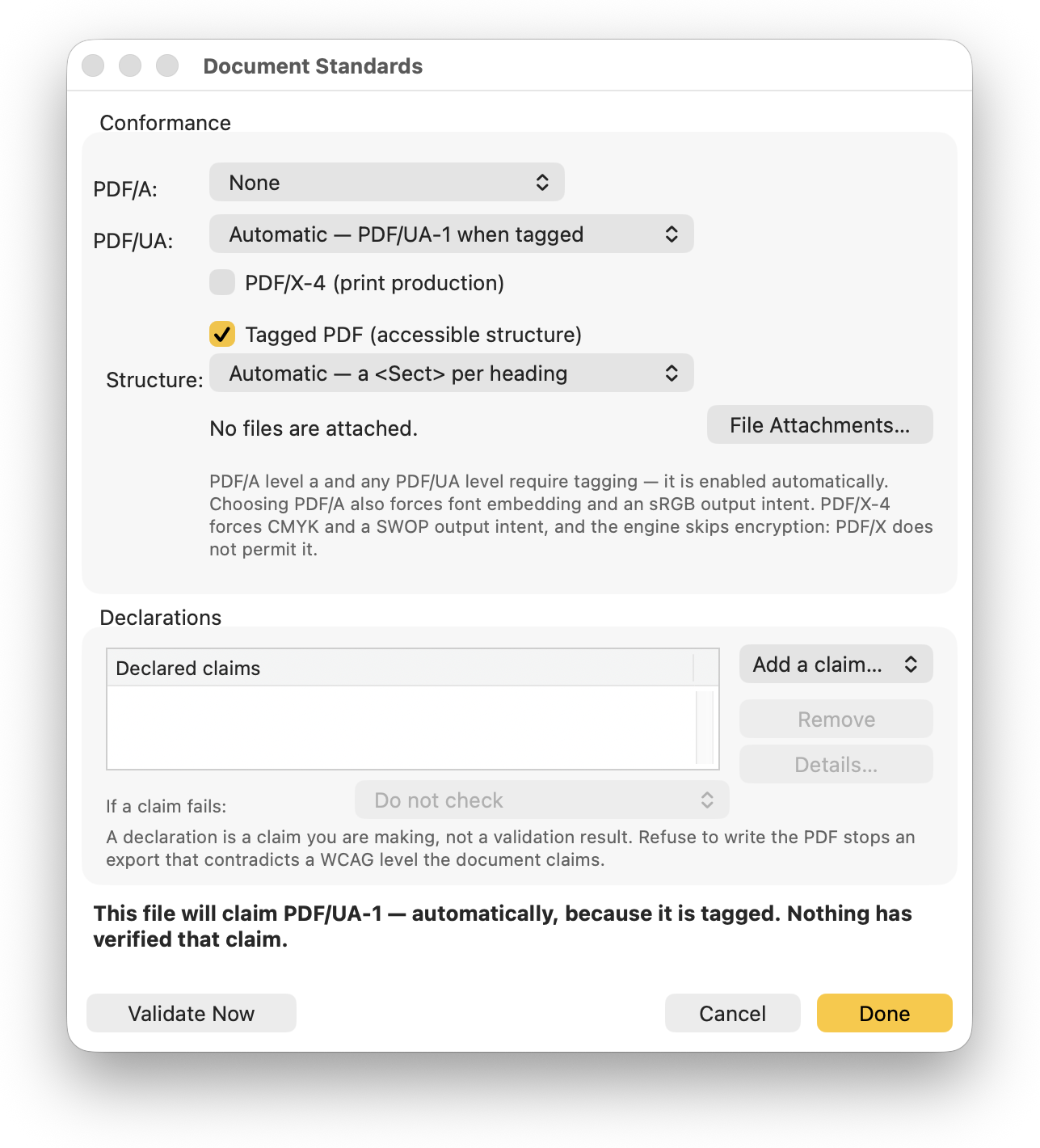
Figure 36. Declaring output conformance in Document Standards.
Choose Document > Output Standards... to open the standards dialog. It has two parts: the conformance controls and the declarations list. Embedded files moved to their own dialog at Document > File Attachments...; the conformance panel shows how many are attached and links to it, because attaching one can change the level you are claiming.
Pick an archival level from the PDF/A popup:
| Level | What it adds |
| PDF/A-2b | Visual fidelity |
| PDF/A-2u | Visual fidelity plus Unicode text mapping |
| PDF/A-2a | Tagged, accessible structure |
| PDF/A-3b / 3u / 3a | The 2-series levels, plus embedded file attachments |
| PDF/A-4 | The PDF 2.0 baseline |
| PDF/A-4e | PDF 2.0 for engineering documents |
| PDF/A-4f | PDF 2.0 with embedded file attachments |
Pick an accessibility level from the PDF/UA popup. It has four rows, and the first of them is not "no claim":
| Row | What the exported file asserts about itself |
| Automatic - PDF/UA-1 when tagged | PDF/UA-1, on any document that is tagged |
| PDF/UA-1 | PDF/UA-1 |
| PDF/UA-2 (PDF 2.0) | PDF/UA-2, for PDF 2.0 documents |
| Tagged, but claim nothing | nothing - the structure tree is written, the claim is not |
Choose Tagged, but claim nothing when the document is tagged and has not been validated. Leaving the popup on Automatic makes the exported file assert PDF/UA-1, which is a claim nothing has checked.
The PDF/A popup, unlike this one, does carry a None row. PDF/A is a target you either declare or do not; PDF/UA is one a tagged document says something about whether you touch the popup or not, which is why removing the claim and making none are two different rows.
Tick PDF/X-4 (print production) when the file is going to a commercial press. PDF/X-4 (ISO 15930-7) describes the printing condition the file was prepared for, so the press does not have to guess: it forces the whole document to CMYK, embeds every font, writes a GTS_PDFX output intent for U.S. Web Coated (SWOP) v2, and gives each page a TrimBox. It is the only PDF/X level PageWright Studio offers, because X-4 is the one that allows live transparency and layers - nothing in your layout has to be flattened to meet it.
Caution: PDF/X does not permit encryption. If the document has a password set under Document > Security..., the exported file will be written without it - PageWright Studio warns you when you tick the box on a document that is encrypted. Turn PDF/X off, or clear the security settings, if the file has to stay protected.
The Tagged PDF (accessible structure) checkbox controls whether the engine writes a full structure tree. You can turn it on by itself, but when a standard requires tagging - PDF/A level "a" or any PDF/UA level - the checkbox locks on automatically and stays on while that standard is selected.
Note: Choosing any PDF/A level also forces font embedding and an sRGB output intent, so the exported file is self-contained. You do not need to configure those separately.
The dialog applies live, so the declared standard lands in the spec as you change it - as the pdfa, pdfua and pdfx keys. Done keeps your choices; Cancel (or Esc) restores the exact state the document was in when the dialog opened, including its undo history.
Declaring WCAG conformance
PDF/A and PDF/UA have identifiers a file can carry in its own metadata. WCAG does not - it is a standard for content, and the conformance most remediation work is asked for by name is a WCAG level. PDF Declarations are how a PDF says so anyway: a machine-readable claim written into the document's XMP, which a checker or a customer can read back.
Use the Add a claim... popup in the Declarations list to add one. WCAG 2.2 and 2.1 are offered at levels A, AA and AAA, along with Well-Tagged PDF (accessibility and reuse), validated PDF/UA-1 and PDF/UA-2, ISO/TS 32005 and HIPAA. Select a claim and click Remove to withdraw it. Claims are stored in the spec's declarations array.
Caution: A declaration is a claim, not a validation result. Writing one does not make a document conformant, and PageWright Studio cannot decide most WCAG criteria - colour contrast in an image, whether alternative text is accurate, whether reading order matches meaning. Claim a level only when someone has actually checked it.
Once a claim exists, the If a claim fails: popup decides what the engine does when the document contradicts it - when, say, the file declares WCAG 2.2 AA and an image has no alternative text:
| If a claim fails | What happens |
| Warn, and still write the PDF | The problem is reported in the status line and the Preflight pane, and the PDF is written anyway. This is the default. |
| Refuse to write the PDF | Export will not write a file that contradicts its own claim. The page still draws while you work, and the Preflight pane lists what breaks the claim. |
| Do not check | The claim is written and nothing is checked. |
Choose Refuse to write the PDF when the file is going somewhere a false claim would matter. Export then stops with a message that names the claim and each finding; Show Me goes to the first one, on its page, and opens the Preflight pane, which lists them all. Fix them, or set If a claim fails to Warn, and export again.
Embedding file attachments
Document > File Attachments... embeds source or companion files in the exported PDF - a spreadsheet behind a report, an XML invoice, the original data file.
- Click Add File... and choose a file. It is added with the Data relationship.
- With a file selected, use the Role: popup to change its relationship: Data, Source, Alternative, Supplement, or Unspecified. The relationship tells a reader how the attachment relates to the document.
- Select a file and click Remove to drop it.
Attachments are stored in the spec's attachments array, each with a relationship value you can also edit in the JSON inspector.
Tip: Attaching a file promotes a PDF/A-2 document to PDF/A-3 - the 2-series does not allow embedded files. For PDF 2.0 documents, choose PDF/A-4f for the same reason.
Checking fonts before you export
Document > Check Fonts... audits every typeface the document names and reports what the engine would actually do with each one.
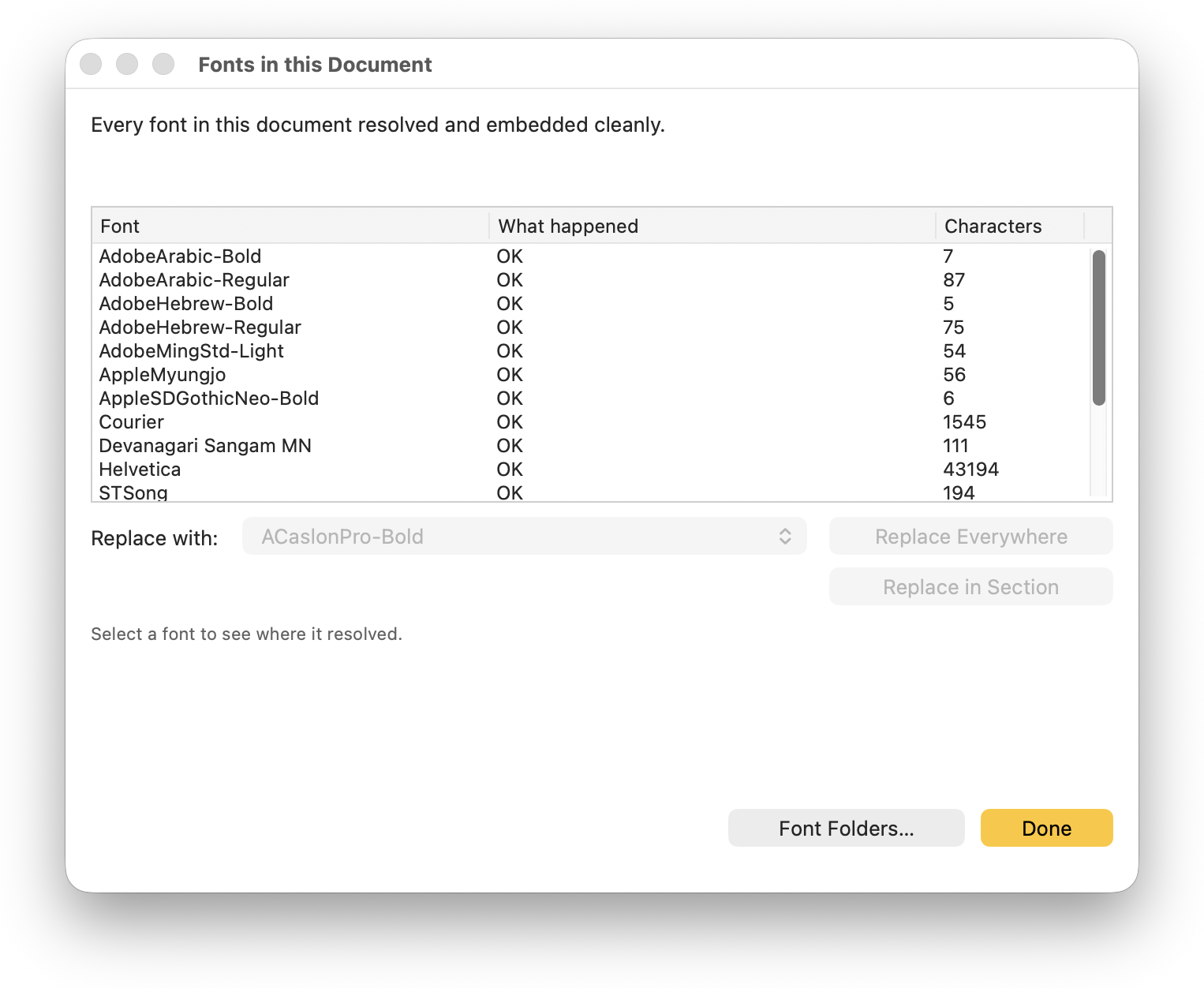
Figure 37. The font audit from Document > Check Fonts.
For each family the report says whether the font is installed, and - the part that matters for a standards target - whether it can be embedded. A font that is installed but cannot be embedded is still a failure for PDF/A and PDF/UA, both of which require every glyph to travel inside the file.
When a font is missing
The engine does not quietly substitute. A document naming a family that is not installed fails to render, with a message saying which family and where it was named - as a block's font, a run's font, a fallback font, or the document's own font. An early version wrote a PDF with no text at all in that case, which looked like success until someone opened it.
The audit offers two repairs, and both are offered rather than applied:
- Replace Everywhere changes that family to one you choose throughout the document.
- Replace in Section changes it only in the section you are working in, and tells you how many uses it left elsewhere - so a scoped repair never looks like a complete one.
Note: "Installed" and "embeddable" are separate questions and the report answers both. A license-restricted font can be sitting on your system, render perfectly on screen, and still make a PDF/A export impossible.
Files travelling inside the PDF
Attached files are listed in Document > File Attachments.... Select one and choose Details... to set the name a reader shows beside the paperclip, a description, the MIME type, and the file's role.
Leave the display name empty and the reader shows the file's own name - which keeps working if you later replace the file. Leave the MIME type empty and the engine works it out from the extension. A file whose role you have not set is listed as Unspecified, which is what the PDF actually says about it; it is not the same as declaring it Data.
Note: Attaching a file promotes a PDF/A-2 document to PDF/A-3, because PDF/A-2 does not permit embedded files. The compliance report names the level you will actually get.
Fonts the document carries with it
Choose Document > Font Folders... to point the document at folders holding faces this computer does not have installed. Those folders are searched before the installed fonts, and they travel with the file: a folder inside the document's own folder is stored as a relative path, so moving the project to another machine takes its typefaces along.
The list shows each folder exactly as the document stores it, with what this computer finds there beside it - 6 faces, or not found on this computer. A folder that is missing here is not removed and not an error: it is very likely correct on the machine the document came from.
Note: The engine reads its font folders once, when it starts, so adding or removing one restarts it and the next preview is a moment slower. Removing the last folder removes the setting entirely, and the document goes back to using the fonts installed on this computer.
When a face loses its color
Two of the report's verdicts are about color rather than failure, and neither means the document is broken.
Colour lost means the face draws in color, this build reads an older version of that format than the face uses, and some characters were drawn in flat black instead. The report says how many. The text is correct; only the color is gone.
Colour bitmap face means the characters are drawn as images and no font program is embedded - which is how color emoji work. The color is right, the text may not be selectable or searchable, and replacing the font is not the fix. The report disables its replace buttons on that row for exactly that reason.
Validating against the standard
Click Validate Now in the standards dialog to run veraPDF against the declared conformance and see whether the rendered document passes. File > Check PDF Compliance... (Cmd-Shift-P) runs the same check from the File menu at any time; it acts on the frontmost document, which must have been rendered first.
The result is one row per thing that can be checked. A tagged document gets a PDF/UA row, checked against the part it claims: PDF/UA-2 for a document set to PDF/UA-2, PDF/UA-1 otherwise. A document declaring an archival level gets a row for that level, and all nine the PDF/A popup offers are covered. Each row reads [x] Compliant, or [ ] Not compliant followed by the number of failed checks - a near miss and a document that needs starting over are different pieces of news, and the count is what tells them apart.
The level a row names is the one the document will actually produce, not the one the JSON literally says. A bare "pdfa": true is the engine's smart default: PDF/A-2a on a tagged document, PDF/A-2u on one that is not. The report resolves it the same way the engine does, so it no longer reports None about a document that is going out as PDF/A.
A document set to Tagged, but claim nothing still gets a PDF/UA-1 row, labeled advisory. That is the point of the retreat state: you can ask "would this pass?" before you publish a claim, which was impossible while the only way to be checked was to assert conformance first.
A PDF/X-4 document gets a row of its own, marked structural. veraPDF has no PDF/X profile, so what PageWright Studio can check is that the PDF/X badge and the output intent are both present in the finished file. That row can never say "compliant" the way the others can, and it does not pretend to.
If the document declares no standard, no tagging and no PDF/X, there is nothing to check - declare a conformance in Document > Output Standards... first. Validation uses the veraPDF installation configured in PageWright Studio > Settings... (Cmd-K).
Note: The PDF/A-4 levels need a recent veraPDF. An older build answers with no verdict at all and the row reads could not be checked - which is a fact about the validator, not about the document. Update veraPDF and run the check again.
What the file will claim
The Claim line under the conformance controls says, in a sentence, what the finished PDF will assert about itself. It is worth reading, because the surprising state is the default one.
Automatic - PDF/UA-1 when tagged is not "no claim". A tagged document with no explicit setting is written with a PDF/UA-1 conformance assertion in its metadata, whether or not anyone has validated it. That is usually what you want, and it is never what "None" would have meant - which is why the row no longer says None.
Tagged, but claim nothing is the honest middle. The document keeps its full structure - headings, tables, alt text, reading order - and simply does not assert conformance. Use it while a document is still being checked, or when house style is to claim only what a validator has confirmed. File > Audit Accessibility... still works on such a document, and File > Check PDF Compliance... reports it as an advisory row, so you can ask "would this pass?" without publishing a claim first.
Structure: controls how much <Sect> grouping the tree carries. All three settings produce a valid PDF/UA-1 file - no validator has an opinion - so this is a readability choice. Every level of nesting is one more container between a screen-reader user and the heading, and a flatter tree is often the better one. The ink on the page is identical.
Who is making the claim
Select a claim in the list and choose Details... to record who is making it, on what date, on what basis, and where the report lives. All four are optional and all four are yours: the engine writes exactly what you type and never fills in a claimant on your behalf.
Auditing accessibility
Choose File > Audit Accessibility... (Cmd-Shift-A) to check the document against a WCAG level it does not have to declare. The chooser is a question, not a claim: picking Level AAA asks whether the document would pass AAA, and changes nothing about what the file says of itself. The window opens on the level it last checked the document against, so auditing again after a fix asks the same question; the first time, it opens on the level the document claims, or on AA.
The audit reads the document model, so it needs no render and takes about a second. The line above the list says what it found: "No findings at WCAG 2.2 Level AA: the document passes every check the audit can make", or how many findings there are. Each finding names its criterion and level, the exact place the engine found it, and - for a contrast failure - the measured ratio against the one required; point at a cell to read it whole. Select a finding and click Reveal in Document to close the window and go to the block that has to change: its page turns into view, and its row is lit in the Blocks pane. Format > Named Styles... (Cmd-Y) then opens on that block's style, where a contrast fix usually belongs.
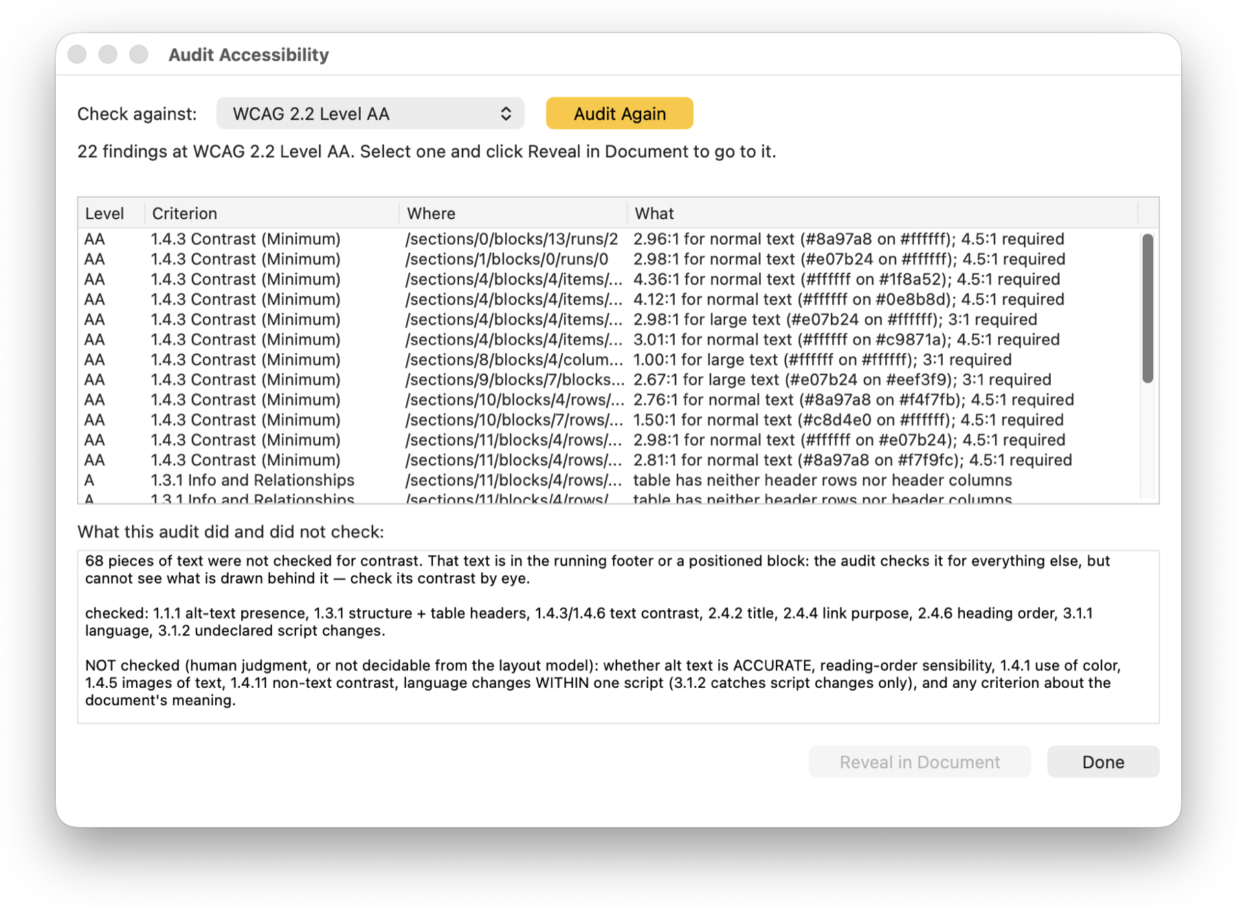
Figure 38. Auditing accessibility at WCAG 2.2 Level AA.
Caution: This is not a conformance claim, and it cannot become one. The audit checks alt-text presence, structure and table headers, text contrast, the document title, link purpose, heading order, and language. It does not check whether alt text is accurate, whether the reading order makes sense, use of color, images of text, non-text contrast, or language changes within one script - those need human judgment.
Text whose background the audit cannot know - in a running header or footer, on a master page, in a positioned block with no background of its own, or on a page under a page template or a watermark - is checked for everything but contrast.
The text under the findings counts it and says where it is in this document; check its contrast by eye. A document that claims a WCAG level gets the same note in the Preflight pane after every render, saying where that text is.
The same findings appear in the Preflight pane after any render of a document that declares a WCAG level, so you do not have to open the audit to see them.
Validating the document itself
Choose Document > Validate Document... to ask the engine whether this document matches the schema. It answers in the Preflight pane rather than a dialog, and every row it puts there is already clickable - the engine names the exact key it refused, and clicking the row selects the block that holds it.
A clean document says so plainly. This is worth running after hand-editing JSON, which is the one route by which a key the schema does not accept can reach a document.
Password-protecting the export
Document > Security... encrypts the exported PDF. Tick Encrypt this document with a password to switch the rest of the dialog on.
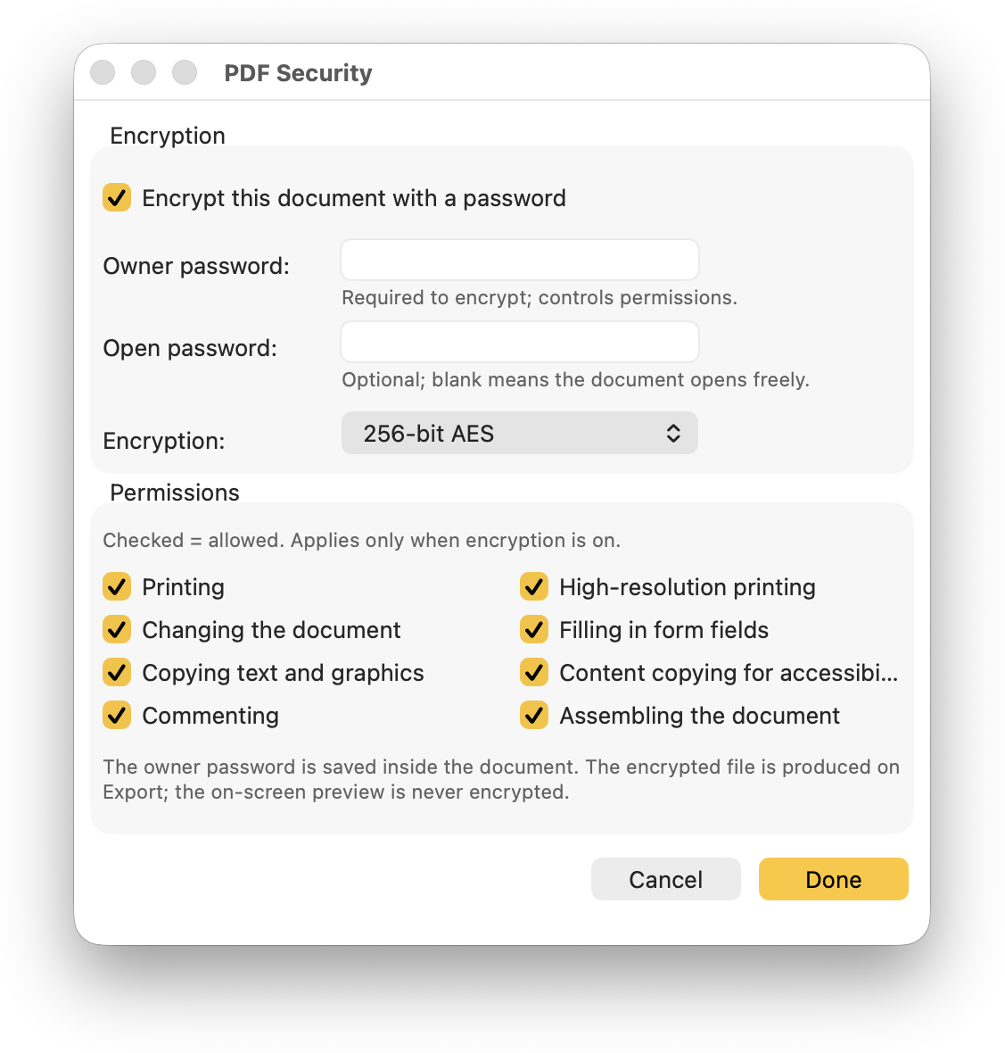
Figure 39. The PDF Security dialog.
- Owner password is required. It is the password that controls the permissions below; anyone who has it can change them.
- Open password is optional. Set one and the reader must type it to open the file at all; leave it blank and the document opens freely, still carrying the permissions you set.
- Encryption is 256-bit AES or 128-bit AES. Prefer 256-bit unless something downstream insists otherwise.
The Permissions group controls what a reader may do without the owner password: printing, high-resolution printing, changing the document, filling in form fields, copying text and graphics, content copying for accessibility, commenting, and assembling the document.
Caution: Leave Content copying for accessibility on for any document you intend to be accessible. Denying it tells assistive technology it may not read the content, which contradicts a PDF/UA claim the same document is making.
Tip: Encryption applies to the exported PDF, not to the PageWright Studio document. The .json you are editing is never encrypted, so keep it where you would keep any other source file.
Exporting the final PDF
The export options
When the document names a face that resolves but will not embed, File > Export PDF... asks two questions before the save panel. On a document with nothing wrong it asks nothing and goes straight to saving, so the common path is unchanged.
Export anyway (proof - fonts not embedded) writes the file the engine would otherwise refuse. Use it to show someone a layout; do not use it for the finished document. The pages will be blank in any reader that does not happen to have the font installed, and a PDF/UA or PDF/A claim in such a file would be false. This box is never remembered, deliberately: a setting that persisted would turn one deliberate proof into every later export. It starts off, except when a proof is all there is to export - when the document has no preview at all because of that font, or after Preview Anyway - and then it comes ticked.
Write a font report beside the PDF writes a .fontaudit.json next to the finished file naming every family, what it resolved to, and anything it could not draw. That one is remembered, and you can set it once in PageWright Studio > Settings..., because a sidecar changes nothing about the PDF itself.
File > Export PDF... (Cmd-E) writes the finished file. The export honors everything the standards dialog declares: the PDF/A and PDF/UA levels, tagging, and the embedded attachments. Run a validation before you distribute the file so there are no surprises on the recipient's end.
When a render fails
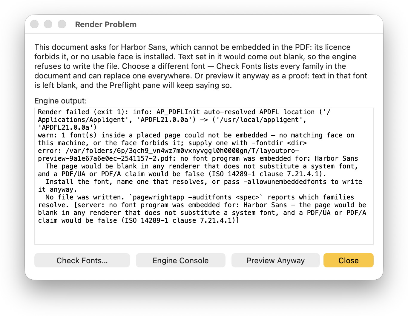
Figure 40. The render-problems panel.
If a change produces a spec the engine cannot lay out, the problem surfaces in a panel - not just the status line. The panel gives you:
- A plain-language explanation: the last change usually produced a value the engine can't lay out.
- The engine's full output, so you can see exactly what it objected to.
- A Revert Last Change button, enabled whenever there is an undo step, that backs out the offending edit in one click.
- A Preview Anyway button, offered only when a named font family resolves but will not embed. It renders the preview with that text left blank so you can judge the layout, and puts a standing row at the top of the Preflight pane saying the fonts are not embedded. It is a preview policy, not a change to the document: it is never saved into the file, it is never remembered as a setting, and it is cleared the moment you open or create another document. It is not offered when the document font itself will not embed - the engine cannot honor the override in that case.
When the failure is a font - the case in the figure - the explanation names the family instead, and Check Fonts..., which lists every family in the document and can replace one everywhere, takes the place of Revert Last Change.
The panel appears once per failure streak, so repeated re-renders of the same broken state do not stack up dialogs. Fix the problem - by reverting, or by correcting the value in the inspector - and the next successful render clears it.
Backing out of a Format dialog
Every live-apply dialog - Output Standards, Named Styles, Typography, Color, Images & Print Production, Watermark, Gradient Fill, Chart Data, Data Sources, and Section - snapshots the document when it opens. Cancel (or Esc) puts the document back exactly as it was, and trims the undo entries the live edits pushed, while Done keeps the changes. Section Properties works the same way: each change applies live as you make it, and Cancel puts the document back as it was before the dialog opened.
The two detail sheets reached by a Details... button - one for a claim in the standards dialog, one for an attachment in the file-attachments dialog - belong on that list too. Each takes its own snapshot as it opens, commits each field as you leave it, and reverts the whole sheet on Cancel, so a half-typed claimant or MIME type never reaches the document. Typography is on the list as well, and now genuinely behaves that way: its Cancel used to keep whatever was still sitting in the focused field, because the field's own commit arrives after the button's.
Note: Because Cancel restores the snapshot, you can experiment freely inside any Format dialog - try a conformance level, watch the live result, and back out cleanly if it is not what you want.
Appendix A. Keyboard Shortcuts
This appendix lists every keyboard shortcut in PageWright Studio, grouped by the menu the command lives in, followed by the keys used while editing text in place and in the Blocks pane, and the mouse gestures the canvas and outline understand. Menu items without a shortcut are not listed - you reach them from the menu itself or from the canvas context menu.
| Command | Shortcut |
| PageWright Studio > Settings... | Cmd-K |
macOS puts Settings in the application menu rather than in File, which is where you will find it however the app defines it internally.
| Command | Shortcut |
| New > From Template... | Cmd-N |
| Open Document... | Cmd-O |
| Close Window | Cmd-W |
| Save | Cmd-S |
| Save As... | Cmd-Shift-S |
| Export PDF... | Cmd-E |
| Audit Accessibility... | Cmd-Shift-A |
| Check PDF Compliance... | Cmd-Shift-P |
| Print... | Cmd-P |
Note: Cmd-N opens the template chooser, not a blank document - you pick the kind of document and its theme, and get one already structured. File > New > Blank Document is on the same submenu without a shortcut.
| Command | Shortcut |
| Undo | Cmd-Z |
| Redo | Cmd-Shift-Z |
| Cut | Cmd-X |
| Copy | Cmd-C |
| Paste | Cmd-V |
| Paste and Match Style | Cmd-Shift-V |
| Copy Style | Cmd-Shift-C |
| Paste Style | Cmd-Shift-F |
| Select All | Cmd-A |
| Edit Text | Cmd-T |
| Duplicate | Cmd-D |
| Find... | Cmd-F |
| Find Next | Cmd-G |
| Find Previous | Cmd-Shift-G |
Tip: Copy Style and Paste Style carry formatting between blocks without touching their text - the fastest way to make one block look like another when neither is using a named style.
| Command | Shortcut |
| Render | Cmd-R |
| Zoom In | Cmd-= |
| Zoom Out | Cmd-Minus |
| Zoom to Fit | Cmd-0 |
| Zoom 100% | Cmd-1 |
| Zoom 200% | Cmd-2 |
| Go to Page... | Cmd-J |
| Go to Block... | Cmd-Shift-B |
| Expand Outline | Cmd-Shift-X |
| Collapse Outline | Cmd-Shift-K |
| Collapse Outline to Sections | Cmd-Shift-0 |
Note: Cmd-G and Cmd-Shift-G belong to Find Next and Find Previous. The grid toggles (View > Snap to Grid and View > Show Grid) gave up their shortcuts to make room for the standard Find keys, so they are menu-only commands. While the Emoji window has the keyboard, Cmd-=, Cmd-Minus, Cmd-0, Cmd-1 and Cmd-2 size its cells instead (in its list view they do nothing), and those zoom items are named for that (see In the Emoji window, below).
Tip: You can also page the canvas from the keyboard: PageUp and PageDown move one page back or forward, and Home and End jump to the first or last page.
| Command | Shortcut |
| Cross-reference... | Cmd-Shift-I |
| Command | Shortcut |
| Typography... | Cmd-Shift-T |
| Command | Shortcut |
| Section... | Cmd-Shift-N |
| Section Properties... | Cmd-Shift-Y |
| Command | Shortcut |
| Bold | Cmd-B |
| Italic | Cmd-I |
| Underline | Cmd-U |
| Align Left | Cmd-Shift-L |
| Align Center | Cmd-Shift-E |
| Align Right | Cmd-Shift-R |
| Justify | Cmd-Shift-J |
| Named Styles... | Cmd-Y |
The character and alignment keys act on the selection in the in-place editor, and on the whole block when one is merely selected - the same split the format bar uses.
| Command | Shortcut |
| Accessible Table... | Cmd-Shift-H |
| Indent List Item | Cmd-] |
| Outdent List Item | Cmd-[ |
| Command | Shortcut |
| Move Block Up | Cmd-Shift-U |
| Move Block Down | Cmd-Shift-D |
| Indent Block | Cmd-Shift-] |
| Outdent Block | Cmd-Shift-[ |
The align and distribute commands, Pin to Page, and Release to Flow have no shortcuts - use the menu, or right-click the canvas, whose context menu carries the common operations. The four stacking commands have none on the menu either; on a designed page, Option-Up Arrow and Option-Down Arrow move the selection forward and backward, and adding Shift sends it all the way to the front or the back.
Tip: The two bracket pairs do neighboring jobs at different levels. Cmd-[ and Cmd-] move a list item in or out one level of its list; adding Shift moves the whole block in or out of its container.
Editing text in place
When you double-click a text block, an editor opens directly over the block. These keys control it:
| Key | Action |
| Return | Commit the edit and re-render. In paragraph-family blocks, Return starts a new line instead |
| Cmd-Return (or keypad Enter) | Commit the edit in paragraph-family blocks |
| Shift-Cmd-Return | Commit the edit and start a new paragraph after the block, open for typing (a paragraph or heading in the body, not a table cell or a list item) |
| Option-Return | Insert a new line |
| Esc | Cancel the edit and discard changes |
In the Blocks pane
Click a row first, so the pane has the keyboard.
| Key | Action |
| Up Arrow / Down Arrow | Select the row above or below; the page turns to its block |
| Shift-Up Arrow / Shift-Down Arrow | Add the row above or below to the selection |
| Right Arrow | Expand the selected row |
| Left Arrow | Collapse the selected row, or, when it is not expanded, move up to the row it sits under |
| Option-Right Arrow / Option-Left Arrow | Expand or collapse the whole branch |
In the Emoji window
Open it with Insert > Media > Emoji... or Window > Emoji. Tab moves from the search field to Categories, the grid or the list, the skin-tone swatches, and Insert, and Shift-Tab goes back. In the search field, Down Arrow or Return goes to the results, selecting the first one, and Esc clears the search; with VoiceOver on, a search says how many emoji matched. When the grid or the list has the keyboard:
| Key | Action |
| Arrow keys, Page Up / Page Down, Home / End | Move the selection through the grid. In the list, Up Arrow and Down Arrow move a row, and Page Up and Page Down move as many rows as the list shows |
| Cmd-Up Arrow / Cmd-Down Arrow | Jump to the previous or next category |
| Return or Enter | Insert the selected emoji after the selection in the front document |
| Esc | Clear the search; with no search, close the window |
| Any letter or number | Search for it |
| Delete | Remove the last character of the search |
| Tab / Shift-Tab | Go on to the next or previous control |
| Cmd-C | Copy the selected emoji as a character, in the skin tone it shows (Edit > Copy Emoji) |
| Cmd-V | Paste into the search field |
| Cmd-F | Go to the search field |
| Cmd-= / Cmd-Minus | Larger or smaller cells (View > Larger Emoji Size / Smaller Emoji Size) |
| Cmd-0 | Cells at the default size, 48 pt (View > Default Emoji Size) |
| Cmd-1 | Cells at the smallest size, 24 pt (View > Smallest Emoji Size) |
| Cmd-2 | Cells at the largest size, 160 pt (View > Largest Emoji Size) |
| Cmd-Z / Cmd-Shift-Z | Undo or redo in the front document |
| Cmd-W | Close the Emoji window; the document stays open |
When the skin-tone swatches under the detail area have the keyboard:
| Key | Action |
| Left Arrow / Right Arrow | Choose the tone to the left or right of the chosen one, for the selected emoji |
| Up Arrow / Down Arrow | For an emoji of two people, move between the Left person and Right person rows |
| Space | Choose the swatch the keyboard is on |
| Return or Enter | Insert the selected emoji after the selection in the front document |
| Esc | Clear the search; with no search, close the window |
| Any letter or number, Delete | Edit the search, as on the grid |
In the search field, Cmd-A, Cmd-X, Cmd-C, and Cmd-V work on the search text, and Cmd-Delete (Edit > Delete) deletes it back to the start. A click anywhere in the Emoji window gives it the keyboard; dragging an emoji out of it, or moving it by its title bar, does not, and after a drop the document has the keyboard, with the dropped emoji selected. While the Emoji window has the keyboard, the Format shortcuts (Cmd-B, Cmd-I, Cmd-U and the alignment keys) still act on the front document; Cmd-0, Cmd-1 and Cmd-2 size the cells, not the page. In the list view every row is one size, so the five size keys do nothing there.
Mouse and trackpad gestures
| Gesture | Action |
| Double-click a text block | Edit its text in place |
| Right-click | Open the context menu for the block or the canvas |
| Drag on empty canvas | Marquee-select every block fully inside the rectangle |
| Shift-drag | Add the marqueed blocks to the current selection |
| Cmd-drag | Move a block freely, bypassing grid snap |
| Option-drag inside a selected picture | Slide the picture inside its frame, when the frame crops it (fit cover or none) |
| Drag a tool off the palette | Place its block where you drop it |
| Drag a picture file onto an image | Replace its picture |
| Drag a picture file anywhere else on the page, or into the Blocks pane | Add it there as a new image |
| Drag an emoji from the Emoji window, from the grid or the list, onto the page or into the Blocks pane | Add it there; onto a picture, replace the picture |
| Hold Option as you drop an emoji on a picture on the page | Add the emoji on top of the picture, which stays as it was. A picture that flows with the text gets the emoji after it instead |
| Double-click an emoji in the Emoji window, in the grid or the list | Insert it after the selection |
| Right-click an emoji in the Emoji window | Select it and open its menu: Insert, Copy Emoji, Copy Name, Skin Tone, Remove from Recently Used, and, while Recently Used is showing, Clear Recently Used |
| Right-click Recently Used in the Emoji window's Categories | Open its menu: Clear Recently Used, which empties the list and cannot be undone |
| Click a skin-tone swatch in the Emoji window | Choose that tone for the selected emoji, and remember it |
| Option-click a palette heading | Open that category and close every other one |
| Scroll wheel / trackpad scroll | Pan the canvas when zoomed in |
| Click a disclosure triangle in the outline | Collapse or expand that branch |
Tip: Cmd-drag only matters while View > Snap to Grid is on - with snapping off, every drag already moves freely.
With VoiceOver
These are VoiceOver's own commands; PageWright Studio answers them on the page, in the tool palette, the Blocks pane, the buttons along the top, the inspector, the lists in dialogs, and the Emoji window (see Using PageWright Studio with VoiceOver in The Main Window).
| Command | Action |
| VO-Space | Press the item under the VoiceOver cursor: a tool, a category heading, a toolbar button, an inspector tab, or an inspector row. On a row of the Blocks pane, select its block. On a block of the page, select it, as a click does. In a dialog's list, select a row, or do what a click on a cell does. On an emoji in the Emoji window, select it; Return or Insert puts it in. On a skin-tone swatch, choose that tone |
| VO-Backslash | Expand or collapse the Blocks pane row under the VoiceOver cursor |
| VO-Shift-M | On a Properties row, open its menu: Clear, Remove, Copy Style, Paste Style. On a Blocks pane row, open the pane's menu for that block. On a block of the page, open the page's right-click menu for it. On a row of a dialog list that has a right-click menu, such as the style properties, open it. On an emoji in the Emoji window, in the grid or the list, open its menu |
| VO-Command-Space | List what the item can do: a divider's increment and decrement, and scrolling an item into view |
Appendix B. Settings and Troubleshooting
PageWright Studio is a front end: the PageWright engine renders your document, and veraPDF checks standards conformance. This appendix covers the dialog that holds your preferences and tells PageWright Studio where those tools live, and what to do when one of them misbehaves.
The Settings dialog
Choose PageWright Studio > Settings... (Cmd-K). macOS places a Settings item in the application menu, not the File menu, so that is where you will find it.
The dialog has three tabs, and each one owns its own Reset to Defaults - a reset never reaches across a tab boundary to change something you cannot see.
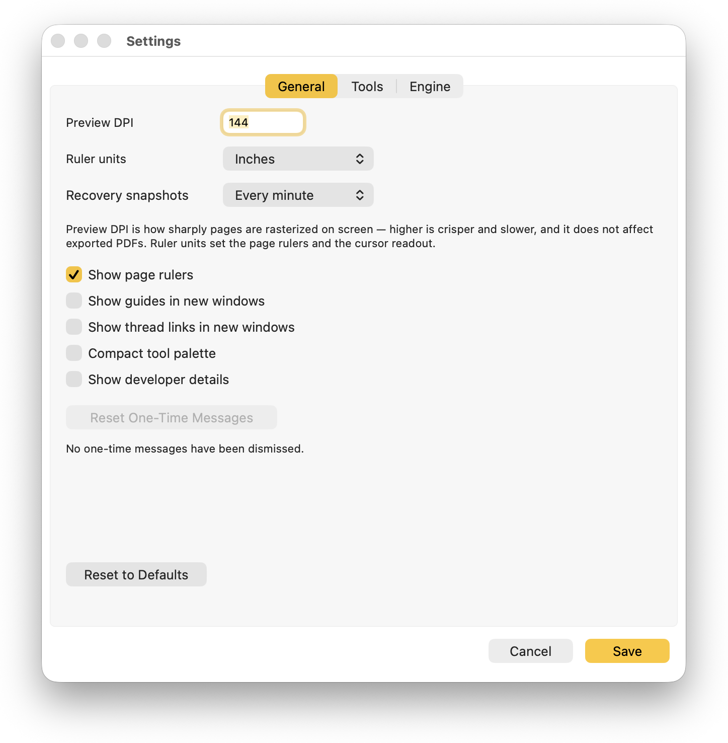
Figure 41. The Settings dialog.
General
Preferences that affect how the app looks and works, rather than what a document contains.
| Setting | What it controls |
| Preview DPI | How sharply pages are rasterized for the canvas, 72-600. Higher is crisper and slower. It does not affect exported PDFs. |
| Ruler units | Inches, centimeters, or points - for the page rulers and the cursor readout in the status bar. |
| Show page rulers | Rulers along the top and left edges of the page. Also View > Show Rulers. |
| Show guides in new windows | Whether a window opens with the page guides showing - the margin box, the running header and footer bands, and the gutters between columns. |
| Show thread links in new windows | Whether a window opens with the thread overlay showing - which frames pour each story, in what order, and where a thread leaves the page. Also View > Show Thread Links, for that window only. |
| Compact tool palette | Shrinks the tool rail to a narrow icon-only strip. Also View > Compact Tool Palette. |
| Show developer details | Adds the render backend and timing to the status line, and fuller output to preflight reports. Also View > Show Developer Details. |
Show page rulers, Compact tool palette, and Show developer details are the same preferences as their View menu items - set either one and the other follows.
Show guides in new windows is the exception, and deliberately: View > Show Guides (and the guides button beside Render) toggles the guides for that window only, so you can turn them on to check one page without changing anything else. This setting is what a window opens with, and changing it leaves the windows you already have open alone.
Reset One-Time Messages brings back notices you have dismissed: the tips that appear in the status bar, and the one-time note explaining that Save writes a .json project while Export makes the PDF. Each of those appears at most once ever, so without this button a dismissed message was gone for good. The line beneath the button tells you how many are currently dismissed, and nothing is cleared until you press Save.
Tools
Chooses which blocks appear in the tool palette. Every block on the Insert menu is in the list; turn off the ones you never reach for and they leave the rail entirely. The Insert menu always keeps them, so nothing becomes unreachable.
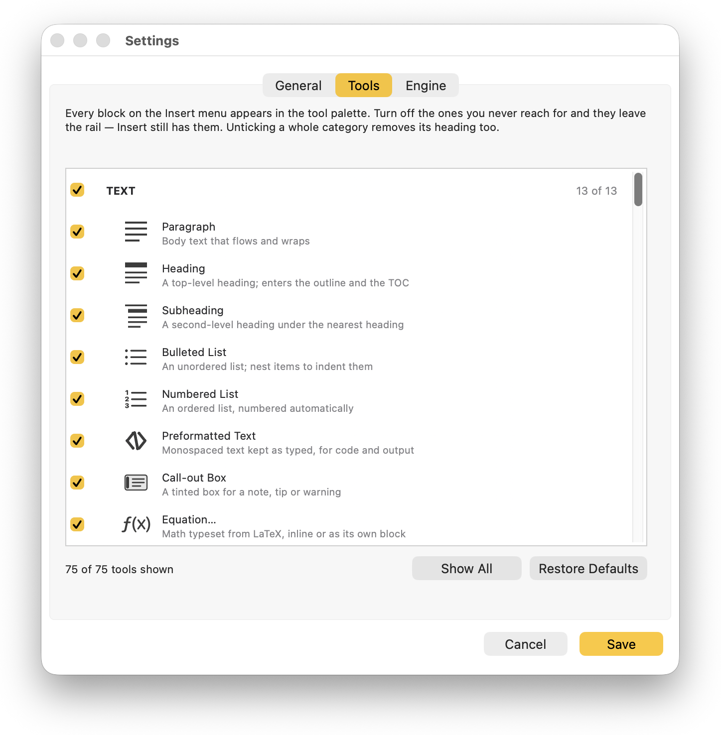
Figure 42. The Tools tab of Settings, choosing which blocks appear in the palette.
Each row shows the block's icon, its name, and a line saying what it is for. A category row is a bulk switch: unticking Form Fields removes all nine at once, and a category with every block turned off loses its heading from the rail as well.
- Show All ticks everything.
- Restore Defaults ticks everything and returns the rail's categories to their default open-and-closed state.
The count beneath the list tracks what you have chosen, and changes take effect when you press Save.
Engine
Paths to the command-line tools, and to the emoji artwork. Every one ships with a sensible default, so on a standard installation you never need to touch this tab - but when you move an engine build, test a new schema, or install veraPDF or the emoji art somewhere unusual, this is where you point PageWright Studio at the right files.
| Field | What it controls |
| Engine CLI (aplayoutapp) | The command-line engine that renders your document to PDF. |
| Engine server (apdoclibapp) | The engine's server mode, used for the fast previews you see while editing. |
| APDFL libraries folder | macOS only: the APDFL Libs directory the engine commands load from. |
| Spec schema (JSON) | aplayout.schema.json, which feeds the More properties... popup in the inspector. |
| veraPDF | The preflight validator behind File > Check PDF Compliance.... Optional - leave it empty and the usual install locations are searched. |
| Emoji library | The folder of emoji art the Emoji window shows and inserts from. Default puts back the standard folder, /usr/local/appligent/emoji (on Windows, the engine\emoji folder beside PageWright Studio); Choose... picks another. Reset to Defaults puts it back too. |
Below the fields a status readout checks each path live: a check mark means the file is there, a cross means it is missing or the path is empty.
Tip: Unless you keep several copies of veraPDF around, leave that field blank. The automatic search finds a standard Homebrew installation without any configuration.
The schema revision line
Under the path checks, one more line reports whether the editor and the render engine are reading the same schema. The schema is what fills the More properties... popup, so when the two disagree the editor quietly offers fewer properties than the engine understands - the page still renders correctly, which is exactly what makes it hard to notice.
| The line says | What it means |
[x] Schema 2026-09-01.1 - matches aplayoutapp | The two agree. Nothing to do. |
[ ] Schema 2026-08-26.1 · aplayoutapp expects 2026-09-01.1 - run install-engine.sh | They differ. The Preflight pane carries the same notice on every render until it is fixed. |
- Schema 2026-09-01.1 - the engine's version is unknown (it predates -schemarev) | The engine is older than this check. Not an error. |
- Schema: no revision stamp - this schema predates x-aplayoutSchemaRev | The file the editor is reading is an older schema. |
A mismatch is never blocking, and it never affects the exported PDF: the engine reads its own copy of the schema, so the render is always correct. What suffers is the editor.
Caution: On macOS PageWright Studio prefers a copy of the schema inside the application bundle over the installed one, and install-engine.sh does not touch the bundle - so a copy built from an older tree can disagree with a correctly installed engine, and reinstalling the engine will not fix it.
When this line reports a mismatch, the Spec schema (JSON) path above it names the file the editor is actually reading. That is the one to check first.
The emoji library line
The last line of the readout describes the folder in the Emoji library field: the emoji sets it holds, how many emoji, and whether it has the artwork for skin tones. It changes as you type or choose a folder.
| The line says | What it means |
[x] Emoji library: Noto Emoji 3D, Noto Emoji 2D - 1,923 emoji · skin tones installed | The library is there, with skin tones in both sets. |
[x] Emoji library: Noto Emoji 3D, Noto Emoji 2D - 1,923 emoji · skin tones not installed | The emoji work, but only in yellow: the Emoji window dims its skin-tone controls. This is the Emoji Art pack without skin tones. |
[x] Emoji library: ... · skin tones in Noto Emoji 3D only | Only the set it names has skin tones. |
[ ] Emoji library: not found at /usr/local/appligent/emoji | There is no folder there. |
[ ] Emoji library: and a reason | The folder is there, but PageWright Studio cannot read it as an emoji library; the reason says why. |
When the LAYOUTPRO_EMOJI_LIBRARY environment variable names a folder, PageWright Studio uses that folder instead of this field, and the line describes it and ends (LAYOUTPRO_EMOJI_LIBRARY overrides this setting).
Save points the Emoji window at the new folder at once. New artwork installed into the same folder, such as the pack with skin tones in place of the one without, is picked up the next time the Emoji window comes to the front, without restarting PageWright Studio.
Saving and canceling
Save stores your changes, clears the app's cached schema and engine information, and re-renders every open document - the change takes effect immediately, with no restart. Cancel discards everything you changed, on all three tabs.
Where settings live
Preferences are stored in prefs.json, under ~/Library/Application Support/LayoutPro/ on macOS and %APPDATA% on Windows.
Note: A field left at its built-in default is stored as unset rather than as its current value. That lets the defaults evolve with the app: when a future version moves its bundled engine, you pick up the new location automatically instead of clinging to an old path.
Troubleshooting
| Symptom | What to do |
| Engine not found; nothing renders | Open Settings... > Engine and check the Engine CLI path - the status readout under the fields shows exactly which one is failing. |
| A render fails after an edit | Read the render-problems panel: it gives a plain-language explanation plus the engine's full output. Revert Last Change puts the document back the way it was. |
| A render fails naming a font | The font the document asks for is not installed, so the engine refuses rather than quietly substituting. The panel offers to replace that family everywhere, or just in the current section - see Standards, Preflight, and Export. |
| A block is missing from the tool palette | Check Settings... > Tools; it may be turned off. The Insert menu always has every block regardless. |
| Preview looks soft or fuzzy | Raise Preview DPI on the General tab. Higher is sharper but slower to render. |
| You need to see exactly what the engine said | Window > Engine Console shows everything the engine has printed this session, in order and time-stamped - renders from before you opened it included. Its window is titled Appligent Console. |
| Check PDF Compliance... reports veraPDF missing | Install it with brew install verapdf, or enter its path on the Engine tab. |
| The Emoji window shows no emoji and names a folder | It cannot find its emoji library there. Check the Emoji library row on the Engine tab: its line says what is in the folder, or that it is not there. |
| The Emoji window's skin-tone controls are dimmed | The emoji art installed has no skin tones for the set on show. Install the Emoji Art pack with skin tones; the Emoji library line then says skin tones installed. |
Caution: Preview DPI affects only the on-screen raster, never your exported PDF - but a large value makes every re-render slower, and PageWright Studio re-renders after each edit. Step it up gradually rather than jumping straight to 600.
Appendix C. The Block Catalog
Every block PageWright Studio can insert, by category. These are the same categories the tool palette uses and the same items the Insert menu lists - the table below is generated from the application's own catalog, so it cannot fall out of step with what the app offers.
Blocks come in two kinds, and the difference decides how you place them:
- Flow blocks are typeset into the page in order. Insert one and it lands after the current selection, or at the point you drop it if you dragged it in. Most blocks are flow blocks.
- Placed blocks - form fields, shapes, and the text frame - are positioned. Choosing one arms click-to-place: your next click on the page puts it there, and you can drag and resize it afterward.
Any flow block can be turned into a placed one with Arrange > Pin to Page, and back again with Release to Flow.
Tip: If a block you want is missing from the tool palette, check Settings... > Tools - it may simply be switched off. The Insert menu always carries all of them.
Text
| Block | What it inserts |
| Paragraph | Body text that flows and wraps |
| Heading | A top-level heading; enters the outline and the TOC |
| Subheading | A second-level heading under the nearest heading |
| Bulleted List | An unordered list; nest items to indent them |
| Numbered List | An ordered list, numbered automatically |
| Preformatted Text | Monospaced text kept as typed, for code and output |
| Call-out Box | A tinted box for a note, tip or warning |
| Equation... | Math typeset from LaTeX, inline or as its own block |
| Badge... | A colored pill stamped on the selected text |
| Footnote... | A numbered note anchored to the selected text |
| Endnote... | A note gathered at the end of the document, anchored to the selected text |
| Running-head Marker... | An invisible anchor a running head can print by name |
| Cross-reference... | A live reference to a heading, figure or equation |
Layout
| Block | What it inserts |
| Table | A grid you fill cell by cell; headers can repeat |
| Container (group) | Groups blocks so they move and break together |
| Card | A bordered panel with its own padding and background |
| Card Grid | Equal-width cards flowed row by row |
| Columns | Side-by-side columns with explicit widths |
| Bar Gauge | A horizontal value-against-maximum gauge |
| Spacer | Vertical whitespace of a fixed height |
| Rule | A horizontal divider between blocks |
| Page Break | Forces the next block onto a fresh page |
Media
| Block | What it inserts |
| Image... | Place a PNG, JPEG or TIFF from disk |
| SVG Image... | Place vector artwork that scales without blurring |
| Diagram... | A diagram block carrying its rendered SVG |
| Emoji... | Opens the Emoji window: drag an emoji onto the page, or select one and press Return |
Shapes
| Block | What it inserts |
| Rectangle | Draw a rectangle where you click on the page |
| Ellipse | Draw an ellipse where you click on the page |
| Line | Draw a straight line where you click on the page |
| Polygon (triangle) | Draw a triangle where you click on the page |
| Bezier Curve | Draw a curve, then bend it with its control handles |
Charts
| Block | What it inserts |
| Bar | Vertical bars comparing values across categories |
| Line | A line through points, for trend over a sequence |
| Pie | Slices of a whole, from a single series |
| Area | A line chart with the area beneath it filled |
| Waterfall | A running total built from rises and falls |
| Funnel | Stages narrowing from the first to the last |
| Treemap | Nested rectangles sized by their value |
| Sankey | Flows between stages, width by volume |
| Stacked Bar | Bars split into stacked series segments |
| Horizontal Bar | Bars running sideways; good for long labels |
| Combo (bar + line) | Bars and a line together on shared axes |
| Doughnut | A pie chart with the center cut out |
| Scatter | Points plotted at x and y, for correlation |
| Bubble | Scatter points sized by a third value |
| Radar | Series plotted along spokes from a center |
| Polar | Values placed around a circle by angle |
| Candlestick | Open, high, low and close for each period |
| Box Plot | Median, quartiles and outliers per group |
| Heatmap | A grid of cells colored by their value |
| Gauge | One value against its range, on a dial |
Barcodes
| Block | What it inserts |
| Code 128 | Dense alphanumeric; the general-purpose choice |
| QR Code | 2D square holding URLs and long payloads |
| EAN-13 | 13-digit retail product code |
| UPC-A | 12-digit North American retail code |
| Code 39 | Older symbology; uppercase and digits only |
| Data Matrix | Compact 2D for small parts and labels |
| PDF417 | Stacked 2D used on ID cards and tickets |
| Aztec | 2D needing no quiet zone; transport tickets |
Placed PDF
| Block | What it inserts |
| PDF Page... | Place one page of an existing PDF |
| PDF Contact Sheet... | Every page of a PDF as a thumbnail grid |
Form Fields
| Block | What it inserts |
| Text Field | A fillable single-line text field |
| Checkbox | A fillable box that is either on or off |
| Radio Buttons | A fillable group where one option wins |
| Dropdown | A fillable list that opens when clicked |
| List Box | A fillable list showing several rows at once |
| Signature Field | A field for a digital or drawn signature |
| Push Button | A clickable button widget with its own caption |
| Date Field | A fillable field holding a date |
| Label | Static caption text placed on the page |
Data
| Block | What it inserts |
| Repeat (loop over data) | Repeats its blocks once per row of a data source |
| Conditional (if / else) | Shows its blocks only when a condition holds |
| Include partial... | Pulls in another spec file at render time |
| Text Frame | A positioned text box placed where you click |
| Merge Field... | Inserts a {{field}} from the document's record set |
Where each one is documented
The table above says what each block is; the chapters say how to work with them. Inserting Content covers the placement gestures and the block families in turn, Chart, Image, and Shape Editors covers the editors behind charts, gradients, and diagrams, and Data-Driven Documents covers the repeat, conditional, and include blocks that build a document from data, and Editing on the Page covers a table's rows, columns, cells, and how it is tagged for accessibility.